Monday, February 29, 2016

A review of key charts: no recession, no deflation, lots of pessimism

Time for a review of some key charts that I'm following. On balance, I see evidence that inflation is running about 1 ½% to 2%, as it has for the past 15 years or so. I find very little, if any, evidence that monetary policy is too tight or that deflation is likely or a real threat. This suggests that the market is overly concerned about the Fed "running out of ammunition," and overly concerned about the risk of a "downward spiral" that might be sparked by an outbreak of deflation (i.e., people stop spending because money acquires more value with time). It all but rules out the need for negative interest rates, which could be potentially dangerous since their purpose is to destroy the demand for money, and it suggests that the Fed was justified in making a modest increase in short-term interest rates. I also see reasons to think the market may be too pessimistic about the outlook for economic growth. 


The Consumer Price Index and the Personal Consumption Expenditures Deflator (above charts) tend to track each other, with the CPI running about 30-50 bps higher the the PCE deflator due to differences in the basket of goods and services measured by each. In the past year or so, both measures dipped close to zero, due mainly to collapsing oil prices, but they have recovered significantly in recent months. Meanwhile, the core and ex-energy versions of both have been relatively stable: the CPI ex-energy is up 2% in the year ending January '16, and the core PCE deflator is up 1.7% over the same period. Both have accelerated a bit of late, which runs counter to the prevailing notion that inflation is dead. With oil prices stabilizing, it's therefore quite likely that the headline CPI will hit 2% within a few months, and the PCE deflator will be close behind. In the world of macroeconomics, this is as close to the Fed's target of 2% on the PCE deflator as one could hope for, and there is no reason for a shortfall of even ½ % to be of concern. Arguably, the ideal rate of inflation would be 0-1%, but I'd be happy with 1 ½%.


As the chart above suggests, one important source of low inflation over the past 15 years has been declining prices for durable goods (e.g., computers, electronic gadgets, appliances). Durable goods prices on average have fallen by one-third since 1995. At the same time, the prices of "services" (which are mostly driven by the cost of labor) have increase by more than two-thirds. Thus, the deflation of durable goods prices means that an hour's worth of labor buys two and a half times more durable goods today than it did in 1995. 

The source of this "deflation" can be traced rather easily to China, which became a significant exporter of cheap durable goods beginning in 1995. (Durable goods prices never experienced a sustained period of decline prior to 1995, by the way.) The collapse of energy prices in the past year or two shows up in flat to declining prices of non-durable goods, which have depressed inflation of late.

It's a mystery to me why folks like Donald Trump say that China has been stealing our jobs, when thanks to cheap Chinese goods the purchasing power of the entire country has increased significantly.

So: is inflation low because the Fed been too tight? I think not. Inflation has been low mainly because of supply shocks: China's export boom, and fracking technology which has significantly boosted oil production, which in turn has resulted in collapsing oil prices.


The chart above shows the market's expectation for the average annual inflation rate over the next five years (green line), as derived from the yields on 5-yr Treasuries and 5-yr TIPS. Currently 1.32%, expected inflation is lower than the current level of core inflation, and lower than the 2% average inflation rate of the past 15 years. If anything, this suggests the market may be underestimating inflation. If so, then it would stand to reason that the bond market is quite vulnerable to any sign of rising inflation.


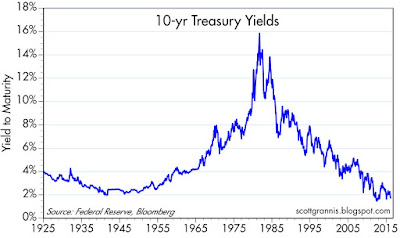
With 10-yr Treasury yields currently a mere 1.73%—only 25 bps above their all-time lows of mid-2012—the bond market is priced to slow-growth, low-inflation perfection; it's vulnerable to any sign that inflation is either not falling or rising, and/or any sign that economic growth is, say, 2% or better. 


Extremely low Treasury yields are also a good sign that the market is consumed by pessimism, given that the earnings yield on equities is 5.7%. Choosing 10-yr Treasuries with a yield of only 1.7% in lieu of equities yielding 400 bps more (and considering further that equities have far more upside potential than bonds at this point) only makes sense if one is convinced that earnings will suffer significantly in the years to come. So far, earnings are down only a little more than 2% in the past 12 months, and most of that is coming from the oil patch. Put another way, the current PE ratio of the S&P 500 is 17.4, whereas the PE ratio of the 10-yr Treasury is 58! To pay so much for the presumed safety of Treasuries is to have truly dismal expectations for economic growth and corporate profits.


About 10 years ago I put together the chart above in order to illustrate how tight money (as reflected in rising real short-term interest rates) and high and rising oil prices conspired to trigger the recessions of 1990-91 and 2001. (As I described it then, the economy gets "squeezed" by expensive money and expensive energy, as illustrated by the blue and red lines converging.) The same thing happened with the recession of 2008-9, as oil prices reached record-high levels and the Fed raised the real Fed funds rate (its primary policy tool) to over 3%. If tight money and expensive oil have traditionally been bad for the economy, then today's negative real rates and cheap oil prices are likely a godsend. This suggests that the economy can do better than the market expects, even if it only continues to grow at 2 -2 ½%, as it has since 2009. 


The chart above illustrates how Fed tightening has preceded every recession since the late 1950s. Recessions have always followed the confluence of high and rising real interest rates (the blue line) and flat to inverted yield curves (the red line). Today, real rates are still negative and the yield curve is still positively-sloped. Monetary policy thus appears to pose no threat to economic growth, at least as far as the bond market is concerned. Otherwise the curve would be flat in the expectation that a recession would make it impossible for the Fed to ever raise rates from their current level.


This recovery continues to be the weakest in modern times. As I pointed out a few weeks ago, the main culprit is extremely weak productivity gains. As the chart above shows, real disposable personal income would be about $1.5 trillion per year higher today if this had been a typical recovery. That's a lot of income left on the table, and it explains why the middle class is not happy with the current state of affairs. Trillions of dollars of prosperity are riding on the results of the November elections, with only Republicans proposing policies that could change things for the better (e.g., reduced marginal tax rates, tax code simplification, reduced regulatory burdens).


Corporate credit spreads are elevated, and that is a legitimate source of concern (see charts above). But most of the problems with default risk are found in the oil patch. Ex-energy, high-yield bond spreads today are still less than what we saw during the PIIGS crisis of 2011, and far less than the spreads we saw in the 2008 financial crisis. So it looks like the problems in the oil patch are relatively contained. And with oil prices having stabilized, spreads on HY energy debt have already tightened by 375 bps from their recent highs of 1,984 bps. Once again I note that swap spreads are still very low, which suggests the problems in the oil patch have not resulted in any deterioration in the economic and financial fundamentals. Systemic risk is still very low, and liquidity is abundant. Healthy financial markets are a prerequisite for managing and resolving economic dislocations. Today, the economic and financial fundamentals are significantly better than they were in 2008. Back then, the Fed was tight, and liquidity was in very short supply. It's a very different story today.


Markets are still very worried, of course, as the chart above shows. The Vix index is unusually high, the 10-yr Treasury yield is quite low, and equities are still down almost 10% from their highs of last May. The pattern in the above chart (i.e., spikes in the Vix/10-yr ratio coinciding with plunges in the S&P 500 index) has been repeated quite often in recent years, only to be resolved with higher equity prices as fears decline and confidence returns. The recent decline in the Vix/10-yr ratio is thus encouraging, as is the lack of evidence that the problems in the oil patch are spreading. Still, there are many ongoing calls for a sharply lower market and a worsening of economic conditions. But from what I see, there is no reason to panic. A simple continuation of what we've seen in recent years should be enough to support equity prices at current or higher levels. In the end, avoiding recession is all that matters, as I've been saying for the past three years.

Tuesday, February 23, 2016

Strange bedfellows: Koch and Sanders

Here is a great article by Charles Koch, one of the “infamous” Koch brothers that liberals routinely demonize. Koch agrees with Sanders that Big Government has unfairly rigged the system in favor of powerful interests and against everyone else.

The senator is upset with a political and economic system that is often rigged to help the privileged few at the expense of everyone else, particularly the least advantaged. He believes that we have a two-tiered society that increasingly dooms millions of our fellow citizens to lives of poverty and hopelessness. He thinks many corporations seek and benefit from corporate welfare while ordinary citizens are denied opportunities and a level playing field.

I agree with him. 
Democrats and Republicans have too often favored policies and regulations that pick winners and losers. This helps perpetuate a cycle of control, dependency, cronyism and poverty in the United States. These are complicated issues, but it’s not enough to say that government alone is to blame. Large portions of the business community have actively pushed for these policies.
Our criminal justice system, which is in dire need of reform, is another issue where the senator share some of my concerns. Families and entire communities are being ripped apart by laws that unjustly destroy the lives of low-level and nonviolent offenders.

Today, if you’re poor and get caught possessing and selling pot, you could end up in jail. Your conviction will hold you back from many opportunities in life. However, if you are well-connected and have ample financial resources, the rules change dramatically. Where is the justice in that?

Read the whole thing. These are important issues that transcend party lines.

Sunday, February 21, 2016

Inflation is not too low, it's just right

My sense of the consensus on inflation: it's very low, threatens to go negative; central banks seem powerless to boost it, but they need to keep trying because very low inflation is a sign that monetary policy is too tight and threatens widespread corporate bond defaults. The reality, however, is quite different. As I've been pointing out for a long time, if you strip out energy prices you find that the underlying rate of consumer price inflation has been running at a 2% pace for more than a decade. Nothing has changed of late. And there's no reason to think the current rate of inflation is too low.


The chart above says it all. It's the CPI ex-energy index, plotted on a log scale. It's been following a 2% growth rate ever since 2003. Whatever the Fed has been doing or trying to do, they have delivered 2% inflation.


The chart above compares the CPI to the CPI ex-energy. I've highlighted two periods when oil prices suffered a significant decline. I think the current period is playing out almost exactly like 1986. Headline inflation collapsed, but bounced back once oil prices stopped declining.

I note that in the late 1990s inflation was about the same as it is today (about 2%) yet that was a period of very strong growth (about 4% a year for several years). Low and stable inflation is a good thing. The problem today is that oil prices have been incredibly volatile. But as I pointed out the other day, the fundamentals of the oil industry have changed dramatically thanks to new drilling technologies. Governments no longer have the monopolistic control over oil supplies that they used to have. There's a new and important source of supply, and his name is Fracking. Oil prices are not going to decline much more than they already have. Oil demand is on the rise, and new drilling has been shut down dramatically—until prices start to rise again.

Oil prices are likely to be more stable in the future than they have been in the recent past, and that will allow the underlying trend of inflation—2%—to be revealed once again.

As an aside, I should note that the "core" rate of consumer price inflation is up at a 2.3% annualized pace over the past six months. Lower oil prices may be helping other prices to rise, because consumers have more money to spend on other things.

I'm once again skiing in Park City this week, so blogging may be light.

Thursday, February 18, 2016

Why is oil so volatile?

This interesting observation from Matt Ridley (author of "The Rational Optimist"):

Why is the price of oil so volatile? I thought I knew the answer — scarcity and Opec — till I read Aguilera and Radetzki. They make the case that depletion has never been much of a factor in driving oil prices, despite the obvious drying up of certain fields (such as the North Sea today). Nor did Opec’s interventions to fix prices make much difference over the long run. What caused the price of oil to rise much faster than other commodities, though erratically and with crashes, they argue, was the result of one factor in particular. 
There was a wave of nationalisation in the oil industry beginning in the 1960s. Today some 90 per cent of oil reserves are held by nationalised companies. ExxonMobil and BP are minnows compared with the whales owned by the governments of Saudi Arabia, Venezuela, Iran, Iraq, Kuwait, the United Arab Emirates, Nigeria and Russia. Post-colonial nationalisation affected many resource-based industries, but whereas many mineral and metal companies were privatised in the 1990s as their grotesque inefficiencies became visible, the same has not happened to state oil companies. 
The consequence is that most oil is produced by companies that are milked by politicians, and consequently starved of cash (or incentives) for innovation and productivity. Lamenting “politicians’ extraordinary ability to mess things up”, the two authors note “the severely destructive role that can be played by political fights over the oil rent and its use."

The good news: "If politicians don’t get in the way, and we have two decades of relatively cheap oil it will be bad news for petro-dictators, oil-igarchs, Isis thugs, and the promoters of wind power, solar power, nuclear energy and electric cars. But it is good news for everybody else, especially those on modest incomes."

No shortage of money

Markets continue to fret over weak oil and commodity prices, a slowdown in Chinese growth, and the threat of contagion from defaults in the oil patch. Are central banks too tight? Are negative interest rates the solution?

I think negative interest rates would be a mistake. You can't fix anything by destroying the demand for money with negative interest rates. Sure, negative interest rates will encourage people to spend their money rather than keep it in the bank, and it will encourage banks to utilize their excess reserves to boost lending. But that is not necessarily going to result in stronger economic growth. More likely, it will just boost inflation, which would further undermine the demand for money and ultimately weaken the economy.

It's true that there is a whole lot of money out there that isn't being spent. But that's because people—and banks—feel a need to accumulate money and deleverage. Tampering with that demand for money might not be a smart thing to do.

Why is it that central banks are everyone's go-to solution for solving the problem of weak economic growth? They shouldn't be. Taking money out of your savings account and spending it isn't going to increase anyone's productivity, and productivity is what creates growth. This is the supply-sider's main belief: spending doesn't drive an economy, producing does. We need to produce before we can consume.

What follows is a brief review of the state of money. There's plenty of it out there, both here and in the Eurozone.


One important measure of money is the amount of money relative to the size of the economy, shown in the chart above. This is a good proxy for the demand for money, and it can be thought of as the amount of one's annual income that is kept in ready cash form (checking accounts, savings accounts, money market funds, cash). Money demand in the U.S. has been rising since the late 1990s, and it has now reached an all-time high.


The best measure of the money supply is M2, shown in the charts above. M2 has been growing at an annualized rate of just over 6% for the past 20 some years. Most of the growth in M2 has been in bank savings deposits. That's unusual, because for many years these accounts have paid little if any interest. That must mean the demand for the safety of these accounts is very strong, since they offer little benefit beyond being a safe repository of money that is easily accessible.


The chart above tracks the history of bank savings deposits, which have been growing at about an 8% annual rate in recent years. Following the 2008 financial crisis, these accounts grew at double-digit rates for several years. It may not be a coincidence that the $4+ trillion increase in bank savings accounts since the beginning of QE1 is of the same order of magnitude as the Fed's QE purchases. In effect, banks took in $4 trillion of savings deposits and used that cash to purchase notes and bonds which were in turn sold to the Fed in exchange for bank reserves. Banks invested their deposit inflows with the Fed.


Today, banks hold about $2.3 trillion of excess reserves. Mike Bazdarich, a former colleague of mine at Western Asset Management, tells me that as a result of a series of regulatory requirements that have been implemented since 2008, (e.g., reserves required to collateralize deposits, the risk-weighted capital requirements imposed by the Basel Accords, plus the soon-to-come Fed-imposed requirement that banks hold highly liquid assets (mainly bank reserves) equal to 100% of the amount that Fed stress tests indicate they would need to survive another liquidity crisis), banks' demand for reserves has skyrocketed. It's possible that half or more of the current excess reserves held by banks today is effectively dictated by various requirements and requirements to come, some of which are still difficult to estimate.

In other words, banks have accumulated a mountain of excess reserves not because they don't want to lend against those reserves but because they had to accumulate them in order to survive. Banks may therefore not be as flush with excess reserves as the numbers suggest. They have responded to changing regulatory burdens by becoming more conservative and hoarding cash. Consumers have done the same in response to the loss of confidence that still persists in the wake of the 2008 financial crisis. In short, there are lots of reasons why the demand for money is strong.


Meanwhile, the supply of money has grown at generous rates all over the world. As the chart above shows, Eurozone M2 has increased almost as fast as M2 in the U.S. over the past two decades.


Seemingly buried in all the hand-wringing about slow growth and tight money, Commercial & Industrial Loans (loans to small and medium-sized businesses) have been growing at double-digit rates for years.


For the past 20 years, Total Bank Credit has been growing at almost the same rate, on average, as M2. Banks, after all, are the only ones who have the ability to create new money. The growth of credit and of the money supply (a bit more than 6% per year) has been well in excess of the growth of nominal GDP. From these facts, it would be hard to make the case that our problems today stem from any lack of money or lack of lending.

So what is holding the economy back? It's time to turn the focus on fiscal policy. Central banks have done all they can. What's standing in the way of progress are burdensome regulations, high marginal tax rates, intrusive government, subsidies for uneconomical green projects, and fear and uncertainty.

Negative interest rates are a solution for a non-existent problem that undermines the demand for money in a way that might have unwanted and inflationary consequences.

Saturday, February 13, 2016

Scalia, RIP


Thursday, February 11, 2016

Another wall of worry

Once again markets are consumed by fears of another global collapse, this time triggered by super-low oil prices and a struggling Chinese economy. These two factors first surfaced last August, only to subsequently subside, but now they have returned with a vengeance. We haven't seen anything this bad since the PIIGS crisis rocked European markets in late 2011 and early 2012, leaving a recession in its wake. The oil patch, however, is now in full crisis mode, fully reminiscent of the financial panic of 2008, as the market is pricing in extensive and painful debt defaults. The question that no one can answer is whether the problems in China and the oil patch will lead to crises in emerging markets and eventually recessions in the developed economies. Are we on the brink of another 2008 (a global rout), or is this going to be like 2011 (i.e., localized and transitory)? My money is on the latter, but I'll admit to being nervous.

Here are some charts that put the severity of the current situation in perspective:


As with other stock market selloffs, the current one comes accompanied by a significant increase in fear, uncertainty and doubt (proxied here by the ratio of the Vix index to the 10-yr Treasury yield). Panics that result in a big increase in the implied volatility of equity options sometimes bring with them their own solution, since buying options to limit one's risk becomes extremely expensive (thus making it very expensive to sell on dips and buy on rallies), while selling options becomes potentially very lucrative (rewarding those who are willing to buy the dips and sell the rallies). Spikes in fear of this nature thus attract more liquidity to the market, which in turn makes it easy for those who wish to exit. Real panics feed on themselves when the exit doors are crowded and/or shut, but that doesn't appear to be the case today.


Gold prices and TIPS prices (proxied here by the inverse of their real yield) have been trending down ever since the resolution of the PIIGS crisis. I've interpreted this to mean that markets were gradually regaining the confidence they lost, since both assets are safe havens. Gold appears to have broken out of this downtrend of late, suggesting that panic is setting it. 


It's worth noting that industrial commodity prices have been rising in recent months, tracking the rise in gold prices. Outside of the oil patch, it appears that commodity prices are beginning to recover. A weaker dollar is helpful in this regard. But if industrial commodity prices are recovering, that further suggests that the global economy is not exactly collapsing. 


Corporate credit spreads are certainly elevated, but still far below the levels that characterized the 2008 global financial panic.


Default risk is highly concentrated in the energy sector. High-yield energy bond spreads are now at the extreme levels that we saw in the HY market back in 2008. Spreads at these levels indicate that the market is priced to the expectation that a significant number of bonds will default. Back in November 2008 (just prior to the peak in credit spreads) I had a post which discussed the significance of super-wide spreads. I referenced a Lehman analysis which calculated that spreads in the range of 1700 bps implied that 70% of HY bonds would be in default within the next 5 years. I also referenced a Barclays study that said that HY spreads of 1700 implied "3-4 years of a 15% annual contraction in GDP," which would have been far worse than what we saw during the Great Depression. Bottom line, the current level of spreads in HY energy bonds is consistent with catastrophic conditions in the oil patch. The market may be exaggerating the actual risks, but we can say with confidence that it doesn't get much worse than this.

As I've been noting for quite some time, it remains the case that swap spreads are very low despite the elevated level of corporate credit spreads. This is a significant non-confirmation of the distress in the HY sector. Although the market is extremely pessimistic about the prospects for the oil patch, and quite concerned about the health of speculative bonds in general, the bond market as a whole exhibits little if any systemic risk and generally healthy liquidity conditions. Swap spreads were good leading indicators of the distress in prior recessions, but this time around it's very different. At the very least this suggests that the market's level of panic is exaggerated—that the underlying fundamentals are not as bad as the panic would suggest.


The chart above suggests that the decline in near-term inflation expectations can be fully explained by the decline in oil prices. Oil prices are depressed because of abundant supplies, not because the Fed is too tight. If overly-tight monetary policy were the driver of conditions today, as it was in the third quarter of 2008, we should be seeing falling gold prices and a rising dollar, much as we saw back then. But the dollar today is weak and gold is rising, which again suggests that it's not tight money that is the problem, it is just very low oil prices.


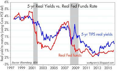
The chart above compares the real yield on 5-yr TIPS with the ex-post real yield on overnight interest rates. The blue line thus represents the market's expectation of where the real Fed funds rate will be in five years' time. As it stands, the market is expecting real yields to rise from their current level of -0.9% to about zero. That is properly characterized as monetary policy becoming gradually "less easy" over the next five years. Nobody is expecting the Fed to actually tighten policy (which would show up in this chart as a narrowing of the spread between the red and blue lines) for the foreseeable future.


Finally, the chart above compares the equity market in the U.S. with its Eurozone counterpart. The current crisis has affected Europe much more than it has the U.S. The magnitude of the current decline in European equities is similar to what happened as a result of the PIIGS crisis and the subsequent Eurozone recession. 

Things are ugly out there, but I don't think we are on the cusp of the end of the world as we know it.

Monday, February 8, 2016

We need another round of QE

I've long argued that the Fed's three Quantitative Easing episodes were never really about "stimulus." Instead, I thought QE was the correct response to a surge in the world's demand for money, money equivalents, and safe, risk-free assets that followed in the wake of the financial crisis of 2008. In recent months I have argued that the Fed was justified in raising short-term interest rates, because the world's demand for money and safety appeared to be slowly declining.

Unfortunately, it looks like both I and the Fed have been wrong of late. I'm not sure what the exact underlying cause of the latest "panic attack" to hit the markets is, but signs point to 1) the ongoing slowdown in the Chinese economy, 2) the collapse of oil prices, 3) rising geopolitical tensions in the Middle East, and 4) a sense that policymakers are clueless. In this latter category we have the rise of Bernie Sanders and Donald Trump, and the apparent tone-deafness to all these problems on the part of the Fed, as reasons for investors to worry about the future economic and policy direction of the U.S. economy. At a time when major economies appear to be wallowing in turbulent seas, it's terrifying to think that the ships' captains might be clueless.

Many commentators have argued that we're also in trouble because central banks are "out of ammunition" since rates are at or near zero. Those who believe this were cheered when the Bank of Japan announced negative interest rates.

However, I think that's the wrong way to think about monetary policy, because it assumes that moving rates up or down is a way of slowing down or goosing economic activity, respectively. As we've seen, central bank purchases haven't had the intended effect on interest rates, and they have not resulted in any meaningful stimulus to any economy. It bears repeating that monetary policy cannot create growth out of thin air: growth only happens when productivity rises, and productivity rises only as a result of more work and more investment. Fiscal policy needs to focus on increasing the rewards to risk and investment; lower interest rates are not the cure-all for chronically weak economies.

Trying to manipulate interest rates hasn't helped, but the Fed's provision of additional reserves to the banking system via QE has addressed liquidity issues and systemic risk issues. U.S. banks have effectively invested $4 trillion in deposit inflows into bank reserves, bolstering their balance sheets in the process. More QE purchases can be a good thing, especially in times like these when markets are very nervous, because the demand for money and safe assets has increased meaningfully. What's needed now is not lower interest rates, but more T-bills (aka bank reserves in an IOR regime).

Things began to heat up beginning right around the end of last year. Since then—just over 5 weeks ago—gold is up some $130, HY spreads are up 150 bps (led by HY energy spreads which have spiked to 1850 bps), crude oil is down 20%, 10-yr Treasury yields have dropped 55 bps, real yields on 5-yr TIPS are down 30 bps, and global equity markets are down 10-20%.


The chart above shows the total of retail money market funds, one of the components of M2. After declining for years, it has spiked by over $100 billion in the past few weeks. Thanks to the fact that the Fed is paying interest on bank reserves—which has been extended, via reverse repo agreements, to non-major banks and other financial institutions—money market funds now pay some interest whereas before they paid almost nothing. That may be the reason for the huge increase in demand for these funds, but it may also be that a lot of money is fleeing China and Europe and these funds look like easy-to-get, attractive safe havens.


The chart above shows required reserves (reserves that the Fed requires banks to have to collateralize their deposits). This component of the monetary base has soared at an annualized rate of 350% in just the past month!  It also explains why the much broader measure of money supply, M2, is up at an annualized rate of 15% in the past month, after growing for 6-7% per year for the past several years.

When the world rushes for the risk exits and into the welcoming arms of banks and money market funds, central banks need to respond by increasing the supply of money. If the Fed doesn't accommodate increased money demand with increased money supply, that can lead to deflation and other sorts of nasty consequences.

Fortunately there are some offsetting factors which today make the situation less than critical. Total Bank Credit (now $11.8 trillion) is rising at a relatively strong clip (8-10%) in recent months, and Commercial & Industrial Loans (now over $2 trillion) are rising at double-digit rates. Oil prices are still weak, but the CRB Raw Industrial commodity index (no energy included) is up over 6% in the past few months. Meanwhile, the dollar has declined because the world figures that the likelihood of further Fed rate hikes has gone down dramatically—and a weaker dollar should provide good support for all commodity prices.

Still, it would be very helpful if the Fed were to make it clear that at the very least, rate hikes are off the table for the foreseeable future and that it probably makes sense to fire up another round of QE. Adding more risk-free money to the system at a time when risk aversion has spiked is just what the monetary doctor would order.


The chart above tells the big-picture story of money demand: the ratio of M2 to nominal GDP. Think of this as being roughly equivalent to the percentage of the average person's annual income that is held in liquid form (cash, savings accounts, checking accounts, money market funds). I've been expecting this ratio to top out for the past several years, but it just keeps growing. The world just keeps stockpiling cash and cash equivalents for a variety of reasons, with fear and uncertainty likely topping the list. People want to hold more and more money, even though it pays a paltry rate of interest. We won't be out of the "fear" woods until this ratio stops rising and starts declining.


The chart above tells the story of the Fed's three rounds of Quantitative Easing. The Fed always told us that the purpose of massive purchases of notes and bonds was to depress interest rates, which in turn was supposed to stimulate borrowing and thus boost the economy. But that's not what happened. Note that during each period of QE (green bars), interest rates actually rose. I think that was because the bond purchases—which effectively transmogrified notes and bonds into T-bill equivalents—was just what the world needed. QE satisfied the world's demand for safe assets, and that lubricated the wheels of finance; rates rose because risk aversion declined and the market felt more comfortable about future growth prospects. But after QE1 and QE2 were discontinued, yields plunged, which was a sign that the Fed hadn't done enough, and/or had ended its QE purchases prematurely. Recall that the periods between QE1, QE2 and QE3 were dominated by the emerging PIIGS crisis in the Eurozone. There was a lot of panic in Europe and a lot of money that fled to the U.S. as a consequence. Each time the Fed started a new QE program, markets breathed a sigh of relief and interest rates rose as a result.

Note that interest rates were relatively stable following the end of QE3. Until recently, that is. I think the recent decline in yields on 10-yr Treasuries is the market's way of saying "Help!" to the Fed. We can only hope that Janet Yellen and her fellow Fed board members hear this and respond before too much time goes by.


I've been showing the chart above for a number of years, since it helps to visualize the market's demand for safe assets (and by inference, the market's level of FUD). The red line is the price of gold, while the blue line is a proxy for the price of 5-yr TIPS (I use the inverse of the real yield on TIPS as a proxy for their price). Demand for safe assets has been declining ever since the PIIGS crisis was resolved in 2012, but it has jumped since the end of last year (i.e., the price of gold and TIPS has jumped). The jump is significant, but it's still relatively tame compared to what we saw back in the 2010-2012 period.


The chart above is also helpful, since 2-yr swap spreads are a good proxy for financial market liquidity and systemic risk. As two wrenching episodes of the PIIGS crisis unfolded in 2010 and 2012, swap spreads soared, especially in the Eurozone. Fortunately, today swap spreads are well-behaved, and that suggests that systemic risk is low and liquidity conditions are still healthy.

With a some more QE help from the Fed and some more time for markets to adjust, there's reason to think we can survive the current crisis.

Thursday, February 4, 2016

Productivity is the missing ingredient


We've know for years that this recovery is the weakest post-war recovery on record, and the chart above makes the case. If this had been a typical recovery, national income (GDP) would be about $2.8 trillion higher than it is today. That's like saying that average wages and salaries would be 17% higher. For a family earning $60,000, that's over $10,000 more income per year that has failed to materialize despite all their hard efforts.


What's been lacking is productivity (the additional output that each unit of labor produces), because productivity is the key to rising prosperity. We can only earn more if we work and produce more. We've had about the same rate of jobs growth during this recovery as we had in the 2001-2007 recovery, but GDP growth has been much weaker. The reason? Very low productivity growth, as seen in the chart above. I use a 2-yr rolling annualized growth rate to measure productivity, since it is quite volatile on a quarter-to-quarter basis. Over a 2-year period I think the quarterly volatility tends to wash out and a truer picture is revealed. Note that the productivity readings we've had in the past several years have always been associated in the past with recessions. It's no wonder that everyone keeps complaining about the economy. It's as if we've been living in recessionary conditions even though things have been slowly improving. Put another way, we've had to work unusually hard just to enjoy very modest improvements in our standard of living. 


The chart above uses the same data, but instead of a two-year rolling period, it uses a 5-yr rolling period. This, I believe, captures the effect of policies put in place by different presidential administrations. It can take years for policies to be put into effect and then have an impact on the economy, and good policies can have effects that last even after they have been reversed.

The colored bars correspond to different presidential terms, with the red bars reflecting a sustained period of declining productivity growth and the green bars a sustained period of very strong and/or rising productivity growth. I would be quick to note that Republican administrations have yielded three periods of declining productivity (Eisenhower, Nixon, and Bush II), while Democratic administrations have only yielded two periods of declining productivity (Carter and Obama). No political party can lay a claim to implementing policies that consistently lead to sustained rises in prosperity.

One thing that stands out is that the Obama years have seen productivity growth that rivals the malaise that characterized the Carter administration. For the five-year period ending last December, non-farm productivity rose at a miserably slow 0.3% annualized rate. In all of post-war history, only the five-year period ending in mid-1982 was worse (small footnote: Reagan's tax cuts did not take effect for almost two years, so his faulty implementation of tax cuts only served to prolong the declining productivity of the Carter years).

There are many factors that contribute to the slow growth of productivity, such as rising regulatory burdens that increase the cost of economic activity, high marginal tax rates that reduce the incentive to work and invest and take risk, and transfer payments that create a culture of dependency and a reluctance to seek out work.


The charts above show that a significant increase in transfer payments (money the government gives to people for a variety of reasons) beginning in late 2008 corresponded to the beginnings of a significant decline in the labor force participation rate. Many millions of workers have left the workforce, and it could be due at least in part to the fact that the benefits that accrue to those not working (e.g., food stamps, disability payments, welfare, earned income credits, assistance to single-parent families) are greater than the net benefits of working, especially on an after-tax basis. Transfer payments now equal almost 20% of disposable income, and that is a big number that currently totals $2.7 trillion and consumes fully 72.5% of all federal government spending. Yikes! Maybe it's simply the case that our government has grown to the point where it is now suffocating the private sector. Too few people are working and too many are on the receiving end of federal largesse. And for those who are still working, the burden of complying with regulations and the burden of taxes is simply inhibiting their ability to work and invest more.

We are not going to see significant improvement in productivity and living standards unless and until we adopt policies that are more conducive to work, investment, and risk-taking. It's that simple. Unfortunately, the proposals being discussed on the left (e.g., Sanders and Clinton) are only going to exacerbate the current situation. Can the right produce a candidate capable of winning and turning the policy ship around? That is the key question this year.

Tuesday, February 2, 2016

Are commodities bottoming out?

The world is still obsessed with the prospect of Chinese weakness, Fed tightening, collapsing commodity prices and super-low oil prices, all of which might—or so the thinking goes—tip us into a deflationary downward spiral. When a narrative such as this becomes so widespread, it's easy to miss important clues to the contrary. I note here a few contra-indicators which bear watching:


The first chart above shows a short-term view of the CRB Raw Industrials commodity index, while the second gives you the long-term view of the same index. This index is composed of some pretty mundane commodities (hides, tallow, copper scrap, lead scrap, steel scrap, since, tin, burlap, cotton, print cloth, wool tops, rosin, rubbers), most of which do not have associated futures contracts and are therefore relatively immune to speculative forces and thus more likely to reflect the changing balance between supply and demand. Since late November, the index is up more than 5%—after tumbling more than one-third from its early-2011 high. As the second chart shows, the plunge in recent years is similar—if not greater—in magnitude to other plunges, all of which were followed by reversals to the upside. Maybe the Great Commodity Price Collapse has come to an end?


As the chart above suggests. Commodities have a strong tendency to move inversely to the dollar's value vis a vis other currencies (note that the y-axis for the dollar is inverted). It might be the case that the dollar is topping out here, just as commodity prices bottom out. [Update: the original chart was mislabeled, now corrected with data as of Feb 3]


This index (see chart above) of the dollar's value against a small basket of major currencies shows that the dollar has been flat for almost a year, another indication the dollar is topping out.

What could be the impetus for the dollar to stop rising? Simple: the perception that the U.S. economy is weak and that therefore the Fed is unlikely to raise rates aggressively. Indeed, I think that process is already underway. Since June of last year, March '18 Eurodollar futures (tied to 3-mo. Libor) have fallen from 2.4% to 1.2%. The market was expecting at least four tightenings by the Fed and now it is only expecting two more over the next two years. With the greatly-reduced prospect of higher short-term rates (and less-than-previously-expected Fed tightening), the dollar is losing some of its appeal.

So, whatever it is that is slowing down the U.S. economy is also reducing the appeal of the dollar, and that in turn is helping to put a floor under commodity prices. And the end of declining commodity prices—particularly if this includes oil—should help alleviate fears of a deflationary death spiral. Markets have a way of resolving things if left to their own devices.

This is not a call for shorting the dollar or going long commodities. It should be taken more as a note of caution that the prevailing wisdom may be getting long in the tooth, and changes may be waiting in the wings.

UPDATE (Feb 3): Well, this change seems to be unfolding all of a sudden. The market senses that the economy is weak, and that therefore the Fed is unlikely to raise rates aggressively. That directly undermines the value of the dollar, which had been boosted by the perception that the US economy was doing much better than others, and that the Fed would be boosting rates. A weaker dollar (which  today is on track for its biggest drop in seven years) provides support to commodity prices, and that is showing up in a huge increase (7-8%) in oil prices today. The stock market is breathing a sigh of relief, as the threat of tight money recedes and higher oil prices reduce the risks of widespread bankruptcies in  the oil patch.