Thursday, June 30, 2022

Bitcoin vs stocks: the strangest dancing couple


Chart #1


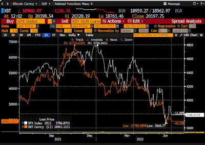
I'm posting Chart #1 because it is so intriguing. Bitcoin is the orange line, stocks the white line. I'm not sure why it is that in the past 2-3 months bitcoin and stock prices appear to be dancing in lockstep, when six months ago it looked like bitcoin was leading stocks.

Since its all-time high last November, bitcoin has plunged by about 72%, while stocks have shed 21%. The market value of the cryptocurrency universe is now $855 billion, down from an all-time high of about $2.9 trillion. $2 trillion of bitcoin "wealth" has been vaporized in just over 7 months. And to think there are over 20,000 cryptocurrencies vying to see which one can gain or lose more than the others. It's crazy.

Bitcoin is the very definition of a speculative asset with no intrinsic value that anyone has yet discovered, whereas stocks represent ownership in established and productive enterprises. Moreover, stocks have an expected return that is a function of their future earnings, whereas holding and transacting bitcoin involve certain costs, with no offsetting dividend or underlying asset. You couldn't find two assets that are more different, yet their prices are moving in apparent lockstep. What is going on here?

Does the collapse of cryptocurrencies have something to do with this year's bear market in stocks? It's certainly tempting to think so, but hard to understand.

Late last year, I think, I made a comment or two on one or two posts to the effect that what most worried me about the future was a cryptocurrency collapse, since to my mind cryptocurrencies had essentially zero value. At the time, bitcoin was riding high, and stocks had yet to reach a peak. Hardly anyone was predicting a bitcoin collapse, much less one whose timing mirrored that of the stock market. It's been a wild ride. 

I welcome comments from anyone who can shed light on this mystery.

Chart #2

Chart #2 shows the current state of inflation expectations over the next 5 years, which have fallen from a fairly recent high of 3.7% to now just 2.6%. This is remarkable. Combined with a fairly dramatic plunge in commodity prices in recent weeks, this is the market's way of saying the Fed should NOT get overly aggressive with its tightening plans. In fact, in recent weeks the bond market has actually reduced by 75 bps its expectation of what the Fed funds rate will be at the end of next year. 3% is now expected to be the high in the coming tightening cycle, vs. 3.75% just two weeks ago.

If the bond market and commodity markets are right, then the stock market is almost certainly overly-concerned with the potential risks of Fed tightening. 

And it's also possible that stocks are overly-concerned with the ongoing collapse of cryptocurrencies.

Wednesday, June 29, 2022

The money-printing press has all but shut down


Yesterday the Fed released the May M2 numbers, and they were good. Since the end of January, M2 has grown at an annualized rate of just 1.3%. Over the past 3 months, growth has been a mere 0.08%—essentially flat. No longer is M2 surging at double-digit rates. If this keeps up, inflation could get back to something like "normal" by early next year.

It's rather impressive that all this progress towards lowering inflation has been achieved while the Fed has only raised short-term rates to 1.75%. As I said in my last post, this is not your grandfather's tightening-which-inevitably-leads-to-recession. That's mainly because last year's burst of inflation was the inevitable fallout from a bout of money-printing the likes of which we have never before seen, and which is very unlikely to continue or recur. 

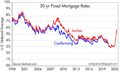
Stop the money-printing—as seems to have occurred—and you take away a major source of inflation virtually overnight. On top of that, the mere expectation that the Fed will seek higher interest rates while also shrinking its balance is working overtime. For example, 30-yr fixed rates on mortgages have zoomed up to 6%, almost twice what they were at the end of last year. This has slammed the brakes on the housing market by boosting financing costs and rendering housing unaffordable for many. Not surprisingly, lumber prices have fallen by more than half since March, suggesting a big cutback in new construction is coming. Meanwhile, we've all heard the drumbeat of recession forecasts from nearly every quarter, so everyone is tightening their belts. Seeing all this, the bond market in recent months has repriced to the expectation that inflation will plunge next year. 

Chart #1

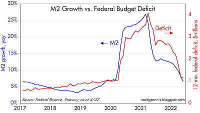
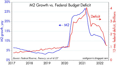
Chart #1 is arguably the most important one in the universe right now. What it shows is that the huge surge in M2 growth coincided with massive federal deficit spending. Milton Friedman long ago created a thought experiment now known as the "helicopter drop," in which the government prints up tons of cash and drops it on the country, and lo and behold, inflation blossoms. Only this time it's real: the government decided to send trillions of dollars of cash ($4-5 trillion) to nearly everyone as penance for Covid shutdowns. It was as if the economy were suddenly flooded with monopoly money dropped by helicopters. At first not much happened; inflation didn't start surging until early 2021, because that was when people began to see that the Covid scare was over and life needed to get back to normal. In the early stages, people were happy to hold on to the flood of new cash. Now, not so much. 

Chart #2

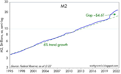
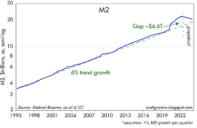
Chart #2 shows the level of M2, the best measure of easily spendable money, which includes currency and retail savings and checking accounts. Starting in April '20, M2 growth surged like never before, and it now stands about $4.6 trillion above its long-term growth trend. (Note that this chart is plotted with a logarithmic y-axis, which makes constant growth rates look like straight lines.) For the past 4 months, M2 has flat-lined, and that is a big deal. The bulk of the outsized increase in M2 showed up in demand deposits, which have surged by 170% (about $3 trillion) since March '20, and "other liquid deposits," which have grown by about $3 trillion over the same period. These are the hallmarks of money printing: banks simply creating money out of thin air in order to monetize/maximize Congress' desire to "stimulate" the economy with deficit spending. Thankfully, the chances of a repeat of this monstrous mistake are slim.

Chart #3

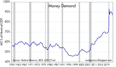
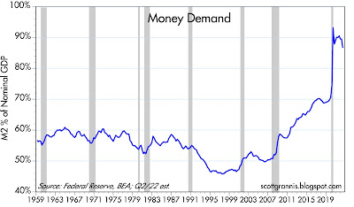
Chart #3 shows the ratio of M2 to nominal GDP, which is equivalent to the percentage of national income that is held by the public in the form of cash and bank deposits. The initial helicopter drop was welcome relief for most, and since the economy was locked down, it wasn't easy to spend it, so cash holdings skyrocketed with almost no impact on prices. But by early 2021, people began to realize that they were holding a lot more cash than they needed, so they began to spend it. That overwhelmed supply chains and drove prices sharply higher, with the result that surging inflation caused nominal GDP to grow at double-digit rates. Nominal GDP rose at a 10.7% annualized rate in the first quarter, and it is likely to grow by about 9% or more in the current quarter (e.g., 2% real growth plus 7% inflation), while M2 growth (as noted above) is going to be close to zero. This effectively reduces the ratio of M2 to nominal GDP, which is the most basic definition of money demand. No one needs to hold a lot of cash these days, especially since it's losing value due to inflation. As this process continues—slow growth in money combined with much faster growth in nominal GDP—money demand will return to levels more consistent with past history.

Chart #4

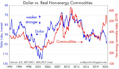
Chart #4 is worth a thousand words, but I'll try to use a lot less. What it shows is that commodity prices (red line) typically rise and fall in inverse relation to the value of the dollar (blue line). A strong dollar usually depresses commodity prices, and a weak dollar typically boosts commodity prices. Except for the past two years, that is, as both commodity prices and the dollar have soared. However, note the recent dive in commodity prices: this very likely reflects the repair of supply chains and less frenzied demand.  

It's also encouraging to see the dollar so strong. If the Fed were doing the wrong thing (i.e., supplying way more dollars than the world wants to hold), then the dollar would be weakening, but it's not. The Fed has not lost control of the situation, and inflation expectations are not "unmoored." 

Chart #5

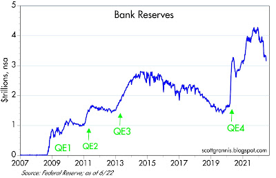
Chart #5 shows more good news. Bank reserves have plunged in recent months, having retraced almost 40% of the rise that accompanied the surge in M2 that began in April '20. Bank reserves, recall, are created when the Fed buys securities from the banking system—when it grows its balance sheet. The process of unwinding QE4 is now well underway, but this has not had any negative impact yet because reserves are still abundant and banks therefore still have an almost unlimited capacity to increase their lending. In other words, there is no shortage of liquidity during this tightening, contrary to what happened with previous tightenings, which were all about the Fed intentionally restricting liquidity in order to boost interest rates. This is a crucial point of difference.

Chart #6

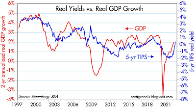
Chart #6 shows that real yields tend to correlate with real economic growth: stronger growth supports higher real yields, and weaker growth results in lower real yields. It also suggests that the bond market is expecting real GDP growth to average about 2% per year for the foreseeable future. This is the same rate that has prevailed since the Great Recession. It's sub-par and not very exciting, but it's a lot better than recession. Unfortunately, there are still headwinds out there in the form of oppressive regulatory and tax burdens, and the uncertainty which naturally accompanies high inflation and the Fed tightening needed to tame it.

Chart #7

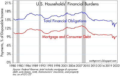
Chart #7 shows households' financial burdens (i.e., monthly payments for mortgages, loans, homeowner's insurance, and property tax as a percent of disposable income), which are very low from an historical perspective. Households have plenty of room to take on additional financial burdens, but they're not. A sturdy household sector will lend important strength to the economy going forward.

Chart #8

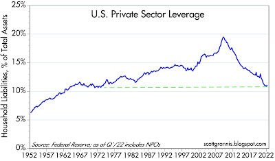
Chart #8 shows that the leverage of the private sector (i.e., total liabilities divided by total assets) has declined significantly over the past 14 years, and now stands at levels last seen in the early 1970s. The federal government has leveraged up, but the household sector has done just the opposite. Government profligacy is balanced by household prudence. Things could be worse.

Chart #9

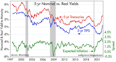
Chart #9 shows the level of nominal real yields on 5-yr Treasuries and the difference between them (green line), which is the market's expectation for what the CPI will average over the next 5 years. Inflation expectations peaked at 3.7% last March, and they have since plunged to 2.7%. Inflation expectations by this measure now are consistent with, for example, a forecast for inflation this year of 6%, followed by 2% per year for the next four years. Bottom line, the market expects inflation to normalize in fairly short order, which is not impossible given the sharp slowdown in M2 growth of late. 

On a final note, I would remind readers that I have been worrying about high and rising inflation for most of the past two years, and I think I was correct in doing so. But with the impressive slowdown in M2 growth and the strong likelihood that the banking system will no longer monetize federal deficits, the outlook has definitely improved.

Regardless, inflation is likely to continue at an elevated pace for most of this year. Wages are being bid up, rents are soaring (playing catch-up to housing prices), higher energy costs are being passed through to many areas of the economy, and some supply chains (Ukraine in particular, a huge source of global food production) are still strained. And, last but not least, money demand is likely going to continue to decline as households attempt to spend down their outsized money balances. It's going to be a bumpy road for awhile.

Markets are good at looking across the valley of despair and seeing hope on the other side, and that is not unreasonable in the present situation.

Saturday, June 11, 2022

Fed tightening need not result in a recession


It's no secret that virtually every recession in the past 50 years (with the exception of the brief economic collapse of last year) was triggered by the Fed tightening monetary policy in order to bring inflation down. That explains why the equity market is reeling: the market believes that today's unexpectedly high inflation will provoke a serious Fed tightening which would inevitably pose a serious threat to the economy.

But even though inflation is much higher than nearly everyone expected (with the exception of economists such as Steve Hanke, John Cochrane, Brian Wesbury, Ed Yardeni, and Bill Dudley and yours truly), a recession is not inevitable this time around, for two very solid reasons: 1) the current bout of inflation was triggered by runaway federal spending that was monetized by the banking system, and that inflation source has all but dried up, and 2) the way the Fed is tightening monetary policy today is very different from how it worked before 2008, and much less likely to harm the economy.

In my last post, I discussed how the evidence shows that enormous federal deficits resulting from Covid-related "stimulus" spending were monetized, resulting in an unprecedented increase in spendable money (M2) held by the public. In earlier posts I've discussed how the the tremendous uncertainties surrounding the Covid-related economic shutdowns boosted the demand for money, and how this delayed the onset of inflation by about a year. Inflation didn't start rising until a year after M2 started surging and until it became clear that the Covid threat was receding. Five weeks ago I explained how money demand was likely to start falling, and how this could result in a surge of retail demand (and continued high inflation) over the next year or so. 

We now know that federal deficits have collapsed (because spending has collapsed and revenues have surged) and M2 growth has also collapsed. In fact, M2 grew at a very slow 1.3% annualized pace in the most recent 3 month period, and in April of this year it actually declined from its March level. This effectively removes a major source of future inflation potential going forward, thus making the Fed's inflation-fighting job a lot easier. 

It's instructive here to recall how the great inflation of the 1970s was created. It began with the Nixon administration's 1971 decision to abandon the dollar's peg to gold, which in turn sparked a massive loss of confidence in the dollar that took 10 years to run its course. The devaluation of the dollar reduced the world's demand for dollars, and it was excess dollars being unloaded that fueled a decade of painfully high inflation. M2 grew at a rapid pace (8-10% per year) throughout those 10 years, so it's not surprising that it took Volcker about 4 years and two recessions before he could bring inflation down. Nothing like that is happening today.

Federal deficits have plunged, and are likely to remain relatively low and non-threatening for the foreseeable future. With his approval ratings nearing rock bottom, Biden hardly commands enough power to push through more spending bills, and meanwhile there is a growing awareness that past spending sprees are responsible for today's inflation. If Congress can simply stop spending more, economic growth and inflation will continue to boost federal revenues. Ongoing inflation will also erode the burden of all the federal debt that has been incurred in recent years. Doing nothing and allowing time to pass will go a long way to bailing us out. Unfortunately, there will be a cost to all this, and it will be borne mainly by the middle class as real incomes decline.

Prior to 2008, the Fed tightened monetary policy by draining bank reserves, which in turn created a liquidity shortage and forced short-term interest rates to rise, since banks needed to compete for scarce reserves by paying more for borrowed reserves to support their deposit base. In the latter stages of Fed tightening, very high real interest rates and scarce liquidity triggered bankruptcies and generally depressed economic activity—until the Fed realized that tight money was no longer needed. It's a sad story often told, but it won't necessarily be repeated. 

Today, the Fed doesn't need to drain bank reserves, even though they are super-abundant (currently $3.3 trillion, an order of magnitude larger than required) and likely to remain so for the foreseeable future. Because the Fed now pays interest on reserves, it can tighten monetary conditions simply by raising the rate in pays on reserves, since that effectively sets a higher floor on all other interest rates. Higher interest rates have the added benefit of increasing the public's demand for M2 money (by making bank deposits more attractive and borrowing less attractive), thus limiting the inflationary potential of all the excess M2 that is sloshing around. With no need to drain reserves, we are unlikely to see threatening liquidity shortages. 

Meanwhile, the dollar is strong, inflation expectations are subdued, and excess M2 is declining. All of which reinforces the idea there is light at the end of this inflation tunnel. The situation is far from being out of control.

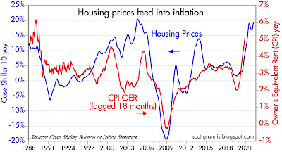
Nevertheless, we should expect to see uncomfortably high inflation for another year or so. The huge increase in housing prices in recent years will take at least that long to find its way into Owner's Equivalent Rent, an important component of the CPI, and it will take time for excess M2 to unwind. And meanwhile, supply-chains are still in disarray, and geopolitical tensions are working to boost energy and raw materials prices. 

Chart #1

Chart #1 is an update of Chart #3 in my last post. The federal deficit over the past 12 months has declined to $1.1 trillion, which is WAY down from its high of over $4 trillion a year ago. Money printing is not likely to recur, and that greatly reduces the future inflation threat we face. 

Chart #2

Chart #2 shows the level of M2 and the huge gap that exists today relative to where M2 would be if it had continued its long-term trend growth rate of 6% per year. The vertical dashed line marks the point at which I project the future path of M2 assuming it declines by about 1% every 3 months (in line with the decline that has already occurred in the April M2 data). At this pace the level of M2 would return to "normal" by around the end of next year. 

Chart #3

Chart #3 is one I have been showing for many years, since I think it is the best way to visualize the demand for money (think of this as the amount of cash the average person holds as a percent of his or her annual income). Money demand typically rises during recessions, as uncertainty causes people to become more cautious. It typically declines in the wake of recessions, as confidence returns and spending increases—exactly what's been happening over the past year. But as I've mentioned several times in the past, money demand has been extraordinarily high in recent years, and it seems very likely to decline going forward, which is why it's very important that money printing cease and the Fed raises interest rates to offset the decline in money demand. The last data point in the chart (Q2/22) assumes a modest decline in M2 (which is already underway), a modest 2% real growth rate of GDP, and inflation of 7%.

If those assumptions hold, then the ratio of M2 to nominal GDP would fall back to 70% by around the end of next year, which is where it was prior to Covid. A painful round trip, to be sure, but not the end of the world.

Chart #4

Chart #4 shows how an increase in housing prices (blue line) takes about 18 months to show up in the Owner's Equivalent Rent component of the CPI (currently, OER is about 30% of the CPI). 

Chart #5

Chart #5 shows the rates on 30-yr fixed rate mortgages. Mortgage rates started exploding last February, rising from 3.25% at the end of last year to now almost 6%. Not surprisingly, the number of new mortgage loans originated already has plunged by one-third since February, thanks almost entirely to soaring borrowing costs. This is evidence that Fed tightening has already had a significant impact on the economy—it's already cooling the super-hot housing market. The Fed doesn't need to raise rates so much as it needs to convince the market that rates are going higher, and they have accomplished that already.

Chart #6

Chart #6 shows the current shape of the Treasury yield curve (blue) and what the market expects it to look like at the end of next year (red). The market fully expects the Fed to raise its target funds rate to about 3.5% or so between now and then. Longer-term rates haven't changed much and are not expected to change much going forward.

Chart #7

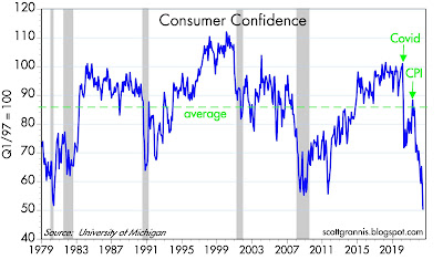
If there's one thing that is looking pretty bad these days, it's consumer confidence (Chart #7). Confidence is abysmally low, and that owes much to the huge increase in food and gas prices along with disapproval of the Biden administration's handling of things. On the bright side, this lack of confidence is working to keep the demand for money stronger than it otherwise might be, and that lessens the inflationary potential of all the extra M2 out there.

Chart #8

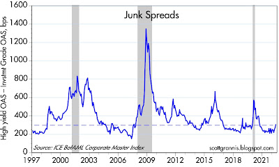
It's also nice to see that credit spreads are not soaring. Chart #8 looks at the "junk spread," which is the difference between investment grade and high-yield debt. Spreads are up, to be sure, but they are nowhere near worrisome levels.

Chart #9

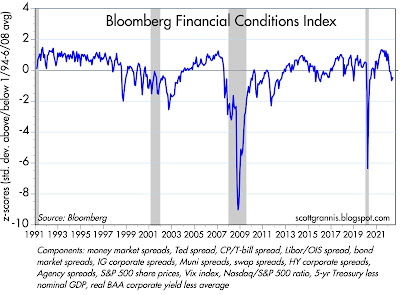
Bloomberg has an index of financial conditions, shown in Chart #9. Here we see the same story: conditions have deteriorated somewhat, but they are far from being worrisome. 

Chart #10

Chart #10 shows 5- and 10-yr Treasury yields and the difference between the two, which is the market's expectation for what the CPI will average over the next 5 years. Inflation expectations are up, but they are not out of control—currently about 3.2%. 

Chart #11

Chart #11 compares the current level of 5-yr real yields on TIPS (red) with the current real Fed funds rate (blue). The red line is effectively what the market expects the blue line to average over the next 5 years. The Fed is expected to tighten significantly, but from a very accommodative stance to begin with.

Chart #12

As Chart #12 suggests, the current level of the 5-yr TIPS real yield is consistent with real economic growth of about 2%. In other words, the bond market expects the economy will grow at a moderate 2% pace for the foreseeable future. This is somewhat slower than the 2.2% annual pace that the economy managed from 2009 to just before the Covid crisis hit. There is every reason to think the economy will continue to grow: job openings far exceed the number of people looking for a job, and there are still millions of workers who are sidelined currently but potentially available to rejoin the workforce. Meanwhile, business investment (e.g., capital goods expenditures) is stronger than it has been for decades.

Chart #13

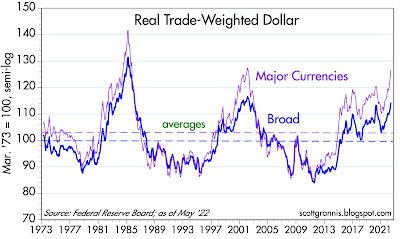
Chart #13 shows the Fed's calculation of the real, inflation-adjusted and trade-weighted value of the dollar vis a vis other currencies. That the dollar is so strong these days—despite trillions of dollars of newly minted M2—can only mean that while things could certainly be better here, we are in much better shape than the rest of the world. All central banks have been ultra-accommodative, but the dollar and the US economy are the best safe-havens given today's geopolitical turmoil.

-----------

There is definitely light at the end of the inflation tunnel (though it's about a year long), and there is little reason to think that Fed tightening—which has already had a significant impact—will be as much of a threat to the economy as past tightenings have been. With one major caveat: Congress must resist Biden's pleas for more taxes and more spending. More taxes would weaken the economy and more spending would aggravate inflation pressures, but neither seem very likely in my judgment.