Monday, December 30, 2013

Predictions for 2014

First, a look at how last year's predictions turned out. On balance, it was a very good year.

Happily, the one thing that I really got wrong was inflation. Instead of rising from last year's 1.8% level, as I thought it would, inflation according to the CPI fell to just over 1% for the year. That's a blessing in disguise—low inflation is always better than high and/or rising inflation, since it reduces uncertainty. In line with my expectation of higher inflation, I thought commodity prices could benefit from a stronger economy and easy money, but they ended up mixed, with food prices standing out as the big loser. I thought the dollar was likely to strengthen since it was so weak and the economy was likely to beat expectations, but instead the dollar was roughly unchanged on average: up a lot against the yen, but down against the euro and the pound. The euro benefited as Eurozone economies emerged from recession, and because of the ECB's somewhat tighter monetary stance.

Fortunately, there were lots of good calls. I thought the economy would do better than expected, and since I thought the market was priced to a very pessimistic outlook, I liked equities as a result. I thought Congress would remain deadlocked, and government spending would shrink relative to GDP and that this would contribute to the economy's strength. Those were very contrarian calls at the time, but they arguably proved correct. The fact that the S&P 500 has returned almost 30% for the year confirms, I think, that the economy exceeded expectations, even though it remains well below its potential. The economy grew only 2% in the year ended September, but is likely to post growth of about 2.5% for the calendar year.

I thought Treasury yields, including TIPS real yields, were very likely to rise since the economic outlook would improve, and that was indeed the case. 10-yr Treasury yields soared from 1.75% to 3%, and 10-yr TIPS real yields jumped from -1.5% to -0.3%. This was a major setback for the government bond market, but a welcome sign that the economic fundamentals are improving.

For the fifth year in a row, I thought cash would be a miserable investment relative to most risky assets, with two major exceptions: gold and investment grade corporate bonds. And indeed it was. Gold has lost almost 30% of its value this year, and investment grade corporate debt has suffered some modest losses. High yield debt enjoyed decent returns, but emerging market debt was hit hard.

I liked real estate, particularly of the commercial variety, for its yield and its inflation-hedging properties. Residential real estate did quite well this year, while commercial real estate generated only modest returns, held back by concerns over higher interest rates.

Here's what I see in my crystal ball for 2014:

From a big-picture perspective, I think we're somewhere in the middle of what is likely to be a long recovery that is going to continue to be relatively sluggish compared to past recoveries. Markets remain pessimistic about economy's prospects, however, as can be seen in the still-very-low level of short- and intermediate-term interest rates and the merely average level of equity multiples despite record-setting corporate profits. We're unlikely to see a robust recovery soon because the economy still faces some stiff headwinds: very high regulatory burdens, high marginal tax rates, and continued monetary policy uncertainty.

Obamacare will fail, but that will be a bright spot, since it will add to the growing body of evidence that government spending and regulatory initiatives are inferior to what can be achieved when the private sector and free market forces are unleashed. On the margin, this will have the effect of restraining the burden of public sector spending and lightening regulatory burdens, which in turn should lead to a somewhat stronger economy as the year unfolds. Pressures will build for market-based healthcare initiatives, which will strengthen the economy by increasing competition and making the healthcare sector prospectively more efficient.

The Fed is going to finish tapering and begin to reverse QE in 2014, and they will probably begin raising the interest rate they pay on reserves sooner than the market expects, but not by much. (Currently the market expects this to happen by the second quarter of 2015.) Still, a sooner-than-expected move to reverse QE and a stronger-than-expected economy will pressure interest rates higher. Tapering and reversing QE will contribute to growth since they help reduce monetary policy uncertainty. With inflation now at very low levels, I continue to believe that it is more likely to rise than to fall, since it is more likely that the Fed will be slow to reverse QE out of concern for the economy, rather than move aggressively.

For the sixth year in a row, I think cash will prove to be an unattractive investment, although I say so with less conviction than a year ago. The yield on cash is still very poor compared to the prospective returns on most other investments.

Real estate should continue to generate attractive returns. It's still a reasonably-priced inflation hedge, and it can benefit from a growing economy and accommodative monetary policy. Real estate-related investments have been depressed of late because of exaggerated concerns over the impact of higher rates and tapering; higher interest rates won't hurt real estate because they will go hand in hand with a healthier economy.

Equities will undoubtedly suffer a painful consolidation at some point this year, if only because they have done so well to date. Profits growth will continue to slow, so further gains in equity prices—which I expect to see over the long run—are going to come mainly from a continued expansion of multiples, which are still trading in the range of fair value. Multiples are likely to be pushed higher in the absence of a recession and with help from very low interest rates.

Investment grade corporate bonds are vulnerable to rising interest rates and thus relatively unattractive, but high-yield and emerging market bonds still offer spreads that should compensate for higher yields.

Gold continues to be an unattractive investment, since it is still priced to a lot more inflation and economic distress than we are likely to see. Commodities are likely to benefit somewhat from an improving outlook for the global economy, but do not offer a compelling investment opportunity at this juncture.

The dollar is likely to strengthen a bit, since it remains very weak and the U.S. economy is likely to once again exceed expectations. An earlier-than-expected shift by the Fed to reverse QE could also help boost the dollar.

If nothing else, 2014 could prove to be very interesting, as we watch the slo-mo Obamacare train wreck unfold, and as the November elections mark a pivotal point in the public's desire for more or less government intervention in the economy. I'm optimistic.

Another Obamacare fatal flaw: subsidies

Not everyone wants "free stuff."

For some good friends, I learned that that subsidies are not necessarily a solution to increasing the number of people covered by healthcare insurance.

They had a catastrophic healthcare insurance policy which covered themselves and their daughter for about $350 per month. They were quite happy with it. Recently, however, they learned that their policy was not going to be renewed because it was not Obamacare-compliant.

The cheapest alternative they could find was $1200 per month, but that does not work with their modest budget. "Did you check to see if you are eligible for subsidies," I asked? "Oh no, Scott. We have never taken money from the government, and we are not about to now. We will just have to go without healthcare insurance. We are not at all happy about this, but we see no alternative."

It's reassuring to know that not everyone is willing to become dependent on government handouts. I'm very proud of our friends' pride, but very upset that it has come to this: to preserve their pride, there are at least some Americans that will have to do without healthcare insurance. This is not right—it is a tragedy. Obamacare not only restricts everyone's healthcare choices, it forces some to either accept handouts they don't want or forego healthcare insurance altogether.

Friday, December 27, 2013

Some favorite charts

We're closing out the year on a high note in many ways. I'm working on a review of my forecasts from a year ago, and thinking about what the future has in store for us. In the meantime, here is random collection of charts that I find very interesting, most of which also point to more good news ahead.


The stated purpose of the Fed's Quantitative Easing bond purchases was to artificially lower bond yields and thus to stimulate the economy. But despite three rounds of QE totaling some $2.8 trillion and a round of Operation Twist (which was designed expressly to pull long-term yields down relative to short rates), the exact opposite occurred: yields are higher and the yield curve is steeper. As the chart above shows, Treasury yields rose during each QE episode, and didn't change at all as a result of Operation Twist. 10-yr yields are almost 100 bps higher today than they were when the first QE was announced. It's paradoxical, but in a way the "failure" of QE to produce the desired results is proof that it worked, as I explain here.

In any event, this whole episode has taught us that the Fed can't manipulate rates, no matter how much they insist they can. Interest rates are determined by the market, and they are up because the economy has been doing better than expected. It's also interesting that the stock market always worries about higher interest rates—since by the Fed's logic lower interest rates are good for the economy—but in reality higher interest rates can be a very good thing. The tapering and eventual reversal of QE will also be a good thing, since it will remove a tremendous amount of monetary uncertainty that exists because of the almost $2 trillion of excess reserves that are sitting on the Fed's balance sheet today.


Gold was on a tear from the beginning of 2001 until a year ago—a fantastic winning streak that fed on investors' fears of a terrible economy and massive monetary expansion. In roughly the same time frame, real yields on 10-yr TIPS fell from 4% in 2000 to an almost unbelievable low of -1.8% earlier this year for similar reasons. Both have since reversed dramatically, as shown in the chart above, in a sign that the fear and risk aversion that have characterized this recovery are beginning to fade. If these trends continue, it will be because confidence is returning, and that bodes very well for the long-term economic outlook. Although it may also make the Fed's job of reversing QE more difficult, since as confidence returns the demand to hold cash and excess reserves will fall, and this could result in an unwanted expansion of the money supply and higher inflation.


Gold and commodity prices tend to track each other over time, but they diverged significantly beginning in late 2008. In the past year they have been coming back into alignment. Commodities are roughly unchanged for the past several years, but gold has been pounded. The age of speculation has ended. We hope it will be replaced by a new era of investment-led expansion in the coming years.


The yen has weakened considerably against the dollar over the past year, and Japanese stocks have skyrocketed, as shown in the first of the above charts. As the bottom chart shows, Japan may finally have broken the deflationary spell that had plagued the economy for the past several decades—most of which was due to an excessive appreciation of the yen. Easier money and a somewhat more stimulative fiscal policy augur well for the Japanese economy. 


Corporate profits after tax have reached an unprecedented high of 10% of GDP, yet equity prices have not yet eclipsed their 2000 highs in real terms. However you look at equity valuation, I think it is hard to build a case for equities being overvalued today. Multiple expansion is likely to be the principal driver of higher equity prices in the year to come, but that's not yet something to worry about. As the chart above shows, equity multiples using the NIPA measure of after-tax corporate profits are still below average.

Monday, December 23, 2013

Amazing changes in relative prices

According to the Personal Consumption Deflator, inflation in November was almost nonexistent. In fact, inflation over the past year has been a mere 0.9%. That's less inflation than the Fed wants, and it's one reason the Fed has not already ended its QE3 bond purchases—presumably the Fed is concerned that inflation is "too low" and deflation is uncomfortably a risk. I've argued before why deflation is not really a risk or a significant concern, and this post adds another reason to the list: deflation is largely confined to the durable goods sector, and it's not the result of deflationary monetary policy. 


The first of the above two charts shows the year over year change in the headline and core measures of the Personal Consumption Deflator. On a year over year basis, headline inflation has dipped to just below the Fed's desired target range. But as the second chart—which shows the 6-month annualized rate of inflation according to these same two measures—shows, inflation on a more coincident basis is running at a 1.3% annual rate. That's pretty close to nirvana in my book.


The above chart shows the major components of the Personal Consumption Deflator: services, durable goods, and non-durable goods. All three are indexed to 100 as of the end of 1994. I chose that date because it marked the beginning of what has now been an unprecedented, 18-year decline in durable goods prices. It's not a coincidence that that date also marked the beginning of the Chinese yuan's 18-year rise against the U.S. dollar, and China's export boom, which flooded the world with cheap manufactured goods. The early- to mid-1990s were also a time when computers began spreading like wildfire and the modern internet was born. 1995 was like the Continental Divide, when manufactured goods prices started going in one direction (down), while service sector and nondurable goods prices went in the other direction (up).

The story is relatively simple: technology, coupled with the rise of China's manufacturing prowess, have driven down the prices of manufactured goods at the same time that they have boosted the productivity of labor. Labor is much more productive today, thanks to computers, technology, and the internet. So productive, in fact, that it takes less and less input from people to make more and better things.

Durable goods prices have fallen by 30% in the past 18 years, while the prices of services (a reasonable proxy for labor costs) have risen by over 60%, and non-durable goods prices have increased by about 50%. Looked at another way, service-related prices have risen by almost 130% (i.e., they have more than doubled) relative to durable goods prices.

This has led to the most amazing change in relative prices in modern times, and it's a gift that keeps on giving to the vast majority of the population: a typical wage today buys more than twice as much in the way of durable goods as it did 18 years ago, and there is no sign that this won't continue.

Most important fact of all: Monetary policy has had little if nothing to do with durable goods deflation. It's all about China opening up its billions of people to the global marketplace, the blossoming of international trade, and the technological wonders released by the combination of ever-more-powerfu computer chips and incredible software technology.

This is not something to fear, this is something to celebrate.

Thursday, December 19, 2013

Tax shares update

The IRS recently released data on individual income taxes in 2011. The Tax Foundation has nicely summarized the data, and I've put the some of the data into the charts below. The story hasn't changed: upper-income earners continue to pay a hugely disproportionate share of total income taxes, and our tax system remains highly progressive.


In 2011, it took $389K or more of adjusted gross income to make it into the top 1% of income earners, and they paid 35% of all federal income taxes. The top 5% of income earners made at least $168K and paid almost 57% of all federal income taxes. The top 10% paid made at least $120K and paid 68%. The top 25% included all those making $70.5K or more, and they paid 86% of all federal income taxes. Meanwhile, the bottom 50% of income earners (those making $35K or less) paid only 3% of all federal income taxes, and the vast majority of them either paid no income tax or received money on net from the IRS.

The Laffer Curve at work: Although the share of total income taxes paid by the top 10% of income earners today has fallen a bit in recent years, it has nevertheless risen by over 40% since the early 1980s, despite the fact that the top income tax rate has been cut in half. Slashing the top marginal rate by half resulted in a huge increase in the share of total income taxes paid by the rich.

Let's talk "fairness:" In 2011, the top 10% of income earners in this country paid two-thirds of federal income taxes, and the top 1% (the rich) paid over one-third. Is that not enough? Almost half of those who work paid no federal income taxes. Is that fair? Is it healthy for so few to pay so much, and for so many to pay nothing? When almost half the population has no skin in the game, and another quarter pay only a very small share of total taxes, it is easy to demonize or exploit the rich—it's called the "tyranny of the majority." But that doesn't make it logical:


Instead of asking the rich to pay even more, we should be thinking about how everyone should pay at least something. Just paying your social security taxes doesn't count, because in theory—if not in practice, since the rich will undoubtedly subsidize the social security income of a great many people in the future when social security revenues fail to cover expenditures—that is money you will get back when you retire. Income taxes, in contrast, go into the general fund.

The chart below shows the share of total income (AGI) earned by each of the groups in the chart above. Not surprisingly, top income earners make a large share of total income. However, if you compare the two charts, you see that the share of total taxes they pay is much larger than the share of income they earn. Our tax code is very progressive no matter you look at it. In 2011, for example, the top 1% of income earners made 19% of the country's total adjusted gross income and paid 35% of total income taxes. The top 5% earned 34% of total income and paid 57% of total taxes. The top 10% earned 45% of total income and paid 68% of total taxes. The top 25% earned 68% of total income and paid 86% of total taxes.


Wednesday, December 18, 2013

Big Government by far our biggest threat

This is a big deal. More Americans than ever before view Big Government as the biggest threat to the country in the future, and the number has risen sharply in the past four years:

(click to enlarge)

From Gallup:

Seventy-two percent of Americans say big government is a greater threat to the U.S. in the future than is big business or big labor, a record high in the nearly 50-year history of this question. The prior high for big government was 65% in 1999 and 2000. Big government has always topped big business and big labor, including in the initial asking in 1965, but just 35% named it at that time.

This makes it very likely that the November '14 elections will be a referendum not only on Obamacare but also on the role of government in general. The forces of more limited government are likely to win the day, and that, in my opinion, would be a huge positive for the economic outlook.

Timid tapering beats none

Today the FOMC announced that it would taper (i.e., reduce) its purchases of Treasuries and MBS by a mere $10 billion beginning next month, and that it would likely take more such baby steps in the future, at a pace consistent with continued improvement in the economy.

$10 billion is such a small fraction (about 6 bps, or 0.06%) of the Treasury and MBS market as to be insignificant. It's the equivalent of easing up on the gas peddle by several microns. The only real impact of today's decision is that it puts the Fed on track—finally—to eventually reverse its Quantitative Easing purchases which began some five years ago, though the beginning of an actual reversal is unlikely to occur for many months. Better to make this decision sooner rather than later, especially given the ongoing improvement in the economy.

Today's timid tapering announcement represents no threat whatsoever to the economy's ability to grow. It would have been worse if the Fed had refrained from tapering, since that might have allowed future Fed chair Yellen to succumb to her dovish instincts and postpone the decision needlessly.

Why the US is not at risk of a Japan-style deflation

Concerns about the risk of a "Japan-style deflation" in the U.S. are once again heating up, as the Fed prepares to taper its bond purchases, something that's very likely to happen either this month or next. The worry—echoed in a front-page article in today's WSJ—is that tapering and eventually ending QE at a time when inflation is unusually low runs the risk of producing even lower or negative inflation (i.e., deflation), which in turn could doom the U.S. economy to very weak or even negative growth for the foreseeable future, much like the problems that have plagued the Japanese economy for many years. Without ongoing QE support, the thinking goes, the U.S. economy could fall into a sort of deflationary quicksand and/or lose all forward momentum. But is deflation really so dangerous, and has growth really been so dependent on QE?

I think these concerns are not only exaggerated but in fact groundless. For one, the U.S. is not even flirting with deflation. Second, deflation is not necessarily a bad thing and it does not necessarily lead to weaker growth. Japan's demographics have likely contributed more to its relatively sluggish growth than deflation has. Third, there is an important difference between the U.S. today and Japan of the past several decades that makes pervasive and crippling deflation in the U.S. economy very unlikely: the dollar has been and continues to be very weak, whereas the Japanese yen was extremely strong for decades. 

Finally, and as I've argued repeatedly in this blog, I don't think that QE policy was ever designed to be stimulative, and that's why it hasn't contributed to boost growth or raise inflation. Contrary to what central bankers all profess and the WSJ article repeats, namely that central bankers have been engaged in "unprecedented money-printing campaigns," there is no evidence of any unusual growth in the money supply. Put simply, the Fed has not been printing money with abandon. The Fed has simply been exchanging bank reserves, which are now close substitutes for T-bills, for notes and bonds. The beginning of tapering and the eventual end of QE is therefore not going to be contractionary or deflationary.

Let's begin by taking a look at inflation in the U.S. as measured by the Consumer Price Index.


The U.S. consumer price index registered a zero rate of inflation in November, but it is up 1.2% over the past year, and it has risen at an annualized rate of just under 2.4% for the past 10 years. As the first of the charts above shows, the CPI index today is only slightly below its 10-yr average growth rate. What we've seen in the past year is a modest slowing in the rate of inflation, but this is hardly a sign of impending deflation. As the second of the above charts shows, the weakness in the headline CPI owes a lot to falling energy prices: ex-energy, the CPI is up 1.6% in the past year. Plus, as the third of the above charts shows, over the past six months both core and headline CPI inflation have been running at very close to a 2% annualized rate. Bottom line: Inflation is relatively low, but it is not even remotely zero or negative.


It's a little-known fact, but if you're looking for evidence of deflation in Japan, you won't find it in their Consumer Price Index. At the consumer level, inflation in Japan has been essentially zero for the past 20 years (see chart above). The index has bounced around a bit along the way, but has trended neither higher nor lower since 1993.


Deflation only shows up in Japan's Producer Price Index and in the GDP deflator, the latter of which is shown in the chart above, and it didn't start until 1999. Since the end of 1998, the Japanese economy has experienced a 1.25% annualized rate of deflation: on average, prices across the entire economy have fallen by roughly 17% over the past 15 years. Deflation now appears to be ending, however, with consumer prices up 1.1% in the year ending October, and the GDP deflator down only 0.3% in the year ending September, thanks to a concerted easing effort on the part of the Bank of Japan which has resulted in a significant decline in the value of the yen. 


As the chart above shows, since the onset of deflation in 1999, Japan's economy has grown at a paltry 0.8% annualized rate, far less than the 2.1% annualized growth of the U.S. economy over the same period. It's tempting to lay the blame for Japan's sluggish growth on the doorstep of deflation, but that overlooks the role of demographics. Thanks to its rapidly aging population and low fertility rate, the Japanese workforce (the number of people working) has shrunk by almost 4% since its 1997 peak, even as the unemployment rate declined to only 4%. Contrast that to the almost 11% increase in the U.S. workforce over the same period (which has actually been much slower than is typical), and you see that the U.S. has had the benefit of a 0.9% annualized increase, relative to Japan, in the number of people working. That could explain as much as 70% of Japan's growth shortfall relative to the U.S. Deflation, in other words, is likely only a small part of Japan's slow-growth story. When the number of people of working age declines, it's hard for an economy to grow. Japan's total population, by the way, is already declining, and is expected to fall by 3% within the next 5 years relative to its high, which was 5 years ago. The U.S. population is expected to grow by 6.5% over the next 5 years, so the disparity between Japanese and U.S. growth could become even more pronounced. 

The talk about Japan's deflation and slow growth has been with us for years (I had a post on this same subject back in May '11) so it's easy to be lulled into thinking that deflation necessarily results in slow growth. The popular argument goes like this: when consumers realize that their money buys more every year, they are less likely to spend, since saving—even with very low interest rates—becomes an attractive way to make money. For their part, borrowers soon learn that when prices fall it becomes harder to generate the cash needed to service debt. Deflation thus acts to depress borrowing and spending, and a shortfall of demand is what causes growth to be weak. 

In reality, it's not as simple as that. Deflation is not necessarily worse than inflation. What hurts an economy is when inflation turns out to be very different from what people expected. Persistently high inflation (such as that suffered by Argentina in the 1970s and 1980s) can wreak havoc in an economy, but it doesn't rule out growth. Lots of inflation is bad because creates uncertainty and high interest rates, which in turn make it difficult to make long-range plans. On a more mundane level, while deflation may cause some consumers to cut back on their purchases in order to acquire more goods and services in the future, other consumers discover that deflation has increased their purchasing power and their standard of living. Borrowers don't necessarily suffer from deflation either; when inflation becomes very low or negative, interest rates invariably fall to very low levels as well. Real interest rates—the true measure of the burden of debt—are actually about the same in Japan as they are in the U.S. Using GDP deflators, for example, the real yield on 10-yr JGBs today is about 1.1%, while the real yield on 10-yr Treasuries is about 1.3%. 

One last observation: As a rule of thumb, inflation benefits borrowers, while deflation benefits savers. Arguably, it's better to have motivated savers (the source of the capital needed to fuel productivity-enhancing investment) than motivated borrowers (especially the type that just want to speculate on higher prices). 

Let's now take a look at what is most likely the proximate cause of Japan's long bout of deflation: the significant and long-lasting appreciation of the yen.


Beginning in the 1970s, the Bank of Japan adopted such an austere approach to monetary policy (restricting the growth of the money supply) that the yen appreciated against other major currencies for the next 35-40 years. Demand for yen simply outstripped supply. A chronic and relative shortage of yen drove its value up from from 350 to the dollar to as strong as 76 to the dollar in late 2011, and from 250 to the euro (using the DM as a proxy) to less than 100. That's appreciation by a factor of 4.6 times against the dollar, and 2.5 times against the euro. 

The steady appreciation of the yen forced Japanese exporters to cut their prices in order to remain competitive, and it forced domestic-oriented companies to cut their prices as well, in order to compete with an ever-cheaper flood of imports. As a result, Japanese inflation was significantly lower than that of most other major economies for over 35 years. This fact is reflected in the upward slope of the green line, which is my estimate of the Purchasing Power Parity of the yen. The slope is upward because the Japanese price level rose by much less—and more recently fell—compared to the price level of other industrialized economies. 


While the yen was surging against the dollar and the euro, the dollar was falling against almost all major currencies, as shown in the chart above. U.S. exporters have not faced the downward pricing pressures that Japanese companies have had to deal with for decades.


Even after adjusting for relative inflation differentials, the real value of the dollar today is very close to its weakest ever, as shown in the chart above. U.S. companies have not been forced to continuously cut costs and prices like their counterparts in Japan. This is a "night and day" difference which could explain at least part of the reason that Japan's economy has been relatively weak. From a fundamental point of view, the U.S. economy has not been subject to the relentless deflationary pressures from abroad that have plagued Japan. On the contrary, inflation and a weak currency have been the norm for the U.S. ever since the early 1970s, whereas it has been just the opposite for Japan.

I think all of this adds up to a powerful argument for why there are no useful parallels between the U.S. and Japan when it comes to the risk of deflation and slow growth.


Looking ahead, there is one thing that has really changed on the margin, and that is the yen's significant decline over the past year. As the chart above shows, the decline of the yen has corresponded tightly with the rise of the Japanese stock market. This provides confirmation for my thesis here, which is that the appreciation of the yen beginning in the late 1990s was symptomatic of overly-tight Japanese monetary policy which proved to be a burden on the Japanese economy. Now that Japan has apparently succeeded in fundamentally relaxing its monetary policy, the prospects for the Japanese economy have brightened.

Why then has U.S. inflation remained low and slowed of late if the Fed is doing all it can to keep interest rates low? I fleshed out the answer to this question in a post earlier this month: it's because we have been experiencing the most risk-averse recovery ever. Risk aversion and a general lack of confidence have translated into very strong demand for money and bank reserves. This is not likely to get worse, and the decline in gold prices and the rise in real interest rates suggests that confidence is slowly returning and risk aversion is beginning to decline. A gradual decline in risk-aversion and a gradual increase in confidence cry out for the tapering and eventual reversal of QE. In the meantime, there is no evidence to suggest that the Fed has burdened the U.S. economy with overly-tight monetary policy, because the dollar has been and continues to be weak.

The U.S. economy is not condemned to nor at great risk of a future of deflation and slow growth.

Housing recovery continues

3 months' worth of data released today show that while the housing market took a pause in the Fall, activity continues to push higher.


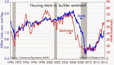
The NAHB survey of builders' sentiment continues to be a good leading indicator of housing starts, and suggests that housing starts will continue to work their way higher. One caveat: data can be choppy this time of the year, since seasonal adjustment factors are large.


Building permits have been less volatile than starts in recent months, but now appear to have provided good guidance, pointing to a continued rise in starts. From a long-term perspective, permits and starts have only recovered to levels that in the past were symptomatic of recessions. In my view, that only makes stronger the case for continued improvement in the housing market in the years to come. The huge decline in construction from 2006 through 2009 had the effect of dramatically reducing new home inventory. With new home formations continuing, however, the pent-up demand for housing is very likely to provide strong support for future gains in residential construction activity. The housing market is still in early innings.


Many would say that housing starts and the housing market in general were slowed down by the jump in mortgage rates that began six months ago. Similarly, it is tempting to say that activity continued to improve despite the rise in mortgage rates. But it is probably more accurate to say that mortgage rates have risen because housing market activity has improved.

Tuesday, December 17, 2013

Reading the World

Russell Redenbaugh is a remarkable person, an excellent thinker, and a successful investor. He's been a good friend of mine for the past two decades, and I've learned a lot from our association. I introduced Russell in a post earlier this year, titled "Overcoming adversity." He introduces himself even better in an 18-minute TED talk which you can see here

Russell is now sharing his insights into markets and investing with a weekly newsletter titled "Reading the World." In it he highlights what he thinks are key events and policies that mark important changes on the margin in the investment outlook. I'm a regular reader. Like him, I think it's critically important to understand how government policies and economic fundamentals interact and influence markets. He translates what he sees going on into recommendations for which asset classes to invest in and which to avoid. In that sense he's more a "macro" investor than a stock picker.

If you're interested, he's offering readers of Calafia Beach Pundit two free reports on monetary policy, plus a 2-week trial subscription for only $1. You can access this offer here

Monday, December 16, 2013

Industrial production picks up


November industrial production rose much more than expected (+1.1% vs. +0.6%), led by a 0.6% increase in manufacturing production, which is up at a 5.1% annualized rate in the past 3 months. Industrial production has now reached a new all-time high.

The contrast between the vitality of the U.S. economy and the ongoing struggles of the Eurozone economy (see top chart above) is stark, and can also be seen in the significant outperformance of the U.S. equity market (see chart below).


If we were doing as poorly as the Europeans, then we would really have something to complain about. As it is, all the evidence points to a substantial and ongoing recovery in the U.S. Things could be a lot better, to be sure, but the pervasive negative sentiment regarding the health of the U.S. economy is way overdone, in my view.

Thursday, December 12, 2013

Commercial real estate looks strong


According to the CoStar indices of commercial real estate prices, the sector has been quite strong this past year: prices are up between 7 and 10% for the 12 months ending October. As the chart above suggests, there is still a lot of interesting upside potential in commercial real estate.

Retail sales still relatively strong

November retail sales were a bit stronger than expected (+.7% vs. +.6%), but the overall picture of retail sales was unchanged. What we have seen in recent years is retail sales growth of about 4% per year, and today's report didn't change that. If anything, it is significant that retail sales growth has not declined this year given the end of the payroll tax holiday and the rise in some marginal tax rates.


Adjusted for inflation, retail sales have been increasing steadily for almost 18 months.


If we take out the volatile sectors (building materials, autos, gas stations), the chart above illustrates exactly why this has been the weakest recovery ever. Although sales are growing at close to their typical pace, there is currently a shortfall of about 12% relative to the long-term trend. This is directly attributable to the fact that there are upwards of 10 million people who have left the workforce since 2008. In effect, we've taken almost 10% of the economy's productive capacity (its workers) and sidelined it, so overall output is about 10% less than what it could have been if they were all working.  The key to a stronger recovery lies in figuring out how to get these people to return to the workforce.

One thing is now clear: higher taxes, more government spending, more emergency employment benefits, and more income redistribution are not going to do the job. We need policies that encourage risk-taking and work; policies that increase the after-tax rewards to risk-taking and work, not policies that reward caution and leisure. 

Unemployment claims are getting volatile


Seasonally-adjusted, first-time claims for unemployment jumped last week to +368K, much higher than the 320K expected. This is almost certainly a by-product of seasonality, which can be very volatile especially at this time of the year, and as such is likely to be reversed in the next week or so.


The underlying fundamentals of the workforce are more accurately represented by the chart above. As of the end of November, weekly unemployment claims as a % of the active workforce fell to within inches of their lowest level ever. Employers are just not laying many people off these days, after adjusting for seasonal factors. This is a good thing.


As the chart above shows, the number of people receiving unemployment insurance has been falling steadily for almost four years straight. If the current bipartisan budget agreement survives, which seems likely, the "emergency claims" portion of this chart will go to zero next month—the program will not be renewed, and this will take about 1.25 million people "off the dole." The emergency claims program was an unprecedented action to begin with, back in mid-2008, and it has been renewed every year. This has contributed to the sluggishness of the current recovery, as I explain here. So the termination of this program is likely to stimulate the economy to some degree next year, as well as contributing to lower the budget deficit. Come January, there could be as few as 2.5 million people receiving unemployment insurance compensation ever month, which will be the lowest since early 2007.

Wednesday, December 11, 2013

Totally unexpected news, all bullish

Five years ago global financial markets were in a shambles, global trade was shutting down, credit spreads had blown out to unbelievable levels, and most people's hopes for the future were going up in smoke as their homes and their investments collapsed in price. Since then we've pulled back from the abyss, financial markets are as calm as they've ever been, the economy is growing, and equity markets are booming. In many important ways, the recovery and the improvements we've seen in recent years have far surpassed even the super-optimists' wildest dreams. Nobody saw this coming, and it's all very good news, even though this is the weakest recovery ever.


Back in July 2008, U.S. crude oil production was just over 5 million barrels per day. At that time, NOBODY would have predicted, even in their wildest dreams, that crude production would increase by 60% (to 8 mbd) by the end of 2013. But it happened, thanks to fracking technology.


Back in July 2008, natural gas prices hit an astounding high of $13.58 per million BTUs. At the time, the talk was of critical and chronic shortages that would push prices still higher and potentially cripple the economy. NOBODY would have predicted, even in their wildest dreams, that natural gas prices would fall by two thirds by the end of 2013, blessing U.S. consumers with some of the lowest energy prices in the world. But it happened, thanks to fracking technology.


Back in the first half of 2003, natural gas prices on average reached their highest level ever relative to crude oil on a sustained basis. NOBODY would have predicted, even in their wildest dreams, that natural gas prices would fall by 75% relative to crude oil prices over the next 10 years, thus conferring a unique advantage to U.S. industrial energy consumers, due to the difficulty of exporting the growing relative abundance of U.S. natural gas supplies. But it happened, thanks to fracking technology.

As Mark Perry notes, "The Great American Energy Boom ... might qualify as the most important economic story of the past decade."


Back in December 2009, the federal deficit was 10.2% of GDP, and we were told that deficits exceeding 9% of GDP were economically debilitating and could spiral out of control. At the time, NOBODY would have predicted, even in their wildest dreams, that the deficit would decline to a mere 3.6% of GDP within the next 4 years, thus eliminating the need for higher tax rates. But it happened, thanks mostly to zero growth in federal government spending and a growing economy.


Back in mid-September 2008, the monetary base totaled $875 billion, and it had grown only 5% per year over the previous decade, and only 2.3% over the previous year. At the time, NOBODY would have predicted, even in their wildest dreams, that the base would more than quadruple over the next five years. And even if you had God's word that you spoke the truth, every living economist at the time would have told you that such an explosive increase in the monetary base would almost certainly lead to an explosion of inflation. NOBODY would have predicted that an explosion of the monetary base would have resulted in a rate of consumer price inflation that would average only 1.5% per year over the next 5 years. But it happened, thanks to the fact that the Fed decided to pay Interest on Reserves, and thanks to banks' almost insatiable demand for safe, risk-free assets.


In late 2008, when we learned that after-tax corporate profits for the third quarter had fallen to 7.1% of GDP, down from an all-time high of 8.6% just two years earlier; when the stock market had lost almost half its value in less than a year; and most chartists were predicting that profits would mean-revert to 6% or less of GDP, NOBODY would have predicted, even in their wildest dreams, that corporate profits would hit an unimaginably high 10% of GDP within the short span of only three years. But it happened, thanks to the Fed's QE efforts, corporations' inherent dynamism and the ability of the U.S. economy in general to cope with adversity, among other things.


Near the end of 2008, as financial markets were imploding and corporate credit spreads had reached previously unimaginable heights—which in effect predicted that 24% of all corporate bonds would be in default within the next 5 years, and the next several years would be the most disastrous in the history of the U.S.—almost nobody would have predicted that it was the buying opportunity of a lifetime. But it was, even though markets didn't hit bottom until a few months later.

Markets move and economies respond when the future turns out to be different than what everyone expected it to be. The past five or so years have been a case study in how this can happen, as we have swung from expecting the end-of-the-world-as-we-know-it to now being in the fifth year of a recovery. The future turned out to be MUCH better than expected in many ways—even though this has been the weakest recovery ever—and that is the main reason that the equity and corporate bond markets have enjoyed their most spectacular rally on record.

Smallest budget deficit in 5 years is great news

In the 12 months ended Nov. '13, the federal budget deficit was $615 billion. The last time we saw a deficit that low was 5 years ago. It has dropped $862 billion from its all-time high of $1.48 trillion in Feb. '10. As a % of GDP, the budget deficit this year will be a mere 3.6%, down radically from the its 2010 high of 10.2%. This dramatic improvement far exceeds anything that wild-eyed optimists might have predicted 4-5 years ago.


Most of the credit (about 60%) goes to spending restraint: this year federal spending will be about $3.43 trillion, which is the same as was spent in the 12 months ended June 2009. That will mark four and a half years of zero increase in federal spending. As a % of GDP, federal spending this year will be 20.4% of GDP, down from its 2009 high of 24.4%. The other 40% of the reduction in the deficit comes from increased tax revenues, which in turn came mostly from an increase in the tax base (i.e., more people working, higher incomes, increased capital gains realizations, and higher corporate profits). As a % of GDP, tax revenues this year will be about 16.9% of GDP, up almost 20% from the low of 14.2% in 2009. We didn't need higher tax rates to boost revenues, we just needed a growing economy.


This is BIG news. The shrinking size of government (relative to the economy) means that expected future tax burdens have declined significantly. This lifts a heavy burden from the shoulders of the economy, and paves the way for stronger economic growth in the years to come.


This improvement has nothing to do with the surge in tax receipts in the final months of 2012, when income and capital gains realizations were accelerated in order to beat the higher expected tax rates of 2013. As the chart above shows, monthly revenues have been noticeably higher than their year-ago levels in almost every month for the past three years. This is ongoing improvement that should continue.

Given all this unexpectedly great news, the need for and the justification for higher tax rates has all but vanished. Moreover, we now know that Keynesian theory—which holds that a huge reduction in the budget deficit and a huge decline in spending relative to the economy would be terrible news for the economy—is completely wrong. The past 5 years have proven to be a very expensive but very valuable lesson in how to deal with out of control budget deficits. The formula is simple: hold the line on spending, let the economy grow, and avoid raising taxes if at all possible. We could do better going forward if we not only keep spending growth very low but also reduce tax rates.

Four years ago it seemed impossible that we would ever see the budget numbers that we are seeing today. Looking ahead, it's not impossible at all that things could improve even more.

Tuesday, December 10, 2013

10 charts to watch

In my view, market-based data are better indicators of what is going on beneath the economy's surface than official statistics. Market-based data are usually available in real-time, and they are derived from the interactions of millions of participants from all over the world—the wisdom of crowds distilled into one number. They aren't seasonally adjusted, and they aren't subject to revisions after the fact. But they do require some interpretation, so here is a collection of 10 market-based indicators that I'm paying attention to, and why. On balance, I think they all reveal a gradual improvement in the economic and financial fundamentals, but the persistence of a general aversion to risk.


Gold and commodity prices tend to track each other over time, but gold is much more volatile (note that the range of the y-axis on the right is about twice the range of the same y-axis on the left). Gold tends to lead other commodity prices, being the most speculative of them all. Gold also is unique among commodities since all the gold ever mined throughout history is still held by someone somewhere, whereas most other commodities are either incorporated into other stuff, consumed, or deteriorate with time.

Gold is the classic refuge from inflation, geopolitical risk, and just plain uncertainty. It's a darling of speculators, perhaps because it's price can go up or down enormously and it's widely held. What the chart above tells me is that gold overshot the prices of commodities in the early years of the current recovery—in part due to concerns that the Fed's QE program would lead to hyperinflation—and is now in the process of realigning since inflation remains low and stable. Industrial commodities have been relatively stable for several years now, and gold looks to be in the process of coming back down to a level that is more consistent with the current level of industrial commodity prices. I note that over the past century, the real price of gold in today's dollars has averaged just under $600/oz.


The two charts above zoom in on the prices of gold and industrial commodities over the past 5 years. Gold looks like it's having a tough time maintaining its current lofty levels, while industrial commodity prices have been unusually stable for the past two years. 


Gold prices have tracked the inverse of the real yield on 5-yr TIPS amazingly well over the past seven years. (Think of the inverse of real yields as the price of TIPS.) The world was willing to pay ever-higher prices for gold and TIPS through 2012 because—as I see it—the world was desperate for safe assets that also offered protection against inflation. Prices for both were bid up to extremely high levels (corresponding to strongly negative real yields on TIPS) which reflected deep-seated pessimism and very bearish expectations for the future. Instead of doom and gloom, we have since seen inflation remaining low and economic growth fundamentals in the U.S. improve on the margin. Both TIPS and gold are thus facing selling pressure. Still, at current levels both reflect a fairly strong demand for risk-free assets, and thus reflect a market that is still moderately risk-averse.


The two charts above track nominal and real yields on Treasuries, and the difference between the two which is the market's expected inflation rate. If anything stands out, it is that expected inflation hasn't changed much in the past 16 years. The market currently expects inflation over the next 5 and 10 years to average a little over 2%, and that is very close to what inflation has actually averaged over the past 5 and 10 years. This tells us that the market does not see believe that the Fed's QE policy will be inflationary. Should that change, and if expected inflation were to begin rising, that would be very significant, since it would presage a significant increase in interest rates and a more rapid than expected shift by the Fed to tighter monetary policy.


Real yields on TIPS should tend to track real growth expectations for the U.S. economy. Very strong real growth inevitably leads to strong real investment returns, and TIPS need to compete with that by offering higher real yields. For the most part this has been the case, as the chart above shows. Currently, however, there is a rather large gap between the two, which to me suggests that the market worries that U.S. growth will slip below 2% in the next few years. I take this to mean that the market is pessimistic and risk-averse. But if real yields continue to rise, that would be a clear sign of a return of optimism and/or a decline of pessimism. The higher real yields on TIPS go, the more optimistic the market is about the prospects for U.S. growth.


The Baltic Dry Index measures the cost of shipping bulk commodities in the Asia/Pacific region. It is a function of two major variables: the supply of shipping capacity and the demand for shipping capacity. Prices were depressed for most of the past several years because of a significant increase in shipping capacity. More recently they have rebounded rather strongly, presumably because economic activity is continuing to increase (e.g., Chinese demand for coal from Australia) while shipping capacity is relatively constrained. As such, this appears to be signaling a somewhat stronger global economy, which would in turn support a stronger U.S. and Eurozone outlook.


The chart above shows that there has been a very strong inverse correlation between the value of the yen and the Japanese stock market. The yen was extremely strong from 2007 through 2011, and the Japanese stock market lost over half its value. That tells me that the yen was so strong (and by inference, Japanese monetary policy was so tight) that it damaged the outlook for real growth by creating deep-seated deflationary expectations and disrupting Japan's ability to compete. Consumers could make money just by holding on to their cash, for example, rather than spending it. Japanese manufacturers faced extreme difficulties competing with overseas rivals due to the incredibly strong yen, which made Japanese goods uncompetitive.

The outlook for Japan has brightened considerably in the past year, however, since the Bank of Japan adopted an aggressive policy easing stance. This has allowed the yen to return to non-deflationary levels, and that in turn has allowed Japanese manufacturers to more effectively compete in the global marketplace, and convinced consumers to save less aggressively. If the yen were to strengthen again, that would be a bad sign for the stock market and the global growth outlook.


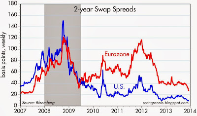
Swap spreads have been very good leading and coincident indicators of the health of financial markets and the economy. U.S. swap spreads have been exceptionally low for the past year or so, a reflection of abundant liquidity and extremely low systemic risks. Eurozone swap spreads have been substantially higher, in contrast, reflecting ongoing problems with sovereign default risk. However, the recent decline in Eurozone swap spreads stands out: this is the lowest they've been since pre-recession days. Fundamentals in the Eurozone are likely improving significantly on the margin, and that is good news for just about everyone.


Corporate credit spreads continue to decline, and that suggests that the outlook for the U.S. economy continues to improve. Spreads are still somewhat high relative to pre-recession periods, however, suggesting that the market is still somewhat cautious. The persistence of risk aversion in U.S. markets suggests that risk assets are not yet in a bubble.


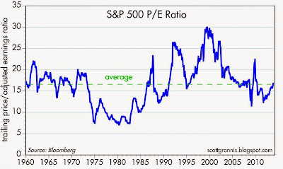
The PE ratio of the S&P 500 is only slightly higher than its long-term average, despite the fact that corporate profits are at all-time highs, both nominally and relative to GDP. This is another indicator that risk aversion persists and that equity valuations are still somewhat attractive.


As the chart above shows, Eurozone equities have significantly underperformed their U.S. counterparts in the past few years. The Eurozone economy has been in a recession for most of that period, so this is understandable. The Eurozone economies are now emerging from recession but are still plagued with sluggish growth. Nevertheless, the 12-month trailing PE ratio of the Euro Stoxx index is about the same as the PE ratio of the S&P 500 (both are just under 17), but the forward PE ratio of the Euro Stoxx index is 13, as compared to 15.4 for the S&P 500. This suggests that caution and risk aversion are somewhat more pronounced in the Eurozone, which makes sense given the problems that persist in many of the weaker Eurozone economies. On balance, I don't see that Eurozone stocks are more attractive than U.S. stocks, but there could come a time when the relative valuations of U.S. and Eurozone stocks reveal an attractive investment opportunity.