Friday, April 27, 2018

GDP highlights: money demand down, business investment up

First quarter GDP growth modestly exceeded expectations (2.3% vs. 2.0%), but it was hardly impressive. However, some emerging underlying trends are indeed impressive: thanks to increasing confidence and tax reform, money demand is declining and business investment is rising. Both have the potential to power GDP higher and faster for the foreseeable future.

Chart #1

As Chart #1 shows, real GDP growth has been on a downtrend for the past several quarters. I had expected Q1/18 growth to exceed 3%, as it had in previous quarters, but it was not meant to be. A number of observers have noted that first-quarter growth tends to be on the weak side, perhaps due to faulty seasonal adjustments, and that may well be the case.

Chart #2

Nevertheless, as Chart #2 shows, year over year GDP growth (which avoids seasonal adjustment flaws) has been trending significantly higher for the past year or so. At 2.9% currently, it meaningfully exceeds the 2.2% average annual growth rate for the current expansion.

Chart #3

Despite the recent pickup in growth, the big picture is far from impressive. As Chart #3 shows, the big picture is dominated by an ever-widening "gap" between where the economy is and where it might have been had past growth trends continued. By my estimate, the size of the gap is about $3 trillion.

Chart #4

Chart #5

As Charts #4 and #5 show, one of the biggest things that has happened in the past year or so is a sharp rise in business and consumer confidence. Confidence jumped almost immediately following the November 2016 elections.

Chart #6

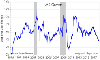
As I've argued for many years, one of the defining characteristics of the current business cycle expansion has been risk aversion and a lack of confidence. People were so shocked by the near-total collapse of the financial markets and the global economy that they began to stockpile money. Money demand surged, as shown in Chart #6, beyond anything we had seen previously. That is now beginning to reverse; people are beginning to spend down their money balances and to use their cash to finance increased spending and investment.

Chart #7

Chart #7 tracks the two components of money demand shown in Chart #6: M2 money supply and nominal GDP. I calculate that if the relationship that prevailed between M2 and GDP for the decades prior to 1990 were to re-establish itself, this could result in an additional $4 trillion of nominal GDP. In other words, if the stockpiled cash were to be released into the economy, this could support an additional $4 trillion of national income. That's equivalent to an increase in national income of roughly 25%.

Chart #8

Chart #9

The rise in confidence directly coincides with a decline in the growth of M2 and Bank Savings Deposits, as shown in Charts #8 and #9. Bank savings deposits, I have argued, are an excellent measure of money demand, since in the current expansion they have paid little or no interest. People have put trillions of dollars in the bank because they want it to be safe, not because they want the interest. Bank savings deposits were about 50% of M2 prior to the 2008 recession, and they have now grown to be almost two-thirds of M2. From the end of 2008 until the end of 2016, bank savings deposits more than doubled, from $4 trillion to $8 trillion, for an annualized rate of increase of almost 10%. 

Savings deposit growth has now fallen to about 3%, which is similar to the decline in M2 growth to 3-4%. In the past several quarters, M2 growth has been less than nominal GDP growth, with the result that the demand for money (i.e., M2/GDP) has declined. This is potentially just the beginning of something that could continue for years. The Fed no longer needs to force-feed liquidity to the economy; the increased willingness of people to spend what they have accumulated is sufficient to do the trick. 

Chart #10

Chart #10 shows the other important and recent change in the economy: a pickup in investment, which began early last year, coincident with rising confidence and fueled of late by tax reform. Private fixed investment rose by almost 7% in the year ending March 2018. By historical standards, investment is still relatively weak, as Chart #10 shows, but it is increasing at a healthy pace. Increased investment enhances the likelihood that we will see a pickup in productivity and living standards in the years to come. As Chart #10 also shows, there is plenty of upside potential here.

Q1/18 growth may have been a bit disappointing, but a look inside the numbers shows that there is reason to remain optimistic.

Wednesday, April 25, 2018

Who's afraid of 3%?

The all-important 10-yr Treasury yield rose above 3% today, and that naturally leads to all sorts of questions. Is it good, or is it threatening? Is the Fed too tight? Is inflation about to rise? Is the stock market at risk? I argue here that on balance it's a good thing, and the only ones who need to worry are those that are betting against the US economy.

Chart #1

Three years ago I predicted that we were in the early stages of a bond bear market, and Chart #1 is one validation of that claim: the multi-year downtrend in yields has been broken. To be honest, however, I was a bit early in my prediction. The bear market didn't start until 10-yr Treasury yields hit an all-time closing low of 1.36% in July '16. Today, 10-yr Treasury yields are trading with a 3-handle for the first time in almost seven years (with the exception of one day, Dec. 31, 2013, when yields reached briefly exceeded 3%). 

Chart #2

Chart #2 shows the history of 10-yr Treasury yields going back to 1925. The great bond bull market began when 10-yr yields hit an all-time high of almost 16% in September '81, and it lasted almost 35 years. Perhaps not coincidentally, my career as an economist began in early 1981 when I went to work for Claremont Economics Institute (CEI). That was just before CEI found itself in the limelight, the result of having produced the Reagan Administration's "rosy scenario" forecast that bond yields and inflation were going to plunge as the economy picked up speed. It took a few years before our forecast was vindicated, though none of us at the time would have predicted that bond yields would be falling for the next three and a half decades. What a ride!

Chart #3

Chart #4

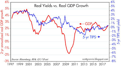
As I see it, the first leg of the great bond bull market that has now ended was driven mainly by lower inflation, whereas the second leg was a function of slower real growth, coupled with fears that very slow growth would lead to very low inflation. Chart #3 shows how it took almost 20 years—from the early 1980s through the early 2000s—for 10-yr yields to close the gap between interest rates and inflation; as a result, real (ex-post) yields fell from very high levels to long-term average levels (1%-2%). As Chart #4 shows, the very low real yields of the past 7-8 years have tended to track the very slow real GDP growth of the current economic expansion. And very low real yields combined with low inflation expectations gave us very low nominal yields up until a few years ago.

Chart #5

Since 1997, when TIPS were first introduced, we have enjoyed daily, market-based measures of forward-looking inflation expectations, and that's better than comparing today's interest rates to last year's inflation. Chart #5 shows the history of nominal yields on 10-yr Treasuries, real yields on 10-yr TIPS, and the difference between the two, which is the market's expectation for what the CPI is going to average over the next 10 years. It's worth noting that the real yield on 10-yr TIPS today is just over 0.8%, whereas the ex-post real yield on 10-yr Treasuries (subtracting the year over year change in the core CPI) is also just over 0.8%. If anything, this suggests the market is confident that the future will be similar to the past, and that the Fed is on a sustainable path to raise short-term rates in line with improving economic fundamentals. 

Chart #6

If anyone should fear 10-yr Treasuries breaking through the 3% barrier, it's prospective homebuyers. Since 30-yr mortgage rates tend to trade about 1½ points above the yield on 10-yr Treasuries, the rise in 10-yr Treasury yields has produced a commensurate rise in mortgage rates, as Chart #6 shows. 30-yr fixed, conventional mortgage rates have been 4.5% or less for the past six years, but now they are moving higher. This is certainly bad news for homebuyers, but is it a bad thing for the economy?

Chart #7

To date, rising mortgage rates have yet to put a dent in the demand for new mortgages. In fact, as Chart #7 shows, new issuance of mortgages (for purchases, not refis) has risen significantly in recent years despite rising mortgage rates. This should not be surprising, actually, since it is rising demand for loans and a stronger economy which are bidding up the cost of borrowed money. The higher rates of the past year or two are not bad for growth because they are the natural result of stronger growth. Higher rates are only bad when they rise in real terms as a result of tighter monetary policy, but that's not the case today.

Chart #8

Chart #9

Chart #8 compares 2-yr US yields with 2-yr German yields. As Chart #9 shows, US yields have soared relative to their German counterparts, with the spread (blue line) now exceeding 300 bps. And it's not just nominal yields that have diverged: German real yields on 5-yr inflation-indexed bonds are -1.4%, far lower than today's 0.73% real yield on US 5-yr TIPS. Very low real yields in Europe are symptomatic of very weak growth fundamentals. That can be seen in the fact that the US stock market has vastly outperformed the Eurozone stock market since 2009, as shown in Chart #10.

Chart #10

Traditionally, as Chart #9 also shows, a wider spread between US and German yields has corresponded to a stronger dollar (shown here as a weaker Euro), because higher US rates usually reflect a stronger US economy. But since the beginning of the Trump presidency, this has not been the case: in fact, the dollar has weakened despite stronger US growth and higher US interest rates. It's mighty tempting to conclude that whereas Trump's policies have contributed to a strengthening of US economic fundamentals, global investors have steadfastly refused to join the party, perhaps because they can't stand Trump the man.

Chart #11

In similar fashion, as Chart #11 shows, since the beginning of 2017 gold prices have risen even as real yields have risen (and TIPS prices have fallen), contrary to the relationship that prevailed prior to 2017, when gold prices tended to track TIPS prices. The message here? The dollar seems awfully weak and gold seems awfully strong given strong US economic fundamentals. 

Dollar bears and gold bulls are the ones who really need to fear the advent of higher US interest rates. Arguably, they have misinterpreted rising US rates (and Trump) to mean bad news for the economy, when in fact they are good news. 

I'd wager that Larry Kudlow will be cheering the return of King Dollar before too long, and that would be a very good thing.

Thursday, April 12, 2018

Reading the yield curve's message

If you haven't already heard that an inverted Treasury yield curve is a good predictor of recessions, then either you haven't been reading this blog for long or you haven't been reading much in the financial press of late. (For background, see some earlier posts of mine on the subject here and here.) The subject has become the focus of attention in recent months because the yield curve has been flattening, which in turn has sparked concerns that the risk of recession is rising. These concerns are misplaced, as I explain below.

Chart #1


The top portion of Chart #1 is the standard way to display the status of the Treasury yield curve. It represents the difference between the two lines on the bottom portion: the difference or "spread" between 10-yr and 2-yr Treasury yields. The spread is effectively a measure of the slope of the yield curve, which indeed is relatively flat compared to where it was several years ago. But it's not flat nor is it inverted; it is still positively-sloped, and that means the market believes the Fed is justified in saying it plans to increase rates modestly over the next year or so. The relative flatness of the yield curve is not saying that the Fed is tightening too much or threatening growth, it's best characterized as the market's way of saying that economic growth expectations are neither exciting nor worrisome. I explain this a bit more below.

Chart #2

Chart #2 is another way of looking at the yield curve—a better way, since it gives us some important additional information. The red line in Chart #2 is similar to the blue line in Chart #1, but the blue line in Chart #2 is the important addition: it shows the real, inflation-adjusted Fed funds rate, which is the overnight rate that the Fed targets. The Fed these days has absolute control over the nominal funds rate, while the rest of the nominal yield curve is essentially a projection of what the market thinks the funds rate will average over time. Any yield curve analysis worth its salt should measure not only the slope of the Treasury curve, but also consider the level of the real Fed funds rate.

The Fed doesn't just target the funds rate. What it really targets—but rarely talks about—is the real funds rate. Borrowing money at 5% when inflation is 1% is one thing, but borrowing money at 5% when inflation is 10% is quite another (the former means borrowing is expensive, the latter means borrowing money is a good way to make money). Real borrowing costs are what truly affect behavior. When money is very expensive—when real borrowing costs are high—people are discouraged from borrowing and spending and are encouraged to save money; eventually, if real rates are forced too high, economic activity suffers. That's been the proximate cause of every one of the recessions in the past 60 years.

One thing that stands out in Chart #2 is that the real funds rate has been negative for the past decade. Doomsayers think this means the Fed has been flooding the world with money, and the sky will soon be falling. Monetarists reason that, since we have seen neither a collapse of the dollar nor soaring inflation over the past decade, this can only mean one thing: the demand for short-term financial assets has been incredibly strong for many years (another way of saying that the market has been very risk averse for most of the past decade), and, moreover, the Fed hasn't artificially depressed interest rates, nor has it flooded the market with money no one wanted. The Fed has kept rates low because the demand for money has been strong. See this post (The Fed is not "printing money") from five years ago for more background.

Chart #2 actually has two messages: 1) an inverted yield curve is a good leading indicator of a recession, and 2) very high real short-term interest rates are also a good leading indicator of a recession. When both those conditions hold, that's when you need to worry about a recession. Today we're not even close to having to worry. Despite the Fed having raised its target funds rate six times in the past 18 months (from 0.25% to today's 1.75%), the real funds rate is still in negative territory (-0.18% as of March 31 by my calculations), because inflation over the past year has been almost 2%. The Fed has raised its target for the real funds rate because the market has grown less risk-averse and economic growth expectations have improved somewhat. The Fed hasn't "tightened" in the sense that it is trying to slow things down. The Fed is just following the market.

Chart #3

Chart #3 is important because it gives us information about the slope of the real, inflation-adjusted yield curve. Real yields are just as important, if not more so, than nominal yields. The blue line, the real funds rate, is ground zero for the real yield curve, while the red line, the real yield on 5-yr TIPS, is the market's estimate for what the real Fed funds rate will average over the next 5 years. Today, the front end of the real yield curve is positively sloped (i.e., the spread between the two lines is positive), and it has actually been steepening since last summer. The message: the market agrees with the Fed that short-term interest rates, in real terms, will need to rise in coming years. Not by a whole lot, but by enough to rule out the notion that the market and/or the Fed are nervous about the health of the economy. The time to worry is when the real yield curve becomes negatively-sloped, as happened before each of the past two recessions (i.e., when the blue line exceeds the red line, because that means the Fed has tightened too much).

Another reason the Fed needs to raise real rates is to boost the attractiveness of the $2 trillion of excess bank reserves held by the banking system. Failing to do so would decrease banks' desire to hold excess reserves, and that in turn would lead to excessive lending, too much money, a weaker dollar, and rising inflation.

Chart #4

Chart #5

Chart #4 uses real and nominal 5-yr yields to give us information about the market's inflation expectations. Despite the Fed having kept real short rates negative for 10 years, inflation expectations today are no different from what they have been in the past. As Chart #5 shows, the CPI ex-energy has been on a 2% growth path for the past 15 years, and inflation expectations today, based on 5-yr TIPS and Treasury yields, are about 2.1%. That is effectively proof that the Fed has not been printing money or distorting markets. In monetarist parlance, the Fed has managed to keep the supply of money pretty much in line with the demand for money, though not completely, because inflation has averaged about 1.6% per year for the past 10 years.

Chart #6

Chart #6 shows that real yields on TIPS also provide us with information about the market's GDP growth expectations. The level of real yields tends to track the level of real growth, and that is not surprising at all. A stronger economy implies higher real returns, and real yields should therefore rise in a faster-growing economy. Conversely, as economic growth weakens, as it did following 2000, real yields should fall. Currently, real yields of about 0.5% on 5-yr TIPS tell us that the market expects the economy is likely to grow about 2-2.5% per year, according to my reading of the bond market tea leaves.

If last year's tax reform results in a significant increase in economic growth, as I expect it will, then the Fed is going to have to guide real yields significantly higher as well. And that of course means significantly higher nominal yields, assuming inflation expectations remain "contained."

But for the time being, today's yield curve holds no threatening messages for the economy, and I think the market intuitively understands this.

What's worrisome today is not the yield curve, but the threat of a possible trade war with China and the ongoing tensions in the Middle East. The volatility that we are seeing is the result of the turbulence one would expect when headwinds (trade war risk, Middle East tensions) collide with tailwinds (last year's tax reform). For now, the market's judgment is that the two opposing forces effectively neutralize each other, with the result that growth is expected to be unimpressive, while inflation is expected to remain in the neighborhood of 2%.

Friday, April 6, 2018

Despite a weak March, jobs growth still improving

The March private sector employment report was a big miss on the downside (102K vs. 188K), but the trend rate of growth in private sector jobs continues to improve. The monthly jobs numbers are notoriously volatile and subject to significant revision after the fact, so one month's number cannot possibly be significant. For years I've focused on the 6- and 12-month rate of growth in private sector jobs, and by those measures conditions in the labor market continue to improve, after hitting a low last September. Here are the relevant charts:

Chart #1

Chart #2

Charts #1 shows the nominal monthly change in private sector jobs, while Chart #2 shows the 6- and 12-month rate of growth of private sector jobs. Big swings such as we have seen in recent months are pretty much the norm, so any attempt to characterize the underlying dynamics of the jobs market must rely on at least several months. Over the last six months, private sector jobs have increased on average by 213K, which translates into a 2.0% annualized rate of growth. Over the past 12 months, private sector jobs have increased on average by 187K, for a 1.8% rate of growth. This represents a significant improvement since the low point in September of last year, when private sector jobs rose at a 1.6% rate over the previous 6 and 12 months. We're making progress, albeit slowly.

Chart #3

Another bright spot is the recent pickup in the year over year growth of the labor force (the number of people of working age who are employed or looking for work). This hit a low of 0.4% last October and now stands at 1%, which is close to its average in recent decades. Background: over the long haul, the labor force tends to grow by about 1% per year, and productivity tends to average about 2%: the combination of the two, 3%, gives you the long-range average rate of growth of the economy. The current recovery, the weakest on record, has seen annualized growth rate in the labor force of just 0.5% and annualized productivity growth of only 1.0%.

Chart #4


Chart #4 shows the size of the labor force, which for many years increased by a little over 1% per year. If that growth trend had persisted, there would have been another 12 million or so either working or looking for work, and the unemployment rate—currently 4.1%—would currently be a lot higher.

Chart #5

The Labor Force Participation Rate has been steady—and quite low—for the past several years, but with a hint of improvement. (This is the labor force—those working and looking for work—divided by the working age population.) This rate is going to have to increase in coming years if the economy is to grow by more than 3%. Which means that a good portion of the 12 million or so that have "dropped out" of the labor force are going to have to decide to get back in the game. There are hints that this improvement has begun, but progress is still slow. What will entice millions of folks to get off the sidelines and back to work? Better-paying jobs. Where will the extra money to pay higher salaries come from? From increased corporate profits, which are baked in the cake thanks to the recent tax reform, and which will increase the nation's capital stock as corporate investment improves. With more capital deployed in the economy, labor will become relatively scarce and thus more valuable—and better-paid.

Chart #6 

Chart #6 is another bright spot, since it shows that there has been zero change in the level of public sector employment since the end of 2007. (Note that the y-axis for both series shows a similar scale increase, namely 20%.) This means the relative size of the public sector workforce has shrunk by almost 10% over the past decade. That is a very good thing, since the private sector is much more productive. 

Monday, April 2, 2018

ISM optimism

The monthly surveys of the Institute for Supply Management are very timely (though not real-time) indicators of the health of the manufacturing and service sector industries, and that's a good reason to pay attention to each release on the first of the month. They aren't perfect, but when they register strong levels it is almost always the case that the economy is doing well. I dedicate this post to today's manufacturing sector release, which was uniformly positive. That's comforting, given the backdrop of tariff wars.

It's obvious that the market is more concerned about the threat of a tariff war, as evidenced by today's renewed decline in stock prices, than it is bolstered by the strong ISM surveys. Trump has mandated tariff hikes targeted to China, and China is now retaliating with its own tariffs on selected US goods. This way lies misery, and the real losers will be consumers in both China and the US, who will be saddled with higher prices for a wide range of products. We can only hope that these are negotiating tactics on both sides, and that in the final analysis trade between the US and China will become more fair and more free. If not, we will have a mess on our hands and Trump's presidency will end in ignominy. Can he really be so stupid as to carry this tariff war to its disastrous conclusion? Thank goodness he has Larry Kudlow at his side to warn him of this danger.

Chart #1

Chart #1 compares the overall ISM manufacturing index to quarterly GDP growth. The two don't track perfectly, but as I look at the chart it strongly suggests that Q1/18 GDP growth is very likely to exceed current estimates, which, according to the current output of the Atlanta and NY Fed's models, is likely to be just under 3%. I'd wager that if the ISM index remains at or near these levels for several more months, we are very likely to see some stronger-than-expected GDP numbers before too long.

Chart #2

Chart #2 tracks export orders. Although the March reading dropped from the very high level of the February reading, this survey still suggests that overseas economies are doing well, and US exporters are enjoying strong demand.

Chart #3

Chart #3 shows that a significant number of ISM respondents are experiencing rising prices. This could be a harbinger of higher inflation ahead, but it could only be a sign of generally strong global conditions.

Chart #4

Chart #4 shows that a meaningful number of manufacturing firms are planning to increase their hiring activity in the months to come. That in turn reflects a decent level of optimism on the part of industry executives.

Chart #5

Chart #5 compares the US manufacturing index to a similar index/survey of Eurozone manufacturing firms. Both have been quite strong of late, but conditions in the Eurozone appear to have softened a bit in recent months. Eurozone stock markets have been underperforming their US counterparts for many years, however, so somewhat weaker conditions in Europe are not "new" news.

UPDATE: Today's release of the ISM Service Sector surveys (4/4/18) adds to the growing list of indicators which point to stronger US GDP growth:

Chart #6

Chart #7 compares the monthly changes in private sector employment as calculated by the Bureau of Labor Statistics and ADP. We are seeing here preliminary signs of an increase in the trend rate of growth in private sector employment. I think there is a decent chance that Friday's jobs report will be somewhat stronger than the market is currently expecting (+190K).

Chart #7

The market is obviously torn between the good news, reflected in part by the above charts, and the bad news, which is a budding tariff war with China. Comparing the two, I'm inclined to say that "a bird in the hand (i.e., stronger US GDP growth) is worth two in the bush (i.e., the possibility of a trade war with China)." Tariffs are for the moment only in the threat stage, still months away from actually being imposed, whereas it is becoming more clear that the US economy is gaining upward momentum.

Sunday, April 1, 2018

Charts we never thought we'd see

Ten years ago we were in the early stages of what would later prove to be the most severe economic downturn since the Great Depression. We'd all seen the charts and read the history of that tragic event and its terrible impact on the country, and we hoped it would never happen again. But there were things 10 years ago that we never expected to see, which later unfolded to our lasting astonishment. Here are just a handful of charts, which I offer to remind us of the amazing economic and financial developments of the past decade, about whose nature economists are still debating.

Chart #1

Chart #2

Chart #1 shows the dramatic—and ongoing—decline in initial unemployment claims. Ten years ago the vast majority of economists would have said that claims could never decline much below 300K per week, since that was most likely the minimum amount of normal turnover in the labor force. Yet here we are today with weekly claims approaching 200K per week. And as Chart #2 (the ratio of weekly claims to total payrolls) shows, claims have NEVER been so low in recorded history, relative to the size of the workforce. The risk of a typical worker finding him or herself laid off has never been so low. Today, employers are more likely to complain that it is harder to find skilled workers than to complain about the workers they have.

It's a brave new world for workers. But it makes central bankers nervous, since they worry that a tight labor market could result in higher wages that in turn could fuel rising inflation. This worry has its origins in the Phillips Curve theory of inflation, but that theory has never found substantiation in the data—it's the economic equivalent of an old wives' tale. Today's Fed governors are aware of this, so they are not necessarily sitting on pins and needles, but it is a source of policy uncertainty nonetheless.

Chart #3

Chart #3 shows what is arguably not only the most astounding economic or financial thing that happened in the past decade but also the most unbelievable. If you had asked any economist 10 years ago what were the chances of the Fed creating over $2.5 trillion of excess reserves in the space of a few years he or she would have stated flatly: ZERO. It couldn't possibly happen, because if it did it would herald the collapse of the dollar and an inevitable hyperinflation. The consequences of such an event were so terrible that the event itself was considered to be impossible. Yet here we are today with inflation running around 2% (as it has for more than a decade) and the dollar trading pretty close to its long-term, inflation-adjusted average vis a vis other currencies.

Prior to late 2008, when the Fed launched its Quantitative Easing program, excess reserves were measured in billions of dollars, not trillions. The Fed managed monetary policy by adding or subtracting reserves (which prior to late 2008 paid no interest) from the banking system: by creating a scarcity of reserves, banks would be forced to pay more to borrow them, and that would result in higher short-term interest rates. Today, with a previously-unimaginable abundance of reserves, the Fed has resorted to pegging the interest rate it pays banks that hold reserves, and that seems to be working. Regardless, we've been sailing in uncharted monetary waters for most of the past 10 years, and economists are still debating how everything is going to work out in the years to come. 

To this day there are still legions of observers who argue that what the Fed did starting in late 2008 was simply a massive amount of money-printing, a desperate monetary stimulus that was necessary to avoid a depression, and the economy has been running on fumes ever since. 

Others, myself included, believe that what the Fed did was not monetary stimulus at all. It was simply a rational response to an unprecedented increase in the public's demand for money and money equivalents, which in turn was the result of the near-collapse of the global financial system and the worst global recession in modern memory. The world was running very scared, so the demand for safe monetary assets was nearly insatiable. Unfortunately, there were not enough T-bills (the classic monetary safe haven) to go around. By deciding to pay interest on bank reserves, the Fed effectively made bank reserves equivalent to T-bills, and that was exactly what the world wanted: trillions more of safe, default-free, interest-bearing assets, and the Fed had the ability to create bank reserves with abandon if need be. And so it was that the Fed bought trillions of notes and bonds, and in the process created trillions of T-bill equivalents. I explained this in greater detail in a post five years ago ("The Fed is not printing money"). It did the trick, and now the Fed is beginning to slowly unwind QE, as it should, given how much confidence has returned in the last year or so.

 Chart #4

Chart #4 shows that the inflation-adjusted Fed funds rate has been negative for almost exactly the past 10 years. Never before in modern times has this occurred. Those same legions of observers that think QE was monetary stimulus in disguise argue that real interest rates have been artificially depressed by the Fed's actions. I and others, in contrast, argue that real short-term interest rates have been extraordinarily low because of extraordinarily strong demand for safe, short-term assets. If the price of a bond is bid up high enough, its yield will turn negative; it's a simple matter of bond market math. T-bills, and bank savings deposits, have been in such high demand that investors have been willing to accept zero or negative real yields. The Fed has not been artificially lowering rates, the market has driven rates to very low levels because of very strong demand for safety and very high levels of risk aversion.

Chart #5

Prior to the Great Recession, most economists would have said that the 2% yields on 10-yr Treasuries we saw in the post-Depression years would never recur, because those yields were the by-product of very weak growth and very low inflation. Yet those same 10-yr yields fell to an all-time low of 1.3% in July 2012, during a period in which the US economy grew at a 2.4% annualized rate and inflation was on the order of 2%. I believe the only way to explain these extremely low yields is to understand that they were driven to low levels by intensely strong demand for default-free assets. After all, the Fed doesn't control 10-yr yields; the market does. Today, inflation is about the same as it was in 2012, but the economy is a bit stronger and confidence is much stronger. Demand for safe assets has declined, as a result, and 10-yr yields have doubled. It all makes sense.

Chart #6

Finally, we come to what is arguably the most unexpected chart of them all, Chart #6. Prior to the Great Recession, the US economy had suffered many recessions, but after a few years it had always bounced back to its long-term trend. And in fact, the deeper the recession, the stronger the recovery. Milton Friedman formalized this observation in 1964, calling it the Plucking Model (see my discussion of this here). Unfortunately, the economy hasn't bounced back this time: growth since mid-2009 has averaged about 2.2% per year. I've attributed this slow growth to the heavy burdens of government spending, regulations, and taxes, all of which rose beginning in late 2008. If the economy had returned to its previous growth path, it would be at least $3 trillion bigger today.

Chart #7

Chart #7 shows how productivity (output per hour of those working) has been extraordinarily low for the past 10 years; this is the main explanation for why growth has failed to snap back to its long-term trend. Prior to the Great Recession, productivity averaged about 2% per year. But productivity has been much less than 2% over the past 10 years. As I've noted, the lack of productivity can easily be traced to weak business investment, which in turn is a natural response to increased tax and regulatory burdens.

Although extraordinary and wholly-unexpected things have happened over the past 10 years, there is still a logical way to understand what has happened and why. And it follows, therefore, that it is reasonable to assume that things could get a lot better in the future if the Fed continues to slowly unwind QE and the federal government continues to reduce our onerous regulatory and tax burdens.

As it has since 2009, I believe it pays to remain optimistic.