Wednesday, June 28, 2023

M2 update; no reason to worry


I'm a monetarist when it comes to inflation. As Milton Friedman taught us, inflation is what happens when the supply of money exceeds the demand for it. The best measure of the supply of money is M2, but nowhere is there a statistic which directly measures the demand for money. Money demand can only be measured after the fact, by observing changes in the money supply and changes in inflation. For example, if inflation rises we can be sure that the demand for money has been less than the supply of money. Even if M2 growth is low, inflation can rise if the demand for money is falling. And as we saw in late 2020, rapid M2 growth can occur even as inflation remains low, because back then the demand for money was very strong given all the uncertainties and shutdowns. (Check out this post from October 2020 for more background on this.)

The Covid era has given us something akin to a laboratory experiment in the interaction between money supply and money demand. We've seen a massive, unprecedented increase in the money supply followed by an equally impressive decline in the money supply. Meanwhile, inflation has gone from low to high and is now halfway back to normal. The lags between money and inflation have been "long and variable," as Friedman noted. Unfortunately, the Federal Reserve has paid virtually no attention to any of this, and neither has the press nor the vast majority of economists. There are lessons to be learned here, and fortunately, there is reason to remain optimistic about the future.

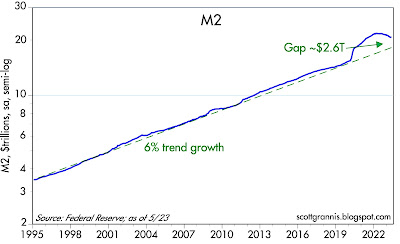
Chart #1

Chart #1 shows the level of M2 (blue line) and its 6% per annum trend growth rate (green line) which has been in place since 1995. According to data released yesterday, M2 increased by $131 billion in May, breaking a 9-month losing streak totaling just over $1 trillion. M2 has fallen 4% in the past 12 months, and is up only 0.9% in the past 24 months. Yet M2 is still about $2.6 trillion above where it might have been in the absence of the Covid crisis. I've argued that this "extra" amount of M2 serves as a cushion against recession, because it means that the economy is still flush with cash and liquidity. See this post for more on why liquidity is so important to both the economy and financial markets. 

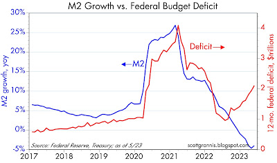
Chart #2

Chart #2 compares the growth rate of M2 to the 12-month running total of the federal deficit. This strongly suggests that the $6 trillion of federal deficit spending in 2020-2022 was financed by money creation. The one good thing here is that the increased deficit over the past year has not resulted in any increase in M2, because the spending has been financed by borrowing, not money creation. This is as it should be. Bottom line: the source of the inflation surge in recent years has dried up, and inflation is on the way out.

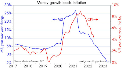
Chart #3

Chart #3 compares the growth of M2 with the rate of CPI inflation lagged by one year. The chart suggests that there is approximately a one-year lag between changes in money supply growth and changes in inflation. Given the dramatic decline in M2 growth which began early last year, the chart suggests we will see a similar decline in inflation over the next 6 months or so. As I've argued for months, the decline in inflation is well underway.

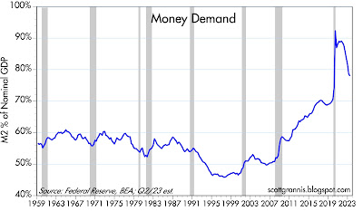
Chart #4

Chart #4 is my attempt to quantify "money demand." I'm one of the few economists who pay attention to money demand because it's crucially important: after all, inflation is what happens when the supply of money exceeds the demand for money. Check out this post from October 2020, in which I elaborate on how strong demand for money can offset rapid growth in money supply. Money supply can be abundant, as it was in 2020, but inflation didn't show up until April of 2021. I think that's because the demand for money was very strong in 2020: everyone was hoarding money because of all the Covid-related uncertainty. Inflation began to appear in 2021 only after confidence picked up and life began returning to normal after the first round of vaccines—people no longer wanted to accumulate money. People began spending the money they had accumulated, and that aggravated the problem of supply-chain disruptions, driving prices higher. This post from March 2021 elaborates on these thoughts. 

Think of the ratio of M2 to nominal GDP as the amount of cash and cash equivalents that the average person is willing to hold, expressed as a percent of their annual income. As the chart shows, money demand fell  rather dramatically beginning in late 2021, and inflation peaked about six months later. In recent months the decline in money demand has slowed quite a bit; I think that's due to 1) the Silicon Valley Bank failure and 2) rising real interest rates. People are more cautious about holding money these days, and it's not a coincidence that most of the M2 increase in May was due to a $76 billion increase in retail money market funds which are now yielding almost 5%. Holding money when rates are 5% is a lot more attractive than when they were almost zero back in early 2022. Higher interest rates also discourage borrowing, especially for mortgages; mortgage originations have fallen by 50% in the past year. (Note: being less willing to borrow money is equivalent to being more willing to hold money.)

For the past 18 months the Fed has been raising short-term interest rates in an attempt to bolster the demand for money. If they hadn't done that, plunging money demand would have pushed prices even higher. In effect, they were trying to prevent the public from rapidly spending all the excess money that accumulated in the 2020-2021 period. And it has worked. The May pickup in M2 suggests there has indeed been a slowing in the decline in money demand. 

Chart #5

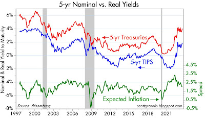
Chart #5 shows nominal and real yields on 5-yr Treasuries (red and blue lines), and the difference between the two (green line), which is effectively the market's expectation for what the CPI will average over the next 5 years. Inflation expectations today are about 2.1%, which is very close to what inflation averaged in the 20 years leading up to the 2020 Covid crisis. In effect, the bond market believes the inflation problem has been solved. The yield curve is very inverted these days (i.e., short-term rates are much higher than long-term rates), which means that the bond market expects the Fed to lower short-term interest rates dramatically over the next year or two—because the market believes the Fed will eventually realize that the inflation problem has been solved.

Chart #6

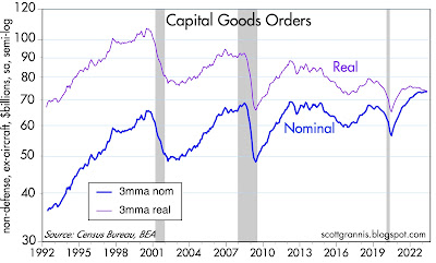
Changing the subject: Chart #6 shows the 3-mo. moving average of capital goods orders in both nominal and real terms. Capital goods orders ("capex") are investments that companies make which will boost future productivity (i.e., purchases of machinery, computers, tools, new plants). As such, capex is a leading indicator of future economic growth. Nominal capex has reached a new high in nominal terms, but in real terms capex has been lackluster to say the least: it's fallen almost 30% in the past two decades. I believe this tells us that economic growth in coming years will also be lackluster: 2% or less per year. 

Chart #7

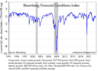
Chart #7 shows Bloomberg's index of financial conditions, with the components listed at the bottom. According to this, the outlook for financial markets and thus the economy is "normal." 

Summary: There is nothing to fear from the behavior of M2; money and liquidity are still abundant and key indicators such as swap and credit spreads tell us that the economy's fundamentals are still sound. The source of our inflation problem has dried up and inflation is on its way back to normal. The Fed was slow to react to all this, but they have not yet made a significant mistake. It's therefore not surprising that the stock market has been creeping higher.

Wednesday, June 14, 2023

Inflation is under control


Unfortunately, the Fed hasn't yet figured this out, but I strongly suspect they will before too long. Meanwhile, standing pat, as the FOMC did today, is the least worst alternative to easing. Interest rates are relatively high from an historical perspective, but there are as yet few—if any—signs that monetary policy is too tight or that it is threatening the health of the economy. The fact that the year over year change in the CPI (now 4.0%) is still above the Fed's 2% target is meaningless, when a look under the hood shows that this measure of inflation will almost certainly fall to 2% (or lower) within the next several months. 

Chart #1

Chart #1 compares the 6-mo. annualized change in the CPI to the same change in the CPI less shelter costs. According to the latter, inflation has already fallen to 0.8%. As I have been arguing for the past several months, the measure of shelter costs (e.g., rents) used in the CPI lags the reality of the housing market by about 18 months. In the real world, housing prices have not increased at all over the past year, but the CPI is assuming they have been rising. So removing shelter costs from the CPI is entirely legitimate. Without shelter costs artificially inflating the CPI, inflation would already by significantly less than the Fed's target. And if that doesn't convince you, then look at the fact that over the past six months, the CPI has risen at only a 3.2% annualized rate, and it's almost guaranteed to fall further by the end of the year as shelter costs turn negative. 

Chart #2

Chart #2 shows the 6- and 12-mo. annualized change in the Producer Price Index for Final Demand. This index is comprised of things that inhabit the early stages of the inflation pipeline, and here we see that inflation is already comfortably below 2%. 

Chart #3

Chart #3 compares the value of the dollar (inverted) to the inflation-adjusted price of crude oil. Two things to note: commodity prices have a strong tendency to move inversely to the value of the dollar—a stronger dollar tends to push commodity prices down, and a weaker dollar tends to push commodity prices up. Today the dollar is relatively strong vis a vis other currencies, and commodity prices are generally weak. Crude prices are down almost 40% since last summer's peak, and the CRB Raw Industrials index (a broad measure of non-energy commodity prices) has fallen to levels which prevailed over a decade ago. In real terms, oil today costs about half of what it did a decade ago. Cheap energy can be a powerful tonic promoting economic health. 

Chart #4

Chart #4 compares the real Fed funds rate (the true measure of how high interest rates are) to the slope of the Treasury yield curve. Note that every recession on this chart was preceded by a huge increase in real interest rates (blue line) and a significant inversion of the yield curve (red line). Today the yield curve is definitely inverted, but real interest rates are not yet punishingly high, so by this criteria a recession is not yet baked into the cake. And as I've noted in prior posts, credit and swap spreads are still quite low, which also suggests that recession risk is low.

Chart #5

Chart #5 compares the level of the S&P 500 (blue line) to the level of the Vix (fear) index. Here we see that the market has been moving up from its low of last September at the same time that the Vix index has been declining from 31 to now only 14. Fears are subsiding and the stock market is breathing a sigh of relief. The market knows it is only a matter of time before the Fed wakes up and starts easing. 

Monday, June 5, 2023

Inflation and spread charts updated


Last week the Fed effectively announced there would be no rate hike at the June 14th FOMC meeting, but there might be a hike at the July 26th meeting. I think the information we have to date strongly suggests that the Fed is done—no more hikes. The only question now is when they start to cut and by how much. Currently, the bond market is priced to a 50% chance of a 0.25% hike at the late July meeting, and at least a 1% cut by year end, with the peak funds rate coming in late summer. I think there's a decent chance we will see short-term rates end up lower than current expectations.

My reason for being bullish on bonds (i.e., expecting lower interest rates) is based my observation that inflation will continue to decline. I'm optimistic the economy will avoid a recession because I see low and falling swap and credit spreads, which in turn are indicative of a healthy outlook for the economy and corporate profits. 

Chart #1

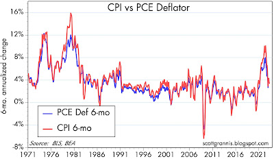
Year over year measures of inflation fail to pick up turning points until after the fact. That's why I prefer to use a 6-mo. annualized measure of inflation, which I've used in Chart #1. Both the Personal Consumption Expenditure Deflator and the CPI have fallen to below 4% by this measure (CPI 3.3%, PCE deflator 3.5%), and are within striking distance of the Fed's 2% target. 

Chart #2

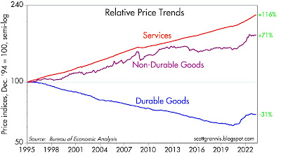
Chart #2 shows the relative behavior of the three main components of the PCE deflator. The striking news here is that durable and non-durable goods prices have not changed at all since last June! The only prices that have been rising in the past 10 months are services prices; and shelter prices (rents and housing prices) make up a large portion of services prices.

Chart #3

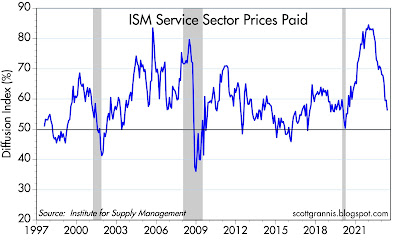
As for the rest of the service sector, the May ISM survey (Chart #3) shows that only a small majority of service sector firms report paying higher prices. That's lower that the historical average for this survey, which is 60%. That's relatively recent data which confirms that inflation pressures continue to fall for this very important segment of the economy.

Chart #4

Chart #4 shows how changes in housing prices take about 18 months to show up in the CPI, through what is called Owner's Equivalent Rent, which in turn comprises about one-third of the CPI. Since housing prices have how been falling for the past 18 months, the OER component of the CPI will become negative in coming months, thus subtracting a major portion of upward inflation pressure in the CPI.

Chart #5

Not surprisingly, the bond market has figured this out. The green line is the market's expectation for what the CPI will average over the next 5 years: 2.15%. If you convert this to the PCE deflator, that's roughly equivalent to a forecast that the PCE deflator will average 1.7% or so over the next 5 years—and that's less than the Fed's target of 2%. Does the Fed pay any attention to the bond market? I sure wish they would.

Chart #6

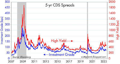
Chart #6 shows Credit Default Swap spreads, which are a highly liquid proxy for corporate credit spreads, which in turn are indicators of the market's confidence in the outlook for corporate profits—and by extension for the outlook for the health of the economy. CDS spreads are relatively low and have been falling since the Silicon Valley Bank fiasco. This is very comforting.

Chart #7

Chart #7 shows a broader and somewhat less liquid measure of corporate bond spreads. By this measure too, spreads are relatively low and have been falling in recent months. 

Chart #8 

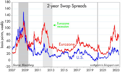
Chart #8 shows 2-year swap spreads, which are excellent and very liquid indicators of market liquidity and the outlook for the economy. Here too we see that conditions in the US have been improving of late and are generally quite healthy. Even conditions in Europe have improved of late. At current levels, 2-yr swaps in the US are in the lower portion of what a "normal" range would be. I think this is highly important, since it shows that the Fed's tightening actions have not resulted in a loss of liquidity in the bond market, and that in turn is essential to healthy, functioning markets. The Fed has raised rates by enough to balance the demand for money with the supply of money, and that is all it takes to bring inflation down. There is no need for the Fed to intentionally weaken the economy in order to fight inflation. (Higher rates make you more inclined to hold on to your cash, since it can be invested at a decent rate, contrary to the conditions that prevailed early last year, when short-term interest rates were close to zero.

All things considered, the economy should avoid a recession, inflation should continue to decline, and sooner or later the Fed will be lowering short-term interest rates.