Friday, January 29, 2016

The yield curve says "no recession"

Because of the way the Fed conducts monetary policy, the Treasury yield curve can tell us a lot about the market's expectations for economic growth and inflation. Currently, the yield curve is saying that the market expects to see modest economic growth of 1 - 2% for the foreseeable future, with modest inflation as well, in the range of 1.3 – 1.6% per year over the next five to ten years. 

Central banks have only three choices when it comes to policy tools. They can either control the money supply, interest rates (short or long, but not both), or the exchange rate, and only one of those at a time. After choosing one, they must accept the market's verdict on the others. Any attempt to control more than one of these monetary variables will inevitably end in tears, as the central banks of Argentina and many other developing economies can attest.

The Fed long ago decided that it would conduct monetary policy by controlling overnight interest rates (i.e., Fed funds). For many years the FOMC would add or subtract reserves from the banking system in order to keep the Fed funds rate (the rates banks charge each other to borrow reserves) at or near the Fed's target. Beginning in late 2008, the Fed modified this strategy, since it purposefully supplied trillions of excess reserves to the banking system. With a super-abundance of reserves, banks essentially have no need to borrow more, so the traditional Fed funds market no longer exists. The Fed solved that "problem" by deciding to pay interest on excess reserves (IOER), and that rate became the de facto Fed funds rate, enforced recently by allowing non-bank institutions to enter into reverse-repo transactions with the Fed and thus effectively earn the same rate that major banks can by holding excess reserves at the Fed.

The evidence to date is still relatively scant, but it looks like things are proceeding according to the Fed's plan. Libor, the rate that the market demands for lending to banks instead of to the Fed, is trading around 60 bps, which is somewhat higher than the 50 bps that banks earn by lending money to the Fed (i.e., by holding excess reserves at the Fed), and that makes sense. In other words, the Fed appears to have found a way to target the overnight risk-free rate by simply changing the rate it pays on excess reserves. The Fed's primary tool—short-term interest rates—hasn't changed, but the method of implementing it has.


Regardless, it is important to remember that the Fed can only control short-term rates. As three Quantitative Easing episodes from 2008 through 2014 demonstrated, despite the Fed's massive purchases of notes and bonds, 10-yr Treasury yields actually rose (see chart above). This put the lie to the Fed's professed objective of buying notes in order to artificially lower yields and thus "stimulate" the economy. As I've explained many times over the years, the real purpose of QE was NOT to lower bond yields and stimulate the economy—the real purpose was to supply the world with more risk-free monetary assets (aka bank reserves, which, with the addition of IOER, became T-bill substitutes) in order to satisfy the world's intense demand for money and safe assets in the wake of the 2008 financial crisis. The Fed did this by buying notes and bonds and "transmogrifying" them into T-bill equivalents. This was neither stimulative nor inflationary, since the Fed was simply supplying the money that the market wanted to hold.

Since the Fed can only control short-term rates, observing longer-term rates can tell us a lot about the market's expectations for the future of Fed policy. 2-yr Treasury yields, for example, are equivalent to the market's guess as to what the Fed funds rate will average over the next two years. The current 2-yr yield of 0.8% is a function of the market's expectation that the Fed funds rate will rise from 0.5% today to 1% or so two years from now. This expected path of the funds rate is consistent with a forecast of modest economic growth and low inflation. It is not consistent with an expectation of recession.

Market equilibrium tells us that, collectively, investors at any moment in time must be indifferent between earning the prevailing overnight risk-free interest rate for two years or investing their money in a 2-yr risk-free security and holding it for two years. Ditto for 5-year yields. But when it comes to 10-yr yields, the analysis becomes trickier, since the market invariably demands some kind of premium for locking in yields for such a long period. Nevertheless, looking at the difference between 2-yr and 10-yr Treasury yields can tell us a lot about what the market expects from the Fed over the next several years.


The two charts above show the history of 2- and 10-yr Treasury yields and the difference between the two, which is the slope of the yield curve. Note that the slope of the yield curve typically flattens or inverts (becomes negative) in advance of recessions. This is the bond market's way of saying that emerging weakness in the economy is putting a lid on the Fed's ability to raise short-term rates, and that it is increasingly likely that the Fed's next move will be to cut, rather than raise, rates. The current slope of the yield curve is not unusual at all, and is typical of the middle part of a business expansion. The market doesn't believe the economy is going to be weak enough to warrant lower short-term rates for the foreseeable future.


The chart above compares the nominal yield on 5-yr Treasuries with the real yield on 5-yr TIPS, the difference between the two being the market's expected annualized rate of inflation over the next 5 years, currently 1.3%. This is relatively low, but not unprecedented and not of great concern. Indeed, I would be thrilled if inflation were to average 1.3% per year for the foreseeable future. Inflation is pernicious, penalizing savers and rewarding borrowers, and is effectively a backdoor way for the government to avoid the full consequences of its spendthrift ways. The lower the better, in my book.


The chart above compares the real yield on 5-yr TIPS with the 2-yr annualized rate of real GDP growth. These rates tend to track each other, with real yields on TIPS tending to be a point or so less than the economy's growth tendency over the past two years. That makes sense: you can lock in a risk-free rate of return on TIPS, or you can take your chances with the real growth of the economy. Risk-free yields should always be less than riskier returns. As I read this chart, the market is expecting real GDP growth to be between 1 and 2% for the next few years, which is a bit less than the 2.1% annualized growth of the economy in the current business cycle expansion.

There's not much to get excited or worried about here. The market is (not atypically) projecting that recent trends in growth and inflation will persist for the foreseeable future.


Meanwhile, as the chart above suggests, this continues to be the weakest post-war recovery on record. If this had instead been a "normal" recovery, the economy today would be about 15% ($2.8 trillion!) bigger. Rather than worrying about a recession, we should be obsessed with finding ways to get the economy back on its long-term growth path. (Hint: smaller government, reduced regulatory burdens, lower and flatter marginal income tax rates, and much lower corporate tax rates.)

It's the unrealized growth potential of the economy that is the big news, not the risk of recession.

Wednesday, January 27, 2016

More reasons to avoid despair

Three weeks ago I noted that although there was no shortage of bad news out there, there was reason to avoid despair. In this post I offer more than a dozen charts which make the case for remaining optimistic that things are getting better—albeit slowly—not worse.


Housing prices have been rising for almost four years now, and they were up over 5% nationwide in the year ending last November.


New home sales continue to rise, and probably have a lot of upside left.


Housing starts are likely to continue rising, as suggested by relatively strong builder sentiment and rising building permits. The housing sector is one of the economy's strongest.


As the chart above shows, new applications for home mortgages (not including refis) are up 40% from the levels that prevailed during 2014. 30-yr fixed conforming mortgage rates currently are 3.7%, and with the exception of 10 months in late 2012 and early 2013, have never been lower. If confidence continues to improve, there is every reason to think the housing market has plenty of upside.


Gasoline prices haven't been this low for a long time.


In response to substantially cheaper gas prices, vehicle miles driven have risen almost 5% since oil prices started to fall in mid-2014. Consumers and businesses are definitely responding to cheaper energy prices. Cheaper energy prices are likely working to stimulate more activity throughout the economy that has yet to show up in the statistics.


As the chart above shows, the big drop in real gasoline prices (shown here as a rising red line) has been an important source of rising consumer confidence.


A survey of small businesses shows that hiring plans continue to improve.


The U.S. consumer is far from being tapped out. Indeed, credit card debt as a percent of disposable income (the red line in the chart above) hasn't been this low for decades. After years of deleveraging, consumers are just beginning to return to the credit well.


This index of industrial commodity prices (CRB Raw Industrials) is up over 4% in the past two months. This leaves commodity prices more than 90% above their lows of late 2001, and suggests that demand is starting to pick up and/or supplies are starting to tighten. Despite the global weakness sparked by the slowdown in China, prices are not going down a black hole.


Bank lending to small and medium-sized businesses has been rising at double-digit rates for over five years. This reflects increased confidence on the part of businesses and banks.


After five years of very slow growth (2008-2013), bank credit is expanding at a more normal pace, up over 8% per year for the past two years.

Confidence is rising, there is no shortage of money or credit, businesses are hiring, cheaper energy prices are stimulating more activity, and the housing market is firing on all cylinders. This is not what you would expect to see if the economy were teetering on the brink of another recession.

Friday, January 22, 2016

Don't forget the TED spread

This blog has paid a lot of attention to swap spreads over the years, in the belief that they are good coincident and leading indicators of systemic risk and economic and financial market health. Swap spreads have been very low of late, despite the turmoil in the oil patch, which has sent spreads on high-yield energy-related debt to levels not seen since the height of the 2008 financial panic. I think that means that the problems in the oil patch are not likely to spread to other areas, in the way that problems with mortgage-backed securities spread to the global economy in 2008. Why? Because swap spreads tell us that liquidity is abundant (thanks to QE) and the financial markets are thus able to fulfill two of their primary roles, which is to spread risk around and, through the magic of markets, find prices that match sellers to buyers, and that balance the supply of and the demand for commodities such as oil. Markets can almost always solve problems if left to their own devices, and if central banks respond to crises by providing needed liquidity.

A related indicator, lost in the QE shuffle of the past 7 years, is the TED spread, which stands for the difference between the yield on 3-mo T-bills and 3-mo Libor (T-bills/Euro Dollars). It is a direct measure of the premium that investors demand for accepting the risk of loaning money to a bank rather than to the U.S. Treasury. 


As the chart above shows, that spread soared to more than 300 bps at the height of the 2008 financial crisis, an indication that the world was deathly afraid that more banks would collapse in the wake of the Lehman failure. The TED spread also soared in late 1987, as the S.E. Asian currency crisis blossomed and entire banking systems overseas were threatened. The spread rose for years prior to the 2001 recession, accurately signaling developing problems. In contrast, the current level of the TED spread, 34 bps, is about what it equals during periods of relative calm.


The chart above shows the evolution of the TED spread (the bottom half of the chart) and its components (top half). What it also shows is that the Fed's efforts to raise money market rates through its IOER reverse repo program are working. 


This last chart shows just the yield on 3-mo T-bills, often referred to as the bedrock risk-free rate for the entire world. That this rate has risen from zero to 30 bps against the backdrop of a global financial panic in recent weeks is notable, to say the least. If global conditions were truly calamitous, the Fed's efforts to raise short-term rates arguably would have proved futile, as there would have been an overwhelming demand for the safety of 3-mo T-bills. [Chart corrected from initial publication to show a closing yield of 0.3% rather than 0.24%.]

Bottom line, the underpinnings of financial markets look reasonably solid, and that offers the promise that the turmoil in the oil patch will be resolved without plunging the world into another 2008-style crisis.

Thursday, January 21, 2016

Chart updates

This week I'm in Park City to do some skiing with my brother, which is a good time because the Sundance Film Festival, which starts today, keeps a lot of people off the slopes. Yesterday the mountain was all but deserted.

Yesterday had all the markings of a panic selloff, so it's not surprising that the market is up today. 

Here are a few charts and some commentary in the meantime, since I'm off for the slopes shortly and it's a beautiful day:


The worst damage is still limited to the energy sector, as crude prices fall into the 20s. As the chart above shows, spreads on energy-related high-yield debt have now reached the levels that marked the utter panic of 2008. Can things get much worse? Doubtful. Outside the energy sector, however, spreads are at levels that we last saw during the PIIGS crisis of late 2011. That's bad, but it's not a crisis, and it suggests that any contagion from the energy sector is still quite limited.


Despite all the turmoil, gold prices remain in a downtrend, as do TIPS prices. Sure, there have been some counter-wiggles, but nothing significant. I note that there are many analysts who look at falling gold prices as symptomatic of tight monetary policy. I disagree. I think gold prices reached exorbitant levels a few years ago on fears that monetary policy was going to seriously debase the value of the dollar (i.e., monetary policy was way too easy). I think gold has been declining since as the market loses its fears of dollar debasement, and as inflation remains low. In a sense, the market over-reacted to what it thought was too-easy monetary policy and now is slowly coming back to more reasonable levels. TIPS prices have tracked gold prices for the same reason: inflation fears have diminished and have been replaced—slowly—by a return of confidence.


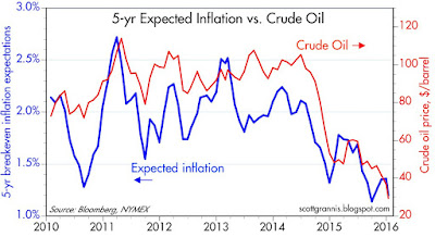
Most of the turmoil in the past year has centered around falling energy prices. But take those out, and inflation has been running at 2% per year on average since 2003. Ho-hum, nothing much has changed except that oil has gone from being very expensive to now very cheap.


We've seen this movie before. A big drop in oil prices depresses inflation, but core prices aren't much affected. Once oil prices stop declining, headline inflation returns to the level of ex-energy price inflation.


Both the CPI and the PPI (core versions) are behaving in similar fashion, registering inflation of about 2% per year.


Monday, January 18, 2016

Recommended reading: Taxes and a Two-Santa Theory

The late Jude Wanniski was the most prolific writer and economic thinker that I have ever had the pleasure to know, and he played an important role in my economic education over the course of two decades. He was the one who coined the term "supply-side economics," and he was instrumental, along with Art Laffer, Jack Kemp, and Robert Mundell, in shaping Reagan's economic thinking and  the policies which led to The Seven Fat Years (the title of Robert Bartley's excellent book) in the 1980s. 

I heartily recommend you read Jude's 1976 essay, "Taxes and a Two-Santa Theory." It's a quick and easy way to understand the tax and spending roles played by our two political parties over the last century. It's easy to forget how each party has evolved over the years. Republicans were not always the party that favored tax cuts, and they have made their share of mistakes, as have the Democrats.

Excerpt:


Simply stated, the Two Santa Claus Theory is this: For the U.S. economy to be healthy and growing, there must be a division of labor between Democrats and Republicans; each must be a different kind of Santa Claus.
The Democrats, the party of income redistribution, are best suited for the role of Spending Santa Claus. The Republicans, traditionally the party of income growth, should be the Santa Claus of Tax Reduction. It has been the failure of the GOP to stick to this traditional role that has caused much of the nation’s economic misery. Only the shrewdness of the Democrats, who have kindly agreed to play both Santa Clauses during critical periods, has saved the nation from even greater misery.

On the eve of this year's presidential election, the Democrats are promoting more income redistribution and more spending, while the Republicans are trying to convince the country that tax cuts are what's needed to boost the economy. This time around I think the Republicans are right, but they still have to execute, and their record on that score is spotty.

Plus ça change, plus c'est la même chose.

HT: Russell Redenbaugh

Friday, January 15, 2016

Key charts to watch

Financial markets are once again swooning as oil prices collapse, stoking fears of another global financial crisis. Without trying to minimize the angst we all feel, I offer here some charts which are useful for retaining one's sanity, along with some commentary.


For all the turmoil out there, it's remarkable that the prices of gold and 5-yr TIPS remain in a downward trend. (Note: I use the inverse of TIPS's real yields as a proxy for their price.) If conditions were really unravelling, the market would be paying ever-higher prices for these two safe haven assets. They were much higher in price in late 2011 and 2012 when the PIIGS crisis was at its apogee. That crisis threatened the economies of the eurozone and the euro itself. The current crisis is much more narrowly defined.


Sharply lower oil prices have dramatically increased the risk of default for energy-related corporate debt, as shown in the blue line in the first chart above. But the threat of defaults is concentrated in the energy sector. Non-energy high-yield debt credit spreads are only 660 bps, much less than half the 1600 bps spreads on energy-related bonds, and less than the spreads on all HY debt at the peak of the PIIGS crisis. As the second chart above shows, swap spreads are very low, in sharp contrast to how they behaved in previous recessions. Very low swap spreads tell us that financial markets are highly liquid and that systemic risk is very low. This is mostly a problem affecting the oil patch, not everybody.

Markets today are far more liquid than they were in 2008 and 2011-12. That is of critical importance, and a source of comfort.


Like all the other big selloffs in recent years, fear has been the main driver. (As a proxy for fear I use the ratio of the Vix index to the 10-yr Treasury yield.) The Vix/10-yr ratio hit a high of almost 25 when the PIIGS crisis was at its most intense. So far, the China/oil crisis looks substantially less scary than the PIIGS crisis. 


The PE ratio of the S&&P 500 has dropped to its long-term average of 16.5. So stocks are at "average" valuations today. But: corporate profits are still very high relative to GDP (9-10% of GDP, versus a long-term average of 6-7%). The PE ratio on 10-yr Treasuries is about 50 today (the inverse of their 2% yield). What this means is that the market is deeply distrustful of the staying power of corporate profits. Deeply. Investors are willing to accept extremely low yields on safe assets in order to avoid the perceived risk of stocks. There is a LOT of fear priced into the market, even though PE ratios are not historically depressed.


As the two charts above show, the bond market is priced to the expectation that consumer price inflation will average 1.2% per year for the next 5 years. That's relatively low, but not unprecedented. Deflation/depression fears were rampant at the end of 2008, when inflation expectations fell to negative levels. Today, low inflation expectations are being driven mainly by very low oil prices, as the second chart suggests. Core inflation, I would note, is still running at just under 2%. The problems today center around oil, not the fact that the Fed has raised interest rates a mere 25 bps.


Commodity prices have plunged in recent years, but raw industrial commodity prices (above) are actually up over the past two months. Non-energy commodity markets may be finding support at current levels.


For all the decline in commodity prices, they are still significantly higher today than they were at the end of 2001, when very tight monetary policy (as seen in 4% real yields, a flat- to inverted yield curve, and a very strong dollar) created a genuine risk of deflation. As the chart above shows, most of the extreme moves in commodity prices have been due to extreme moves in the dollar. When commodities are measured in euro terms (blue line above), they are much more stable, and still 70% higher than in 2003. I note that the two y-axes in the chart both have the same range (the top value is 3.5 times the lower value). I note also that the dollar has been relatively flat for most of the past year.

Thursday, January 14, 2016

Federal finances look good, but threaten to deteriorate

Six years ago the federal budget deficit peaked at almost $1.5 trillion, a staggering 10.2% of GDP. Last year it was only $475 billion, a modest 2.3% of GDP. That's some pretty significant progress that hardly anyone expected, and it was due mainly to spending restraint and the growth of jobs, incomes, and profits. 

Keynesian economists in 2009 would have predicted a massive recession/depression had you asked them to forecast the impact of such a huge reduction in the deficit. At the time (2009), they all predicted that a surge in spending (i.e., the ARRA) would jump-start the economy boost growth for several years, and they disagreed only about the size of stimulus spending, with most arguing for more rather than less. As it turned out, almost $1 trillion of "stimulus" spending gave us the slowest recovery on record. Ditto for the Fed's QE and massive purchases of notes and bonds, which did little if anything to stimulate the economy. All the government and policy intervention was for naught. From a supply-sider's perspective, it's more likely the case that massive government spending and policy intervention contributed to the economy's malaise.


Spending was flat from mid-2009 to late 2014, but since then it has resumed its upward trend, even as the economy slowed last year (which is not surprising from a supply-side point of view). Revenues, in contrast, rose over 60% from their early-2010 low. 


Relative to GDP, the picture looks pretty good. Spending currently is around 20.5% of GDP, just over one percentage point above its post-War average, and way down from its 2009 high. Revenues are coming in around 18.2% of GDP, also about one percentage above their post-War average. Unfortunately, they are unlikely to increase much further relative to GDP, since the growth of revenues has already slowed to 4-5% or less. Unless, of course, policies take a turn for the better (e.g., lower marginal tax rates, reduced regulatory burdens).


Last year's deficit was only slightly above its post-War average. If current conditions were to continue, the outlook for federal government finances would be sustainable for at least several years. Unfortunately, without entitlement reform, spending could rise significantly in the years to come. Transfer payments last year totaled over $2.7 trillion, almost 73% of total federal spending and 15% of GDP! Needless to say, transfer payments don't contribute to GDP, since they involve taking money from taxpayers and giving it to people who likely are not working or not paying much in taxes (e.g., retired, disabled, lower income). We need reform in Washington for the outlook to brighten.


Individual income taxes (which include taxes on dividends and realized capital gains) were the main engine behind revenue growth, rising at an annualized rate of 10.2% over the past six years. Despite disappointingly slow economic growth last year, individual income taxes last year increased 9%. Payroll taxes (FICA) didn't grow nearly as fast, however, thanks mainly to the slow recovery in jobs and a payroll tax holiday in 2011 and 2012, but they rose 5.4% last year, despite the modest 1.9% growth in jobs.

Tuesday, January 12, 2016

Lots of stupidity on both sides of the aisle

Don Boudreaux reminds us that lots of voters in both parties are "utterly ignorant of the ways that economies and governments work ... [and] in equal parts mindless, bigoted, and uncivilized. They are, in short, dupes for power-mad despots-in-waiting."

Read the whole thing, it's not too long. Reading Don's website periodically is an excellent and free education in economic thinking.

Friday, January 8, 2016

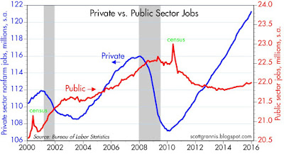
No change in the jobs picture

The December jobs number was much stronger than expected (292K vs. 200K), but one month in this volatile (and often revised) series is not enough to call a trend. As I see it, private sector jobs have been growing by a little more than 200K on average per month for the past several years, with no substantive change. If the December number is significant at all, it's because it undermines fears of a growth slowdown or recession. And given the market's weak expectations for growth, that's a positive. For now, the market appears to be obsessed with developments overseas, even if they are unlikely to have a significant impact on the U.S. economy one way or the other. How many are aware that U.S. exports to China account for less than 1% of our annual GDP? In the highly unlikely event that China cut its purchases of U.S. goods and services by half, that would amount to a $60-70 billion hit to GDP, and that's almost a rounding error.


The chart above illustrates my first point above. On average, the private sector has been creating a little over 200K jobs ever months for a long time. In this context, December's report was simply more of the same. We'd have to see at least 2 or 3 more strong numbers before getting excited.


The trend in private sector jobs growth is a little over 2% per year. Add that to the 0.6% increase in  labor productivity over the past 3 and 5 years and you get a GDP growth expectation of 2.7%. Nothing to get excited about, but it sure beats what's going on in most other developed countries. And consider this: the incremental growth of the U.S. economy this year will likely be almost as much as the entire annual output of Argentina.


One bright spot is that the growth of the civilian labor force (those who have a job or are looking for a job) has inched up to about 1% per year. But it's still the case that some 10 million people appear to have dropped out of the labor force (i.e., relative to past trends, there is a shortfall of about 10 million people in the labor force).


Another bright spot is the very slow growth of public sector jobs in the current business cycle expansion. The private sector is what powers the whole economy and pays the salaries of the public sector. The public sector has been shrinking relative to the rest of the economy for six years now, and that has freed up resources for the more productive private sector. 

Thursday, January 7, 2016

Oil is extremely cheap

Arab Light oil fell to $27/bbl today, even as gold rose to $1108/oz. In terms of gold, oil has only rarely been this cheap.


The chart above shows the ratio of gold prices to oil prices. Today, one ounce of gold buys you almost 40 barrels of oil. That's only happened twice in the past 45 years (July '73 and July '86). In both instances, oil quickly rebounded.


The chart above shows that, in relation to other things (using the CPI as a proxy for the price of "other things"), oil is still above its all-time lows, but it is back to the levels that prevailed during the late 1980s and early 1990s, and it has fallen by a staggering 79% from its 2011 highs. This is the biggest percentage decline in oil prices to ever happen in the space of 14 months.


OPEC is refusing to cut back its oil production in order to preserve its market share, but U.S. producers have responded aggressively to collapsing prices. As the chart above shows, the active oil drilling rig count in the U.S. has plunged by two-thirds in the past 14 months. This implies a significant reduction in expected oil supplies, at the same time as consumers have responded by driving more (vehicle miles driven in the most recent 12 months are up 3.5% over year-ago levels, the first increase in 9 years). I think it's safe to say that it won't be long before oil prices rebound.

Oil prices are sending a powerful message to producers and consumers: produce less and consume more. Markets sometimes take awhile to fully respond to dramatic changes in prices, but they don't take forever.

China learns a costly lesson

The problem with China is not that the economy is collapsing, it is that the government is reluctant to let markets work. Bureaucrats and statists like to think that they know best, that markets are flawed and need limits and controls, but that's just hubris to the max. Markets aggregate the wisdom of millions when setting prices, and prices in turn send vital signals which help keep an economy running smoothly.

Government intervention in markets invariably results in unintended consequences, and China's "circuit breaker" on their stock market is only the latest example. When market participants are told that markets will shut down if stocks drop more than 7%, that only intensifies the desire to sell, as investors scramble to get out before the door shuts. The best way to keep capital in a market is to let capital know that it is free to leave whenever it wants. Turn off the circuit breakers and watch the market sort itself out!

Fortunately, China's securities regulator this morning announced the suspension of its circuit breaker program; bureaucrats learned a tough but important lesson. Although this is likely to provoke another stampede for the exits (after all, they might decide to reinstate the circuit breaker), in time the market—if left alone and given the proper assurances—will find the price that restores equilibrium. 

But it's not just the securities market that is having trouble, it's also the foreign exchange market, since the central bank is trying to fix the yuan's price with discreet adjustments to the yuan instead of allowing the currency to float freely. Eventually they will find the right price, but only at the cost of sowing uncertainty and squandering reserves. If the price of the yuan is too high, then the central bank will only fritter away its reserves trying to defend the price. That's what has been happening for the past 18 months, as China's forex reserves have dropped from $4 trillion to $3.33 trillion as of the end of December '15, and the central has been forced to cut the yuan's value from 6.05 to 6.59 per dollar. 

Markets are very powerful forces, and the Chinese economy and its markets are now so large that the government has essentially lost the ability to manage things according to bureaucrats' whims. This is good news for the long haul, but expect to see further dislocations along the way, because bureaucrats are loathe to give up their power.

Here's a quick look at how things stand.


The chart above shows the value of the yuan (blue) and the level of the central bank's foreign currency reserves (red). In a pegged currency regime such as China's, the central bank must purchase any net inflow of foreign currency. China enjoyed huge net inflows of capital for most of the past two decades because the economy was booming and foreign investors were eager to join the party. The central bank purchased some $4 trillion of foreign currency during this time, and that served to expand China's monetary base, essentially converting dollars into yuan to support a rapidly expanding economy. But the boom times are over, and capital flows began to reverse a year or so ago. The central bank was slow to react, however, and so it had to sell almost $600 billion of its reserves to defend what is now an "overvalued" yuan from the market's perspective. They don't want to do this forever, however, and so the decision to "devalue" the yuan back in August, and now to accelerate the decline of the yuan peg. Sooner or later they will find the right value of the currency which balances capital flows and restores confidence to the forex market, but it's an agonizing process. Better to just let the yuan float.


The chart above shows the inflation-adjusted value of the yuan vis a vis its trading partners, as of the end of November. Here we see that despite the August devaluation, the yuan was still very strong, having effectively appreciated by almost 100% since early 1994. Since November the yuan has dropped another 3% against the dollar, so I figure the yuan is now about 2-3% below its all-time high in real terms. That's not a collapse by any measure; the yuan is still one of the world's strongest currencies. It will probably decline further, especially if the government keeps trying to control the decline by selling reserves and doesn't allow a free float. But this should all be seen in the light of the economy's transition from rapid growth to more moderate growth. And in the context of powerful markets teaching hubristic bureaucrats a lesson.


The chart above shows the Shanghai Composite index. Note that even after the recent sharp decline, stocks are still more than 50% above their value as of 18 months ago. What was crazy was the huge runup in stocks from mid-2014 to mid-2015, during which time stocks rose some 160%.
China is going to eventually figure things out, and the economy is not going to collapse.