Showing posts sorted by date for query Phillips Curve. Sort by relevance Show all posts

Tuesday, June 4, 2024

Tight money hasn't hurt corporate profits


The market tries, but just can't shake its Phillips Curve instincts, which is why any news that is considered to increase the likelihood of interest rates being "higher for longer" is deemed bad for the economy and bad for stocks, and vice versa. It's not surprising that this is so, since decades of experience have taught the market that recessions reliably follow periods of tight monetary policy. ("Tight" being defined, traditionally, as high and rising real interest rates, and a flat to inverted yield curve, and a strong currency. I've maintained for many years, however, that a better definition of tight money would include high and rising credit spreads.)

What the market is missing is that the Fed in 2009 adopted an abundant reserve regime that changed everything. Higher interest rates since then have not equated to bad news for the economy because abundant reserves mean abundant liquidity, and that in turn is what keeps the economy on an even keel and credit spreads low. Meanwhile, falling inflation restores confidence to the economy, and that boosts investment and productivity. That's certainly the case today: credit spreads are quite low—which in turn suggests that markets are functioning well and the outlook for the economy's health is decent. Even though monetary policy is almost certainly tight.

Chart #1

Currency in circulation (Chart #1) grew at a fairly steady pace of 6.6% per year from 2010 through 2019. It then exploded upward in the wake of the massive Covid stimulus spending. Over the past few years the pace of currency growth has slowed dramatically: currency in circulation has increased by only 1.3% over the past year. 

If the trend line in Chart #1 represents "normal," then this chart suggests that money supply (in the form of currency) now matches money demand and monetary conditions are supportive of a low inflation outlook. (As I've argued before, the supply of currency is always equal to the demand for currency, since unwanted currency is simply returned to banks in exchange for deposits.)

Chart #2

The M2 measure of money supply grew at a fairly steady pace of 6% per year from 1995 through 2019, as shown in Chart #2. It then exploded upwards by about $6 trillion, which was the result of the monetization of $6 trillion in COVID "stimulus" checks. For the past two years, M2 growth has been flat to negative. As the chart suggests, it's only marginally higher today than it would have been in the absence of COVID spending. By this measure, monetary conditions have gone from extremely easy to reasonably tight. Tight, because the money supply has shrunk, inflation has fallen, real yields are relatively high, and interest-sensitive sectors of the economy (such as housing) are suffering.

Chart #3

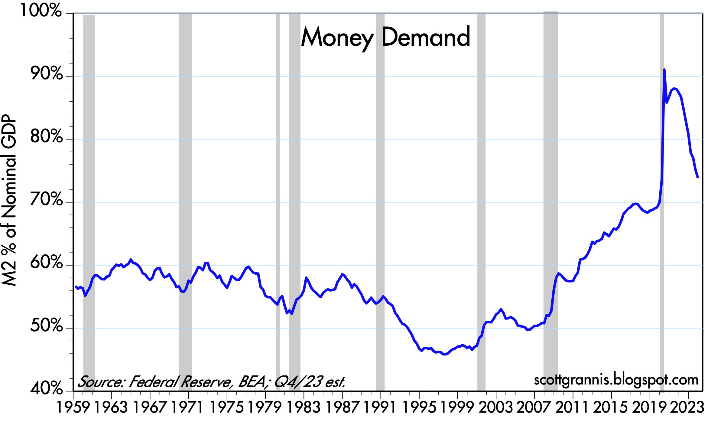
As I define it, "money demand" is best expressed as the ratio of M2 to nominal GDP, which can be thought of as the amount of cash that the average person wants to hold compared to his or her annual income. Chart #3 suggests that, as is the case in the previous two charts, monetary conditions have almost returned to normal. Money demand surged during the Covid crisis, only to reverse once the economy got back on its feet. Money demand now is almost back to pre-Covid levels. There is no longer a huge surplus of unwanted money to fuel rising prices.  

Chart #4

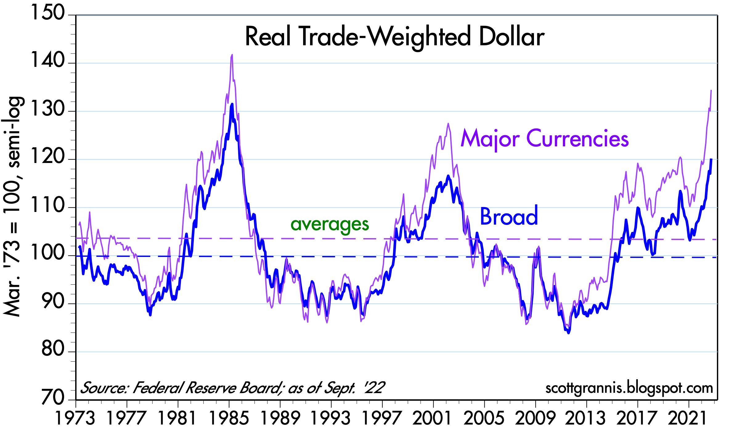
Chart #4 shows the value of the dollar vis a vis a relatively small basket of major currencies and a large basket. Most importantly, the chart adjusts for inflation differentials, which means that it is a good indicator of the purchasing power of the dollar in different countries. By any measure, the dollar today is quite strong from an historical perspective. This is way tight money works: attractive interest rates plus confidence in the Fed's ability to constrain inflation create extra demand for dollars relative to other currencies. 

Chart #5

Chart #5 shows the rate of inflation according to the total and core versions of the Personal Consumption Deflator. Clearly, whatever the Fed has done in the past two years ago has resulted in a significant decline in inflation. 

Chart #6

Chart #6 shows the three major components of the Personal Consumption Deflator. Here we see that prices of durable goods have actually declined in the past year, while the prices of non-durable goods have increased only marginally. The only significant source of inflation is in the services area, which is dominated by wages. It's not unusual for wages to lag price increases in other sectors. Wage increases are thus likely to moderate going forward, and this will bring headline inflation back down to the Fed's target.

Chart #7

Chart #7 shows that corporate credit spreads are very low from an historical perspective. This is the bond market's way of saying that investors are quite confident in the outlook for corporate profits. And, by extension, confident in the future health of the economy. 

Chart #8

I have been updating and publishing Chart #8 for at least the past decade. To this day it amazes me that it has not received more attention. The 3.1% trend line (green) represents the growth path that the economy followed from 1965 through 2007. The 2.2% trend line (red) represents the growth path that largely has prevailed since mid-2009. If the economy had regained the 3.1% growth path after the 2008-2009 Great Recession, it would be fully 25% bigger in real terms today! (What a difference 1% less growth per year can make!) What explains today's slower growth should be the issue that is front and center of the national debate. My short explanation is that the economy has lost its dynamism due to 1) excessive government spending, 2) increased tax and regulatory burdens, and 3) rising transfer payments.

Chart #9

Chart #10

Charts #9 and #10 compare the level of corporate profits to the nominal size of the US economy. By either measure, profits are exceptionally strong. If this is the price of "tight money" then let's have more of it! (Note: I have excluded profits and losses generated by the Federal Reserve's abundant reserve regime from overall corporate profits.)

Chart #11

A traditional measure of equity valuation on a macro level compares the price of stocks to the trailing 12-month sum of after-tax corporate profits (the price-earnings ratio, or PE). Chart #11 does the same, but it uses the level of after-tax corporate profits as calculated by the National Income and Products Accounts over the past quarter. This is a more timely and more consistently-calculated measure of profits than the traditional PE ratio. (I credit Art Laffer for this, an approach he has been using for over 40 years.) By this measure stocks are relatively expensive, but not extremely so. 

Chart #12

Borrowing from Art Laffer again, Chart #11 compares the theoretical level of corporate profits (calculated as the capitalized value of NIPA profits—profits divided by the 10-yr Treasury yield) to the market value of stocks as proxied by the S&P 500. Note that, according to Chart #12, stocks were hugely "overvalued" in 2000, and they were also very overvalued at that time according to Chart #11. Today, however, stocks appear to be appropriately valued, since their actual and nominal valuations are roughly equal. 10-yr Treasury yields both drive and explain the differences between these two measures of equity valuation.

This in turn implies that lower interest rates (which should follow the decline in inflation) will increase the appeal of equities as an asset class. This in a nutshell is the "Fed put" that I mentioned in my previous post. Tight money hasn't hurt the economy at all.

Thursday, November 30, 2023

A reassuring outlook


This is a short post to update M2, GDP, and inflation statistics. All are consistent with the view that the economy is growing at a moderate pace and inflation is fast approaching the Fed's target (indeed, by some measures it is already below target).

M2, the most important monetary variable that the world (and the Fed) seem resolutely to ignore, continues to decline. It ballooned in 2020 and 2021 as $6 trillion in deficit-financed COVID "stimulus" spending was mysteriously monetized. Since then, excess M2 has dropped by more than half, and the remainder has been effectively neutralized by Fed interest rate hikes.

In apparent defiance of multiple forecasts that Fed tightening would surely result in a 2023 dominated by recession, GDP grew at a recently-revised and robust 5.2% annualized rate in the third quarter. Once again, market wisdom (e.g., the economy has the unique ability to confound the majority of forecasts) has proven correct. Those who still adhere to Phillips Curve thinking are still scratching their heads: how is it that the economy can strengthen even as the Fed tightens and inflation falls?

It is now abundantly clear that the Fed has no reason to tighten monetary conditions any further. Inflation is within spitting distance of its target. Indeed, the only question at this point is When will they begin to ease? The market is now quite sure that the first easing will come at the May '24 FOMC meeting, but there is no reason they can't ease well before then. Thus, there is reason to remain optimistic about the outlook for the economy and the financial markets.

Chart #1

Chart #1 shows the level of the M2 measure of the money supply, arguably the best measure of money that is easily spendable. Since 1995, M2 grew by about 6% per year, all the while inflation remained relatively low and stable. The "bulge" in M2 has now shrunk by more than half, thanks to negative M2 growth and ongoing growth in prices and the size of the economy. 

Chart #2

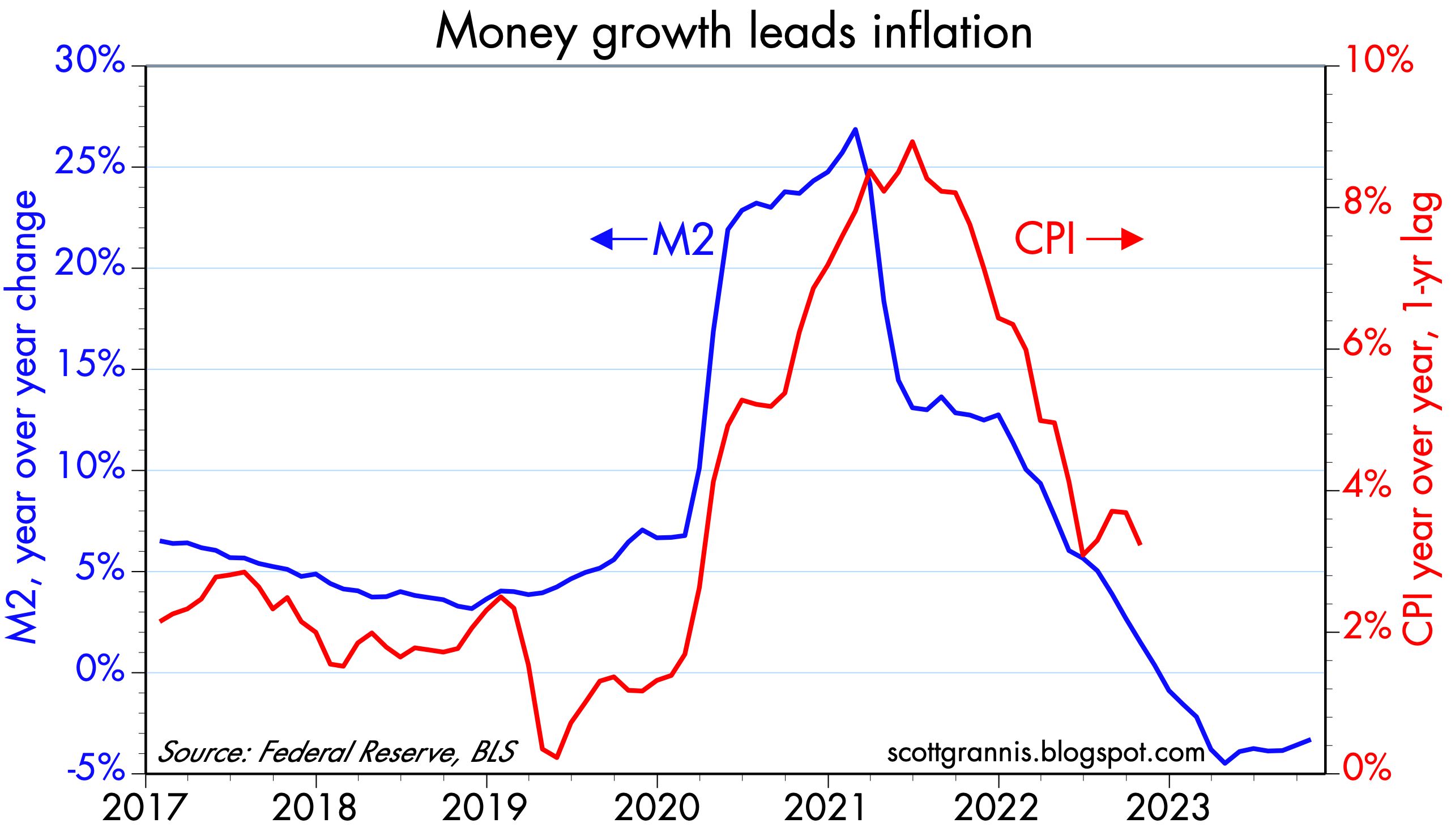
Chart #2 is designed to show how growth in M2 predicts inflation by about one year. Negative M2 growth since late 2022 strongly suggests that measured inflation will be declining for the next year.

Chart #3

Chart #3 looks at what I call "Money Demand." It's the ratio of M2 to nominal GDP, and it is best described as the amount of readily-spendable cash money that households are willing to hold expressed as a percentage of their annual income. Money demand surged during the onset of the Covid crisis, only to then collapse as the world slowly returned to normal. In times of crisis it is natural for folks to want to hold bigger money balances, and to subsequently spend down those balances as the crisis passes. Money demand today is almost back to where it was pre-Covid by this measure. Today, folks are still willing to hold some extra cash thanks to the fact that interest rates on cash have soared. Short-term interest rates of 5% or so actually more than make up for current inflation rates of 3% or so. So there's an incentive to hold on to cash rather than spend it. For most of the past 3-4 years or so, those incentives were reversed: interest rates were lower than inflation, so the smart thing to do was to "borrow and buy." Today the monetary incentives are tilted to "save and invest."

Chart #4

Chart #4 looks at the 6-mo. annualized rate of inflation according to the total and core versions of the personal consumption deflator. Both have now fallen to 2.5%, which is only marginally above the Fed's target of 2%. 

The inflation drama is over. 

Saturday, October 28, 2023

Growth and inflation update: not much to worry about


The big news this week—though widely anticipated—was the 4.9% annualized growth of the economy in the third quarter. Analysts still infected by Phillips Curve thinking worried that a strong economy would encourage the Fed to keep rates "higher for longer," thus posing the risk of a recession next year. (Note: economic growth does not cause inflation. In fact, over the past year the economy has continually beat growth expectations, all the while inflation has been declining rather significantly.) By week's end, worries about Middle East tensions trumped growth fears, and inflation data showed that disinflation, not inflation, remains the order of the day. Interest rates backed off their highs, and equities traded lower. Expect Phillip Curve nightmares to continue to haunt the market this coming week. As for Middle East tensions, well, that merits concern but I don't know of any obvious solution to that.

Chart #1

While 4.9% growth in one quarter certainly stands out as a big number, it's worth noting that it's an annualized number. In fact, the economy reportedly grew only 1.2% in the third quarter. And as Chart #1 shows, the path of real GDP (blue line) experienced only a small wiggle to the upside with this latest number, and it will probably experience a much smaller wiggle next quarter. The big story with GDP is that the economy has been growing by more or less 2.2% since mid-2009. That's a lot slower than the 3.1% trend which prevailed from 1965 through 2007. Today, the U.S. economy is unfortunately not in danger of growing too fast. It is just muddling along, fighting the headwinds of very high tax and regulatory burdens aggravated by excessive government spending on transfer payments and "green" energy boondoggles (green energy needs subsidies to compete since it's woefully inefficient).

 Chart #2

Chart #2 shows the year over year change in the GDP deflator, which is the broadest measure of inflation we have. By this measure, inflation has fallen from a high of 7.7% to now 3.2%. 

Chart #3

Chart #3 shows the 6-mo. annualized rate of change of the Personal Expenditures Consumption Deflator and its core (ex-food and energy) version (note: the PCE deflator is a better measure of inflation than the CPI because the weights of its components change dynamically as consumer habits change). Over the past six months both of these measures show inflation rising at a 2.8 - 3.2% annual rate, only about 1 percentage point faster than the upper end of Fed's target. 

Chart #4

Chart #4 breaks down the Personal Consumption Deflator into its 3 main categories. Note the impressive decline in durable goods prices which began in 1995, the year China first opened its economy to world trade. Most of the increase in inflation in recent decades comes from the service sector, which in turn reflects mostly wages. The huge increase in wages alongside a significant decline in durable goods prices means that an hour's worth of work today buys more than 3 times as much in the way of durable goods as it did in 1995. We've never before seen such an increase in purchasing power; prior to 1995, durable goods prices never declined on a multi-year basis.

Chart #5

Chart #5 shows real and nominal yields on 5-yr Treasuries and the difference between the two (green line), which is the market's expectation for what CPI inflation will average over the next 5 years. The rise in yields over the past 18 months has been driven almost exclusively by the rise in real interest rates. Real rates, in turn, are the best measure of how tight monetary policy is. Thus, tight money (as measured by a 340 bps rise in real yields) has brought inflation expectations down to about 2.3%, which is almost exactly the upper bound of the Fed's target for PCE inflation (2%), because the CPI tends to exceed the PCE deflator by about 30-40 bps per year.

Chart #6

Chart # 6 compares the level of real yields on 5-yr TIPS to the 2-yr annualized growth of GDP (which I use because it smooths out the random quarterly variations in actual GDP growth, and it likely mimics the public's perception of what current GDP growth is). Real yields tend to track the strength or weakness of the economy; high real yields prevailed in the late 1990s when the economy was exceptionally strong (growth rates of 4-5%), and real yields have been low during most of the past decade as the economy has averaged 2% annual growth. With the exception of the past 18 months, of course, when real yields have surged. If the economy remains on a 2.2% growth path, it wouldn't be unreasonable to expect that real yields will decline significantly from today's 2.4% levels. That would likely coincide with a relaxation of the Fed's monetary stance, and that, in turn, would provide welcome relief to the market.

Sunday, August 13, 2023

A look inside the inflation numbers says the Fed is done


I've long believed that the Fed and most media observers are confused about how inflation works. That's because most people are still captive to the traditional Phillips Curve model of inflation, which says that in order to tame inflation, the economy needs to suffer a significant slowdown in growth. In turn, that means that the Fed needs to be very tight for a significant period; no easing until early next year. 

So the market is convinced the Fed will be on hold through at least the end of the year. But a look inside the inflation statistics suggests that is likely to be unnecessary; inflation is very likely to continue to decline in the months to come. At some point, likely well before year end, the Fed is going to have to concede that inflation has been licked—and lower rates accordingly. 

And now for some charts:

Chart #1

Chart #1 shows the quarterly annualized rate of inflation according to the GDP deflator. This is the broadest and most inclusive measure of inflation that we have. In the second quarter prices throughout the economy rose at a mere 2.2% annualized rate—exactly in line with the Fed's target. Why is no one else talking about this? To me, it's abundantly clear that inflation is yesterday's news. Inflation is more likely to decline further than it is to rise. 

Chart #2

Chart #2 looks at the 6-mo. annualized growth of the Consumer Price Index with and without shelter costs, the latter of which comprise over one-third of the total. I've been highlighting this for a long time: shelter costs are notorious for measuring housing prices and rents with a lag of one year or more. Absent shelter costs, the CPI over the past six months is up at a teeny-tiny annualized rate of only 0.6%! Including shelter costs, the CPI over the past six months is up at a 2.6% annualized rate, which is only slightly above the Fed's 2% target. (Actually, the Fed is targeting 2% for the PCE deflator, which is equivalent to about a 2.5% CPI.) Why all the anguish about inflation "still running hot?" 

Chart #3

Chart #4

It's well-known that housing prices and rents stopped rising about a year ago, but owner's equivalent rent, the largest single component of the CPI (red line) is still rising, albeit at a somewhat slower rate in recent months. As Chart #3 shows, OER lags changes in housing prices by about 12-18 months. As Chart #4 shows, OER inflation has been falling—and it will very likely continue to fall for the next 6-9 months. Before the year is out, OER disinflation might well be enough to cause the overall CPI to turn negative.

Chart #5

Chart #5 shows the three major components of the Personal Consumption Deflator, which increased by 3.0% in the year ending June. Note how both the non-durable goods and durable goods indices have been unchanged since June of last year. This means that the only source of inflation in the economy since June of 2022 has been in the service sector. Shelter costs figure prominently in this sector, just as they figure prominently in the CPI. Shelter costs are badly measured; correcting for that we find that inflation is no longer a problem.

Chart #6

Chart #6 shows the percentage of businesses who report paying higher prices, according to the ISM survey. Only 57% reported paying higher prices in July, and that is about the same number that reported paying higher prices in the year prior to Covid. In short, we're back to where we started on inflation.

Chart #7

Chart #7 shows the nominal and real yields on 5-yr Treasuries and TIPS, and the difference between them (green line), which is the market's expectation for what CPI inflation will average over the next 5 years. By this measure, the bond market fully expects the Fed will deliver on its inflation promise: 5-yr inflation expectations are about 2.2%. 

Chart #8

Now let's turn to the economy. Contrary to the hand-wringers who lament that the economy is "running hot" and thus we're unlikely to see further declines in inflation, Chart #8 (monthly changes in private sector jobs) makes it clear that the growth of private sector jobs has been declining since early 2022. The private sector is the one that counts, and jobs there have grown by only 2.2% in the past year. That's down sharply from the 5.0% year over year growth rate through July '22. Over the past six months, private sector jobs have increased at only a 1.6% annualized rate. Judging by the jobs market, the economy is unlikely to do much better than 2% going forward. That's not even close to "running hot" in my book.

Chart #9

Chart #9 compares the level of inflation-adjusted GDP (blue line) with two trend lines (green and red dashed lines). It's plotted on a log scale axis, which means constant rates of growth show up as straight lines. Here we seen that since the summer of 2009, the US economy has grown on average by about 2.1% per year. That's way less than the 3.1% growth trend that prevailed from 1965 through 2007—21% less, in fact. If the economy had followed a 3.1% trend growth path, it would be 26% larger today. We live in a slow-growth world, thanks to massive (and terribly wasteful) government spending on transfer payments and inefficient "green" energy.

Economic growth has been sluggish for the past 14 years, yet that didn't stop inflation from rising to double-digit levels. That's because growth has nothing to do with inflation; inflation is all about money. By sharply boosting short-term interest rates since early last year, the Fed has managed to bring money supply and money demand back into line, and that is why inflation has fallen. 

M2 growth has slowed dramatically and inflation has fallen because interest rates have soared. Higher interest rates make holding money more attractive, AND they make borrowing money less attractive. The public today is more willing to hold onto M2 and less willing to spend it. The public is less willing to borrow money since interest rates are so high and more willing to pay back existing loans. (Banks create M2 money when they make net new loans.) The result is a balancing of the supply of money and the demand for money, and the gradual disappearance of inflation.

Currently, the market expects the Fed to hold rates steady through the early part of next year, and then to begin easing. If my reading of the monetary and inflation tea leaves is correct, the Fed should begin cutting rates now, not next year. If they wait too long, we will see the CPI entering negative territory (i.e., deflation). 

Would deflation be a huge problem? Many seem to think so, but I'm not so sure. The argument against deflation is that consumers would pull back on their spending—and weaken the economy—because cash would become an earning asset. Why buy something now if you can buy it later with fewer dollars? The problem with this line of thinking is that economic growth does not depend on consumers spending money. We don't spend our way to prosperity, we work hard and invest in order to prosper.

Growth is the by-product of savings and investments that boost the productivity of the average worker, in addition to the organic growth of the workforce. For example, and roughly speaking, a 1% increase in productivity plus a 1% increase in jobs results in real economic growth of 2%.

Be patient. Sooner or later the numbers will convince the Fed that lower rates are called for. In the meantime, enjoy an economy that continues to grow, albeit relatively slowly, and inflation that continues to decline.

P.S. Two days ago we returned from a two-week family vacation in West Maui (Napili Bay, to be precise). If you've been following the news, you know that last week an unimaginably disastrous tragedy befell Lahaina, which is about 8 miles south of Napili. Although we suffered no harm, we were without electricity and communications with the rest of the world for 3+ days. Our hearts and prayers go out to those (several of which worked at our hotel) who lost their homes, friends, and family members.

Thursday, January 12, 2023

Why inflation has declined but the economy remains healthy


The December CPI report released today supports everything I've been saying for months. Inflation pressures peaked in June, with the year over year CPI registering 9.0%, the 6-mo. annualized rate 11.2%, and the 3-mo. annualized rate 11.0%. As of December those same measures were significantly lower, registering 6.4%, 1.9% and 1.8%. Quite an impressive decline! Inflation is no longer a problem.

The ex-energy version of the CPI showed the same decline, only on a smaller scale, with the peak also occurring in June: YOY 6.6%, 6-mo. 7.6%, and 3-mo. 8.6%. As of December, those same measures were 6.4%, 5.1%, and 3.5%.

The core version (ex food & energy) declined as well: June 5.9%, 6.8%, and 7.9%. December: 5.7%, 4.6%, 3.1%.

Some observations:

1) Energy prices traditionally are by far the most volatile component of the CPI, and this past year was no exception. Ex-energy and ex-food & energy measures of inflation were lower overall than the total and much less volatile, which means a lot of the inflation we experienced was of energy origin and temporary.

2) Any change in the trend of a measure of growth over time (e.g., inflation, disinflation) should show up first in the 3-mo. annualized numbers and later in the year over year measures. This is exactly the pattern we have seen with the recent surge in inflation which began in January 2021, when year over year inflation was 1.4%, 6-mo was 2.9%, and 3-mo. was 2.9%. We haven't come full circle yet, but we're getting pretty close, since the 3-mo. annualized measures of inflation (total, core and ex-energy) are now in the range of 1.8% to 3.5%.

Check out these posts from last year, which show I was way ahead of the crowd in seeing the peak in inflation pressures. Moreover, I have consistently argued that the Fed did not need to crush the economy in order to bring inflation down and that is even more true today.

Fed tightening need not result in a recession (June)
Market to Fed: no need to panic (July)
Inflation pressures cool, economic outlook improves (August)
M2 says the Fed doesn't need to crush the economy (August)
More predictors of lower inflation (September)
Fed's Rx for the economy should be a tincture of time (October)
Higher interest rates have solved the inflation pr... (December)

As for the Fed, I would hope they realize that inflation pressures were worse in the first half of last year at a time when the economy suffered two quarters of negative growth (inflation adjusted), while inflation declined significantly in the second half of last year, when the economy enjoyed two quarters of roughly 3% growth (inflation adjusted). This, of course, runs completely contrary to Phillips Curve thinking, which holds that just the opposite is true: namely, that a weaker economy is a prerequisite for reducing inflation.

Moral: the Fed doesn’t need to crush the economy to bring inflation down. Why? Because inflation is caused by too much money, not too much growth. M2 growth started slowing early last year, and the Fed raised interest rates in an unprecedented fashion; that combination worked to bring inflation down because it reduced the excess supply of money and at the same time gave the public a strong incentive to hold on to their unusually large money balances instead of spending them (which would have aggravated inflation pressures). From a broader perspective, stronger economies almost always go hand in hand with low inflation, while chronically weak economies (e.g., Argentina) suffer from persistently high inflation.

There is every reason to think that inflation will continue to cool without the need for further Fed rate hikes. And contrary to what so many pundits are fond of saying these days, the unemployment rate needn’t have to rise in order for inflation to fall. Inflation has been falling quite nicely, thank you, even as the unemployment rate has fallen to historically low levels.

And don’t overlook the unique fact that, despite the Fed’s aggressive monetary “tightening,” credit and swap spreads have been declining for the past three months. If “tight” money were a problem, we should have seen credit spreads widen. But they haven’t. Why? Because higher interest rates are not necessarily bad for the economy, at least to the degree we have seen this past year. What’s so bad about 4-5% interest rates? I’m so old I remember when it was heresy to predict that 10-yr Treasury yields would decline to 7%. And at the time the economy was doing just fine.

“Tight” money came to have that moniker not because the Fed drove interest rates higher, but because in order to push rates higher the Fed had to drain reserves from the banking system. That made money scarce, and that was why monetary policy came to be known as “tight.” The Fed restricted liquidity and that caused marginal players to go bankrupt, which eventually slowed the economy and caused the demand for money to skyrocket, which in turn brought inflation down, but at a huge cost.

Everything changed in late 2008, because that was when the Fed decided to pay interest on bank reserves and simultaneously adopted a policy of abundant reserves (aka Quantitative Easing). Money today is not scarce, bankruptcies are not exploding, yet inflation is coming down. Why? Because higher interest rates have served to balance the demand and the supply of money, and when that happens, inflation declines. Money in the bank pays 4% or so today, and that’s a lot more attractive than the 0% you could earn on money balances a year ago.

That, in a nutshell, is why inflation is down and the economy is still OK. Chairman Powell, are you listening?

UPDATE, Jan.14: I have access to my charts again, so I want to post just this one to illustrate the above text:

Chart #1

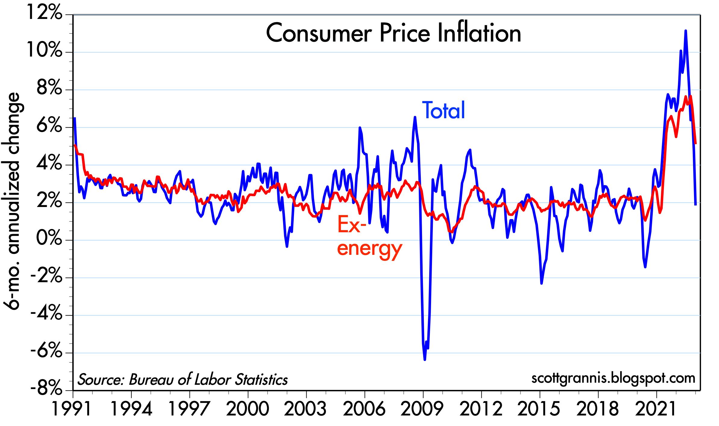
Chart #1 compares the 6-mo. annualized growth rate of the CPI (blue) and the ex-energy version of the CPI (red). This highlights the degree of volatility that energy contributes to the CPI. But it also highlights just how much the upward momentum of both measures has reversed definitively. The 3-mo. annualized growth of the ex-energy CPI has fallen to 3.5%, which all but ensures that the 6-mo. annualized measure will continue to decline. The 6-mo. growth rate of headline CPI is already back to levels that preceded Covid on a 6-month basis: 1.9%.

It's true that the year over year growth of CPI is still way above the Fed's target (i.e., 6.4% vs. 2%), but that ignores the much more important changes on the margin. If an MBA teaches you anything it is that you must always focus on the changes that are happening on the margin, not what has happened over the past year. On the margin, the housing market is definitely turning down. Yet about one-third of the CPI is based on the government's calculation of what homeowners would be paying if they were renting the house they own, and that is a very lagging indicator—as much as a year behind the reality of today's housing prices. We know for a fact that housing prices are turning down all over the country, so homeowner's rent will soon be subtracting significantly from the CPI.

Wednesday, October 19, 2022

Fed's Rx for the economy should be a tincture of time


As I've argued in recent posts, there's plenty of evidence to suggest the Fed has already tightened by enough to bring inflation down: the dollar is super-strong, real yields have risen sharply, the yield curve is inverted, commodity prices are plunging, and the housing market has run into a brick wall. Yet the Fed seems determined to tighten even more. I think they're driving by looking into the rear-view mirror. They're trying to burnish their reputation as an inflation fighter, after having fallen miserably behind the inflation curve in 2020 and 2021. And I think that the long-discredited Phillips Curve (which posits that unemployment must rise if inflation is to fall) still haunts the Fed governors' minds. It's all so unfortunate.

Fortunately, however, a recession is neither imminent nor inevitable. Industrial production and jobs are still growing at decent rates, 2-yr swap spreads are still in normal territory, and real interest rates are not prohibitively high. But the economy could fall into a recession if the Fed doesn't change course (aka "pivot") before too long. There's a precedent for this—in January 2019, when the Fed realized it had become too tight and reversed course—and I don't see why they can't do it again.

Chart #1

Chart #1 shows two measures of the inflation-adjusted and trade-weighted value of the dollar. By any measure the dollar is very strong. This is fully consistent with US monetary policy being tight and much tighter than that of any other major economy. Demand for dollars is strong, and there is no shortage of reasons for why that is so: geopolitical turmoil in Europe and East Asia would surely suffice. From an economics point of view, it would be highly unusual for a very strong currency to also be experiencing inflation (otherwise known as a loss of purchasing power). Prices all over the world, when translated into dollars, are falling.

Chart #2

Chart #2 compares the inflation-adjusted value of gold (red line) to the inverted value of the dollar (blue line). Big moves in the dollar's value almost always accompany inverse moves in commodity and gold prices. What's striking about today is that gold and commodity prices have not fallen further given the strength of the dollar. Long-time readers will note that this chart, which has appeared many times in recent years, has correctly predicted falling gold prices.

Chart #3

Chart #3 compares the nationwide average rate for 30-yr mortgages (orange line) to an index of new mortgage originations (mortgages taken on to finance the purchase of a new home). Mortgage rates have doubled this year, and new mortgage originations have fallen by half. That's a huge development! In other words, soaring mortgage rates combined with very high prices have dealt a heavy blow to the housing market. This is a perfect example of how higher interest rates can change incentives and also slow the economy. People today are much less willing to borrow (which implies higher money demand) and much less willing to buy (which also implies a demand for cash rather than goods. The sharply increased demand for money is acting directly to neutralize much of the extra M2 money supply that was created a few years ago. And that, in turn, means declining inflation pressures. (Recall that M2 has been flat for the past 9 months or so.)

Chart #4

Chart #4 compares housing starts (blue line) with an index of homebuilders' sentiment. Sentiment has plunged in recent months as homebuilders have seen a sudden slowdown in home purchases. In the past, sentiment has often been a very good predictor of housing starts. We could be on the verge of seeing a big slowdown in residential construction, and that would be a surefire contributor to a recession. Chairman Powell, please take note!

Chart #5

The top portion of Chart #5 compares the average rate on 30-yr mortgages (white line) with the yield on 10-yr Treasuries (orange line). The bottom portion shows the difference between the two, which looks to average about 150 bps in normal times. The spread today, in contrast, is over 300 bps; no wonder the housing market is in trouble. As the bottom chart also suggests, such peaks in spreads is typically short-lived, since they most likely reflect panicked selling and hedging by institutional players. Something is likely to change before too long, and it's likely that mortgage rates and spreads to Treasuries will decline.

Chart #6

Chart #6 compares the value of the dollar (orange line) with the real yield on 5-yr TIPS. As I've noted before, 5-yr real yields on TIPS are equivalent to the market's expectation for what the real Fed funds is going to average over the next 5 years. Real yields have soared by almost 400 bps in just over a year, which is not only unprecedented but also indicative of an extreme tightening of monetary policy. It's sort of like giving a horse tranquilizer to a mildly psychotic patient. Please, Chairman Powell, enough is enough!

Chart #7

Chart #7 compares an index of U.S. industrial production with a similar one in the Eurozone. Without a big decline in industrial production it is very unlikely that the U.S. economy is experiencing a recession. And so far, industrial production continues to grow. The Eurozone economy has been battered by the Ukraine conflict and soaring energy prices, yet industrial production has yet to decline. Both economies have an urge to recover what was lost to the Covid shutdowns.

Chart #8

Chart #8 shows the level of private sector non-farm employment, which continues to grow at a healthy pace. Recessions are famous for throwing people out of work, but we have yet to see any sign of that in the U.S. economy. 

Chart #9

Chart #9 shows the level of 2-yr swap spreads, my favorite indicator and predictor of the health of the U.S. economy and financial markets. Swap spreads are still within a "normal" range, which implies that liquidity is still abundant and the corporate profits and the economy are likely to remain reasonably healthy. As the chart suggests, swap spreads would have to rise appreciably before one might expect to see a recession on the horizon. Note also that swap spreads have tended to decline in advance of recoveries. 

Chart #10

Chart #10 is my favorite recession "dashboard," since it tracks two key indicators of monetary tightness and how they interact to produce recessions. Every recession here was preceded by an inversion of the yield curve (red line) and a significant rise in real short-term interest rates (blue line). As I noted in Chart #6, the market expects the Fed to raise short-term real interest rates (a key measure of Fed tightness) to at least 2% in coming years, but that has yet to happen, and so far the yield curve is only mildly inverted. To be fair, I'd score this chart as tentatively predicting a recession within the next year or so. 

Summing things up, there is little doubt that the Fed has already tightened monetary conditions to a significant degree. Sensitive prices (e.g., the dollar, commodity prices, gold) have turned down meaningfully, which alone would be a decent indicator of lower inflation to come. It would be a real shame if the Fed were to continue on its present tightening course in the belief that only by crippling the economy (e.g., higher unemployment, falling industrial production, and a collapsing housing market) can they hope to get inflation back under control. 

My recommendation would be for Dr. Powell to give the economy a "tincture of time," not higher interest rates.

Friday, September 16, 2022

The dollar's strength is telling Powell to chill


Here's my understanding of the current collective wisdom of the market:

  • Both inflation and the US economy are "running hot."
  • The Fed needs to boost rates dramatically to slow the economy and bring down inflation.
  • The US economy is very likely to suffer another recession as a result.
  • The outlook is not so terrible, however, since once it is clear that inflation is under control the Fed will be able to lower rates.
  • The Fed will hike the funds rate to a peak of 4.5% over the next 6-7 months, then cut rates to 3.75% by mid-2024.
  • Inflation, currently running about 8%, will fall back to 2% or so by the end of next year

As I've pointed out in previous posts, however, the Fed and the market are ignoring some very obvious signs which strongly suggest that the Fed's best course of action is to NOT follow this script: 1) the dollar is extremely strong, 2) commodity prices are falling, 3) the M2 money supply has not grown at all for the past 6 months because the federal government is no longer sending Covid stimulus checks to the public, 4) measured inflation is already declining, and 5) inflation expectations have declined significantly, down 120 bps since early March (inflation expectations peaked at 3.69% and are now 2.49%). Moreover, yesterday FedEx shocked the market by suggesting that demand has all but collapsed. All of this suggests money is already tight enough to impact the economy, and more could be destructive.

The market is telegraphing that what the Fed is planning to do is potentially destructive to the economy. Why does the Fed still think the only way to lower inflation is to undermine the economy? That's Phillips Curve thinking, and it has been debunked countless times. Growth doesn't cause inflation. Too much money is the culprit (i.e., money that exceeds the demand for it). What the Fed needs to do in cases like today's is to 1) bolster the demand for money by raising interest rates (they have accomplished that goal already!), and 2) reduce the unwanted supply of money (something that is well underway since the M2 money supply stopped growing long ago). 

If the Fed were to follow the market's script, we could see real problems develop. The US economy could weaken dramatically, creating a double whammy for the working class: rising unemployment on top of already-declining real wages. This is totally unnecessary.

I have to believe they won't follow through on their hiking hysteria. And that should prove very positive for the economy and the market.

A few charts to illustrate the situation with the dollar:

Chart #1

Chart #1 shows two measures of the trade-weighted, inflation-adjusted value of the dollar. Each uses a different basket of currencies: major currencies vs. most currencies. The dollar today is within inches of its all-time highs according to these measures. It's not healthy for the dollar to be this strong, because it is symptomatic of very restrictive monetary policy. Sure, European currencies are weak because their economies are at risk with the Ukraine-Russia conflict. It's logical that Europeans would rather hold dollars, and the Japanese too (the yen is plunging). That's fine, but the Fed should figure this into its calculations: increased demand for dollars with the dollar at all-time highs calls for looser, not more restrictive Fed policy.

Chart #2

Chart #2 compares the price of gold with the real yield on 5-yr TIPS. Real yields are a direct measure of the relative tightness or easiness of Fed policy. The Fed tightens by causing real yields to rise (shown here by a drop in the blue line), and tight monetary policy from the Fed makes gold less attractive since it yields nothing in comparison. Tight money has always caused gold prices to decline, while easy policy feeds into rising gold prices. 

Chart #3

Chart #3 compares real and nominal yields on 5-yr Treasuries, with the difference being the market's expectation for what CPI inflation will average over the next 5 years. Inflation expectations have averaged a very modest 2.5% for more than a year, despite the big increase in inflation we've lived through. This can only mean that the market realizes that the current inflation is a one-off phenomenon that is very likely to reverse in the near future. 

Note also that the last time TIPS yields were as high as they are today was in late 2018. Check out my posts from back then, here and here. This episode was reminiscent of today, in that both times the Fed was hell-bent on tightening policy at a time when the market was warning that a tightening was not needed—and stocks crashed both times. The Fed finally reversed course in early 2019, that unleashed the economy. We can only hope they will do this again!

Chart #4

Chart #4 compares the price of gold to the value of the dollar (inverted on the chart). A strong dollar has always been bad for gold, and a weak dollar good for gold. If the Fed hikes rates aggressively from here the outlook for gold and many other commodities looks quite bleak.

Chairman Powell, you need to take a chill pill, and the sooner the better. Please don't give us aggressive tightening rhetoric at next week's FOMC meeting. 

Sunday, April 1, 2018

Charts we never thought we'd see

Ten years ago we were in the early stages of what would later prove to be the most severe economic downturn since the Great Depression. We'd all seen the charts and read the history of that tragic event and its terrible impact on the country, and we hoped it would never happen again. But there were things 10 years ago that we never expected to see, which later unfolded to our lasting astonishment. Here are just a handful of charts, which I offer to remind us of the amazing economic and financial developments of the past decade, about whose nature economists are still debating.

Chart #1

Chart #2

Chart #1 shows the dramatic—and ongoing—decline in initial unemployment claims. Ten years ago the vast majority of economists would have said that claims could never decline much below 300K per week, since that was most likely the minimum amount of normal turnover in the labor force. Yet here we are today with weekly claims approaching 200K per week. And as Chart #2 (the ratio of weekly claims to total payrolls) shows, claims have NEVER been so low in recorded history, relative to the size of the workforce. The risk of a typical worker finding him or herself laid off has never been so low. Today, employers are more likely to complain that it is harder to find skilled workers than to complain about the workers they have.

It's a brave new world for workers. But it makes central bankers nervous, since they worry that a tight labor market could result in higher wages that in turn could fuel rising inflation. This worry has its origins in the Phillips Curve theory of inflation, but that theory has never found substantiation in the data—it's the economic equivalent of an old wives' tale. Today's Fed governors are aware of this, so they are not necessarily sitting on pins and needles, but it is a source of policy uncertainty nonetheless.

Chart #3

Chart #3 shows what is arguably not only the most astounding economic or financial thing that happened in the past decade but also the most unbelievable. If you had asked any economist 10 years ago what were the chances of the Fed creating over $2.5 trillion of excess reserves in the space of a few years he or she would have stated flatly: ZERO. It couldn't possibly happen, because if it did it would herald the collapse of the dollar and an inevitable hyperinflation. The consequences of such an event were so terrible that the event itself was considered to be impossible. Yet here we are today with inflation running around 2% (as it has for more than a decade) and the dollar trading pretty close to its long-term, inflation-adjusted average vis a vis other currencies.

Prior to late 2008, when the Fed launched its Quantitative Easing program, excess reserves were measured in billions of dollars, not trillions. The Fed managed monetary policy by adding or subtracting reserves (which prior to late 2008 paid no interest) from the banking system: by creating a scarcity of reserves, banks would be forced to pay more to borrow them, and that would result in higher short-term interest rates. Today, with a previously-unimaginable abundance of reserves, the Fed has resorted to pegging the interest rate it pays banks that hold reserves, and that seems to be working. Regardless, we've been sailing in uncharted monetary waters for most of the past 10 years, and economists are still debating how everything is going to work out in the years to come. 

To this day there are still legions of observers who argue that what the Fed did starting in late 2008 was simply a massive amount of money-printing, a desperate monetary stimulus that was necessary to avoid a depression, and the economy has been running on fumes ever since. 

Others, myself included, believe that what the Fed did was not monetary stimulus at all. It was simply a rational response to an unprecedented increase in the public's demand for money and money equivalents, which in turn was the result of the near-collapse of the global financial system and the worst global recession in modern memory. The world was running very scared, so the demand for safe monetary assets was nearly insatiable. Unfortunately, there were not enough T-bills (the classic monetary safe haven) to go around. By deciding to pay interest on bank reserves, the Fed effectively made bank reserves equivalent to T-bills, and that was exactly what the world wanted: trillions more of safe, default-free, interest-bearing assets, and the Fed had the ability to create bank reserves with abandon if need be. And so it was that the Fed bought trillions of notes and bonds, and in the process created trillions of T-bill equivalents. I explained this in greater detail in a post five years ago ("The Fed is not printing money"). It did the trick, and now the Fed is beginning to slowly unwind QE, as it should, given how much confidence has returned in the last year or so.

 Chart #4

Chart #4 shows that the inflation-adjusted Fed funds rate has been negative for almost exactly the past 10 years. Never before in modern times has this occurred. Those same legions of observers that think QE was monetary stimulus in disguise argue that real interest rates have been artificially depressed by the Fed's actions. I and others, in contrast, argue that real short-term interest rates have been extraordinarily low because of extraordinarily strong demand for safe, short-term assets. If the price of a bond is bid up high enough, its yield will turn negative; it's a simple matter of bond market math. T-bills, and bank savings deposits, have been in such high demand that investors have been willing to accept zero or negative real yields. The Fed has not been artificially lowering rates, the market has driven rates to very low levels because of very strong demand for safety and very high levels of risk aversion.

Chart #5

Prior to the Great Recession, most economists would have said that the 2% yields on 10-yr Treasuries we saw in the post-Depression years would never recur, because those yields were the by-product of very weak growth and very low inflation. Yet those same 10-yr yields fell to an all-time low of 1.3% in July 2012, during a period in which the US economy grew at a 2.4% annualized rate and inflation was on the order of 2%. I believe the only way to explain these extremely low yields is to understand that they were driven to low levels by intensely strong demand for default-free assets. After all, the Fed doesn't control 10-yr yields; the market does. Today, inflation is about the same as it was in 2012, but the economy is a bit stronger and confidence is much stronger. Demand for safe assets has declined, as a result, and 10-yr yields have doubled. It all makes sense.

Chart #6

Finally, we come to what is arguably the most unexpected chart of them all, Chart #6. Prior to the Great Recession, the US economy had suffered many recessions, but after a few years it had always bounced back to its long-term trend. And in fact, the deeper the recession, the stronger the recovery. Milton Friedman formalized this observation in 1964, calling it the Plucking Model (see my discussion of this here). Unfortunately, the economy hasn't bounced back this time: growth since mid-2009 has averaged about 2.2% per year. I've attributed this slow growth to the heavy burdens of government spending, regulations, and taxes, all of which rose beginning in late 2008. If the economy had returned to its previous growth path, it would be at least $3 trillion bigger today.

Chart #7

Chart #7 shows how productivity (output per hour of those working) has been extraordinarily low for the past 10 years; this is the main explanation for why growth has failed to snap back to its long-term trend. Prior to the Great Recession, productivity averaged about 2% per year. But productivity has been much less than 2% over the past 10 years. As I've noted, the lack of productivity can easily be traced to weak business investment, which in turn is a natural response to increased tax and regulatory burdens.

Although extraordinary and wholly-unexpected things have happened over the past 10 years, there is still a logical way to understand what has happened and why. And it follows, therefore, that it is reasonable to assume that things could get a lot better in the future if the Fed continues to slowly unwind QE and the federal government continues to reduce our onerous regulatory and tax burdens.

As it has since 2009, I believe it pays to remain optimistic.