Showing posts sorted by relevance for query Dr. Copper. Sort by date Show all posts
Wednesday, July 7, 2010
Dr. Copper says the patient is fine
The price of copper is traditionally such a good indicator of the economy's health that copper has earned the nickname "Dr. Copper." In this chart we see copper trading today at about the same level as it was for a few years prior to the crash of 2008. At $3/lb., copper today is worth almost five times as much as it was in November 2001, when most commodity prices hit bottom. That was also the end point of the 2001 recession, and also the beginning of what would be many years of very accommodative monetary policy from the the Federal Reserve.
I keep hearing the drumbeat of deflation concern, but it's hard for me to understand. Back in the early 2000s deflation risk was extremely high: gold fell to $260/oz., most commodity prices hit lows they hadn't seen since the 1970s, and the dollar was soaring against most currencies. Now all these key indicators of the scarcity of money are reversed: commodity prices are near all-time highs, gold is $1200/oz., and the dollar is in the lower end of its historical trading range vis a vis other major currencies.
If nothing else, copper prices today tell us that deflation is not a concern but that inflation is. I think copper also is telling us that the global economy is pretty healthy, as demand for the metal has been unusually strong for a number of years. My friend Mike Churchill points me to an interesting story suggesting that copper supply is also relatively tight. Whatever the case, $3 copper is saying that deflation and recession are simply nowhere to be found in the global economy.
Tuesday, February 9, 2010
Copper update and other musings
Early in January I posted a chart of copper prices with the title "Dr. Copper says the patient has recovered." I noted that the huge rebound in copper prices was a good sign that the global economy had recovered from its slump and was rapidly returning to health. Since then, copper prices have fallen about 15%, commodity prices in general have slumped, and so have equity prices.
The shorthand version for what has happened in the past month is a reversal of the "carry trade:" risk assets are down, and the dollar is up. Fear is up too, with the VIX bouncing from the teens to the mid-20s. Concerns over Greece and the stability of the EU are likely catalysts for the recent bout of nerves, but so too is the sudden rise of populist attacks on big banks (see my friend Don Luskin's article in today's WSJ on the subject), concerns that Fed and some other central banks are preparing to tighten monetary policy, and the fact that numerous countries, including the U.S., are being forced to confront the problem of out-of-control budget deficits brought on by profligate public sector spending practices.
Does this selloff in risk assets mark the end of the recovery and the beginning of a renewed bout of economic weakness? Could a Greek default really bring down the EU and/or the Euro, and ultimately infect the U.S. economy with another case of the economic willies? Is the global recovery so tenuous that it can't bear interest rates that move up from zero, or that it can't survive without government spending life support?
My position for the past year or so has been that the U.S. economy has recovered in spite of all the fiscal and monetary stimulus that has been thrown at it; that in fact the recovery would be stronger if it weren't for stimulus. I think fiscal and monetary stimulus are vastly over-rated. No one can prove what the government spending multiplier is, but I'll vote for it being negative. I don't see how the act of taking money from John and giving it to Joe can result in a stronger economy, and if Joe ends up being less careful about spending the money he's been given than John (which is not a very dubious proposition), then the result is clearly a weaker economy. And since when does printing money make an economy stronger? Throwing money out of helicopters probably results in new spending, but that is much more likely to just push prices up than it is to cause anyone to build new plant and equipment.
Consequently, I can't get concerned over the approach of the end of stimulus, which I think is the dominant source of the market's fear in recent weeks. Bring it on, I say. Let's have higher interest rates right now, so we can worry less about what how high inflation might go in the future. Let's have spending freezes or outright reductions in spending right now, so we can worry less about how high future tax burdens might have to rise. Let's please return to the old-fashioned notion that people know best and government knows least about how to run our lives and our businesses. Let's hope that the Tea Party ends up throwing a bunch of misguided politicians of both parties out of Congress come this November.
If lower copper prices and a reversal of the carry trade are signaling anything, it's that the world may be stumbling its way to a better set of policies, and that is good news.
Wednesday, July 22, 2009
Dr. Copper says the fever has broken (2)
Copper, long thought by economy-watchers to be the smartest of commodities (thus the nickname "Dr. Copper") is now up 102% from its December lows. Clearly there are some major forces at work out there, one of which is that the world is making considerable progress toward regaining the conditions that prevailed prior to last year's financial crisis. We have definitely seen the worst of the economy, and I would be very surprised if the economy has not been in recovery mode for the past month or two.
Thursday, July 7, 2011
Dr. Copper agrees: the "soft patch" is over
This chart of nearby copper futures shows how prices have jumped in the past week, confirming that the recent rally in equities and the selloff in Treasuries have been driven by improving growth fundamentals. Dr. Copper (so-called for its ability to detect and reflect the changing dynamics of economic growth and monetary policy) has been on a tear since early 2009, with a few pauses along the way which coincided with periods during which the market had deep concerns about the risks of a double-dip recession.
Markets are feeling better about the prospects for growth even as yields on 2-yr Greek debt and the prices of Greek credit default swaps continue to show a very high likelihood of a significant Greek restructuring/default. So the Greek debt tail is not likely to wag the global economic dog. Economic activity is likely to continue to expand, albeit at a relatively slow pace.
Monday, January 4, 2010
Dr. Copper says the patient has recovered
Since last February I've been noting the recovery in copper prices and arguing that this was a sign of recovery. Copper prices are now 172% above their lows of Dec. '08, and only 15% below their all-time highs. Not only has the economy's "fever" broken, but it appears to be regaining its former health quite rapidly, to judge by the huge recovery in copper prices.
Friday, July 24, 2015
Commodity prices in perspective
Consider this post a public service announcement. The objective is to put recent commodity price trends into a long-term, historical perspective. I think that what it shows is that despite significant declines in the past few years, commodity prices are still holding up quite well relative to where they've been in the past.
We start the review with "Dr. Copper." Copper prices have been extraordinarily volatile in recent decades. Copper has declined 40% from its early 2011 all-time high, but it is still 290% above its 2001 low.
The CRB Raw Industrials index is my favorite commodity index. It doesn't include any energy or precious metals. It includes mostly just basic commodities of the sort that don't lend themselves to speculation or stockpiling. This index has fallen almost 30% from its 2011 high, but it is still almost 110% above its 2001 low.
The chart above shows the inflation-adjusted value (in today's dollars) of the CRB Raw Industrials index. Here we see that despite the huge increase in commodity prices since their all-time lows of 2001, prices today are still about 30% below their early 1980s level in inflation-adjusted terms. I don't include prices going back to 1970 because the composition of the index changed, but most commodity indices show almost no change in real terms from 1970 to 1980. Similarly, commodity prices in the 1960s were largely unchanged in real terms. In the end, what becomes apparent is that commodities tend to become cheaper over long periods. Presumably that is because of technological advances in exploration and extraction techniques. This vindicates the late Julian Simon's view that the only scarcity that exists in the world is human ingenuity. There has demonstrably been no scarcity of commodities.
The CRB Spot Commodity index consists of the Raw Industrials index featured above, plus the CRB Foodstuffs index. After adding in notoriously volatile food prices, the picture remains essentially the same.
The chart above extends the CRB Spot index back to 1970. Note that commodity prices were relatively stable from 1980 through 2000, then they surged from 2001 to 2011.
The chart above converts the index from nominal to real terms. Note that prices in the 1970s were volatile, but ended the decade relatively unchanged.
Finally, the chart above compares the price of gold to the CRB Raw Industrials index. Note how closely they move, but also note how much more volatile gold prices are than most other commodity prices. Both are in a weakening trend.
Are lower commodity prices bad? Are they symptomatic of the onset of deflationary conditions? Do they reflect a weakening of the global economy? Or do they simply reflect more abundant supplies and reversals of the very strong commodity prices that we saw in the years leading up to 2011? I tend towards the latter explanation. After, all, as the saying goes, "the best cure for higher commodity prices is higher prices." Higher prices elicit more supply. We know that for sure is the case with oil:
Thursday, April 9, 2009
Dr. Copper says the fever has broken
The economy still faces huge obstacles to a full recovery, no doubt about it. Fiscal policy is more likely to smother growth than to stimulate it; there are still many homes that will be foreclosed; the labor market has yet to find its footing (but I note that unemployment claims have been flat for the past weeks), etc. But the market was priced for a long downward spiral. If it can just manage to avoid going down a black hole, that becomes very bullish given the market's pervasive pessimism. This rally is a sign that the economic fever has broken; the patient may take a long time to fully recover, but he is not going to die. That's excellent news.
Tuesday, September 27, 2022
Everything's down except inflation
And that means inflation has peaked and will be headed down in the months to come.
Inflation as measured by government indices (e.g., CPI, PCE Deflator) is a lagging indicator of true inflation. True inflation is defined as the loss of purchasing power of a currency. Right now that is just not the case: the dollar is soaring against nearly every currency in the world and virtually all commodity prices are collapsing. Don't pay attention to inflation; pay attention to sensitive market-based prices—they tell you where inflation is headed.
The Fed was very slow to see the inflation problem which showed up in surging M2 growth in 2020, and they are being very slow to see that inflation fundamentals have improved dramatically this year.
Chairman Powell has it all wrong: the way to kill inflation is not to kneecap the economy, it's to reduce the supply of money and increase the demand for it by raising interest rates. The Fed has already succeeded in doing that! There's no reason at all that we need a recession to get inflation down. In fact, a growing economy can actually help to bring inflation down by increasing the supply of goods and services. I just don't see the Fed continuing on the inflation warpath for very much longer.
Chart #7 shows the best measure of US housing prices. Note that prices stopped rising a few months ago according to this measure. However, since the index is based on an average of prices over the previous three months, it's quite likely that the actual peak in housing prices happened some time in the March-April time frame. And it's not at all surprising that housing prices have peaked considering that mortgage rates have more than doubled so far this year (most recent quote is 6.7% for a 30-yr fixed conventional mortgage). This is how monetary policy impacts prices and inflation: higher rates increase the demand for money and reduce the demand for borrowed money; people become much less anxious to own things when interest rates are high. It's better to hold on to your money than spend it; better to rent than buy, which is why rents are increasing as housing prices soften.
Chairman Powell has it all wrong: the way to kill inflation is not to kneecap the economy, it's to reduce the supply of money and increase the demand for it by raising interest rates. The Fed has already succeeded in doing that! There's no reason at all that we need a recession to get inflation down. In fact, a growing economy can actually help to bring inflation down by increasing the supply of goods and services. I just don't see the Fed continuing on the inflation warpath for very much longer.
This bad Fed dream will be over soon. This is not the time to be cashing out of risk assets.
Chart #1
The dollar is very strong and rising against virtually every currency in the world (Chart #1). That means that most prices outside our borders are going down. Come to Argentina, where I am at the moment, and you won't believe how cheap things are. Great wine for $3-5 per bottle. Steaks for $3. A 1-mile Uber ride for $1. Tip a cabby with 1000 pesos (the largest-denomination bill, but worth only $3.33 US) and they will sing your praises. We have a 3-room suite in a nice hotel for only $70 a night. To worry about US inflation at a time like this is crazy.
Chart #2
The M2 money supply (Chart #2) has risen at a paltry 2.3% annualized rate over the past 9 months, and M2 has been flat for the past 6 months. If rapid M2 growth beginning in 2020 was the fuel for inflation (very likely), then the inflation fires are already dying down. The surge in M2 that began in 2020 was the spark that triggered rising inflation about a year later; the lack of M2 growth that began late last year will undoubtedly result in a decline in measured inflation before year end.
Chart #3
The CRB Raw Industrials index (Chart #3) is down 18% since its early March high. Nearly every commodity has exhibited the same behavior, as the following charts show.
Chart #4
Chart #4 shows copper prices, which are down 35% since March. "Dr. Copper" is telling us that the Fed has no reason to worry. But maybe they should worry because they are threatening a whole lot more tightening when none is needed. This is what is called "closing the barn door after all the horses have left."
Chart #5
Chart #5 shows gold prices, which are down 22% from last March's high. Gold is traditionally very sensitive to changes in monetary policy. This is a strong signal that the Fed may have already tightened too much.
Chart #6
Chart #6 shows crude oil prices, which are down a whopping 35% since mid-June. This is a very significant decline that will have the effect of lowering the prices of all things that depend on energy.
Chart #7
Chart #8
Finally, as Chart #8 shows, the market's expectation for what CPI inflation will average over the next 5 years has now fallen to 2.33% (the bottom half of the chart), thanks to a huge increase in market interest rates (top half, representing 5-yr Treasury yields and 5-yr TIPS yields.
Markets these days are a lot more worried that the Fed will needlessly kill the economy than that inflation will do anything but decline.
UPDATE: We've been in Argentina for a week now, and it's painful to see the sorry state of the economy and the abysmal level of prices. Food here costs about one-fourth what it does in the U.S., not because unemployment is high (which it is), but because no one earns enough to afford to spend more. Those pundits who argue that the Fed needs to tighten by enough to push unemployment higher so that inflation will come down should come to Argentina to see the results of high unemployment. Prices for basic things may be low, but the inflation rate here is about 100% a year. Anything produced outside of Argentina comes in at international prices, and sooner or later the prices of basic things will necessarily rise to international levels. Things are cheap here only temporarily. The lower and middle classes are being robbed of their purchasing power by inflationary monetary policy, and the only one benefiting from the theft is the government. That's called the inflation tax. The government prints money to pay its bills, and anyone who touches that money loses purchasing power on a daily basis, while on the other side of the coin the government gets to keep on spending. Bottom line: Argentine M2 is growing by leaps and bounds—70% a year at last count, whereas in the US, M2 is flat. The US is on the cusp of disinflation, while Argentina is on the cusp of hyperinflation.
If higher unemployment were necessary to bring inflation down, Argentina would be suffering from deflation by now.
Thursday, December 30, 2010
Impressive signs of economic strength
It's said that "Dr. Copper" is the commodity that is best at diagnosing the health of the economy. If that's true, then the global economy is really humming along, since copper prices are now hitting new, all-time highs.
The CRB spot index measures the price of a collection of very basic, non-energy industrial commodities. It too is at a new all-time high, suggesting that global manufacturing activity is moving forward in robust fashion. Most of the commodities in this index do not have associated futures contracts, so speculative hoarding is not liable to be a distorting factor.
The chart above is the Chicago Purchasing Manager's Index, and it has reached a 22-year high; the employment component of the same index has reached a new post-recession high. Moreover, the December Milwaukee PMI released today rose much more than expected.
The chart above shows the average price of regular gasoline according to the AAA survey, and it has reached a new, post-recession high.
The Korean stock market (KOSPI) is within inches of a new all-time high (the all-time intra-day high was 2085 in Nov. '07).
The chart above shows Commercial & Industrial Loans, a good measure of bank lending to small and medium-sized businesses. Loans have stopped declining and are now rising, a sign that banks have eased their lending standards and/or businesses are once again seeking to borrow more. In either case, that bodes well for future economic growth.
Some of the action in the above charts may be due to accommodative monetary policy and rising inflation pressures, but it's equally likely that they reflect improving economic activity. There are certainly pockets of weakness left, particularly in the housing market, but it's hard to ignore the growing list of signs of strength.
Wednesday, February 4, 2009
More signs of life
Pessimists and doom-and-gloomers would say this is all simply a "dead-cat bounce," and we are sure to see all of these signs of life fall back to new, cataclysmic lows. I continue to believe we have seen the worst of this recession. Will someone please let Congress and the president know that there is no urgent need for a trillion dollar stimulus bill?
Wednesday, July 6, 2022
Market to Fed: no need to panic
It all began earlier this year when the M2 numbers began to show a significant slowdown, a development I have highlighted at length in previous posts. It's now pretty clear that the surge in M2 was a one-off phenomenon, fueled primarily by a monetization of multi-trillion-dollar-deficits which began in 2020 and continued through at least the third quarter of last year. Since then the federal deficit has plunged and M2 growth has gone flat. The thing that was driving inflation on the margin was money printing designed to enhance the "stimulus" of government handouts, and that has ground to a halt. That's great news, but the lags between money and inflation are "long and variable," according to Milton Friedman.
There's still a lot of inflation in the pipeline which will be showing up in coming months and quarters, even though the source of rising inflation has been all but extinguished. Soaring housing prices in recent years are now boosting rents, and will do so for at least the rest of this year; rents comprise about 30% of the CPI. Wages and salaries are rising, but they are likely to keep ratcheting up until the economy eventually adjusts to a new, lower-inflation equilibrium, and wages invariably lag rising prices. Energy prices have turned down in a big way in the past month, but lots of other prices are still moving up to offset increased energy costs that were created months ago. Commodity prices are plunging of late, but it will take months before commodity-derived products begin to reflect those lower input costs. And don't forget monthly social security payments, which are due to increase by a significant amount early next year based on the recorded inflation this year, which could well be more than the 5.9% adjustment that was made to 2022 payments. Think of this as "inflation momentum" which will take time to dissipate.
The market is now beginning to look across the valley of still-high inflation this year to the other side, when inflation news will start improving. Markets are good at reading the inflation tea leaves; if only politicians were so smart.
So here are the inflation tea leaves that most impress me, and which can only be the result of a sharp moderation in the growth of M2 money. Taken together, these developments are the polar opposite of what you would expect to see if the Fed were making a too-loose mistake.
Chart #1
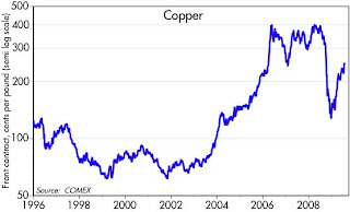
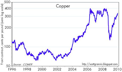
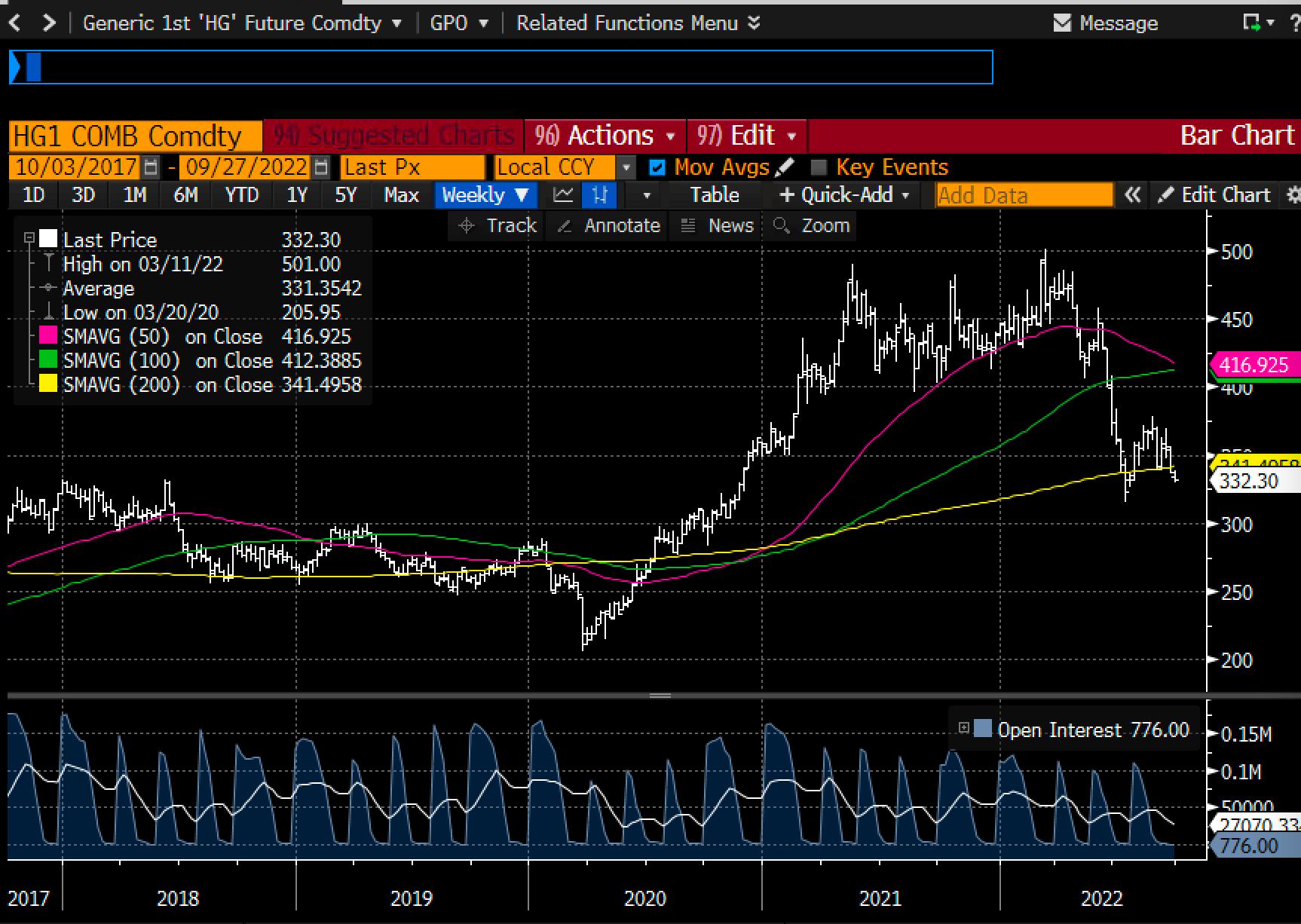
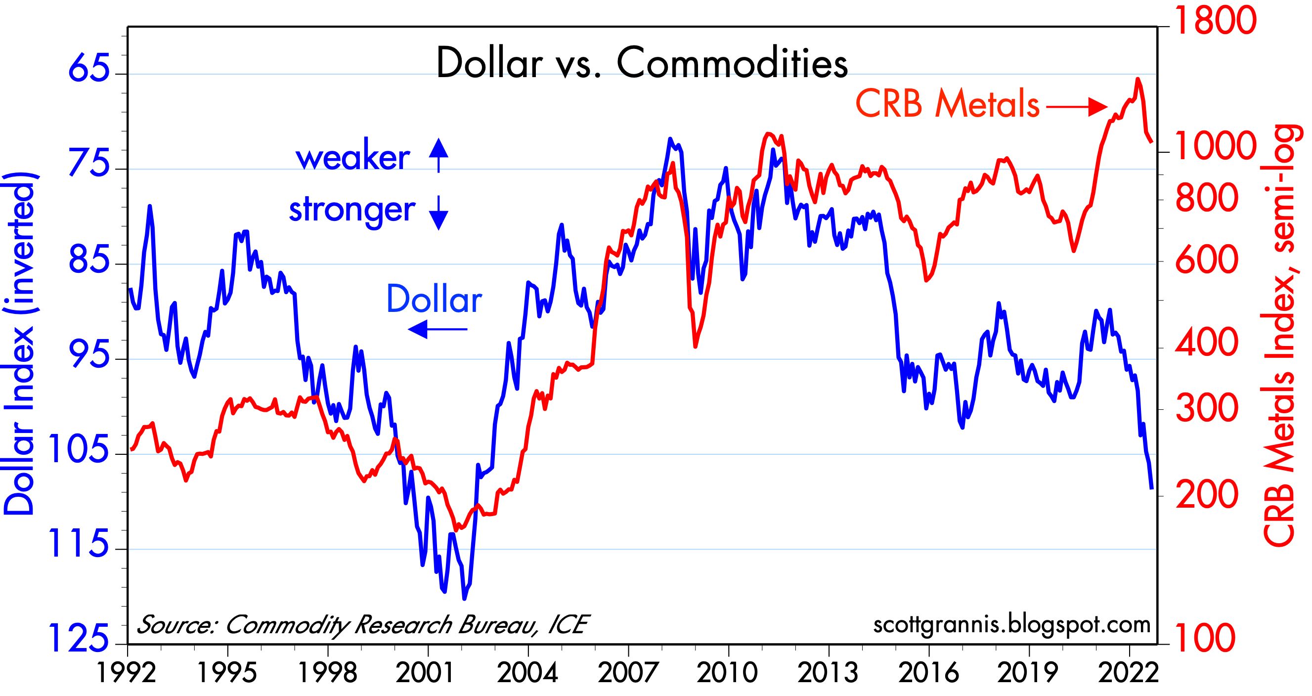
Chart #1 compares the level of the dollar (inverted) to an inflation-adjusted index of non-energy commodity prices. A strong dollar has almost always coincided with weak commodity prices, but we saw just the opposite in the past two years. Now, rather suddenly, commodity prices are diving, responding in more typical fashion to the fact that the dollar is quite strong these days. Copper prices are down 30% from their high earlier this month, reversing about half what it gained over the past two years. "Dr. Copper" is famous for reflecting changes in underlying economic and financial fundamentals.
Chart #2
I first created Chart #2 about 40 years ago, and I have been updating it ever since. It's done a pretty good job, over the years, of comparing actual currency values to their "fair value" which is otherwise called purchasing power parity. If my estimates are correct, a dollar spent in Europe at the exchange rate of $1.02 per euro buys roughly 15% more stuff than it does in the U.S. We leave soon for 2 weeks in Italy, and I'll have a chance to test whether my calculations of PPP are correct.
The larger story is that a strong dollar means the world's demand for dollars is very strong, and that is helping to soak up all the extra M2 that was printed in prior years.
Chart #3
I commented frequently in the past year or so that gold was not moving higher on news that inflation was exceeding expectations because gold rose in anticipation of higher inflation today years ago. The recent weakness in gold is thus best interpreted as the gold market anticipating lower inflation in the years to come.
As the chart suggests, gold has been slow to respond to expectations for higher real interest rates (aka Fed tightening via higher real interest rates), but there is reason to think that gold has begun to catch on; Fed tightening today will result in lower inflation tomorrow.
Chart #4
Thanks to the introduction of TIPS (Treasury Inflation Protected Securities) in 1997, we have a direct reading of the bond market's inflation expectations are for coming years. It's called the Breakeven Inflation rate, or the rate which will make you indifferent to holding nominal T-bonds or TIPS (and calculated simply by subtracting real rates from nominal rates). The bond market now expects the CPI to average 2.5% a year over the next 5 years, and that's down sharply from an all-time high of 3.6% registered in mid-June. Wow.
Consistent with the improvement in the outlook for inflation contained in these charts, the bond market has adjusted downwards, by a whopping 100 bps, its expectation of the Fed's target rate at the end of 2023 (was 4%, now 3%).
All good news, of course, especially since it means the risk of recession (typically brought on by a punishingly tight Fed) is likely lower than the broader market thinks. And it's a clear message to the Fed that they needn't (and definitely shouldn't) panic and raise rates too much or too fast.
Tuesday, August 4, 2009
Dr. Copper says the fever has broken (3)
Commodity prices are an excellent way of keeping tabs in real time on the progress of the global economy. Copper has been leading the way, now up 124% from its lows of last year; crude oil is up 110%; the Journal of Commerce index of commodity prices is up 45%; the CRB spot commodity index (which contains no oil) is up 24%. With few exceptions, just about every commodity on the planet has risen significantly in price from its recent lows. While the almost universal rise in commodity prices might well have something to do with globally accommodative monetary policy, it must also reflect, in my opinion, a revival of global commerce and a resumption of global growth following last year's collapse.
I'm well aware that the global investment community is still heavily populated by bears. Many of the bears are awaiting the second coming of the global collapse, which they assume will be precipitated by the collapse of the Chinese economy and/or the withdrawal of Chinese government stimulus funds. Others point to the dangers of higher T-bond yields, and/or the inevitable reversal of the Fed's quantitative easing strategy. Still others fear that the heavy hand of Obama-fueled government and/or higher tax burdens will crush the private sector. And almost every day it seems, I see an article warning about the coming avalanche of home mortgage defaults and foreclosures, and commercial real estate disasters.
I think the bears underestimate, or fail to understand, the ability of markets to discount the future, and to reprice assets so that they can be redeployed more profitably. We will most likely see higher home foreclosures and increased commercial real estate defaults, but markets are well aware of this and the losses have been effectively priced in. The thing that disturbs markets is the unexpected. By last March the market had come to expect just about the worst combination of events that anyone could imagine. Since then the reality, while still painful to so many, has been much less bad than the expectations. Markets and the economy can rally even when faced with deteriorating conditions in some sectors, provided those conditions have been properly evaluated and factored into prices.
I think the bears also underestimate, or fail to understand, how much and how fast economic actors can adjust to changing circumstances. Free markets are still the rule in the global economy, and there are literally billions of people out there who are eager to work, make money, and improve their lot in life. The Chinese government may well be making some mistakes with its stimulus spending, but it's hard for me to imagine that a few hundred billion of stimulus funds could overwhelm or negate the efforts of the many hundreds of millions of Chinese—and Indian—workers who are driven by an insatiable desire to catch up to the living standards of the West, and who now have an opportunity to participate in the largest global free market ever created.
Wednesday, August 31, 2022
Commodities say the Fed is pretty tight already
What follows is a collection of my favorite dollar/commodity charts updated for today's prices. If the Fed continues on the inflation warpath, commodities are in trouble. But the fed ought to be seeing a clear message in these charts: commodities have already broken to the downside after a strong inflationary runup. The implication as I see it is that the Fed is already pretty tight and has probably broken the back of inflation. Plus, with the dollar so strong it's hard to see how the general price level can continue to rise at an unusually rapid pace; inflation by definition is a loss of a currency's purchasing power. That's just not happening in the sensitive commodity markets. Moreover, real estate activity has measurably softened, with 30-yr mortgage rates back up to 6%.
Message: the Fed has pushed up interest rates and the dollar to the point that demand for homes and commodities has taken a beating. This is how the Fed fights inflation. They don't need to do too much more, and they most certainly don't need to crush the economy or put people out of work to get the inflation rate down.
Chart #1
Note the strong, twenty-year correlation between the strength of the dollar and raw industrial commodity prices (Chart #1). I've inverted the value of the dollar to emphasize that a rising dollar almost always coincides with falling commodity prices. The last time the dollar was this strong commodity prices were only about half of what they are today.
It's a similar story for other commodity prices, as shown in Charts 2-7:
Chart #2
Chart #3
Chart #4
Chart #5
Chart #6
Chart #7
Chart #8
As Chart #8 implies, real estate has almost overnight become extremely expensive, given the huge runup in mortgage rates. This rates as one of the biggest shocks to the real estate market that I can remember.
UPDATE (9/1/22): The ISM Prices Paid index, released today, provides more graphic evidence that inflation pressures peaked months ago. The index, which reflects the percentage of respondents reporting paying higher prices for inputs, was 87 as of last March, and has since fallen to 52.5. See Chart #9 below:
Chart #9
Subscribe to:
Posts (Atom)