Wednesday, July 23, 2025

Over the long haul, S&P 500 returns have been impressive


Today the S&P 500 set yet another all-time high of 6,359. 

As the chart below shows, since 1950 the S&P 500 index has increased by slightly more than 8% per year, from 16.79 to 6359. Add reinvested dividends to this and you get a total return of 11.6% per year, according to Bloomberg. If this price performance continues, and given that the current dividend yield on this index is only 1.2% a year, one could expect an investment in the S&P 500 to produce an annualized total return of almost 9.5% per year going forward. Subject, of course, to violent swings along the way, as the chart makes clear.
 

Since 1950, the Consumer Price Index has increased by about 3.5% annualized. This means that the total, inflation-adjusted return of the S&P 500 has been 7.8% annualized over the past 75+ years.

Food for thought!

Wednesday, July 16, 2025

Inflation remains low


June CPI and PPI figures were released this week, and the buzz centers around whether Trump's tariffs have boosted inflation. There is some evidence in the numbers of tariffs boosting the prices of some goods, but it would be premature—and unwise—to declare that yes, tariffs are causing a rise in inflation. 

Tariffs arbitrarily increase the price of some goods, but that is not the same as monetary stimulus, which is the only thing that can boost the overall level of prices. Absent an increase in the supply of money, higher prices for some goods will almost certainly result in lower prices for other goods. A household on a fixed budget that is faced with higher prices for food will have to cut spending on some other things.

In any event, it's difficult if not impossible to find evidence in the numbers that inflation is rising. Here are some charts to prove it:

Chart #1

Chart #2

Charts #1 and #2 both focus on the CPI and the CPI without its shelter component. The first chart shows the change in these indices on a 6-month annualized basis, whereas Chart #2 shows the year over year change. I fail to see where the latest numbers have changed the overall picture. By any of these measures, inflation currently is somewhere in the neighborhood of 2-2.7%.

Moreover, according to Chart #2, the ex-shelter measure of inflation has been 2% or less for the past two years, as I've been pointing out repeatedly over the past year or so. The reason? The method the BLS uses to determine shelter costs is flawed, as illustrated in Chart #3.

Chart #3

Chart #3 is designed to show that Owner's Equivalent Rent (OER), which makes up about one-third of the CPI index, is driven by the year over year change in housing prices 18 months ago. Talk about lags! The rise in housing prices has slowed significantly over the past few years, and the most recent surveys show that housing prices are actually flat to down a bit over the past year. Yet OER purports to tell us that housing costs have increased by about 4% in the past year. Using a more contemporaneous measure of housing costs would thus yield a much lower overall rate of inflation.

Chart #4

Today the June figures for Producer Prices were released. They show inflation running at 2 to 2.5% over the past year. But as Chart #4 shows, producer prices overall have only increased 0.7% in the past three years, for a 0.2% annualized rate!

Chart #5

Chart #5 shows an index of non-energy commodity prices. Since overall inflation peaked in mid-2022, these prices are essentially unchanged

Chart #6

Chart #6 shows the price of crude oil, which is a key determinant of energy prices and which has been extremely volatile over the past 60 years. Since mid-2022, when most measures of inflation peaked, energy prices have been falling.

Chart #7

Chart #7 shows an index of five industrial metals prices, one of which is copper, which jumped 10% 10 days ago, thanks to a new Trump tariff. Still, metals prices overall are unchanged over the past three years. 

Inflation isn't determined by individual prices; you have to look at broad measures of prices over time. Focusing on one month's numbers is a fool's game, since monthly data are notoriously volatile.

Commodity prices have been generally stable for the past three years. This is a solid base for the conclusion that the Fed is doing a good job of keeping inflation low. 

Monday, July 14, 2025

Charts of interest


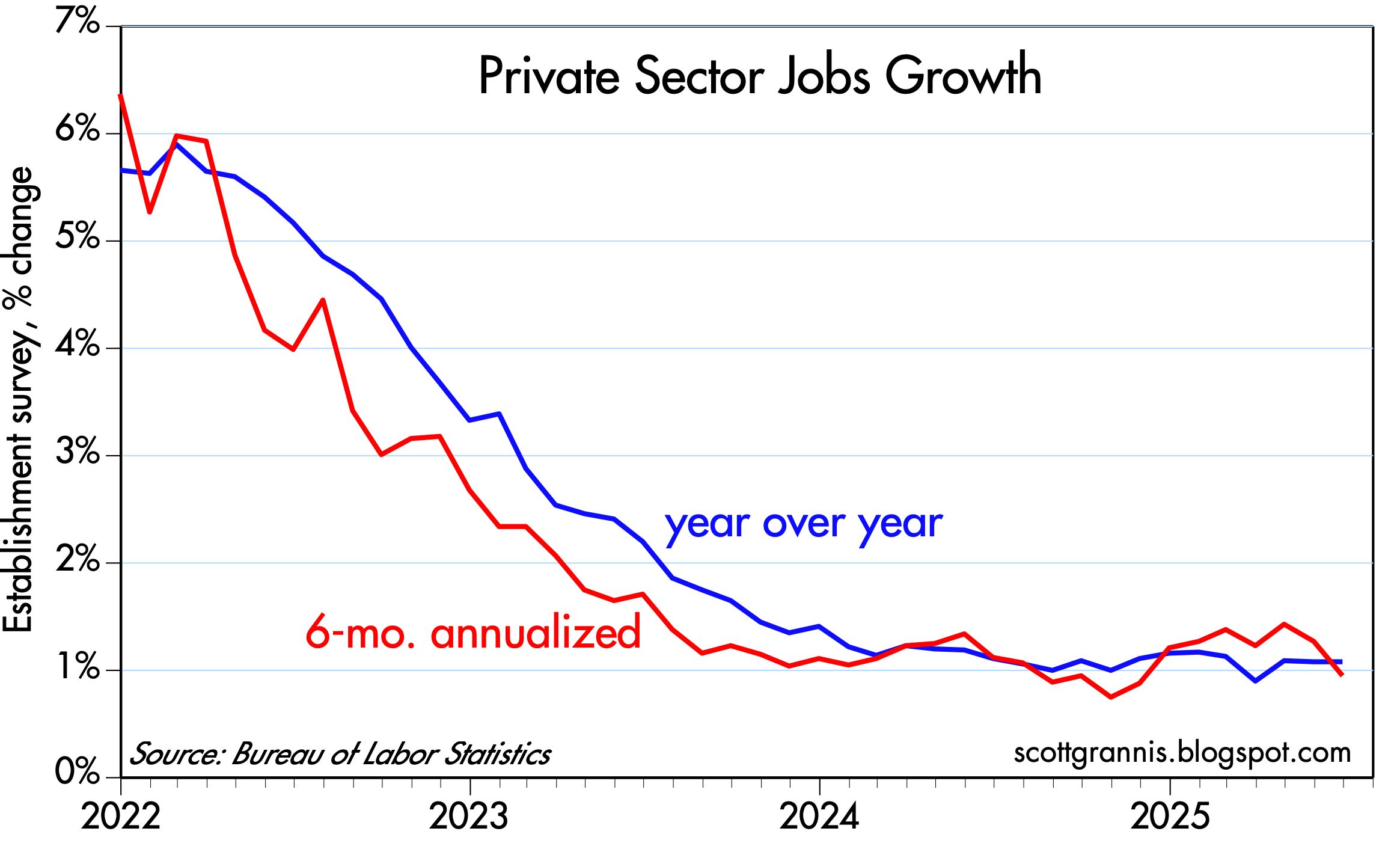
Some charts I find of interest to the general public, and which you're unlikely to find elsewhere:

Chart #1

Chart #1 sheds light on an important input to the dollar's value: real yields. The red line shows the level of real yields on 5-yr TIPS. These are true real yields, since TIPS are bonds whose principal is adjusted by the CPI, and whose coupon is a "real" yield. (Their return to the investor is equal to the rate of consumer price inflation plus a real yield.) Real yields on TIPS are determined by market forces, and are in turn influenced by the market's expectation of future Fed policy. TIPS are not only safe from default, but also safe from the ravages of inflation. 

The blue line is an index of the dollar's value vis a vis other major currencies. That the two tend to move together suggests that higher real yields enhance the value of the dollar, while lower real yields detract from the dollar's value. The situation today suggests that the dollar is trading on the weak side of where it would normally be given the current level of real yields. This further suggests that investors aren't entirely comfortable with the outlook for the U.S. economy (e.g., tariffs, deportations).

Chart #2

Chart #2 shows my model of the Purchasing Power Parity of the dollar vs. the euro. Currently, the model suggests that the dollar is just about equal to its PPP value against the euro. That further suggests that an American traveling in Europe is likely to find that the dollar price of goods and services there is roughly equal to prices in the U.S.

Chart #3

Chart #4

Chart #3 shows the level of credit spreads on Investment Grade and High-Yield corporate bonds—higher spreads reflecting greater credit risk, and lower spreads reflecting lower credit risk. Spreads today are just about as low as they have been for the past several decades. Chart #4 shows the difference between the two, which is a simple way of judging how nervous the bond market is. Taken together, these spreads are excellent barometers of the health of corporate profits, and by extension, the health of the economy. Conditions are looking pretty good according to corporate bond investors.

Charts #5 and #6

Chart #5 shows the ratio of federal transfer payments (social security, medicaid, unemployment insurance, subsidies, food stamps, etc.) to disposable income. Transfer payments represent money the government gives people money for reasons other than to compensate for their labor. Chart #6 shows the Labor Force Participation Rate, which is the ratio of people working or looking for work divided by the number of people of working age.

The dotted vertical lines mark periods of time when transfer payments ratcheted up rather sharply. That the participation rate ratcheted down each time suggests that people are less willing to work when they receive more money for not working. Funny how that works!

Note the more-than-doubling of transfer payments as a percent of disposable income from 1970 to today. Today, one of every five dollars spent by consumers comes from the government. Viewed from another angle, taxpayers are funding 20% of consumer spending. 

Chart #7

Chart #7 shows the breath-taking growth of federal government spending and tax receipts. Revenues today are more than 5 times what they were 35 years ago, and have increased at a 4.8% annualized rate. Spending today is more than 6 times what it was 35 years ago, and has increased at a 5.3% annualized rate. Our problem is runaway spending, not a lack of taxes.
  
Chart #8

Chart #8 shows the major components of federal revenues. Individual, corporate, and payroll taxes have all increased relentlessly with the passage of time. What stands out here is estate and gift taxes, which today represent a paltry 0.6% of total revenues (~$30 billion per year), and which have not increased at all over the past 25 years. The net worth of the private sector has quadrupled over the past quarter century, but estate and gift taxes haven't budged. This tax could be abolished and the impact on federal finances would be less than a rounding error. Yet this tax gives rise to an army of tax lawyers and accountants, while at the same time diverting trillions of dollars to sheltered investments. It undoubtedly costs the economy far more than the value the government collects. We would all be better off without it.

Thursday, July 3, 2025

The June jobs report was not strong


Today's June jobs report is being touted as strong enough to put any chance of a Fed ease on hold. That's silly, in my view. Putting things in the proper perspective, today's job report was one more in a year's worth of mediocre numbers. Private sector jobs (the ones that really count) have been growing at a 1% rate for over a year, which is consistent with real GDP growth of about 2%, a bit less than we've seen since 2010. Nothing in this report should give the Fed a reason to keep monetary policy tight.