


As I put it in a post three years ago, "recessions typically follow periods of excesses—e.g., soaring home prices, rising inflation, widespread optimism—rather than periods dominated by risk aversion such as we have today." It's not slow growth that precipitates a recession, it's too much risk-taking and too much optimism that eventually collide with the reality of tight money. Recessions happen when the future proves to be radically different—in a bad way—than it was presumed to be, and people are thus forced to do an about-face.
Today, risk aversion is just as abundant, or even more so, than it was in the latter half of 2015. Instead of plunging oil prices back then, today we have a global slowdown in manufacturing activity. Instead of Brexit fears, we have the fear that Trump's tariff wars will escalate and precipitate a global recession. Meanwhile, monetary policy is not even close to being tight: real and nominal yields are extremely low, and liquidity is abundant. Yes, the yield curve is inverted, but while an inverted yield curve has always preceded a recession, by itself it is not sufficient to provoke a recession. I explored this in detail in this post: Risk aversion is the big story, not the yield curve.
Risk aversion is everywhere, because for one thing it's hard to find any economy that is prospering these days. China's economy has been slowing for many years and is really feeling the pain of Trump's tariffs; manufacturing conditions nearly everywhere have been negatively affected by higher tariffs; the Eurozone is barely growing; Argentina is suffering through yet another recession; and the "Trump Bump" that propelled US growth to over 3% a year ago has faded. Fed projections of US GDP growth in the current quarter average 2.3%, which would take us almost all the way back to the 2.1% Obama-era range of growth which characterized the weakest recovery ever.
The following charts lay bare the case for economic weakness and risk aversion, and the rationale for why a recession is nevertheless not baked in the cake.
Chart #1

As Chart #1 shows, big declines in the ISM Manufacturing Index tend to coincide with periods of weak growth. The current level of this indicator suggests US economic growth could be in the range of 0-2%. Caveats: it's important to keep in mind that this index has a subjective component, being calculated based on questionnaires filled out by the nation's purchasing managers. At the current level, it says that a little over 50% of those surveyed see conditions deteriorating. Also, there have been quite a few times in the past when the index has been as low as it is today without a recession following.
Chart #2

Chart #2 is one component of the manufacturing index, and its recent slump makes it clear that Trump's tariff hikes, which began in the first quarter of 2018, were the proximate cause of the current weakness in manufacturing conditions.
Chart #3

Chart #3 suggests that, facing deteriorating export orders, a majority of manufacturing firms are now less inclined to make new hires. This is not good, of course, but keep in mind that manufacturing jobs represent less than 10% of US payrolls. It's a small segment of the economy.
Chart #4
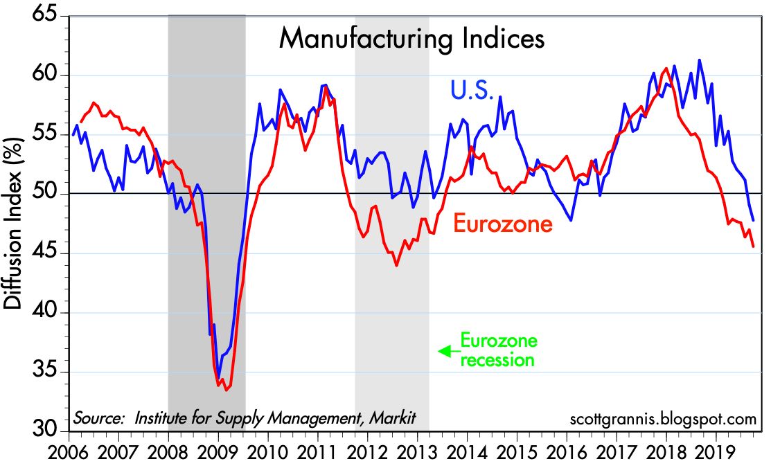
Chart #4 shows that manufacturing conditions in the Eurozone have deteriorated even more so than in the US. Trump's tariffs are having global repercussions.
Chart #5

Chart #5 shows conditions in the service sector, which represents over 70% of US payrolls. Conditions have deteriorated, but not significantly.
Chart #6

Chart #7 shows that the service sector is relatively weak in the Eurozone, and has been for some time.
Chart #7

Chart #7 shows that there has been a significant decline in the hiring intentions of service sector businesses. This chart is probably the most bearish chart I can think of right now. Will there be no net new hiring in the future?
Chart #8

Charts #3 and #7 make a strong case for a slowdown or even a flattening in overall employment growth. And indeed, we've already seen a slowdown in the growth of private sector payrolls, as I've been documenting in several posts this year, and as the recent payroll numbers reflect. Chart #8 shows that over the past six months, private sector job gains have averaged 132K/mo. The September number was just 114K. Jobs growth is definitely slowing—private sector jobs currently are growing at the rate of about 1.2% per year, which is down from last year's 2.1% high—but it's far from going to zero.
Chart #9

As Chart #9 shows, there has to date been absolutely no increase in the pace of layoffs; first-time claims for unemployment today are as low as they have ever been. Moreover, today brought news that the unemployment rate has fallen to 3.5%, a level not seen since 1969. Firms in general may not be anxious to hire, but no one seems anxious to reduce their workforce. What we have today is a case of "failure to thrive," not a case of degenerative economic disease.
Chart #10

Chart #10 illustrates how real yields tend to track the real growth rate of the economy, and that makes perfect sense. When the economy is strong, real yields in general are strong. Which is another way of saying that demand for bonds is weak when the economy is strong. By the same logic, demand for bonds is strong (i.e., yields are low) when the economy is weak. Real yields have declined this year as a weakening economy has boosted demand for the safety of Treasuries. The chart further suggests that the bond market is pricing in the expectation that real growth going forward will be about 2%, a bit weaker than what we saw during the Obama years. That's a far cry from recession levels.
Chart #11

Chart #12

Chart #11 compares the level of 5-yr Treasury yields with the Core CPI inflation rate. Prior to the Great Recession, bond yields moved almost in lockstep with inflation, and yields were reliably higher than inflation. But since 2010, the bond market has virtually ignored inflation. Demand for bonds has been so intense that nominal yields have been bid down to very low levels relative to inflation. That's directly illustrated in Chart #12, which shows the difference between nominal 5-yr yields and core inflation. The current level of ex-post real yields on 5-yr Treasuries is as low as it has been in almost 40 years. By this measure (i.e., the demand for the safety of bonds), risk aversion hasn't been this high in several lifetimes.
Chart #13

Chart #13 shows a long history of 10-yr Treasury yields, which are now only inches above their all-time low. Demand for the safety of Treasury bonds is so intense that investors are willing to pay $66 for $1 dollar worth of annual earnings. (That's the inverse of the current 1.52% yield on 10-yr Treasuries, otherwise known as their PE ratio.)
Chart #14

Risk aversion can also be found in the equity market, as Chart #14 shows. The current PE ratio of the S&P 500 is 19.3, which means that the earnings yield on stocks is 5.2%, a premium of 3.7% over 10-yr Treasuries. Whoa: investors are happy to pay $66 to be assured of an annual return of $1 in Treasuries, but it only takes $19 for the promise of $1 in equities. That is another way of measuring just how risk averse this market is.
Chart #15

Finally, Chart #15 compares the price of gold to the price of 5-yr TIPS (using the inverse of their real yield as a proxy for their price). Both of these assets promise guarantees of sorts. Gold is the classic refuge from economic and political storms. TIPS are default-free and guarantee an inflation-adjusted rate of return. That their prices tend to move together makes sense, since they are both safe havens, and are thus indicative of risk aversion.
With so much risk aversion, and with no sign that monetary policy is too tight or even likely to become tighter, it's highly unlikely that today's slow-growth environment is a precursor to a recession. Maybe we'll see more economic weakness before things get better, but in the meantime there is little reason to think that today's slow growth makes a recession tomorrow more likely.
26 comments:
So, sideways market for how many years?
very good analys once again, thanks to give us such reading !
Another terrific wrap-up by Scott Grannic.
Well, Scott Grannis is certainly a braver man than me.
I will take a double shot of Maalox, please. Followed up by an Alka-Seltzer on the rocks.
Perhaps by some measures monetary policy is not restrictive. On the other hand, Milton Friedman said you do not get to very low interest rates and very low inflation rates after decades of loose money.
So, as usual, I am not certain about anything.
Wow these indices have changed big league in the past few months.
The next year is going to be very interesting.
Thanks Scott for sharing your data and thoughts.
Keep them coming!
Big AL from Canada.
"periods dominated by risk aversion such as we have today."
I disagree with the basic concept of this article.
Based on current high stock and bond prices, there is very little risk aversion.
Real estate prices are not as overvalued as in 2006, but stocks and bonds sure are.
The lack of progress of the bull market since January 26, 2018, when the the S&P 500 reached it's 2018 high of 2,873 is telling us something is wrong with the economy, and we should listen.
I am hoping for no recession in the next year, because that might lead to a new socialist president. But my wishful thinking won't change anything.
Scott,
Does the export index include energy exports? I am sure that the rapid increase in exports of LNG and crude oil should be a strong positive in measuring exports. Similarly it is hard to fathom even a slowdown when the unemployment level continues to fall and real wages are rising. Maybe this is a "rolling readjustment," a term coined by Nixon?
Tom
Tom, re exports: I'm not sure, but I doubt the Export Orders index includes energy exports. This is a manufacturing sector survey. I do agree with you that it's hard to see a recession when more and more people are working and real wages are rising and layoffs are almost a thing of the past. The prospect of a Warren presidency is the main threat to American prosperity right now.
Cliff, re "high" stock and bond prices. High stock prices do not necessarily mean risk aversion is low. It's not enough to look at the level of a price in isolation. You need to look at relative valuations. Are stock prices high relative to earnings? Not really: PE ratios are only slightly above long term averages. The earnings yield on stocks is very high relative to the yield on Treasuries, and that to me means that the market is very skeptical of corporate profits. In other words, PE ratios are quite low relative to bond yields. Very high prices on bonds in general must mean that demand for bonds is strong, especially when compared to the level of inflation. That must mean that risk aversion is high.
Mr. Grannis
I only use stock valuations that have high correlations to 10 year stock returns, such as the Price to Sales Ratio.
The P/S Ratio is near record highs.
https://www.multpl.com/s-p-500-price-to-sales
The median P/S Ratio is so high it is unprecedented in stock market history.
The Price Earnings Ratio does NOT correlate well with 10 year stock returns,
therefore it is an inferior stock valuation ratio.
The Shiller 10 year P/E Ratio works okay
https://www.multpl.com/shiller-pe
Many financial assets are at unusually high prices.
Even real estate (which ONLY seems reasonable
when you compare prices with the 2006 bubble) !
That can't be risk aversion.
Stock prices, and valuations that predict future (10 year) market returns are very high.
That can't be risk aversion.
Prices for bonds are very high.
That can't be risk aversion.
If there was a high level of risk aversion now,
then stock prices would be falling.
But the S&P 500 has not moved much since the 2018 peak,
on January 26, 2018, at 2,873
but they have not declined much either.
Cliff if the price to sales is a reliable measurement of valuation why did it fail ahead of 2007 as it was sideways to down?
Layoffs are happening. They've just been happening in small "restructuring" blocks. That's what they've been doing at my work, Gulfstream Aerospace. I've also learned of similar practices at IBM, among others. I guess they just haven't gotten to the magnitude that affects Initial Claims dramatically yet. But if you look at IC they seem to be bottoming out. Wide bottom or not seems they'll eventually spike again.
I take issue with one of your comment in this article: TIGHT MONEY...sorry Andrew but on what planet could the US current interest rate policy be called tight money...interest rates are below the level of inflation, if that's tight money, I don't know what loose money would be.
I suspect that the Repo market's recent problem was caused by timing issues, and also by the usual liquidity participants being less than inclined to play in the ultra short term market because there's simply not enough yield to bother.
That's not the same thing as ultra-tight monetary policy (look at the Feds number).
Finally, the economy Vs. aircraft analogy always had a limit and should not be overused. The current ultra-low rates will have unforeseen results on the economy since even "experts" who've been in this field for years are stumped that $17 trillion of debt could yield negative interest rate -- and even that the US is able to finance its massive (5.3% of GDP) federal deficit.
Cliff, I would LOVE to know how you can argue against risk aversion when the 10 year us trading near all time lows when we have a federal deficit of UMteen trillion. Clearly, investors are clamoring into low risk securities world wide. If that isn't risk aversion, what is it?
The debate here regarding whether monetary policy is tight or not - somehow segues with this somewhat bizarre WSJ article. By my reading, those making policy decisions, and the armchair economists here, are working through very limited and abstract models of human behavior, and fail to reflect other dynamics like lower need for capital in a digital world for example. The arguments for looser policy don't often enough connect the dots as to the practical purpose. For instance - are there businesses that would like to borrow but can't, either because rates are too high or banks won't lend? Will 1/4pt reduction cause consumer financing to tip more consumers to consume? Anyway, this was strange article for a non-economist.
~~~~~~~~~~~~~~~~~~~
https://www.wsj.com/articles/the-real-problem-central-bankers-face-the-rest-of-us-11570536214
A study being presented this Saturday at the Bank of Finland finds that men with below-average IQ—using a standardized Finnish military intelligence test—don’t consume more when they expect higher inflation down the road. They are also much less sensitive to changes in interest rates, even when comparing men of equal education or income (women weren’t studied).
Oops, should make clear, I'm not suggesting our host is an armchair economist. Even with my limits of understanding, Scott's explanations in this blog has been of great value to me.
The chart at the link below is proof that financial assets are very expensive
and Mr. Grannis is wrong about risk aversion -- sorry it took me a day to find the chart.
There are three possibilities:
Mr. Grannis is right on this subject.
I am right. Or we are both wrong.
The chart shows the total value of financial assets as a percentage of GDP
If financial assets are very expensive, then risk is high, and aversion is low.
https://el2017.blogspot.com/2019/10/dont-let-anyone-tell-you-financial.html
.
.
.
To Bill Snarf:
The P/S Ratio for the S&P 500 is a good valuation measure that correlates very well with S&P 500 returns over the next 10 years -- it doesn't tell us much about the next year. It is telling us that buying an S&P 500 index fund (and stocke in general) now would be "buying high", when you should want to buy low, and sell high.
The P/S Ratio told us 2009 was a great time to make a long term stock investment.
.
.
.
To Steve: Buying bonds at very high prices, and very low yields, is not risk aversion.
Cliff: the chart you link to is fundamentally flawed, because it compares a stock (financial assets) to a flow (GDP). This is an apples-to-oranges comparison which is meaningless. A better comparison would be the ratio of financial assets to total assets. That shows that the ratio today is roughly the same as it was in the 1950s.
Scott,
Another interpretation of monetary policy: The interest rate is the cost of borrowing but it is also the cost of saving. For example, if the Fed's lower interest rate policy is designed to stimulate the economy by encouraging bank lending, it is also reducing the income of savers who are invested in short-term floating rate securities. If the expanding older demographic means that the loss of interest is higher than the economic benefits of stimulating loan demand, then lower interest rates are contractionary. Maybe that is what is happening around the world as lower interest rates are accompanying slowing growth.
Cliff: I hasten to add that my criticism should primarily be directed to those who produced the chart you referenced; the analysts at BofA Merrill Lynch should know better.
Isn't that chart similar to Buffetts TMC/GDP?
https://www.gurufocus.com/stock-market-valuations.php
Except I know Scott has posted that due to globalization certain metrics like domestic corporate profits relative to GDP may be outdated...
That chart that cliff referenced also shows 'all financial assets" meaning presumably treasuries as well as stocks. When treasuries are expensive-and I'm assuming we can all agree that they are-this is a result of risk AVERSION not attraction. Even if you make the leap that stocks are "expensive" that chart basically means that BOTH are which actually makes more sense. To me it means too much $ chasing too few assets but it does not necessarily risk attraction.
Having said that, I'm not at all sure it matters. BOTH could get seriously burned in next big drawdown.
Mr. Grannis:
Here you have frequently compared a stock (total US government debt) with a flow (GDP), especially after I riled you up by stating the fact that the national debt tripled under your hero Ronald Reagan.
Why is it okay for YOU to compare a stock to a flow ?
But when I compare a stock to a flow, that's no good ?
Am I sensing a double standard ?
Also, Warren Buffett has said that his favorite stock market valuation indicator is total market capitalization as a percentage of GDP.
Are you implying that Mr. Buffett has also recommended a faulty indicator?
I know this blog, since 2008, has always been bullish on the U.S. economy, and stocks are never overvalued here.
That's very consistent, but consistent doesn't mean it's correct right now.
I placed a Median S&P500 Price Sales Ratio chart,
and a Wilshire 5000 index as a percentage of GDP chart
are at this link:
https://www.el2017.blogspot.com
Maybe this link will work?
http://el2017.blogspot.com/
Apple hits all-time high!
Cliff: you make a valid point about National Debt/GDP. I've used that ratio as a measure of the "burden of debt," but it is indeed flawed. Debt is a stock, and GDP is a flow. In my defense, I would note only that both numerator and denominator have a significant inflation component. In an era of high inflation, as we had in the early 1980s, a tripling of debt over a period of 8 years is not as big a deal as a tripling of debt in a period of 8 years of very low inflation. Relative to the size of the economy, which grew rapidly in both nominal and real terms during Reagan's terms, national debt grew only moderately, from 25% of GDP to 39%. A better measure of the burden of debt would be total interest payments as a % of GDP, since both are flows.
I don't have the numbers in front of me, but I suspect that during Reagan's terms, total interest payments on the national debt as a fraction of GDP grew by much less that the burden of debt using my flawed calculation. That's because interest rates plummeted during the 1980s.
Thanks Scott. Can increased risk aversion be explained by retirement demographics ie baby boomers retiring and seeking lower risks?
Post a Comment