The worst you can say about the US housing market is that home prices appear to be consolidating after almost four years of gains. There are few if any signs of a housing bubble waiting to pop, or a mismatch between housing supply and demand. Prices are no longer rising by 5-10% year, to be sure; instead they are rising only 2-3% per year. Nevertheless, housing construction is proceeding at a fairly modest pace, from an historical perspective, and new home sales are increasing. Mortgage rates remain at historically low levels, and housing in general is affordable.
Chart #1
Chart #1 reminds us that the health of the housing market is closely tied to the health of the broader economy. With one exception—the mini-recession of 2001—a significant downturn in housing starts preceded every recession in the past 50 years. The current level of housing starts is weak by historical standards (40% below the peak of early 2006), but remains far below levels that have been associated with housing busts in the past.
Chart #2
Chart #2 compares a survey of builder sentiment with the level of starts. Not surprisingly, sentiment tends to lead starts. Builder sentiment today remains quite optimistic, and they are the ones closest to the action on the ground. So I would expect to see starts register further gains in the future. Labor shortages likely explain why starts are not more robust. And, it's likely that the prevailing mood of caution in the country and the markets which I've observed for years has contributed to keep the housing market sane.
Chart #3
Chart #3 shows the supply of unsold homes, which has been very low for a number of years. The supply of unsold homes began rising in 2005, and the housing market peaked (in price and in housing starts) in early 2006. Lax lending standards (negative amortization loans, no doc loans, inverse floaters, zero down payments) and a surge in housing starts created a huge oversupply of homes and an artificially strong demand for homes that was unsustainable. There are no such signs today.
Chart #4
Chart #5
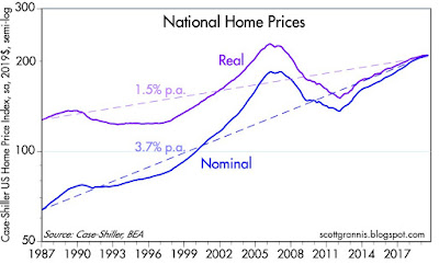
Chart #4 shows the broadest and arguably the best measure of US housing prices. Case-Shiller methodology focuses on repeat sales and covers a large portion of the country. Housing prices today are about 6% above their 2006 high, but on an inflation-adjusted basis, prices are still 12% below their 2006 highs. As Chart #4 also suggests, the real price of homes tends to rise modestly over time, due to the increasingly-larger size of houses and rising real incomes. Chart #5 simply shows the year over year increase in nominal prices. The latest datapoint in Chart #5 shows national home prices up 3.2% in the year ending July. The Case Shiller index for the 20 largest metropolitan areas shows a gain of only 2% in the past year.
Chart #6
Chart #6 shows 30-year fixed mortgage rates, which today are running around 4%, well below the ~6% rates that prevailed in 2006 when the housing market peaked. Prices are only modestly higher today than they were in 2006, but borrowing costs have plunged.
At today's prices and mortgage rates, homes are much more affordable than they were in 2006 (see Chart #7).
Chart #8
Not surprisingly, new home sales (see Chart #8) are still in an uptrend, and still far below the boom-time levels of the mid-2000s. There is plenty of room to run.
Chart #9
Chart #9 shows an index of new mortgage purchases (i.e., mortgages taken out for new purchases, not for refinancing purposes). Mortgage rates have averaged around 4% during the period shown in this chart, and new buyers have been entering the market all along.
Chart #10
Chart #10 reminds us that consumer confidence is rather strong, and that adds to the body of evidence (affordable prices, no shortage of new buyers, no oversupply of homes) suggesting that the outlook for the housing market is healthy.


6 comments:
No do Canada
One thing-- we create more poor and unskilled people everyday. Is construction really sufficient? Are we heading for a shortage?
Great post. Chart #1 shows how new housing starts are still suffocated, primarily by property zoning.
The results of Chart #1 show up in Chart #7, which shows that housing is less affordable than in the 1980s and 1990s (and probably the decades before that).
The Wall Street Journal just published a story to the effect that family medical insurance costs $20,000 a year. Add that to housing costs along the West Coast.
These issues are much more important than whatever the Donks and the 'Phants are talking about in DC, and even much larger than the trade dispute with mainland China.
from the Fed's latest Z.1 report:
153% of GDP versus 189% of GDP
tells us more than most of the charts used here:
Q2 2019:
Household Real Estate holdings reached a record $32.676 TN (153% of GDP).
Q4 2006:
Real Estate holdings posted a previous cycle peak of $26.466 TN (189% of GDP)
Thanks for your analysis.
What conclusions would you draw as a holder of Real Estate debt (rather than the equity), and the risk/reward going forward?
Thanks
Scott, thoughts on this?
https://www.washingtonpost.com/business/economy/federal-government-has-dramatically-expanded-exposure-to-risky-mortgages/2019/10/02/d862ab40-ce79-11e9-87fa-8501a456c003_story.html?fbclid=IwAR25OT0ao-JalNGqVhCnxryTFjNlgRh5yNG1SCqP7IaxTlLJtgU1g7xRB_g
Post a Comment