


Q4/16 GDP was revised slightly upwards to an annualized rate of 2.1%, which happens to be exactly the same as the annualized rate of growth of the economy since the current recovery began in mid-2009. It's been the slowest recovery on record. As the chart above shows, if the economy had instead regained its long-term average growth rate of 3.1% per year, the economy today would be roughly $3 trillion dollars bigger. I've called that the Obama Gap.

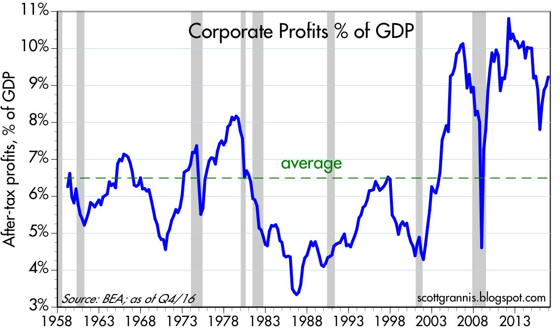
The charts above compare after-tax corporate profits to nominal GDP. It should be clear that despite this being a very weak recovery, corporate profits have been unusually strong. For years I've explained the shortfall in growth as being the result of very weak investment on the part of corporations; without investment their can be no productivity gains, and without productivity there can be no improvement in living standards. Both corporations and consumers have been generally risk-averse for the past 8 years, due to increased regulatory and tax burdens, and a general, anti-business sentiment emanating from Washington. Consumers have deleveraged significantly, while the government has borrowed heavily, absorbing ever penny of the profits generated by corporations since the recovery began. Corporations might have invested that money more efficiently, but instead the government spent most of it on transfer payments.

As the chart above shows, the increase in corporate profits over time has corresponded rather closely to the increase in equity prices. As I argued a few weeks ago, the stock market is not rising simply because of a "Trump bump," it is rising because global economic fundamentals are and have been improving, as is the outlook for corporate profits.

The chart above compares NIPA profits with reported profits (using Bloomberg's calculation of profits from continuing operations). Note that the two measures tend to track each other over time, with the NIPA measure leading the reported profits measure (because it is based on quarterly annualized profits, whereas the reported profits measure uses a 12-mo. trailing average). The rebound in NIPA profits last year is almost certain to show up in rising EPS in the months to come, and the stock market is priced accordingly. Ed Yardeni expands on this subject in a recent post here. For those interested in why the NIPA measure of profits has been consistently higher than the reported measure since the 1990s, see my post of a few years ago on this subject here.


The standard method of calculating equity multiples (PE ratios), is to divide current prices by a trailing 12-mo. average of earnings per share (see the second chart above). I've refined this a bit by using Bloomberg's calculations of PE ratios, which use only profits from continuing operations. A better way, I would argue (as Art Laffer convinced me many many years ago), is to divide current prices by the most recent quarterly annualized rate of profits as calculated in the National Income and Products Accounts (NIPA). This compares current prices to the most recent measure of true economic profits. I've taken this analysis a step further (see first chart above), and calculated PE ratios for the S&P 500 using the NIPA measure of profits instead of reported corporate earnings (I then normalized the results so that the long-term average PE ratio using NIPA profits would be similar to the average PE ratio using reported profits). By either measure, PE ratios today are modestly or moderately above average, whereas corporate profits using the NIPA calculation are significantly above average. If I had to choose one, I would go with the NIPA version of PE ratios, which shows the equity valuations today are only modestly above average.

The chart above shows the equity risk premium, which I define as the difference between the earnings yield on stocks (i.e., the inverse of the PE ratio) and the yield on 10-yr Treasuries. This is the extra yield that the market demands in order to feel comfortable accepting the added risk of equities vs. risk-free Treasuries. In the boom times of the 1980s and 1990s this risk premium was consistently negative, a sign that the market was quite confident that equities were attractive. But for the duration of the current business cycle expansion, the premium has been consistently positive, a sign that the market has been quite reluctant to take on the added risk of equities. Risk aversion, as I've argued for years, has been one of the hallmarks of this recovery. It's been declining of late as confidence slowly rebuilds, but it would be difficult to argue from this chart that the equity market is priced to optimistic assumptions. I would further note that current risk premiums are about the same as the were in the late 1970s, during the infamous "Carter malaise."
Finally, I would note that these measures of equity valuation have nothing to do with surveys of investor and/or consumer sentiment. They rely solely on market-based measures, and as such, I think they are more reliable and informative.
11 comments:
The corporate profits story is heartening, and a testament to people investing and working the private sector. They get better at that they do, and constantly.
Why is the US and global economy growing so slowly, post-2008?
I thought Obama was mediocre, and that is only in comparison to his predecessor. I say if you are partisan in the US, that means you prefer blue kool-aid to red, or vice-versa.
Remember, when Obama took office after eight years of red kool-aid, the GDP was shrinking at a 10% annual rate, the financial system had collapsed, and the US was in two counterproductive yet fantastically expensive wars.
Check out the S&P 500 in the Clinton years, the Bush jr. years, and then the Obama years. That's a chart the red kool-aid drinkers will not reproduce.
Through the Bush jr. and Obama years, the US has spent $16 trillion on "national security," being the DoD, DHS, VA, black budget and pro-rated debt.
And people are jazzed or worried about Trump's $1 trillion, possibly leveraged, infrastructure program?
Maybe the "Obama Gap" is Obama's doing.
But the global economy slowed down markedly after 2008. An inflection point.
More likely, it was the US Federal Reserve that has suffocated global growth.
David Beckworth is a scholar at the hard-core right-wing George Mason Mercatus Center. He posits the Fed sets monetary policy for about 70% of the global economy. as other central banks key on the Fed.
http://macromarketmusings.blogspot.com/2017/02/the-monetary-superpower-strong-as-ever.html
So the Fed is choking off global growth.
This makes more sense to me than "Obama did it." Jeez, there was GOP Congress for much of the Obama years anyway.
Let us hope for better under Trump.
People criticize Trump, but he has invited rounds of business leaders to the White House. He sat in the 18-wheeler recently, he has visited factories. Sure, symbolism.
But when was the last US president that even did this?
Scott: I thought this was a terrific post. Great info and presentation.
Benjamin: The Fed has a lot to answer for in its history (and, of course, it never will). But on the presidential question, I just can't understand why the bulk of the country hasn't come to the simple conclusion that W and O were both horrible presidents. They should both be reviled by the people for what they did to this country. Ironically enough, each was horrible for roughly the same reason: both were big government statists. W's statism was expressed in militarism and cronyism. O's was expressed in militarism, cronyism, and regulatory overreach.
The gap that Scott has occasionally shown between what GDP should have been and what it is - $3 trillion now - was created by many factors. But surely we can all agree that W and O figured prominently. The Fed no doubt played a role, as well. I think we can also agree that its mere existence (the gap) and the pathetic business investment figures over the last decade attest to just how awful the last two administrations were.
I just can't understand why so many people feel compelled to defend one or the other.
I have more confidence in the equity premium chart than the others because it takes into account somewhat the interest rate environment at the time, which has varied greatly since the 1960's.
The late 1990's and early 2000, was dominated by the internet boom. Since that time, the equity premium has hovered in 2 ranges: 2003-2007 and 2013-2016.
The markets appear to be reverting back toward the earlier range.
I'm also leery of blaming Obama for everything. The housing market bubble was due to a bipartisan agreement to loosen up lending rules. Handing out mortgages to 80's as if they were candy, is a sure way for fast profits, but doomed to failure.
The Republicans appear to be convinced that they must free up the Banking industry. Let us hope, that at least some of the earlier lessons are still vivid in the mind of current regulators.
Scott,
fyi
Typo here:
" I've taken this analysis a step further (see first chart above), and calculated PE ratios for the S&P 500 using the NIPA measure of profits instead of reported corporate earnings (I then normalized the results so that the long-term average PE ration using NIPA profits would be similar to the average PE ratio using reported profits)."
ration should be ratio
more typo:
"I would further note that urrent risk premiums are about the same as the were in the late 1970s, during the infamous "Carter malaise."
'urrent' should be current
Thank you Scott for your continued insights.
Question, how would the decline in Equity Risk Premium and Volatility be related, if at all?
Thanks again.
bob wright: Thanks for finding those typos!
Tom L: Re "how would the decline in Equity Risk Premium and Volatility be related, if at all?" I think the decline in both the risk premium and implied volatility is part of the same phenomenon: the return of confidence after years of risk aversion. Risk aversion is slowly being replaced by risk tolerance and, eventually, even the embracing of risk.
The PCE core came out on Friday, at 1.75% YOY.
The Fed's "average" target on the PCE is 2%. So, if the Fed were to honor its stated policies, running at a little above 2% for a while would make sense.
Instead we see the Fed tightening, even though it is below its stated target.
Maybe that is good---but a central bank should honor its public stance. If the Fed wants to target 1.75% on the PCE, or let it serve as a ceiling, then it should say so.
My own view is that we are giving up a lot of output for small negative changes in the PCE (or CPI).
The Fed has raised the interest rate it pays on bank reserves to 1%. I think it's misleading to term that a "tightening" of monetary policy. It's more accurate to say that monetary policy is now somewhat less accommodative than it was previously. Back in the late 1990s the Greenspan Fed made it clear that it does not just target nominal rates, but more specifically it focuses on real short-term rates. If a hike in the nominal funds rate does not result in a higher real rate, then the Fed has not tightened. Today, the 1% nominal funds rate is meaningfully less than the 2% rate of inflation. The real Fed funds rate has thus been negative for many years and remains so by a clear margin.
Moreover, the Fed continues to supply the banking system with a huge amount of excess bank reserves—$2 trillion, in fact. And the real yield curve continues to be positively sloped (i.e., the real short-term funds rate is less than real risk rates on risk-free Treasury notes and bonds). And short-term swap spreads remain in a normal range (currently about 35 bps). This all adds up to strong evidence that monetary policy is not tight.
Furthermore, there is no reason to believe that Fed policy has contributed to the unusually slow pace of the current business cycle expansion. If anything, it's possible that we may be in the early stages of an acceleration of growth despite the Fed's efforts to push real short-term rates modestly higher. Indeed, I would argue that the chain of causality does not start with the Fed and end with real growth; it starts with growth and ends with the Fed. The Fed is raising real short-term rates because it observes that economic growth fundamentals are improving.
Furthermore, there is no reason to believe that Fed policy has contributed to the unusually slow pace of the current business cycle expansion.--Scott Grannis.
Well, I suppose there is no way for me to "prove" my sentiments, and that is that the Fed has been too tight. (The nice thing about macroeconomics is that no one is ever wrong.)
Of course, the Fed has mostly undershot its inflation targets since 2008, so if the 2% PCE target was considered an ideal----the sweep spot where growth is optimized, but without causing runaway inflation----then the Fed has been too tight.
I hope we are coming into a growth spurt in 2017-2021. I think at best we will plug along a 2% real growth, with some downside risks. I am heartened when I read about a Tesla, building world's-largest buildings and huge battery and car factories. But how many Tesla's are there?
BTW, some Richmond Fed scholars, using a Taylor Rule-type approach, posit the Fed has been getting tighter and tighter ever since Volcker, and even a little before.
See
https://www.richmondfed.org/publications/research/economic_brief/2016/eb_16-11
Give that growth and inflation has been very slow in recent years (and inflation falling since Volcker), maybe the Richmond scholars are right.
Well, we will see. I would say the odds of an inflationary break-out in 2017-2018 are about nil, but the odds of a recession maybe 10%-30%.
Bank lending looking squishy, property values have flattened. Bad signs. Housing costs suffocating the West Coast, NYC.
BTW, Martin Feldstein says a BAT not so bad.
https://www.wsj.com/articles/the-house-gops-good-tax-trade-off-1483660843
Maybe Trump is right?
Post a Comment