Sunday, December 23, 2018

Equity valuations have improved dramatically

With the price plunge which started in early October, the PE ratio of the S&P 500 (using Bloomberg's measure, which is based on 12-mo. trailing earnings from continuing operations) has fallen from a high of 23.3 last January to 16.48 currently. To put this into perspective, consider that today's PE ratio is below the 60-yr average of this measure (16.9), and it is about equal to the market's PE ratio just prior to the onset of the Great Recession. Relative to the current yield on 10-yr Treasuries (2.79%), stocks now boast an earnings yield (the inverse of the PE ratio ) which is 3.3 percentage points higher, whereas it was only 2 percentage points higher at the end of 2007, and it has averaged only 0.4% over the past 60 years. Looking ahead, the S&P 500 is priced to a mere 14.2 times 1-yr forward expected earnings. In short, and during the course of a year in which the economy has grown 3%, stocks have fallen from an arguably over-valued level to now outright cheap. And the Fed hasn't even begun to tighten monetary policy (though the market certainly fears they will).

Clearly, the market has lost a tremendous amount of confidence in the staying power of earnings and the health of the economy. Otherwise, stocks today would be a screaming buy relative to just about any other risk asset. Sure, there are lots things to worry about: Trump, China, tariff wars, a US slowdown, and another government "shutdown." But there is nothing preordained about how these worries will be resolved. Lots of things can change, and meanwhile the economy's fundamentals remain rather healthy (fabulous corporate profits, very low unemployment, rising wages, a reasonably strong dollar, unusually high consumer confidence, and very low swap spreads). It's not hard to be optimistic when the market is suddenly so pessimistic.

Chart #1

As Chart #1 shows, PE ratios last January climbed to a high of just over 23 on the strength of corporate tax cuts (and the promise of higher after-tax earnings). Now that the tax cuts are a reality and we've seen the growth in corporate profits, It makes sense for PE ratios to back off a bit. But to a level that is below the long-term average?

Chart #2

Chart #2 shows the difference between the earnings yield on stocks (the inverse of the PE ratio, and the dividend yield that would accompany stocks if corporations paid out all current earnings in the form of dividends), and the risk-free yield on 10-yr Treasury bonds, is 3.3%. Investors currently demand an additional 330 bps of yield in order to accept the perceived additional risk of stocks vis a vis Treasuries.   More often than not, however, the equity risk premium is far lower than it is today. During the boom times of the 80s and 90s, the equity risk premium was negative. Investors were so confident in the stock market that they were willing to give up yield in order to benefit from an expected price appreciation. Once again, investors are consumed by pessimism and fear.

Chart #3 

Chart #3 shows the latest estimate of after-tax corporate profits (this accompanied last week's revision to Q3/18 GDP figures). Profits surged some 20% in the year ending last September. Similarly, 12-month trailing reported (GAAP) profits grew almost 23% in the year ending last November. And now the market seems to be thinking that all of this will go up in smoke.

Chart #4

Chart #4 shows the ratio of corporate profits to GDP (using the ratio of the two lines in Chart #3). Profits have been running at the historically unprecedented level of 10% of GDP for most of the past 9 years. Maybe this is unlikely to continue; maybe profits fall back to 8% of GDP. That would still be well above the long-term average. Why shouldn't PE ratios also trade above their long-term average, especially considering the generally low level of interest rates?

Chart #5

Chart #5 compares the earnings yield on stocks to the yield on BAA corporate bonds (a decent proxy for all corporate bond yields). Corporate bondholders get first claim on corporate profits, with equity holders last in line. Since the yield on corporate bonds is safer than the returns promised to equity holders, it only makes sense for equity investors to accept a lower earnings yield—as they did for most of the 80s, 90s, and early 00s—because they expect to receive capital gains in the future (which in turn implies an optimistic outlook). The periods during which the reverse held (i.e., when earnings yields exceeded bond yields) were generally dominated by fear: e.g., the late 1970s, and the years following the Great Recession, and now. Today, the fact that earnings yields exceed corporate bond yields is a sign that investors are worried about the future and are thus willing to pay a premium for the safety of corporate bonds. (Note: This paragraph has been re-written from its original version to more accurately and correctly describe the message of Chart #5.)
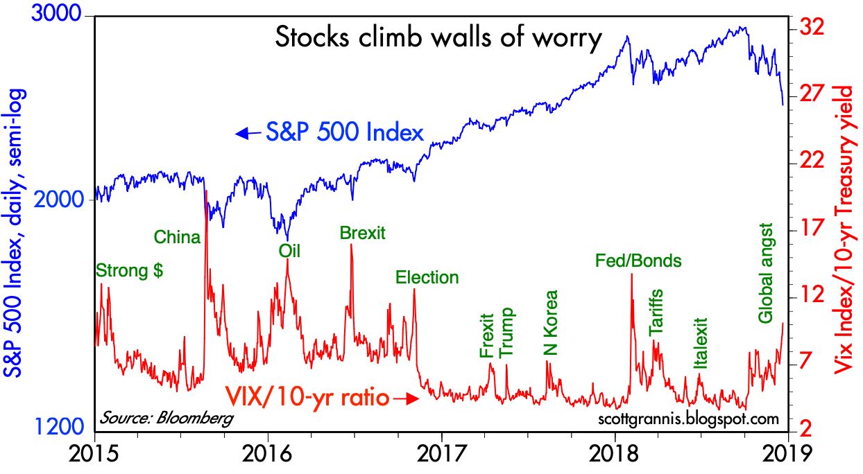
Chart #6

Chart #6 compares the market's worry levels (the Vix/10-yr ratio) to the level of stock prices. We're deep within another bout of anxiety, and prices have fallen some 18% from their recent all-time high. It's not hard to imagine fear reaching even higher levels—commensurate with prior episodes of panic attacks—and prices even lower levels. But at today's levels prices are "vulnerable" to any good news.  Maybe the Fed will reconsider its plan to raise rates twice next year; maybe China will deal (actually they already are offering concessions); maybe the government shutdown won't prove any more painful than before. 

Some words of wisdom distilled from several famous investors: 1) The price of a stock is only important on the day you have to sell it. 2) One should delight when stocks become cheap, not despair.

UPDATE (12/24/18: 10:00 PST) Looks like the panic is close to reaching levels associated with the worst of past selloffs. Here's the latest version of Chart #6:


Thursday, December 20, 2018

The Fed screwed up badly

In the comments section of an earlier post (http://scottgrannis.blogspot.com/2018/12/clouds-and-silver-linings.html), I said:

The interaction of the Fed and the market is a complicated dance, where one leads the other and vice versa. The bond market has been telling the Fed to back off on its plans for higher rates, and I think the Fed has been getting this message. At the same time the Fed has been trying to reassure the market that it has confidence in the economy and the outlook for inflation, but that at the same time it is not willing to do anything rash.

To extend this analogy to the disastrous market reaction to yesterday's FOMC announcement and Powell's subsequent comments, I would say I made the mistake of believing the Fed knew how to do this dance. Unfortunately, the Fed seems to be dancing with two left feet, and has in the process severely injured the feet of its dancing partner, the market. The Fed did not take the bond market's advice to back off on its tightening agenda. The Fed ignored the obvious signs of angst that are playing out around the globe, and it ignored the evidence pointing to declining inflation and declining inflation expectations. A pause was called for and warranted; instead the Fed preferred to tighten and to project a further two tightenings next year, in spite of the fact that the market was not prepared for any further tightenings. And on top of that, Powell said that the unwinding of the Fed's balance sheet was on "auto-pilot," as if nothing could go wrong in the interim.

To make matters worse, former NY Fed Chief Bill Dudley spoke to Bloomberg this morning and essentially seconded everything Powell said yesterday, i.e., the Fed was right to hike rates and there is every reason to think that more hikes are warranted. 

In short, the Fed now has convinced the market that it is more likely than not to over-tighten policy, and that, in turn, raises the spectre of another Fed-induced recession. (Very tight monetary policy is directly responsible for every recession in modern times, as I've repeatedly noted in this blog.)

If the Fed does not reverse course or otherwise clarify its intent, soften its stance, or display more concern for the market's angst, then the chances of a recession will increase significantly. It's hard to believe that Powell would insist on snatching defeat from the jaws of victory, but that's the message he has inadvertantly sent the market. 

There is still plenty of time for Powell to set things straight, because the key financial market and economic fundamentals are still intact. But in the meantime things are likely to get uglier.

Chart #1

Chart #1 shows what in my opinion is one of the most important financial indicators of all: 2-yr swap spreads. These have been excellent leading and coincident indicators of liquidity, systemic risk, and economic health. At current levels (~15 bps), swap spreads are exactly where you would expect them to be in a normal, healthy world. Eurozone swap spreads are on the high end of normal, however, but we know the Eurozone economy is struggling, and possibly flirting with another recession, if recent guidance from Fedex is a guide. As I mentioned yesterday, the US economy appears strong, and swap spreads support that view. They say that systemic risk is low, liquidity is abundant, and the financial and economic fundamentals are healthy. You couldn't ask for anything more.

Chart #2 

Unfortunately, Chart #2 shows that Credit Default Swap spreads are somewhat elevated. I think the main reason for this can be traced to the huge and recent decline in oil prices: it's a replay in a sense of what happened in late 2015, when collapsing oil prices created tremendous pressure on the bonds of energy-related companies. We can't rule out the negative impact of Fed tightening, but for now the main driver of wider spreads seems to be falling oil prices. That can be very painful for oil producers and related industries, but we survived worse just a few years ago, when oil prices truly plunged, from $110/bbl to a mere $30. More recently, the drop has been from a high of $75 to $46. 

Chart #3

Chart #3 compares the price of crude oil to the market's expectation for what the CPI will average over the next 5 years. Inflation expectations have fallen in direct proportion to the decline in oil prices, much as they did in late 2015. Inflation expectations are down mostly due to cheaper energy, and not, as one might fear, to the Fed being too tight. If the Fed were really squeezing market liquidity, 2-yr swap spreads would be high and rising.

Chart #4

Chart #4 compares the value of the dollar (inverted) to the level of industrial metals prices. There is a strong tendency for commodity prices to be inversely correlated to the value of the dollar, and that is easy to see during the period 1997-2014. More recently, from 2015 thru 2018, the correlation has declined significantly, as a much stronger dollar has resulted in only a modest decline in metals prices. I think this shows that the dollar is not "too strong," and that in turn implies that the Fed has not been too tight. If the Fed were intent on creating a shortage of dollars in order to slow the economy, the dollar would be much stronger and/or commodity prices would be much weaker.

Chart #5

Chart #5 shows the market's projection over the past six months of what it thinks the Fed's target funds rate will average in December 2019. Of note is the huge decline beginning last month, from 2.93% to 2.55% today. This is completely at odds with the Fed's current expectation, as announced by Powell yesterday, that the funds rate will be 3% by the end of next year (i.e., two more tightenings in 2019). This is the market's way of telling the Fed that it is on course to over-tighten and thus risk a big economic slowdown or even a recession. You don't need an inverted yield curve (which is still modestly positive) to know that the market is worried about the Fed and the economy. This chart tells you all you need to know. If yesterday Powell had announced a pause and conditioned future tightening to the health of the economy and the state of global markets (e.g., trade tensions) the market would have reacted positively instead of negatively. 

Chart #6

As Chart #6 shows, there is blood in the streets. Fear and uncertainty are surging, and the stock market has plunged almost 16% from its all-time high of last September. At this rate we're likely to see more blood unless and until Powell walks back yesterday's comments. We're not yet in a full-blown panic.

On the positive side, all it takes is a few words to put things right. The damage done to date is not significant or permanent, and it is reversible.

Wednesday, December 19, 2018

US economic activity looks robust

As a general angst continues to grip global markets (Are China and Europe headed for a recession? Are we facing a debt crisis? Is Trump not only guilty but insane?), and while the world awaits the FOMC's rate-hike decision later today with a degree of trepidation, I want to briefly show some charts that suggest the US economy is doing quite well, actually. All of these charts measure recent, actual, physical economic activity—not surveys, not sentiment, not estimates.

Chart #1 

As Chart #1 shows, US industrial production stands out for its ongoing strength, a phenomenon that emerged almost immediately following the November 2016 elections. Eurozone activity, in contrast, has stagnated, and this jibes with the recent announcement by Fedex that its overseas earnings outlook has deteriorated significantly. There's little doubt the US economy is doing better than most others.

Chart #2 

 Chart #2 is a composite of truck, rail, waterways, pipeline and air freight shipments as of October '18. As with industrial production, physical shipment activity has surged in recent years.

Chart #3 

Chart #3 focuses on shipments by train, and includes data as of a week ago (btw, this does not include shipments of crude oil). Here too we see that activity has picked up in the last year or so.

Chart #4 

Chart #4 compares truck tonnage with equity prices. Here we see a dramatic divergence between physical activity and the mood of the stock market. Financial markets appear to be completely out of step with the economy's physical fundamentals.