Wednesday, February 4, 2015

Service sector still OK

Two years ago I had a post titled "Avoiding recession is all that matters." The central point of the post: "When yields on risk-free assets are close to zero, it only makes sense to hold those assets if you need liquidity and/or are highly concerned about the potential for losses in other assets, most of which are yielding substantially more." That same advice still applies today. Cash only makes sense as an investment if you really believe we are headed for a recession. Otherwise you can earn substantially more on a variety of decent investment alternatives (see this post for a chart of the current yields on select investments). That so many people still cling to cash—retail bank savings deposits, which pay virtually nothing, now total $7.7 trillion, up from $4 trillion just five years ago—is evidence that lots of people are still very worried about a recession.

The big news yet to come will be when millions of people holding trillions of cash decide it no longer makes sense to hold so much cash because they no longer worry about another recession. That's when the Fed will need to start tightening monetary policy big time. So far, there's still a healthy amount of skepticism out there, and the demand for money is still quite strong.

The news of late continues to suggest that the economy is growing and that there is no recession on the horizon. We aren't seeing robust growth, but neither are we seeing any of the signs that ordinarily precede a recession. The yield curve is not inverted; the Fed is not tightening aggressively; real yields are very low or negative; and swap spreads are at normal levels.


Today's release of the January ISM report on the service sector was unremarkable, except to the extent that it showed no sign of significant deterioration. Indeed, the business activity index, shown above, registered a level that is reasonably strong.


The non-manufacturing composite index, shown above in blue, also suggests that the service sector remains reasonably strong. It's encouraging that the Eurozone service sector appears to be enjoying a bit of improvement after a multi-month slump.


The above chart shows yet again that there is a lot of worrying going on out there, despite the evidence of continued economic growth and healthy corporate profits. The Vix index is still elevated, and 10-yr Treasury yields are still very low, and both are signs that the market worries about the economy's growth potential and worries that unpleasant things could lie in wait just around the corner.

Monday, February 2, 2015

Two decades of inflation and deflation

You can be excused for being confused about inflation, because inflation and deflation are all around us. The cost of labor is steadily rising but the cost of things (durable goods) has been falling for the past 20 years. On average, inflation has been relatively low, but behind the mask of modest inflation lies a reality that is confusing to say the least. Fortunately, it is very good news for the average worker.

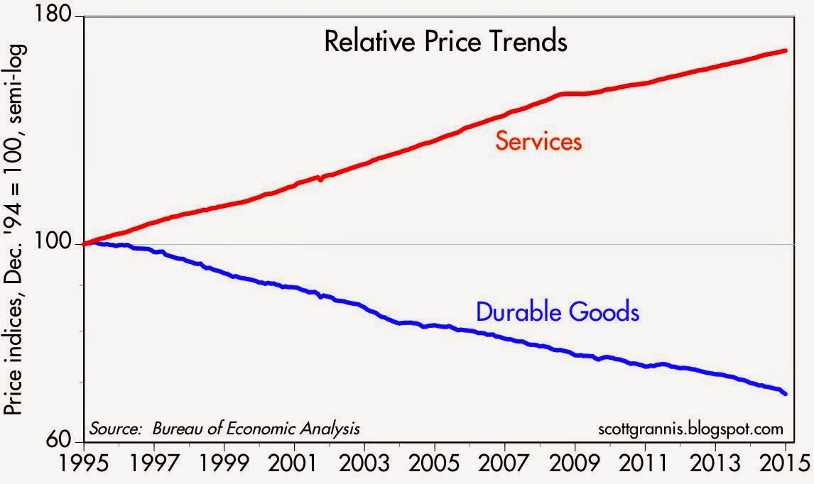
You can best appreciate what's going on with prices by disaggregating the personal consumption deflator into two of its three components: services (a good proxy for labor costs) and durable goods:


For the past 20 years, and for the first time in modern history, the cost of services (labor) has been rising while the cost of "things" (durable goods) has been declining. From 1959 through 1994, durable goods prices never declined for more than a month or two. This changed starting in 1995, which was the year the Chinese yuan began to strengthen, the Chinese economy began to be liberalized, and China began turning into a manufacturing and exporting powerhouse. The net result of rising services costs and the relentless decline of the price of "things" is that the average person's standard of living has risen enormously in the past two decades. Service sector costs are up by about two-thirds, but durable goods costs have declined by almost one-third. That means that an average hour's worth of work today can buy almost two and a half more "things" than it could just 20 years ago.


Even though the prices of many essential goods have fallen enormously and our living standards have increased, in a technical sense—assuming it's actually possible to estimate just how much more value for our money we're getting when we buy durable goods these days—prices on average have been rising. The first chart above shows inflation according to the overall personal consumption deflator (whose components include services, nondurable, and durable goods) and the core personal consumption deflator (which excludes food and energy). The second chart breaks out the rate of inflation in services and durable goods. The past 20 years have seen service sector prices rise by 2.5% and durable goods fall by an annualized 2% per year. Nondurable goods (e.g., commodities) prices have risen by an annualized 2.0% over the same period. Overall, prices have risen an annualized 1.8% over the past 20 years.

To understand durable goods deflation, consider the iPhone, which was first released about 7 ½ years ago. Although the price of an iPhone hasn't changed much over the years, its capabilities have multiplied. Before the iPhone, portable phones were largely just that: portable phones. The first iPhone showed us that phones could also be computers and simple cameras. Today, the iPhone produces full-length, high-definition movies and breathtaking photos; it's a 64-bit supercomputer that fits in your pocket; it monitors your health; it pays your bills with the touch of your thumb; it gives you directions to any place in the world, and the best route to avoid traffic; it holds your entire music and photo collection; it is a trading platform for stocks and bonds; it's a real-time news ticker; it accesses the world's knowledge base in seconds; it takes dictation; it's a video arcade and a movie theater; it communicates with anyone in the world in seconds; it can hold a library of books; and it can diagnose illnesses, to name just a few of its hundreds of thousands of applications for this miraculous gadget. For a mere $650, the iPhone saves you tens or even hundreds of thousands of dollars. Meanwhile, smartphones have spawned new industries (app developers), disrupted others (taxis), and are revolutionizing many others.


One more example: As the chart above shows, the cost of personal computers and peripherals has fallen by more than 95% since the BLS first started tracking them in 1998. That's taking into account, of course, all the extra value (faster speeds, more capabilities, more memory) that, say, $1000 buys today vs. 15 years ago. And by the way, despite two decades of falling prices, the computer industry has thrived. Deflation is not necessarily a death knell for anyone.

The story of the iPhone and other marvels is the story of technological advances that have transformed our world, making it difficult if not impossible to measure "inflation" or living standards by any objective measure. Of equal importance, it's also a story that began with the opening of the Chinese economy in 1995, an event which resulted in unimaginable gains in the productivity of hundreds of millions of workers in the span of one generation.

It may be hard to understand, but it's good news for just about everyone.

Thursday, January 29, 2015

Walls of worry persist

The market is still climbing walls of worry, and that's a good sign.

As I see it, here's the bearish case for equities: The Fed is no longer "printing money" and is soon going to begin to raise short-term interest rates. The market has enjoyed a great party for years, but the Fed is about to take the punchbowl away. Equity valuations are stretched, and earnings reports are turning mixed. The energy sector has been savaged, and there may well be nasty ripple effects: layoffs and defaults. China is in a slump and over-burdened with debt. Europe is in another slump and no amount of QE is going to make things better. Countries all over the world are trying to devalue their currencies in the hopes this will boost exports—but that's a fool's game. Policymakers have run out of tools to stimulate growth; growth is likely to be meager for the foreseeable future. The market's enthusiasm is likely to founder on the rocks of slow-growth reality.

In contrast, here's what I think the bullish case for equities is: QE was never about printing money; it was mainly about transmogrifying notes and bonds into T-bill substitutes in order to accommodate the world's demand for safe assets. Confidence is returning, however, and demand for safe assets is declining, so ending QE was the right thing to do. The economy still has plenty of unused capacity, but growth has definitely picked up in the past year. Congress is very unlikely to raise taxes, and may even succeed in lowering them, especially for corporations. Regulatory burdens are more likely to lighten than to increase further. Even if interest rates start moving up soon, they will still be very low relative to inflation for a long time. Equity valuations are no longer cheap, but relative to the yields on safer assets, equities still look quite attractive. There are still plenty of signs that the market is cautious, and that worries are more prevalent than exuberance. Absent a recession—which looks unlikely—equities are likely to outperform most other asset classes because of their superior earnings yield.

Here's how I read some of the more important market-based tea leaves:


The chart above represents the yield menu that investors have to choose from. If you don't want to bear any risk, you are not going to earn anything on cash. Cash (and cash equivalents such as 3-mo. T-bills) yields zero because the demand for safety is extremely strong. The market seems indifferent between owning equities with an earnings yield of about 5.5% and owning cash, with a yield of zero. That can only be taken as a sign that the market is still quite risk averse.


Risk aversion can also be seen in the chart above, which shows that spreads on corporate bonds have risen meaningfully from their recent lows. When confidence and the appetite for risk are strong, spreads are tight; that is not the case today. But doesn't the recent rise in credit spreads signal a coming recession? I don't think so, since swap spreads—the best leading indicator of economic and financial trouble on the horizon—are still quite low. Systemic risk is low, but there's still a lot of worrying going on, and that makes for a healthy market environment. The time to get really worried is when the market is priced to perfection. As it was in early 2000, when the economy was expected to grow 4-5% per year indefinitely.


The chart above shows that the market has been climbing walls of worry (worry being quantified here by the ratio of the Vix index to the yield on 10-yr Treasuries) for most of the past several months. The Vix index is high, which means investors are willing to pay up for the relative safety of options. The 10-yr Treasury yield is quite low, which means investors don't expect the economy to be very strong.


The chart above shows that the earnings yield on equities is significantly higher than the yield on 10-yr Treasuries. This is a clear sign that the market worries that the outlook for corporate profits is troublesome, to say the least. During times of strong growth (e.g., the 1980s), the earnings yield was well below the yield on 10-yr Treasuries. The equity risk premium has been unusually high for several years, during which time equity prices have marched continually higher. It's been climbing walls of worry all the way up.


The chart above compares the earnings yield on equities to the price of 5-yr TIPS (I use the inverse of their real yield as a proxy for their price). When the price of TIPS peaked in 2012, that was a sign of extreme risk aversion: the market was willing to pay a huge price for the relative safety of TIPS, which are default free and inflation-protected. At about the same time, the earnings yield on equities was also at or near a peak, which reflected great distrust concerning the outlook for corporate profits. In the past few years, demand for TIPS has weakened and confidence in the future of corporate profits has improved. But both are still far from where they would be in "normal" times. The market has become less fearful, but it is still somewhat risk averse.


As the chart above shows, it's unusual for the earnings yield on equities to exceed the yield on BAA corporate bonds, as has been the case for the past several years. Bonds are senior in the capital structure to equities, so they should normally yield more, especially since they don't have the upside price appreciation potential that equities do. Today's level of yields suggests that the market is still willing to "pay up" for the relative safety of bonds.


The prices of gold and 5-yr TIPS have been declining for the past two years, as shown in the chart above. (Here again I use the inverse of the real yield on TIPS as a proxy for their price.) Yet both are still high from an historical perspective. The demand for these two unique assets has weakened as the market has regained some confidence in the future, but they are still relatively expensive. The inflation-adjusted price of gold over the past century has averaged almost $600/oz., which is half of today's price. The average real yield on 5-yr TIPS since 1997 is about 1.4%, which is substantially higher than their current real yield of -0.2%.


As the chart above suggests, the real yield on TIPS should tend to track the real growth potential of the U.S. economy. GDP growth has picked up over the past year or so, and real yields have moved higher, both of which are good signs. But real yields remain quite low relative to the almost 3% rate of real growth over the past two years. That's a sign that the market is dominated more by worries than by exuberance.