


So far, the year 2025 has been pretty wild, not least because of Hurricane Trump. I'm not the only pundit that has been struggling to make sense of things. Seven weeks ago global markets were staring into the abyss, reeling from Trump's tariff onslaught. Some degree of calm has since been restored, and even Trump is licking his wounds.
So it's time to take a step back and survey the landscape of market fundamentals as they appear in the 11 charts which follow. With the exception of the first, all are based on variables that are driven by the interaction of market forces, rather than forecasts or policy prescriptions. Think of them as market "tea leaves" that tell a story if you know how to interpret them. The story as I see it is reasonably healthy.


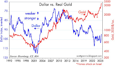


Chart #1

Chart #1 shows the level of bank reserves, which the Fed creates whenever it buys mortgage-backed and Treasury securities. Prior to the end of 2008, bank reserves were measured in tens of millions of dollars; today they are orders of magnitude higher, being measured in trillions of dollars. Prior to 2008, banks were required to hold reserves (which were non-interest-bearing) at the Fed in order to collateralize their deposits. The Fed controlled short-term interest rates and the money supply by keeping the amount of reserves relatively scarce, thus forcing banks to borrow reserves if they wanted to increase their lending.
Today, in contrast, reserves are abundant and the Fed controls short-term interest rates by paying interest on reserves. Not only are reserves now abundant and interest-bearing, they are risk-free in the bargain, making them a very attractive asset. Flush with reserves, bank balance sheets are relatively strong and the banking system has plenty of rock-solid liquidity. Gone are the days when the Fed drained reserves from the system in order to force interest rates higher, while also restricting liquidity. Abundant reserves could well explain why the economy has avoided a recession even as the Fed has tightened monetary policy.
Chart #2

Chart #2 shows the level of 5-yr Credit Default Swap spreads. This is arguably the best and most liquid measure of the market's confidence in the outlook for the economy and corporate profits (lower spreads being good, and higher spreads bad). When investors worry about the future, they demand higher spreads (the difference between the yield on corporate bonds vs. the yield on Treasuries) to compensate for uncertainty. Today, credit spreads are only modestly elevated, which means that the market is reasonably confident in the outlook for the economy and corporate profits. Spreads today are nowhere near the levels we might expect to see if the economy were teetering on the edge of recession. Chart #3 tells the same story, using an average of the spreads on all corporate bonds.
Chart #3

Chart #4

Chart #4 shows a measure of how much financial risk is being held by the private sector: it's the ratio of total household liabilities divided by total household assets. Private sector leverage today is an order of magnitude less than it was at its peak in 2008. This makes the economy much more resilient and able to withstand unexpected stresses. Thank goodness we have a prudent private sector to help offset our profligate public sector.
Chart #5

Chart #5 compares the level of the S&P 500 with the implied volatility of equity options. The latter is a commonly referred to as the "fear" index. Note how spikes in the fear index tend to coincide with declines in the stock market. As Hurricane Trump recedes from the headlines, fears are declining and stocks are advancing.
Chart #6

Chart #6 compares the level of real short-term interest rates (blue line) with the slope of the Treasury yield curve (red line). Note the strong tendency for recessions to be preceded by high real interest rates and inverted yield curves, both of which are the direct result of Fed monetary policy tightening actions. Those conditions have prevailed for the past several years, and so it is little wonder that there have been many predictions of imminent recession. I think we have avoided a recession this time thanks to the Fed's abundant reserves policy, as well as to the private sector's lack of appetite for leverage.
Chart #7

Chart #7 compares the level of real and nominal 5-yr Treasury yields to the difference between the two, which is the market's implied expectation for the average annual inflation rate over the next 5 years. Inflation expectations are reasonably stable these days and within spitting distance of the Fed's target. But ideally, I would prefer to see the Fed target zero inflation. A rock-solid currency is the best platform for a strong economy.
Chart #8

Chart #8 compares the real yield on 5-yr TIPS (red) to the ex-post real yield on risk-free overnight yields (blue). Real yields on TIPS are determined by expectations for Fed tightening. That the two are roughly identical suggests the market sees Fed policy as being relatively stable at current levels for the foreseeable future.
Chart #9

Chart #9 compares the strength of the dollar vis a vis other major currencies (blue) to the price of gold in constant dollars (red). (Note: a falling blue line represents a stronger dollar, and a rising blue line a weaker dollar.) Traditionally, gold has acted as a hedge against a declining dollar, as can be seen by the action from 1992 through 2015—a stronger dollar coincided with lower gold prices, and a weaker dollar coincided with rising gold prices. In recent years, however, this relationship has completely broken down, with gold reaching new highs even as the dollar has been relatively strong. I'm not sure what this means, but it certainly implies that gold is very expensive from a long-term viewpoint.
Chart #10

Chart #10 is constructed in a similar manner to Chart #9. It shows that until fairly recently, commodity prices (excluding oil, which is by far the most volatile of all commodity prices) have moved inversely to the strength of the dollar. I would venture to say that commodity prices look relatively expensive given the dollar's strength.
Chart #11

Chart #11 shows that real oil prices, like most commodity prices, show a strong tendency to move inversely to the strength of the dollar, even in recent years. The chart further suggests that oil is appropriately priced today given the strength of the dollar.


