Wednesday, May 27, 2020

Monetary expansion Argentina-style

We are definitely sailing in uncharted monetary waters. In all of US history we've never come even close to today's monetary environment. Chart #1 is one that no economist ever expected to see coming out of the US:

Chart #1

In the 3 months leading up to May 11th (latest data available), the M2 measure of the US money supply has increased at an 82% annualized rate. In the past six months, it's up at a 40% annualized rate, and in the past year, M2 has increased by over 23%, and these numbers will go higher in the next week or two. This is serious, Argentine-style money growth. The big question now is whether so much monetary expansion will give us Argentine-style inflation.

Chart #2

Chart #2 shows the year over year growth rate of Argentina's M2 money supply, which is up 97% in the past year. From late 2010 through early 2018, Argentina's money growth averaged about 30% per year, and inflation was in the neighborhood of 25-30% per year. Given the recent surge in money creation, inflation in Argentina is going to be approaching 100% before too long.

Chart #3

Chart #3 shows what a decade or so of rapid money growth has done to the value of the Argentine peso. Since early 2007, the peso has fallen from just over 3 to the dollar to now 117; that translates into a 97.5% loss of value vis a vis the dollar. Since the Argentine government locked down the economy fiercely in order to fight Covid-19, revenues have all but dried up. The only way it can pay the bills is to literally print money. 

I've been an avid student of monetary policy and inflation ever since I spent four years living in Argentina in the late 1970s. Back then, inflation averaged about 125% per year, and during a visit to the country in the mid-1980s I was fascinated to watch hyperinflation unfold: prices almost tripled within the span of three weeks. In 2015 I wrote a post on the subject of inflation and Argentina, in which I explained that the conditions in Argentina that allowed a huge increase in inflation didn't exist in the U.S., despite the Fed's massive expansion of its balance sheet and the creation of trillions of dollars of bank reserves. Unlike the US, the government of Argentina relies on direct printing of money to finance its deficit, whereas the U.S. government finances its deficit by selling  bills, notes and  bonds. When the Argentine government needs to finance a budget shortfall, it can "borrow" money directly from its central bank in exchange for an IOU, which in practice is never repaid. In essence, the Argentine central bank simply runs the printing presses whenever the government needs money, and the government pays its bills with monopoly money.

Will the same happen to the US? I sincerely doubt it, but it's not impossible.

In 2013 I wrote a post entitled "The Fed is not printing money," which addressed in detail why the Fed's monetary expansion in the wake of the Great Recession was not inflationary. Over the years since then I have consistently argued that the Fed's huge expansion of bank reserves was unlikely to lead to higher inflation since the Fed was correctly supplying reserves to accommodate the banking sector's demand for safe assets (bank reserves are functionally akin to T-bills). Inflation only happens, as Milton Friedman taught us, when the supply of money exceeds the demand for it. And indeed inflation has remained relatively low and stable for most of the past decade—which in effect proves that the Fed was not "printing money."

The key feature of the US monetary system is that the Fed can not create money directly—only banks can do that. The Fed can, however, make it easier for banks to create money by increasing the supply of bank reserves. Banks need reserves in order to collateralize their deposits. The Fed creates reserves by buying securities (e.g., Treasury bills, notes and bonds, and more recently, mortgage-backed securities and some corporate bonds). In effect, the Fed buys securities and pays for them with bank reserves. But crucially, reserves are not money that can be spent anywhere. The Fed simply swaps reserves for notes and bonds, thus transmogrifying longer-term securities into short-term, risk-free securities. Reserves have become equivalent to T-bills, since they are default-free and pay a floating rate of interest.

In times of great uncertainty and surging money demand, like today, the Fed fills the market's need for short-term safe securities by buying riskier securities and paying for them with risk-free reserves. If banks don't want to hold the reserves they can use them to support increased lending, which indeed does result in a monetary expansion. But if that expansion exceeds the market's demand for money, then higher inflation will be the result. The fact that inflation so far has not risen is proof that the Fed's actions have not been inflationary. Excess reserves—which now total $3.2 trillion—have served to satisfy the banking system's demand for risk-free, short-term assets, and more recently to satisfy the public's demand for a massive increase in bank savings deposits and checking accounts, as shown in Chart #4, which in turn has been turbo-charged by all the uncertainties and disruptions caused by the Covid-19 panic:

Chart #4

Looking ahead, the most important question becomes, "What happens when the Covid uncertainties decline and the demand for risk-free assets declines?"

If the Fed does not reverse course in a timely manner (e.g., by selling notes and bonds and extinguishing bank reserves), then we will find ourselves flooded with unwanted money. And as Argentina has demonstrated, that can lead to a big increase in inflation.

And that is what my friend Nuni Cademartori is illustrating in the cartoon which follows. Too much money erodes the value of money. I've got stacks of million-peso Argentine notes printed decades ago that today are worth about the same as toilet paper.

Let's hope this does not come to pass in the US:


Monday, May 18, 2020

Demand for money; what went up will soon come down

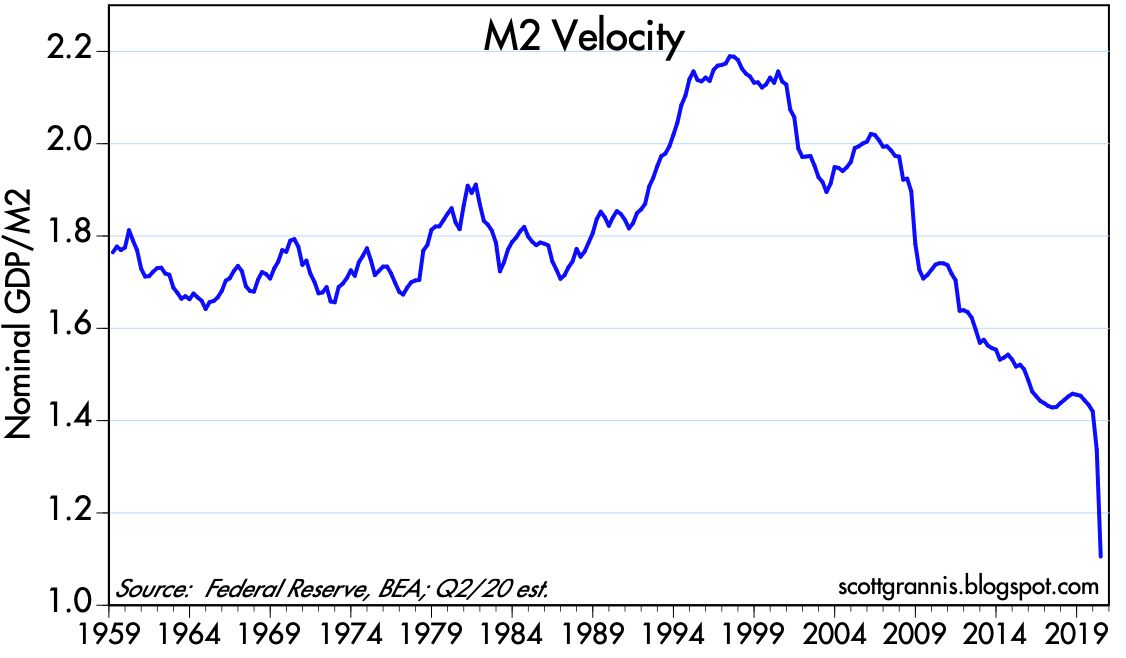
There are two macro variables that loom large these days: 1) the amount of money in the economy has exploded, thanks to the Fed's aggressive QE4 actions, and 2) GDP growth has plunged, thanks to widespread government-mandated shutdowns. When money goes up and economic activity goes down, the result can be described as an increased demand for money (or a reduced velocity of money), which is a typical response to recessions and uncertainty. People tend to stockpile cash during periods of great uncertainty, and—we must NOT forget—they tend to reduce those stockpiles as their confidence returns.

For the past two months we have been experiencing the fastest and steepest decline in economic activity in the history of this country. Estimates of 2nd quarter GDP range from -31% (New York Fed) to -48% (St. Louis Fed). (Note: these are annualized rates of decline.) I'm going to be optimistic and guess that Q2/20 growth will post a 30% annualized decline, which is equivalent to a 6.8% nominal decline. Meanwhile, the M2 measure of the money supply is on track for something like a 50% annualized rate of increase in the current quarter. The following charts show you what these numbers look like:

Chart #1

Chart #1 shows the actual history of these variables and my estimated values of M2 and nominal GDP for Q2/20. The current disparity between the two is historical.

Chart #2

Chart #2 shows the ratio of M2 to GDP, which is a proxy for money demand. Think of it as you would your personal finances: How much cash and cash equivalents do you want to hold as a percent of your annual income? Since the onset of the Great Recession in late 2007, that value for the average person has increased fully 80% (from 50% to 90%). That's a lot of money being stockpiled, mainly because this has been a rather crazy period in history. 

Chart #3

Chart #3 shows the inverse of Chart #2, which can be thought of as the number of times a dollar is spent every year—a proxy for the velocity of money. People today are holding on to their cash like never before. 

So M2 has gone way up and GDP has gone way down because the forced shutdown of the economy has caused the demand for money to soar. That's completely natural and predictable. The Fed has done the right thing by expanding the supply of money in order to accommodate the increased demand for money. The fact that inflation expectations, the dollar, and industrial commodity prices have been relatively stable for the past six weeks confirms that the Fed has accommodated soaring money demand, and has NOT been madly printing money. I've made similar arguments quite a few times in the past on this blog. Quantitative easing is NOT stimulus, it's a badly-needed remedy for a huge increase in the demand for money. 

But what comes next? With increased signs that the economy is reopening and activity is increasing, it's quite likely that the demand for money will begin to decline as confidence slowly returns. Money that has been socked away in bank accounts is increasingly going to be spent on goods and services. Will the Fed be able to reverse its QE4 efforts in a timely fashion? Will the public's desire to reduce their money balances lead to rising inflation?

I won't be surprised to see restaurants reopening with higher prices on the menu. The government will mandate that the supply of restaurant tables be limited (e.g., maximum occupancy rates of 25% and maybe 50%) at a time when many consumers with pent-up demand will be seeking tables. When demand exceeds supply, higher prices are almost inevitable. Especially since few if any restaurants can be profitable at much lower occupancy rates than they have enjoyed in the past—occupancy mandates will force restaurants to raise prices.

But not everything will be supply-constrained. Airlines are going to have a huge surplus of seats for a long time. Hotels will have a vacant rooms galore. Malls and stores won't be full until the fear of contagion and crowds disappears. But we are already seeing positive signs of improvement which are quite likely to continue.

We've seen the worst of the covid-19 crisis. Looking ahead, the 800-lb gorilla that will dominate the economic and financial landscape for the balance of the year will be the need for the Fed to begin to reverse its massive monetary expansion of recent months. Curiously, I see many analysts worrying that a Fed reversal will jeopardize the recovery. On the contrary, I think it would be very worrisome if the Fed did not realize that they need to "tighten" as the demand for money begins to decline.

Wednesday, May 13, 2020

High frequency data show a strong rebound

On March 19th I ventured to guess that we had probably seen the worst of the Covid panic. On April 6th I pointed to Covid green shoots. On April 19th I noted the beginning of the end of the shutdown. On April 27th I noted that things were looking up. A week ago I pointed to signs that showed the economy beginning to reopen. In today's post I show further evidence of what is looking like a fairly strong rebound in economic activity. All of the charts in this post use data that is as recent as today and no older than two weeks. All of the charts—with one exception—reinforce the view that that there has been a significant amount of financial market healing and a meaningful recovery in economic activity. I show the charts in no particular order:

Chart #1
 

Apple has compiled data from millions of user's iPhones all over the world to show that people are getting out of their homes and engaging in more driving, walking, and travel (see Chart #1). In the US, shown here, the low point in driving activity was Easter Sunday, April 12th. Since then, and using a 7-day moving average of the data (there is a distinct weekly pattern to the data, with the weekly low always falling on Sunday), there has been a substantial rebound of over 50% in the number of requests for driving directions. Not bad!

Chart #2

Chart #2 uses weekly data (last datapoint being May 8th) to show that the amount of motor gasoline supplied to the US market has increased 46% in the past four weeks. From that we can infer a significant increase in miles driven by individuals. Impressive!

Chart #3

Chart #3 uses data from TSA to show that the number of passengers processed at US airport security checkpoints has almost doubled since the mid-April low (again, I'm using a 7-day moving average to eliminate weekly patterns). Of course, that is still more than 90% below the level of activity from a year ago, when 2.34 million people passed through TSA checkpoints every day on average. But the longest journey begins with a first step!

Chart #4

Chart #4 is my favorite for tracking how the level of market fear and panic influence the stock market. Things have definitely improved since prices hit bottom almost two months ago, but there is still a lot of  caution in today's prices. Will the rebound we've seen so far continue? Will there be a new, sudden wave of infections? Another shutdown? How fast can businesses respond to the lifting of lockdowns? I would be worried if the market weren't worried about these sorts of things. There are so many variables in play that no one can confidently predict how things will evolve. My main guidepost is an intuitive trust in the resilience of the US economy, the resourcefulness of America's entrepreneurs, and the desire of the average person to work hard and enjoy life.

Chart #5

Chart #5 shows an index of key financial market indicators, compiled daily by Bloomberg. Here again we see a sharp rebound/improvement. This is extremely important, since healthy financial markets are essential to an eventual economic recovery. We're not out of the woods yet, but we have without question pulled back from the edge of the abyss that was looming in late March.

Chart #6
Chart #6 shows one of the indicators included in Chart #5, 2-yr swap spreads. I always keep tabs on this critical, leading indicator of financial market health which has frequently anticipated changes in economic activity. Swap spreads in the US are exactly where we would like to see them, while similar spreads in Europe are somewhat elevated, but not dangerously so. The disparity simply highlights the fact that the US economy is more dynamic and generally healthier than the economies of Europe.

Chart #7

Chart #7 compares the level of 10-yr Treasury yields (red) with the ratio of copper to gold prices (blue). Both of these indicators have shown a tendency to respond to changes in the global economic outlook. Both are still distressingly low, unfortunately, but neither one has deteriorated further since late March.

Chart #8

Chart #8 shows the level of the M2 measure of the US money supply. It's plotted using a semi-log scale on the y axis. Note how for the past 25 years M2 has risen at a fairly steady 6.2% annualized pace. Until recently, that is, when the Federal Reserve pulled out all the stops in an attempt to satisfy the world's sudden and gargantuan demand for money, money equivalents, and safe, liquid assets.

Chart #9

Chart #9 shows the year over year growth of M2. The recent surge, which began in mid-March, is without precedent in US monetary history.

Chart #10

Chart #11

Chart #10 shows the composition of M2. Bank savings deposits account of over 60% of M2, and they have increased by $930 billion since mid-March. This is strong evidence that the demand for safe money has soared as a result of the Covid crisis. Savings deposits pay little or no interest, so people hold them only if they value their safety and liquidity far more than their yield. Demand deposits and checking accounts, close cousins to savings accounts, have increased over $800 billion. Together, the increase in these three components account for almost all of the $1.9 trillion increase in M2 since mid-March. The Fed facilitated this increase by purchasing notes and bonds in exchange for bank reserves (see Chart #11, which is equivalent to transmogrifying notes and bonds into T-bill substitutes. (I've explained this process numerous times in the past.) But this is not the same as "printing money."

What the Fed has done was absolutely essential, since the Covid crisis and the sudden plunge in economic activity created an explosive demand for liquid, safe assets. As long as this demand persists, the huge expansion of the M2 money supply will not be inflationary. Indeed, recent inflation statistics suggests that prices of late have been falling. 

Inflation will pose a threat only if the Fed fails to withdraw its liquidity injections when and if the world's demand for safe, liquid assets begins to subside. For now, that is a tale for future, not for today.

UPDATE (May 22): Here's an updated version of the TSA Throughput data (Chart #3 above). On a 7-day moving average basis, TSA screening activity is up 150% compared to the low of April 17th. From this we can infer a significant recovery in air passenger traffic in the past 5 weeks.

Chart #12