Thursday, April 27, 2023

The economy continues to grow and inflation continues to decline


The news today was supposedly disappointing—GDP growth in the first quarter was weaker than expected, while inflation was a bit higher than expected—but I disagree. I see the economy continuing to grow at about a 2% rate and I see inflation falling. Here are two charts which I think give you a better picture of what's happening on the growth and inflation front.
 
Chart #1

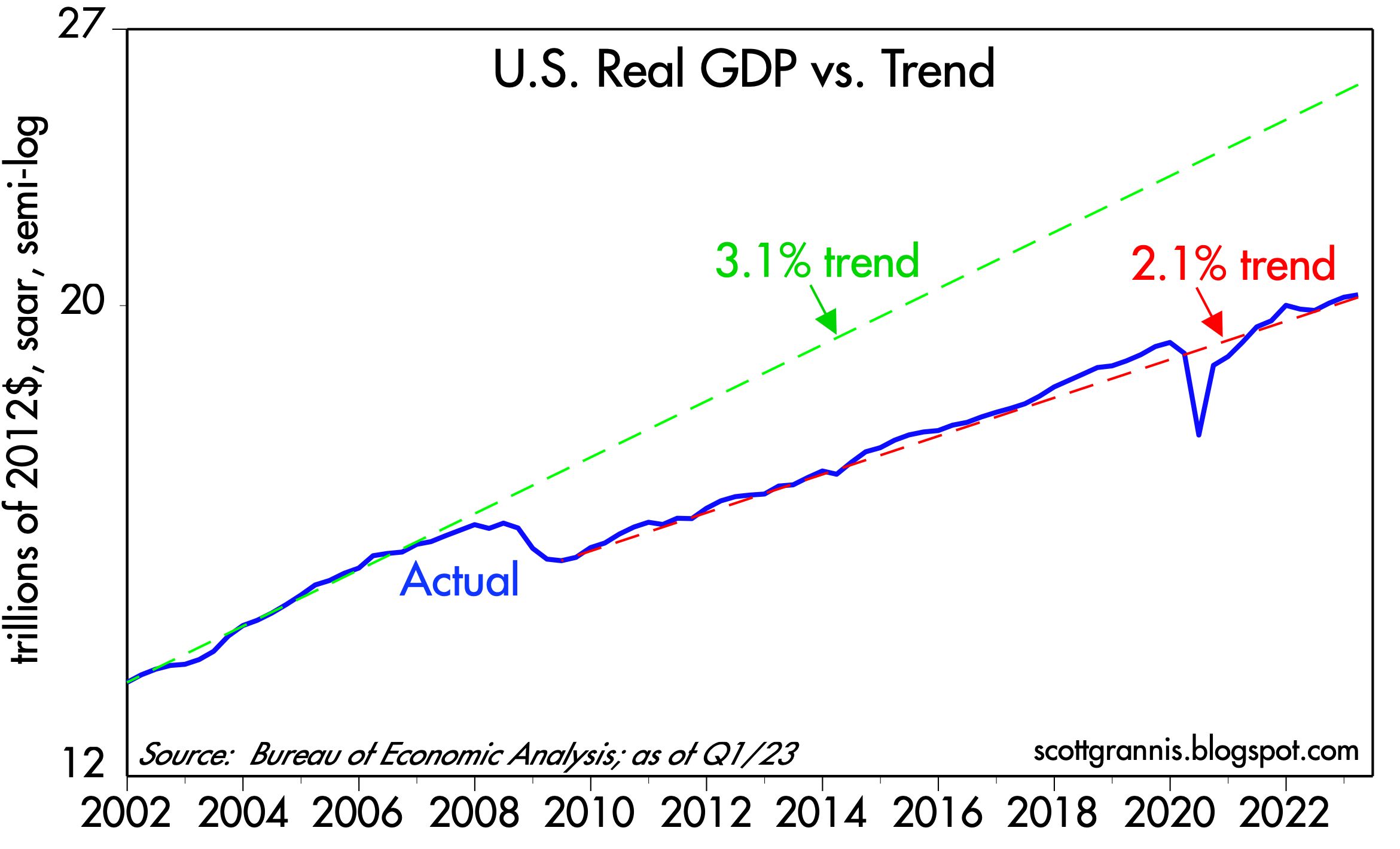
Chart #1 compares the level of real GDP to different trend lines. (Note that the y-axis is logarithmic, so a straight line equates to a constant rate of growth.) From 1965 to 2008, the economy grew by about 3.1% per year on average. But then the economy's growth dynamics changed dramatically following the Great Recession of 2008-09. Since the recovery started in mid-2009, the economy has grown by 2.1% per year on average. Why? I see lots of policy headwinds: Huge increases in tax and regulatory burdens, huge increases in transfer payments, and huge spending on (inefficient) green energy sources, to name just a few, all of which I've discussed at one time or another over the years. 

Yes, annualized growth in GDP fell from a 2.6% rate in the fourth quarter to a 1.1% rate in the first quarter, but those are annualized figures which magnify the actual change in the quarterly levels. Note how you can hardly see this change in the blue line on the chart. Moreover, the mini-recession that supposedly happened in the first half of last year is just a wiggle on this chart. The broad growth trend remains about 2%. 

The net result is that 14 years of anti-growth policies have cost us over $5 trillion in lost output. Put another way, if nothing had changed since 2008, the economy would be about 25% bigger today—and incomes would also be 25% higher. To be fair, I note that demographics have changed; baby boomers retiring have reduced the growth of the labor force. Nevertheless, it's also true that the labor force participation rate has fallen from 66% in 2008 to now 62.6%. That means that some 5 million people of working age have decided to not work. I've tied that to a big increase in transfer payments, which I explained here.

Chart #2

Chart #2 compares the year over year change in the Consumer Price Index to that of the GDP Deflator, which is the broadest measure of inflation that exists. Here it should be clear that inflation by both measures is clearly declining. Moreover, the GDP deflator for the first quarter was an annualized 4%, and according to the CPI, inflation rose at an annualized rate of 3.8% in the first quarter. 

Finally, it's worth noting that swap spreads and credit spreads continue to be relatively low and well-behaved; there is nothing in those statistics which foreshadows a recession. Corporate profits have been mixed, but there have been some pleasant upside surprises of late in the tech sector (e.g., GOOG and META). A recession is far from being "baked in the cake." Nevertheless, the yield curve is still quite inverted, which means the bond market is pricing in the strong likelihood of a recession and an eventual Fed ease. In fact, the bond market assigns a high probability of another 25-50 bps rate hike at next week's FOMC meeting.

The Fed may well hike next week, but that would be a mistake in my view. If they do (because they want to regain some of the credibility they've lost over the past year or so), it won't be a surprise to the market. But if they don't, that would be a nice surprise. In any event, I prefer to bet on what is going on in the economy, not what is going on in the heads of the FOMC members. The Fed may be late to react to the economic realities, but react they will, and that's the bigger story I prefer to follow. 

An economy growing at a modest 2% rate, inflation by all measures declining significantly, combined with interest rates that are high enough to cause pain in many sectors of the economy, do not add up to a rationale for another rate hike next week. 

UPDATE (April 28): Today we received the March figures for the Personal Consumption Expenditure Deflators, which are measures of inflation at the individual level which are arguably superior to the CPI, mainly because they cover a broader basket of goods and services and the weightings of the components adjust dynamically as the economy and consumer habits change. Over long periods, the PCE deflator tends to register about 0.5% less inflation per year than the CPI, which is why many believe that the CPI tends to overstate inflation. It also explains why the Fed prefers to focus on the PCE deflator even though they talk a lot about the CPI. Chart #3 compares the two measures on a year over year basis.

Chart #3

Chart #4

Chart #4 looks at the 3 components of the PCE deflator: services, durable goods, and non-durable goods. It starts at 1995 since that was the year after China devalued its currency for the last time and simultaneously began its long march to become the world's biggest exporter of durable goods. It also marked the first year that the durable goods component of the PCE deflator turned negative. China did become a global powerhouse in durable goods and in the process they drove durable goods prices lower worldwide. US durable goods prices today are 31% lower than they were at the beginning of 1995.

Another point I want to make here is that durable and nondurable goods prices today are unchanged since last June, which not coincidentally was the high-water mark for the year over year change in the CPI and the PCE deflator. In other words, service sector prices are the sole source of whatever inflation has occurred in the US for the past 9 months. It's also important to point out that the cost of shelter (housing prices and rents)  is a significant portion of service sector prices, and as this post notes, that component of the CPI peaked last month. In the months to come, with housing and rental costs falling and durable and nondurable goods prices flat, overall inflation is almost sure to continue to fall.

Tuesday, April 25, 2023

M2 update: a return to normal by year end


Today the Fed released the M2 statistics for the month of March '23, and they were very encouraging. The decline in M2 which began about a year ago is accelerating, with the result that M2 has fallen by almost $900 billion (-4.1%) since its peak. Considering the ongoing growth in the economy and incomes, the ratio of M2 to GDP is now on track to return to pre-Covid levels by the end of this year. This is occurring despite a significant increase in federal deficit spending in the past 9 months (i.e., deficits are no longer being monetized). In short, the monetary inflation wave that flooded the US economy in recent years has receded significantly; as a result, inflation should return to some semblance of normal by the end of this year.

Chart #1

Chart #1 shows the growth of the M2 money supply, which mainly consists of currency in circulation, bank savings and deposit accounts, and retail money market funds. From 1995 through early 2020, M2 growth averaged about 6% per year. It then surged by some $6 trillion as the government began showering consumers with Covid emergency money, most of which ended up in bank savings and deposit accounts. Once the public began spending all this extra money, in early 2021, inflation began to rise.  

M2 growth started decelerating early last year and has since turned decidedly negative. As the chart suggests, the "gap" between actual M2 and where it would likely have been under normal conditions has narrowed by over 40%. At the current rate of M2 decline, the gap will be closed around January or February of next year.   

Chart #2

Chart #2 compares the growth of M2 to the size of the federal budget deficit. This is strong evidence that the outsized growth of M2 which ultimately fueled the big increase in inflation in recent years was the direct result of monetized federal deficit spending. It's VERY reassuring to see that although the federal deficit has been rising for the past 9 months, M2 growth has continued to decline. 

Conclusion #1: federal deficits are no longer being monetized. Thus, the monetary source of rising inflation has dried up. 

Chart #4

Chart #4 shows that there is about a one-year lag between growth in the money supply and the rate of inflation. (The CPI line has been shifted one year to the left so as to make this easier to appreciate.) The big acceleration in M2 growth which began in March '20 was followed by a big acceleration in inflation which began about a year later. Now the tables have turned: The sharp deceleration in M2 growth which began about two years ago was followed about one year later by a deceleration of the CPI. This strongly suggests that we are likely to see a further—and significant—decline in inflation over the course of the next 6-9 months.

Conclusion #2: there is no longer any need for the Fed to tighten monetary policy any further. Excess money dumped into the economy during the Covid crisis is being absorbed, and federal deficits are no longer being monetized. Without monetary fuel, and given that interest rates have been hiked significantly, the odds of a return to "normal" levels of inflation have improved dramatically. Instead of hiking rates next month, the Fed could, and probably should, lower rates, especially in view of increasing signs of economic weakness (e.g., disappointing corporate profits, lower confidence, a housing market on the skids).

Chart #5

Chart #5 is one I've been following for decades. It's very important because it sheds light on the all-important issue of the demand for money. As Milton Friedman taught us, inflation happens when the supply of money exceeds the demand for money. M2 is the best measure of the supply of money, but we lack any direct measure of the demand for money. As I explained in a long post early last year, Chart #5 is a good approximation for the demand for money. 

The initial surge in deficit spending (Q1, Q2, and Q3 of 2020) was effectively neutralized by an equivalent surge in money demand, with the result that inflation remained low throughout 2020 despite an enormous increase in M2. But then money demand weakened even as M2 continued to grow, and that imbalance fueled the rise in inflation that began in early 2021. The recent plunge in money demand (which began in earnest about a year ago) was offset somewhat by flat to falling growth in M2, with the result that inflation began cooling. Sharply higher interest rates, courtesy of the Fed (belatedly) also helped offset the inflationary potential of M2 by increasing the attractiveness of holding money and creating disincentives for borrowing—thus contributing to a slowing in the money supply.

At the current rate of decline in money demand, it should return to pre-Covid levels by the end of this year—at about the same time as the M2 money supply returns to its pre-Covid long-term trend. As Milton Friedman might observe, money supply and money demand are coming back into balance, and that means inflation is yesterday's news.

Monday, April 24, 2023

Good news: Argentina nears another devaluation


Argentina is approaching the point at which a devaluation of the peso (i.e., replacing the official exchange rate with a freely accessible market-based rate) is almost inevitable. Paradoxically, this will be good news for Argentina, at least for awhile. Ideally, Argentina should dollarize its economy, but that probably is too much to expect from a regime which is almost hopelessly corrupt.


The above chart traces the inexorable decline of Argentina's currency since 2007. Since its last iteration at the beginning of 1992, when it traded at 1 to 1 against the dollar, the peso has lost 99.8% of its value. In fact, the peso has been falling for more than a century. Back in 1916, the peso traded at 2 pesos per dollar. Since then, Argentina has changed its currency four times, each time lopping multiple 0's from its nominal value. If the original peso were still in circulation, it would be trading today at 4,580,000,000,000,000 to the dollar!

A new peso, or at the very least a new currency regime, in which the peso's value is determined by market forces instead of by government decree, is just around the corner. We know that because government officials are once again denying that there will be a devaluation. Anyone, like me, who has lived in Argentina long enough knows that official denials of an impending devaluation are a sure-fire signal that it is going to happen. We also know it because the current situation—inflation now exceeds 100%, the currency has lost over half of its value in just the past year, and interest rates exceed 80%—cannot go on forever. As a practical matter, since the largest denomination peso bill in circulation ($1000 pesos) is worth only $2.20 dollars, the average person must walk around with a huge roll of bills just to make incidental purchases. (A new $2000 peso bill has been authorized, but that won't fix the problem.)

The only unknown at this point is whether Argentina will continue to use pesos with a floating (i.e., market-based) exchange rate or whether it will dollarize its economy. The latter would be the best solution, but that's probably a bridge too far for the current bunch of corrupt politicians, since it would require a massive reduction in government spending. Throughout history, the Argentine government has financed deficit spending by resorting to the printing press. Printing money is a pernicious form of taxation, since anyone who holds onto currency that loses value on a daily basis is effectively paying a tax to the government in the form of lost purchasing power. Corrupt politicians have long known that printing money to pay for spending (which, in turn, helps buy votes) is much easier than cutting spending or raising taxes.

Lest we forget, our own government did precisely this in 2020 and 2021, when some $6 trillion of Covid "emergency" spending was effectively financed by a $6 trillion expansion of the M2 money supply. (I began explaining this way back in July '21.) That was the proximate cause of the inflation nightmare from which we are now waking up.

Paradoxically, a devaluation would likely be good news for Argentina, at least for awhile. That's because the current regime—which features an "official" rate of $220 pesos per dollar and a "blue" or parallel rate of $450 per dollar—discourages investment and tourism. If a tourist uses a credit card in Argentina, pesos get translated at the official rate instead of the market rate, which means things cost about twice as much as they would if the tourist used dollars exchanged at the "blue" or parallel rate. Similarly, most foreign exchange which passes through the banking system is processed at the official rate, and that amounts to a severe impediment to foreign investment.

A devaluation would be a boon to Argentine exporters since their export sales would be exchanged at 450 pesos rather than 220. Moreover, it would likely spark a huge inflow of foreign capital since investors would feel more comfortable knowing that they can get a market-based rate for their investment dollars—and it would be much easier to withdraw money in the future if they so chose. Plus, over the years Argentines have stashed hundreds of billions of dollars overseas, and at least part of that would be repatriated following a devaluation.

For more information on Argentina, I have written extensively on Argentina in this blog.

P.S. There are several alternatives that Argentina can choose from at this juncture: 1) eliminate all of the many official exchange rates (as much as a dozen in fact) in favor of a single, market-determined rate, 2) replace the peso with a “new” peso that has an exchange rate of, say, 4.5 to the dollar (thus lopping off two zeroes) while also unifying all exchange rates in one floating rate, and 3) dollarization, which would involve replacing pesos with dollars at an exchange rate of, say, 4.5 to the dollar. 

Door #3 would be the best, but also the hardest to implement, since Argentina would need the cooperation of the US Treasury and it would also need to permanently slash its bloated spending, because it would most likely be impossible to borrow all the money they are currently spending via the printing press. The reward to a successful dollarization would be the effective cessation of inflation, combined with a flood of new foreign investment and a surge in confidence—and ultimately a booming economy. Door #2 would be equivalent to what the government has done several times in the past, but it would require a cumbersome period during which old pesos could be exchanged for new pesos, and it would not force a reduction in spending or inflation. Door #1 is the easiest to implement, since it would require only a change in the laws governing currency transactions, but it would not require the government to curtail spending by enough to significantly reduce the current high level of inflation, which is ultimately the driving factor behind the plunging peso. Doors #2 and #3 would, however, provide some stimulus to the economy since they would likely lead to some new foreign exchange inflows and new investment. That’s because having one free-floating exchange rate is much more efficient than having several government-controlled rates.

P.S. (July 21, 2023): Since I wrote this list the Argentina Fund ETF (ARGT) is up over 20%. It's one of the strongest performers YTD, and over the past 5 years it has almost equaled the performance of the S&P 500. Who would have thought that the (arguably) worst country in the world, plagued by 100+% inflation and a disintegrating government, would deliver such amazing performance? My explanation: things were so bad in Argentina that they could hardly get worse, and now there is a glimmer of light at the end of a very dark tunnel. 

P.P.S. (August 14, 2023): Jorge Milei swept the presidential primary yesterday, surprising nearly everyone. He was my favorite, but most observers, including myself, thought he couldn't possibly win. I see this as great news for the long-term health of the country, but for the moment markets are taking it as bad news—thinking (correctly) that Milei would devalue the peso. Equities are down some 5% and the official exchange rate was devalued some 13% today. The "blue" rate is down 6% today. But here's the thing: Milei wants to ditch the peso, in order to replace it with something solid, like the dollar. That's what Argentina needs most of all. Assuming he is successful, investors should be anticipating huge upside potential for Argentine assets, not dumping them. But for now, uncertainty rules the day; the official election is still months away. Argentine assets are going for fire-sale prices now; they may get cheaper still, but Milei's victory is a sign that a revival is in the cards. Yesterday there was no hope for Argentina; today there is plenty.

P.P.P.S (October 9, 2023): It's still uncertain who will be Argentina's next president, but it is increasingly likely that it will be either Javier Milei or Patricia Bullrich. Both have good ideas that ought to brighten the long-term outlook. But the uncertainty—coupled with massive money-printing—has all but destroyed demand for the peso. The pressures are coming to a head, with elections just around the corner. Here's an update on the peso (official vs. blue); the blue rate is now intolerably weak vs. the official rate, while reserves are virtually exhausted—something big will happen soon:


Wednesday, April 12, 2023

Inflation is yesterday's news


Here's Bloomberg's take on today's March CPI release: "data showed inflation moderated last month, but not enough to forestall the Federal Reserve from raising rates at least one more time this year."

My take: There are only two things you need to know about inflation today: 1) without the Owners' Equivalent Rent component (which makes up about one-third of the CPI), the CPI would have declined at a -1.6% annualized rate in March, and 2) OER inflation has peaked and will almost surely decline significantly in coming months. In short, our national inflation nightmare is over. If the economists at the Fed can't understand this, they should be fired. There is absolutely no reason the Fed needs to raise rates further, and every reason they should begin cutting rates—beginning with the May 3rd FOMC meeting if not sooner. 

Chart #1

Chart #1 shows the 6-mo. annualized growth of the Consumer Price Index and the ex-energy version of the CPI. Both show that on the margin, inflation has declined significantly from its June '22 peak. Headline inflation is now running at about a 3.5-4% rate, not the 5% rate cited by most news sources today. 

Chart #2

Chart #2 shows the one- and three-month annualized rate of change of the Owners' Equivalent Rent component of the CPI. Here we see a dramatic slowing in this major source of CPI inflation that has only just begun. And as mentioned above, without the 6% annualized March increase in this component, the overall CPI would have actually declined. If OER continues to moderate, as it almost undoubtedly will, headline inflation will all but vanish in coming months.

Chart #3

Chart #3 shows how changing housing prices feed into the OER component of the CPI. It takes about 12-18 months for changes in housing prices to show up in OER. Nationwide housing prices peaked almost a year ago, and now OER inflation has peaked. This is a big deal. It's almost as if we have advance knowledge of what the CPI will be doing in coming months: CPI inflation will almost certainly decline, given the weakness in housing prices (which won't go away unless and until mortgage rates come down significantly).

Chart #4

Chart #4 shows another reason why the CPI is going down in a big way. Growth in the M2 money supply foreshadows changes in the CPI by about one year. Given the behavior of M2 in the past year, the CPI is on track to fall to 2% or less by the end of this year, if not sooner. 

To paraphrase Wayne Gretsky, the Fed should be focused on where CPI is going, not on where it has been. It's on its way to zero, and that means the Fed should cut rates—and the sooner the better.

UPDATE (April 13). Today's Producer Price Index news just reinforces the theme that inflation is on its way out:


These measures are different ways of looking at the early stages of the inflation pipeline. Very little to worry about!

Wednesday, April 5, 2023

The Fed needs to cut rates soon


Since the failure of Silicon Valley Bank almost a month ago, interest rates have fallen dramatically. 2-yr Treasury yields are down 130 bps, 5-yr Treasury yields are down 100 bps, and 10-yr Treasury yields are down 70 bps. This amounts to a pronounced steepening of the yield curve, and that in turn is the market's way of telling the Fed that they are going to have to cut short rates soon, and by a lot. In effect, the bond market has priced in a strong likelihood of significant monetary ease. The only question seems to be the timing: will it come at the May 3rd FOMC meeting, or will it be at the June 14th meeting? I wouldn't be at all surprised if it happened before May 3rd. If I were Fed Chair, I would announce a cut in the funds rate of at least 50 bps way before May 3rd. 

While it's very encouraging to note that swap and credit spreads are largely unchanged in the wake of the SVB failure (i.e., there are still no signs of an imminent recession, and liquidity in general remains abundant), there has been some significant capital flight out of smaller banks and into larger banks, and out of deposits and into money market funds and government securities. Since the end of February through March 22nd, commercial bank deposits have plunged by about $400 billion, according to the Fed. At this rate, it's reasonable to think that by now, deposits have plunged by at least another $200-300 billion, or almost $1 trillion since the end of last year. Depositors are voting with their feet, and they are almost running for the exits. Bank stocks have been hit hard, especially the regional banks. There's a strong whiff of crisis in the air.

As Chart #1 shows, the last time the bond market experienced something similar was in late 2007, just before the Great Recession. That's an uncomfortable parallel to say the least.

Chart #1

The top part of Chart #1 shows the Fed funds target rate (white line) and 2-yr Treasury yields (orange line), and the bottom portion shows the difference between the two. Leading up to the end of 2007, short-term interest rates had been rising as the Fed tightened, but then they began to fall precipitously. Notably, the Fed was very slow to follow suit, though eventually they did. By the end of 2008 the funds rate had fallen from 5.25% to 0.25% and financial panic had spread throughout the world. More recently, over the past year the Fed has been very slow to raise rates, always following the market instead of leading the market, since for way too long they thought that the big rise in inflation was just "transitory." Looking ahead, they will likely have to catch up to the reality of declining inflation and a slowing economy by lowering rates.

Unfortunately, the Fed is notorious for being behind the curve as rates rise, and behind the curve when rates fall. This serves to fuel inflation as it rises, and to crush the economy as rates fall. Today we apparently are watching another re-run of the same, unless the Fed soon wakes up.

For months I have been pointing to clear signs that monetary policy has become tight enough to make a difference in people's behavior. Higher rates increase the appeal of holding cash and bank deposits, and they discourage people from borrowing to buy, say, homes. The housing market has been hit hard: since early last year, applications for new mortgages have plunged by 50%, refinancing activity is down by more than 90%, and the supply of new homes for sale has more than doubled. Nationwide, home prices have fallen since hitting a peak about a year ago. Existing home sales are down 30%. 

The nascent banking crisis only serves to tighten monetary conditions, thus adding to already-existing downward pressure on inflation. Whenever a crisis starts, the public's demand for money (and safety) spikes. If that is not offset by a relaxation of monetary policy (i.e., lower interest rates), then deflationary pressures are the result. 

Chart #2

Chart #2 shows that the percentage of service sector businesses that report paying higher prices has plunged to its lowest level in almost three years. This is powerful evidence that inflation pressures in the all-important service sector peaked long ago (in December '21) and continue to decline. The inflation problem that the Fed is determined to fix is definitely on the mend; lowering rates today wouldn't stop this. Not cutting rates would only increase the downside risks to the economy. The time to ease is before the economy shows obvious signs of weakness, not after.

Quick update on mortgage rates:

Chart #3

Chart #3 shows the relationship between 30-yr fixed mortgage rates and the yield on 10-yr Treasuries. In normal circumstances, 30-yr fixed mortgage rates tend to be about a point and a half (150 bps) above the yield on 10-yr Treasuries. (Think of 10-yr Treasuries as the North Star of the world bond market: the standard against which all other interest rates trade.) If the current spread were 150 bps instead of today's 344 bps, 30-yr fixed mortgage rates would be 4.8% instead of today's 6.7%. Mortgage rates today are hugely inflated relative to where they should be, and that has a powerful and negative impact on the housing market.  They will trade lower only as the market loses its fear of inflation and its fear of an unexpected tightening of monetary policy.