Thursday, August 29, 2024

Kamala's tax proposals: frightening!


If you subscribe to my good friend Steve Moore's daily Hotline (subscribe for free here), you have already seen this. I reprint it so as to maximize its distribution. These proposals are so astoundingly anti-business and anti-prosperity that I can't imagine they will ever see the light of day. But at the very least you have here a liberal wish-list that, if even partially enacted, would very likely eviscerate the economy. Click here for more background info.

Kamala Proposes $5 Trillion in New Taxes – the Biggest Tax Hike in the History of the World

We've argued that Harris-Walz is the most anti-business ticket by a major presidential party in our lifetimes and perhaps in American history. And we said this BEFORE we saw the new tax plan. 


Instead of lowering tax rates to make America more competitive, it raises nearly everyone.

The Harris tax plan would:

  • Raise the corporate tax from 21% to 28%
  • Quadruple the tax on stock buybacks from 1% to 4%
  • Double the global minimum tax from 10% to 20%
  • Raise the top Income tax rate from 37% to 39.6%
  • Raise the corporate alternative minimum tax from 15% to 21%
  • Raise the capital gains tax from 24% to 43.5%
  • Impose the first-ever tax on unrealized capital gains at 25%
  • Double the number of Americans subject to the death tax 
+

The compounding effect of these multiple tiers of taxation would mean that a $100 investment in a new company could be subject to an 80% tax rate.  
 

Tuesday, August 27, 2024

Excess M2 continues to fade away


Long-time readers of this blog know that I have been one of only a handful of observers who have linked excessive M2 growth (i.e., money printing) to the big inflation problem that hit the US economy beginning in the first part of 2021. (Here is one of my first posts on the subject in Feb. '21.) I continue to believe that excessive M2 growth was the biggest story that virtually no one—especially the Fed—paid any attention to, until it was too late. Fortunately, this problem began fading away two years ago, and it continues to do so.

It took the Fed a full year before they began to tighten policy, and as I see it, they could have begun to ease at least a year ago, but we now know they won't begin to cut rates until the mid-September FOMC meeting. Better late than never, I suppose, but their tardiness risks destabilizing the interest-sensitive sectors of the economy, particularly housing. In the meantime, the monetary fundamentals support the outlook for continued low inflation.

Chart #1

The M2 measure of the money supply grew at a fairly constant rate of 6% per year from 1995 through 2019. Then it exploded higher beginning in April 2020 as $6 trillion of Covid "stimulus" checks flooded the economy. Once the dust had cleared by late 2021, an extra $6 trillion of deficit spending had been monetized and was sitting in the form of readily spendable currency, bank deposits, and checking accounts (all components of the M2 money supply). This was the fuel for rising prices in 2022.

As Chart #1 shows, M2 has been flat to down since late 2021. It rose a mere 1.3% in the 12 months ending July '24 (according to the latest figures from the Fed, released earlier today). The monetary situation is almost back to normal, as M2 today sits only $1.6 trillion above its long-term trend growth.

Chart #2

Chart #2 compares the growth in M2 with the level of the federal budget deficit. This chart is the smoking gun which proves that the source of our great inflation episode was deficit-fueled spending. Fortunately, deficit spending is no longer being monetized; unfortunately, we still have a monstrous deficit spending problem. Deficits are primarily the result of excessive government spending, and that weakens the economy because it wastes scarce resources.  

Chart #3

Chart #3 compares the growth of M2 to CPI inflation with a one-year lag. Roughly speaking, increases in M2 growth are followed by increases in inflation one year later. This chart suggests that we have another year or so of low and falling inflation "baked in the cake," thanks to very low money growth in the past year. 

Chart #4

Chart #4 shows the ratio of M2 to nominal GDP. I think this is the best way to measure money demand. Think of it as a proxy for the amount of spendable money (cash, checking accounts, bank savings accounts, CDs, and retail money market funds) that people want to hold as a percent of their annual income. (Nominal GDP is an excellent proxy for national income.) Money demand soared in 2020, and that kept trillions of dollars of newly-minted M2 from creating inflation. It then collapsed, and that caused people to spend the money they had previously stockpiled. Extra demand fueled by unwanted money collided with supply-chain shortages to produce sharply higher prices.

I suspect that money demand is approaching sustainable levels, just as excess money supply (M2) is shrinking. That is a prescription for low and stable inflation. 

Wednesday, August 21, 2024

Mortgage rate relief is coming


The minutes of the July 31st FOMC meeting released today tell us it's now virtually certain that the Fed will cut rates at the September 18th FOMC meeting. The only question is by how much. The market has already priced in a cut to 5.0%, and 4.8% is not out of the question at all—the market expects the funds rate to fall 200 bps over the next 12 months. Thanks to these anticipated cuts, the 10-yr Treasury yield has fallen to 3.8%, down significantly from a high of 5.0% last October. 30-yr fixed mortgage rates—which are driven primarily by the 10-yr Treasury yield—have fallen from a high of 7.8% last October to just under 6.5% today.

But as the chart below shows, the spread between these two rates is still quite high from an historical perspective. That's due in part to the extreme volatility of 10-yr yields in the past few years. Investors need extra spread protection in this environment in order to buy mortgages, since falling yields trigger refinancings (which turn long-dated mortgage bonds into cash) and rising yields encourage homeowners to avoid refinancings (which leaves the investor saddled with a low-yielding fixed rate mortgage in a rising rate environment). When rates are relatively calm, as they were in the mid 2010s, the spread traded around 150 bps; today it is over 250 bps.

What I would expect to see is 10-yr yields settling down in a 3.5-4% range, and mortgage spreads tightening to 150 bps or less. That would put 30-yr mortgage rates at around 5-5.5%. And that would give a huge boost to the struggling housing market because it would make homes much more affordable.


Monday, August 19, 2024

GDP, jobs, money, and inflation overview


The past several weeks were spent on a family vacation in Maui, and it was wonderful. Maui is definitely back in business—we have never been so warmly received!

So it's time to resume posting. It's been a month, but my outlook hasn't changed. I still think that the Fed has done enough to tame inflation, which, if measured correctly, is running comfortably within the Fed's target range. The economy is growing at an unspectacular pace, with risks slightly skewed to the downside (but no signs of a recession). Most importantly, financial liquidity conditions are strong, and the outlook for corporate profits remains healthy.

Political risks probably outweigh economic risks at this point. Harris and Trump appear to be running neck-to-neck, and both espouse economic policies that are troubling. Trump is fixated on tariffs, while Harris is fixated on price controls, and either one would hamstring the economy. As much as I dislike Trump's current stance, his intelligence and executive experience clearly "trump" Harris', and the political leanings of Harris and Walz are way too far to the left for my taste. In any event, I can't imagine Harris will survive close scrutiny, and she could easily implode as did Biden in his debate with Trump. 

Chart #1

As Chart #1 shows, the US economy has been growing at about a 2.2% annual rate since mid-2009. No boom or bust is yet in sight.

Chart #2

Chart #3

Private sector jobs growth (Chart #2) has been slowing for the past two years. At the current rate of about 1.5% per year, this is not enough to deliver overall growth of more than 2% or so (as Chart #3 suggests).
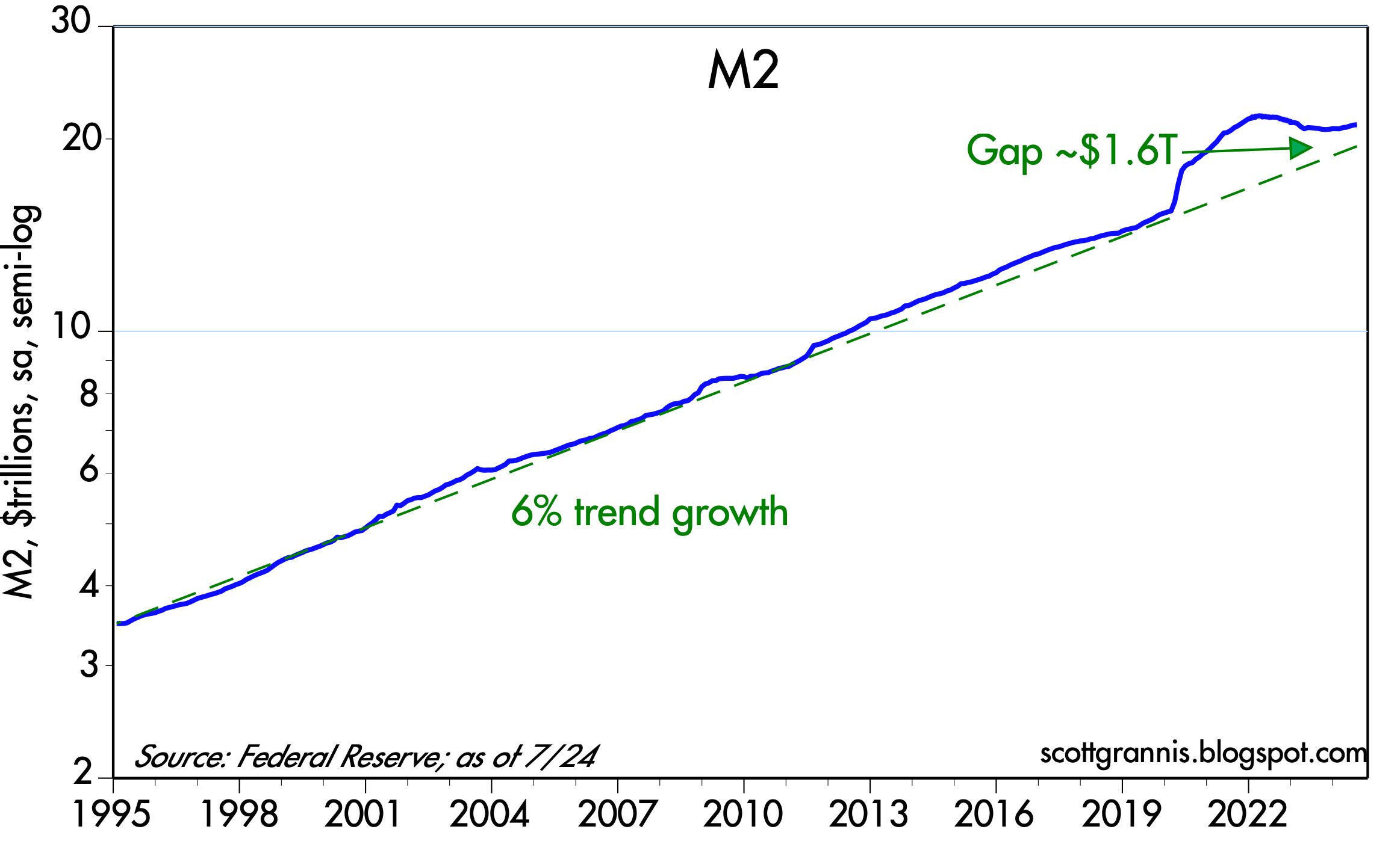
Chart #4

M2 growth continues to slow as well, as Chart #4 shows. The huge bulge in M2 was the by-product of $6 trillion of fiscal "stimulus" doled out by the Trump and Biden administrations, and it was in turn the proximate cause of the inflation bulge. Both are now in the past, and monetary conditions continue to return to some semblance of "normal."

Chart #5

I have argued for years now that the behavior of money demand and money supply easily explain the rise in inflation which began in early 2021 and which peaked in mid-2022. The initial surge in money was offset by an equal surge in the demand for money, which is why inflation didn't surge until early 2021. But after that, and as the economy got back on its feet post-Covid, the demand for money (Chart #5) collapsed. The public began spending the money that had been stockpiled during the Covid shutdowns, and it was a classic case of too much money chasing too few goods (which were constrained because of supply-chain shortages). Money demand is now approaching some semblance of normal.

Chart #6

This same dynamic played out with currency in circulation (Chart #6). During the panic of 2020, most people wanted extra cash in their pockets if for no other reason than that it was difficult to spend it. That has completely reversed. The ratio of currency in circulation to nominal GDP is now less than 1% higher than it was prior to the onset of Covid lockdowns.

Chart #7

Chart #7 shows the spread between investment grade and high-yield corporate debt and Treasuries, which is an excellent barometer of the market's expectations for future profits (lower spreads being good). The current level of spreads also suggests that financial market liquidity is abundant, and that in turn reflects confidence in the health of the economy.

Chart #8

Chart #8 shows the level of Bloomberg's financial conditions index, which uses a variety of money market inputs to gauge the overall health of the financial markets. Conditions appear to be substantially normal here as well, with no signs of distress.

Chart #9

Chart #9 shows the level of the Producer Price Index, which measures inflation pressures early in the production pipeline. As should be evident, there has been zero inflation according to this measure since mid-2022. In fact, the price level according to this measure has actually fallen by 0.9% since June '22, when inflation peaked. 

Chart #10

The Consumer Price Index rose 2.9% in the year ended July '24, but roughly one-third of that increase came from shelter costs (as I've explained repeatedly over the past year or so). Chart #10 shows the changes in the CPI and the ex-shelter version of the CPI, the latter of which has increased by 1.78% in the past year and only 1.45% annualized over the past two years. 

Moreover, the CPI is up at an annualized rate of only 0.4% annualized in the past three months, while the ex shelter version has fallen at an annualized rate of -1.5%! 

Chart #11

Chart #11 shows the three major components of the Personal Consumption Deflator, arguably the best measure of inflation at the consumer level. What stands out here is that, since the inflation peak of mid-2022, prices of durable goods have declined, and prices of non-durable goods have risen by a mere 0.9%. Substantially all of the measured inflation in the past two years comes from "services," which are in turn dominated by shelter costs.

Chart #12

Chart #12 compares 5-y Treasury yields to the ex-energy version of the CPI (I use this measure because energy prices have been extraordinarily volatile in the past two decades). Note the blue asterix at the bottom right hand side of the chart, which marks the year over year change in the CPI ex-shelter (1.78%). At this level of inflation, and based on past relationships, a 5-yr Treasury yield of between 2% and 3% would not be unreasonable at all.

I see no reason for the Fed to delay a move to lower interest rates substantially.