Thursday, June 27, 2024

Monetary conditions are returning to normal


On June 25th the Fed released the May '24 data for M2 (the release is scheduled for the fourth Tuesday of each month for the previous month's data). There were no surprises.

The M2 story as I tell it goes like this: Beginning shortly after the economy was put into Covid lockdown by overzealous and panicked officials, Washington flooded the economy with some $6 trillion worth of "stimulus" checks in an attempt to mitigate the pain. The public, having no ability or desire to spend this bonanza in an era of extreme uncertainty, allowed the money to accumulate in their bank accounts, thus swelling the M2 numbers but having little impact on the economy. Then, as the economy began to slowly return to normal beginning in early 2021, the public began to spend their bonanza, having little or no desire to let trillions of dollars sit in bank accounts paying little or no interest. Extra, unwanted money began to inflate prices and fuel a return to economic growth. The Fed was slow to realize this, waiting for almost a year to begin (slowly) raising short-term interest rates in an attempt to entice people to hang onto the money. But the damage was done, with the result that the economy was flooded with almost $5 trillion of extra demand (i.e., about 28% more M2 than usual) that enabled the price level to rise by about 20% or so.

Today the economy is once again functioning normally, growing at about a 2% pace. The excess of M2 has been largely worked off, and what remains of above-target inflation is an artifact produced by estimates of shelter costs that seriously lag reality and are questionable at best (see this post for a more detailed explanation). The M2 wave crested two years ago, and ex-shelter inflation has been 2.1% over the past year, well within the Fed's upper limit of 2.5%.

The big inflation episode is essentially over, but the Fed is once again slow to figure this out, and thus reluctant to lower interest rates. Meanwhile, high interest rates have all but crippled the housing market (30-yr mortgage rates at 7% are prohibitive at a time when wages are failing to keep pace with prices). Commercial real estate prices have tumbled over 20% according to figures compiled by the CoStar Group, and there is lots of talk about a coming wave of bankruptcies. Floating-rate loans taken out at 3% interest rates are resetting sharply higher, to the dismay of borrowers already suffering from stagnant real wages. The dollar is king of the hill these days, thanks to world-beating interest rates, but this is squeezing commodity producers as well as the offshore profits of major industries.

To be sure, not all is bad. The Covid lockdowns led to many unforeseen productivity enhancements (e.g., zoom meetings, remote work). The Fed has been reluctant to tighten, so liquidity conditions remain near-optimal. The return of low inflation has boosted confidence. Corporate profits have not disappointed. Credit spreads are low and relatively stable.

Chart #1

Chart #1 illustrates how the almost $5 trillion of "extra" M2 growth has gradually disappeared. The green line extends the growth rate of M2 from 1995 through 2019). Currently, M2 stands only about 9% above where it might have been without the Covid distortions.

Chart #2

Chart #2 shows currency in circulation, which also experienced a burst of growth but has since returned to its long-term trend growth. Currency is a good proxy for money demand, since people only hold currency if they want to—unwanted currency quickly finds its way back to the bank system to be exchanged for interest-bearing deposits. Money demand surged in 2000-2021, but has since returned to "normal" over the past year.
Chart #3

Chart #3 is another way to measure the demand for money, by dividing M2 by nominal GDP. This is a proxy for the amount of liquidity people are comfortable holding as expressed by a percentage of their annual income. Here too we see things are returning to what might be considered "normal," or pre-Covid levels. 

To sum up, the monetary situation has for the most part returned to normal. This lends strong support to the belief that the Fed has essentially managed to once again tame inflation. Interest rates are quite likely to decline going forward, and the only question is one of timing. Meanwhile, the Fed has lots of "dry powder" to unleash (in the form of lower interest rates) should the economy stumble.

The biggest obstacle the economy faces now is fiscal policy, which will depend to a great deal on the outcome of the November elections. Much as I detest Trump's personality and his affinity for tariffs, I strongly believe his policies (e.g., lower tax rates, reduced regulation, smaller government) would result in a stronger economy than if Biden were granted another term in office.

P.S. Sorry for the dearth of posts this month. We spent a lot of time in Argentina recently, where, among other things, we attended the Cato conference in Buenos Aires. There is still tremendous enthusiasm for Milei and his policy prescriptions, but there are concerns that he may delay dollarization for too long. In the meantime he has accomplished much more than anyone would have thought possible in his first six months in office. 

Tuesday, June 4, 2024

Tight money hasn't hurt corporate profits


The market tries, but just can't shake its Phillips Curve instincts, which is why any news that is considered to increase the likelihood of interest rates being "higher for longer" is deemed bad for the economy and bad for stocks, and vice versa. It's not surprising that this is so, since decades of experience have taught the market that recessions reliably follow periods of tight monetary policy. ("Tight" being defined, traditionally, as high and rising real interest rates, and a flat to inverted yield curve, and a strong currency. I've maintained for many years, however, that a better definition of tight money would include high and rising credit spreads.)

What the market is missing is that the Fed in 2009 adopted an abundant reserve regime that changed everything. Higher interest rates since then have not equated to bad news for the economy because abundant reserves mean abundant liquidity, and that in turn is what keeps the economy on an even keel and credit spreads low. Meanwhile, falling inflation restores confidence to the economy, and that boosts investment and productivity. That's certainly the case today: credit spreads are quite low—which in turn suggests that markets are functioning well and the outlook for the economy's health is decent. Even though monetary policy is almost certainly tight.

Chart #1

Currency in circulation (Chart #1) grew at a fairly steady pace of 6.6% per year from 2010 through 2019. It then exploded upward in the wake of the massive Covid stimulus spending. Over the past few years the pace of currency growth has slowed dramatically: currency in circulation has increased by only 1.3% over the past year. 

If the trend line in Chart #1 represents "normal," then this chart suggests that money supply (in the form of currency) now matches money demand and monetary conditions are supportive of a low inflation outlook. (As I've argued before, the supply of currency is always equal to the demand for currency, since unwanted currency is simply returned to banks in exchange for deposits.)

Chart #2

The M2 measure of money supply grew at a fairly steady pace of 6% per year from 1995 through 2019, as shown in Chart #2. It then exploded upwards by about $6 trillion, which was the result of the monetization of $6 trillion in COVID "stimulus" checks. For the past two years, M2 growth has been flat to negative. As the chart suggests, it's only marginally higher today than it would have been in the absence of COVID spending. By this measure, monetary conditions have gone from extremely easy to reasonably tight. Tight, because the money supply has shrunk, inflation has fallen, real yields are relatively high, and interest-sensitive sectors of the economy (such as housing) are suffering.

Chart #3

As I define it, "money demand" is best expressed as the ratio of M2 to nominal GDP, which can be thought of as the amount of cash that the average person wants to hold compared to his or her annual income. Chart #3 suggests that, as is the case in the previous two charts, monetary conditions have almost returned to normal. Money demand surged during the Covid crisis, only to reverse once the economy got back on its feet. Money demand now is almost back to pre-Covid levels. There is no longer a huge surplus of unwanted money to fuel rising prices.  

Chart #4

Chart #4 shows the value of the dollar vis a vis a relatively small basket of major currencies and a large basket. Most importantly, the chart adjusts for inflation differentials, which means that it is a good indicator of the purchasing power of the dollar in different countries. By any measure, the dollar today is quite strong from an historical perspective. This is way tight money works: attractive interest rates plus confidence in the Fed's ability to constrain inflation create extra demand for dollars relative to other currencies. 

Chart #5

Chart #5 shows the rate of inflation according to the total and core versions of the Personal Consumption Deflator. Clearly, whatever the Fed has done in the past two years ago has resulted in a significant decline in inflation. 

Chart #6

Chart #6 shows the three major components of the Personal Consumption Deflator. Here we see that prices of durable goods have actually declined in the past year, while the prices of non-durable goods have increased only marginally. The only significant source of inflation is in the services area, which is dominated by wages. It's not unusual for wages to lag price increases in other sectors. Wage increases are thus likely to moderate going forward, and this will bring headline inflation back down to the Fed's target.

Chart #7

Chart #7 shows that corporate credit spreads are very low from an historical perspective. This is the bond market's way of saying that investors are quite confident in the outlook for corporate profits. And, by extension, confident in the future health of the economy. 

Chart #8

I have been updating and publishing Chart #8 for at least the past decade. To this day it amazes me that it has not received more attention. The 3.1% trend line (green) represents the growth path that the economy followed from 1965 through 2007. The 2.2% trend line (red) represents the growth path that largely has prevailed since mid-2009. If the economy had regained the 3.1% growth path after the 2008-2009 Great Recession, it would be fully 25% bigger in real terms today! (What a difference 1% less growth per year can make!) What explains today's slower growth should be the issue that is front and center of the national debate. My short explanation is that the economy has lost its dynamism due to 1) excessive government spending, 2) increased tax and regulatory burdens, and 3) rising transfer payments.

Chart #9

Chart #10

Charts #9 and #10 compare the level of corporate profits to the nominal size of the US economy. By either measure, profits are exceptionally strong. If this is the price of "tight money" then let's have more of it! (Note: I have excluded profits and losses generated by the Federal Reserve's abundant reserve regime from overall corporate profits.)

Chart #11

A traditional measure of equity valuation on a macro level compares the price of stocks to the trailing 12-month sum of after-tax corporate profits (the price-earnings ratio, or PE). Chart #11 does the same, but it uses the level of after-tax corporate profits as calculated by the National Income and Products Accounts over the past quarter. This is a more timely and more consistently-calculated measure of profits than the traditional PE ratio. (I credit Art Laffer for this, an approach he has been using for over 40 years.) By this measure stocks are relatively expensive, but not extremely so. 

Chart #12

Borrowing from Art Laffer again, Chart #11 compares the theoretical level of corporate profits (calculated as the capitalized value of NIPA profits—profits divided by the 10-yr Treasury yield) to the market value of stocks as proxied by the S&P 500. Note that, according to Chart #12, stocks were hugely "overvalued" in 2000, and they were also very overvalued at that time according to Chart #11. Today, however, stocks appear to be appropriately valued, since their actual and nominal valuations are roughly equal. 10-yr Treasury yields both drive and explain the differences between these two measures of equity valuation.

This in turn implies that lower interest rates (which should follow the decline in inflation) will increase the appeal of equities as an asset class. This in a nutshell is the "Fed put" that I mentioned in my previous post. Tight money hasn't hurt the economy at all.

Friday, May 17, 2024

Charts with a message


The US economy grew 3.1% last year, trouncing widespread calls for a recession and exceeding my relatively sober expectation for 2% growth. With growth apparently persisting this year, and with popular inflation numbers marginally higher than the Fed's target, both the market and the Fed now question whether and by how much the Fed should cut rates. The prevailing market wisdom holds that the Fed will cut rates once before year end; they might move sooner, however, if the economy shows clear signs of slowing down and year over year inflation falls below 2%.

I continue to argue that the Fed has essentially reached its inflation target. M2 money growth has been flat to negative for two years, and inflation ex-shelter costs (which are artificially inflated due to the BLS's faulty measurement) has declined to the Fed's target. Moreover, today's interest rates are high enough to almost paralyze the housing market, high enough to keep the dollar strong, and that in turn is enough to depress most commodity prices. Fortunately, credit spreads are still quite low, and, when combined with plentiful liquidity, it's not hard to conclude that monetary policy is not tight enough to precipitate a recession.

The correct way to view the interplay between growth and inflation is to first understand that high inflation is bad for growth, while low and stable inflation is conducive to growth. Economic growth by itself does not cause inflation—only monetary policy does. As my mentor John Rutledge explains it, inflation is like fog on the highway; it forces everyone to slow down because of a lack of visibility. Inflation creates uncertainty about the future value of the dollar, the level of interest rates, and prices. Reducing inflation thus eliminates uncertainty and promotes investment, which in turn drives growth. In short, the economy grew so much last year because inflation fell. 

The charts which follow have several messages: 1) interest rates are high enough to cause some serious problems in the housing market, while at the same time boosting the dollar and keeping downward pressure on commodity prices, and 2) some sectors of the economy—manufacturing, international trade, small businesses, commercial real estate, and the service sector in general—are struggling even as the high tech sector continues to boom and corporate profits are showing healthy growth (which is why the stock market is moving higher).

Chart #1

The average rate on mortgages held by the public is 3.9% or so, whereas the current mortgage rate for new 30-yr loans is 7.2%. This creates a powerful incentive to avoid selling one's home, because acquiring a new mortgage is extremely expensive. It also depresses the demand for housing because 7.2% mortgage rates make home prices quite unaffordable for the vast majority of people. Housing supply and demand are both very constrained, with the result that the market is not likely in an equilibrium situation. Conditions could change dramatically at any time.

Chart #1 also shows that the spread between mortgage rates today and 10-yr Treasuries (the backbone of the mortgage market) is elevated. Why? Because investors are reluctant to buy 30-yr mortgages that could turn into very short-term interest rate loans should Treasury yields decline (because those who borrow at today's high rates would rush to refinance if rates fell). In sum, homeowners don't want to sell, buyers don't want to buy, and lenders (investors) don't want to lend. Again, this is not a healthy market and these conditions cannot persist much longer. 

Chart #2

As Chart #2 shows, housing hasn't been so unaffordable for many decades. 

Chart #3

Chart #3 shows that the volume of new mortgage applications is at very low levels, having dropped by roughly 75% since the heydays of 2005-2006. 

Chart #4

As Chart #4 shows, and as is consistent with the big decline in new mortgage applications, the volume of home sales is very low from an historical perspective. 

Chart #5

As Chart #5 shows, housing starts are weak because builders are not confident that the outlook for the housing market is healthy. Modest growth in home construction will not be a source of stronger overall growth. What is clear is that the housing market needs a significant decline in interest rates in order to improve.

Chart #6

As Chart #6 shows, industrial production in the US has been flat for several years. Meanwhile, industrial production in the Eurozone is suffering from recessionary conditions. The US economy is the global economy's primary engine of growth these days, but it is not very impressive.

Chart #7

World trade volume (Chart #7) surged from 2000 through 2019, but has since stagnated. Geopolitical tensions undoubtedly explain most of this, but without an increased pace of trade the global economy is lacking a key engine of growth. Heaven help us if war spreads to Europe and throughout the Middle East. 

Chart #8

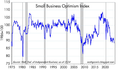
As Chart #8 shows, small business optimism is very low. Small businesses are essential to the overall health of the economy, so this is a troublesome sign. Likely culprits: increasing regulatory burdens, high inflation, high tax burdens, green energy subsidies which incentivize unproductive investment, geopolitical tensions, and the political polarization which increasing divides the economy.

Chart #9

Chart #9 shows that commodity prices have a strong tendency to move inversely to the strength of the dollar. (The dollar is plotted on an inverse y-axis, so a falling blue line means a stronger dollar.) What stands out here is that commodity prices are unusually strong relative to the dollar. But their ability to rise appears to be constrained given the dollar's ongoing strength. 

Chart #10

Chart #10 tells us that the dollar's strength owes a lot to the fact that US interest rates are much higher than those in Europe and the rest of the developed world (the blue line represents the spread between 2-yr US and German yields). Stronger US growth and more attractive yields combine to enhance the appeal of the dollar vis a vis other currencies. This is turn helps depress commodity prices, which also helps to restrain inflation. 

Chart #11

Chart #11 tells us that the commercial real estate market is facing serious problems. On a value-weighted basis, commercial property prices have fallen 20% from their July '22 high. By the same measure, office property prices (not broken out here) have fallen 34.5% from their all-time high.

Chart #12

Chart #13

Chart #12 suggests that business activity in the service sector of the economy (by far the largest sector) has fallen significantly of late. Chart #13 shows that that less than half of service sector businesses plan to increase the number of jobs. By this measure, the service sector could be experiencing recessionary conditions. It also reinforces the message of Chart #8 (small business optimism), and together the two tell a troubling story.

Chart #14

Chart #14 shows the year over year change in the number of private sector jobs according to the establishment survey. (Private sector jobs are the only ones that really count, in my opinion.) Jobs are growing at a relatively moderate 1.7% annual pace, which is nothing to get excited about. If this were to continue, it would probably be enough to sustain an overall pace of growth for the economy of about 2.5% - 3.0% per year—which is at odds with all the charts above that tell of weakness. What stands out here is the rather significant deceleration of jobs growth since the beginning of 2022. This is not a boom, but neither is it a bust. Yet.

Chart #15

Chart #16

Chart #15 is an updated version of a chart I have been featuring for months. What it says is that if it weren't for the way the BLS computes housing prices (which is based on the year over year change in housing prices 18 months ago), inflation today would be within the Fed's target range today. (The Fed is targeting 2% inflation in the Core Personal Consumption Deflator, which is equivalent to about 2.5% in the CPI, because the CPI tends to exceed the deflator by roughly 0.5% per year.)

Chart #16 all but proves that the BLS uses ancient housing prices to compute today's rate of shelter inflation. The red line has been falling almost exactly in line with the yoy change in housing prices 18 months ago. If this relationship holds, then the red line will fall from 5.8% today to about 2.5% by October, and this would in turn subtract a significant amount of shelter inflation from the overall CPI. 

On balance, I see the risks pointing to weaker rather than stronger growth, and lower rather than higher inflation. If the economy weakens, interest rates are quite likely to fall, and that will reduce the threat of further weakness. I think the stock market sees this as well, in the form of what is called a "Fed put," or what is akin to a hedge against recession.