Tuesday, March 23, 2021

The problem with unwanted money


The demand for money—as measured by the ratio of M2 to nominal GDP—currently stands very near to an all-time, eye-popping high (see Chart #1). The turmoil and fears which characterized the Covid-19 era caused the public to seek out and hold trillions of dollars of extra cash, and the Fed correctly obliged this demand for money and money equivalents by greatly expanding its balance sheet— transmogrifying notes and bonds into T-bill equivalents (aka bank reserves). (I've explained this all in detail over the course of many previous posts.) Conveniently, increased savings on the part of a terrified and sheltering public provided most—if not all—of the money that Treasury borrowed to fund Covid relief spending. 

Chart #1

Chart #2

But as Chart #1 suggests, the surge in money demand has passed. Confidence is returning and the economy is regaining lost ground. It stands to reason that the demand for money should begin to decline, and it has already declined, as we see in Chart #2, driven mainly by a sharp rise in nominal GDP. This is quite likely to continue; the main question going forward is how much of the increase in nominal GDP will be real and how much will be inflation. 

Chart #3

Chart #3 shows the daily volume of airline passengers (white) screened by TSA, with the magenta line being the 7-day moving average. Notice the sharp increase in air traffic in the past two months. Compared to the levels which prevailed 2 years ago at this time of year, air traffic is now down only 40%, whereas at the lows of last April, air traffic had plunged by an astounding 96%. With the rapid pace of vaccinations and increasing signs of optimism, there is every reason to expect air traffic to grow rapidly in coming months and the economy to grow as well.

The resurgent demand for air travel almost certainly is driven in large part by increased confidence. And with increased confidence, the rationale for the public continuing to hold a huge portion of their annual incomes in cash (i.e., the public's demand for money) surely is fading. But since the Fed has taken no steps to reverse its note and bond purchases, the M2 measure of money supply can't simply evaporate. And with the recently passed Covid relief bill, deficit-funding spending is going to ratchet up once again, which could add yet more money to the financial markets, especially since the Fed plans to continue to its purchases of notes and bonds. 

Unwanted money can't disappear, but it can fuel an expanding economy and it can bid up the prices of other assets.

Chart #4

Chart #4 provides some clues as to how this works. The bars represent the current yield on a variety of investments. The green line is the market's expected average annual increase in the CPI over the foreseeable future (about 2.3%); think of that as the average increase in the prices of all goods and services over the next 5-10 years. Owning cash, short-term Treasuries or mortgage backed securities is very likely to give you a loss in terms of purchasing power. On the other hand, yields on real estate trusts, high-yield debt, emerging market debt and the S&P 500 promise to deliver a purchasing power gain. Unwanted money (much of which is held in very short-term investments such as T-bills, bank deposits and 2-yr Treasury notes) will naturally want to seek out the much more attractive returns on just about all other assets. And as prices for other assets rise, their yields will decline. 

This is another way of saying that a tsunami of unwanted cash likely is going to lift the prices of just about everything, and that is another way of saying we are going to see more inflation in the years to come, UNLESS the Fed reverses course. Which they have promised not to do for at least another year and a half. 
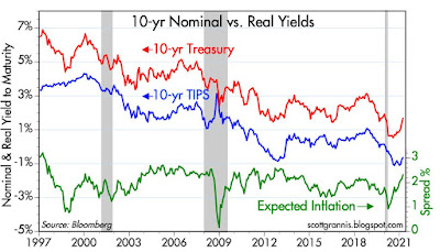
Chart #5

Chart #5 shows us the bond market's way of expressing the view that inflation is likely to average about 2.3% per year for the foreseeable future. The difference between real and nominal Treasury yields gives you the market's expected rate of inflation. Note that most of the increase in inflation expectations of late has come from a rise in nominal Treasury yields. Real yields are still very low.

Chart #6

Chart #6 shows how 2-yr real yields on TIPS have a strong tendency to track the growth rate of real GDP over time. That real yields are currently so low means that the market either does not have a lot of confidence in future growth prospects, and/or the market is still very risk averse (meaning that people are willing to pay extremely high prices for the relative safety of TIPS). Going forward, we are likely to see real yields rise as long as the economy demonstrates that it has the ability to grow by at least 1-2% per year for the next several years. 

Chart #7

Chart #7 gives us a long-term view of the evolution of the Treasury yield curve (using 2- and 10-yr yields as the classic reference points for short and long-term interest rates). Bear in mind that short-term rates are heavily influenced by both the Fed's monetary policy target and the market's demand for safe assets. The yield curve has steepened noticeably since last summer, mainly due to rising long-term yields, which in turn have been driven by expectations that the economy will improve enough to allow the Fed to raise short-term rates in the future. This is a healthy development, since very low yields are a sign of a very weak and risk averse economy. There's no reason yet to worry that higher yields will derail the ongoing equity market rally. 

Tuesday, March 16, 2021

The Covid winter is over

Here are just a few important and very encouraging charts—part of a larger picture in which the US  economy is definitely emerging from its long Covid winter.

Chart #1
Chart #1 shows a critical and timely measure of US air travel, which includes data as of yesterday. The green line is the 7-day moving average, which is the one to watch since there are definite trends in travel on the various days of the week. Here we see that passenger traffic has increased 78% (!!) since January 27th of this year. It's still down over 40% compared to the levels which prevailed before the onset of lockdowns, but the recovery is proceeding rapidly. Looking ahead, we still have a lot of good news to look forward to as confidence is on the rise and vaccinations proceed apace. And by the way, the US stands out as leader of the vaccination pack among developed nations, with the notable exception of Israel, which has vaccinated over half of its population.

Chart #2

My state has been one of the hardest hit (mostly due to extreme lockdown measures ordered by our politicians). As Chart #2 shows, big lockdowns didn't flatten the curve at all last year, since they were firmly in place last November, when daily new cases began to surge. Vaccines have helped, but they can't really account for the bulk of the decline year to date, since it was underway well before significant numbers were vaccinated. That means natural immunity (acquired from exposure to the illness or natural exposure to similar viruses over the years must be a very important factor contributing to the rapid demise of this pathogen. Either way, the severity of Covid cases and the growth of new daily cases has improved dramatically. In Los Angeles County (10,000,000) population, there were only a handful of Covid-related deaths in the most recent reported week, and daily new cases have dropped almost 90% since late January. Overall, statewide daily new cases have plunged 92% since late January.

Governor Newsom: please open the California economy NOW!

Chart #3

Chart #3 is one of my perennial favorites, since it shows the Fed has been responsible for almost every recession in the past 60+ years (the notable exception being the brief Covid crackdown recession that started a year ago). Recessions (gray bars) have occurred after every major spike in the real Fed funds rate (blue line) and every major flattening or inversion of the yield curve (red line). The purpose of Fed tightening has always been to increase real interest rates (and effective borrowing costs) in order to break the back of rising inflation. (Higher real interest rates work to increase the demand for money thus reducing the amount of excess money in the system at the same time the Fed is withdrawing reserves and shrinking the supply of money.) A significant tightening of monetary policy also causes the yield curve to flatten and to eventually invert (when long-term rates fall below the level of short-term rates). An inverted yield curve almost always means that monetary policy is so tight the economy begins to suffer and the market realizes that the Fed will soon have to reverse course.

As should also be apparent, we are nowhere near either of those conditions at present. Real interest rates are exceptionally low, and the Fed has promised to keep them there for a looonnnggg time. (I have serious doubts they will actually do that however). The yield curve has steepened a bit, which is a sign that the bond market realizes that the economy is improving and the Fed will eventually have to raise short-term rates at some time in the future. But it is not very steep from an historical perspective. 

Other indicators that have traditionally signaled that monetary policy is so tight that it is threatening economic growth prospects—such as 2-yr swap spreads and Credit Default Swap spreads—are firmly at the low end of their historical ranges. That means that liquidity is abundant and the outlook for corporate profits is positive. In short, there are no warning signs of economic trouble ahead to be found in the market. 

I would ordinarily be ecstatic about the prospects for the economy, were it not for a growing number of disturbing developments such as huge increases in government spending, promises of huge increases in a broad range of taxes, growing federal control over the economy, continued lockdowns and mask mandates, and expanded welfare measures (e.g., higher minimum wages and increased healthcare subsidies). Most troubling is the prospect of a significant increase in inflation, since that inevitably erodes standards of living, raises barriers to savings and investment, and works to transfer the burden of a mountain of government debt to the private sector in devious and pernicious ways.

All the things that worry me share a common denominator: they serve to reduce the incentives to work and invest. In short, they are anti-supply side. As a supply-sider, I firmly believe that the only way to truly stimulate an economy is to increase the incentives to work and invest by reducing tax burdens, keeping the value of the currency stable, and minimizing the amount of government intrusion in the economy.

Thursday, March 11, 2021

This is a very wealthy country


Today the Fed released its estimates of household net worth as of the end of December 2020. Net worth has reached a new record high in nominal, real, and per capita terms. Covid has been a disaster, to be sure, but the US economy is healthy and poised to continue to prosper, albeit at a much slower rate than we have seen in the past. Here are some charts that tell the story, which is for the most part very impressive.

Chart #1

As Chart #1 shows, the private sector of the US economy currently has a net worth (total assets minus liabilities) of more than $130 trillion. That's up $12 trillion from a year ago, for a growth rate of 10%. Financial assets have done the best, but noteworthy is the relatively small increased in household liabilities since just before the Great Recession: liabilities have gone from $14.5 trillion at the end of 2007 to only $17.1 trillion as of a few months ago, for a growth rate of only 1.3% per year. Real estate holdings, meanwhile, have gone from $25.8 trillion (that was just after the peak of the housing boom) to $35.8 trillion at the end of 2020, for a growth rate of only 2.6% per year. 

Chart #2

Chart #2 adjusts the net worth figures for inflation, and uses a semi-log scale for the y-axis to show that over the long haul, real net worth in the US has increased by an annualized rate of about 3.6% per year. Recent experience is not at all out of line with what we've seen in the past.

Chart #3

Chart #3 further adjusts the net worth figures, subtracting inflation and dividing by the size of the US population. Here again we see a fairly steady rate of growth over the years, but it does look like the current number is on the strong side of what we might have expected. Regardless, the average person in the US enjoys a net worth of about $390,000. Yes, of course that number is inflated due to the estimated 2,100 billionaires we have amongst us, whose total net worth is estimated to be about $8 trillion. (I'm sure it's even more today given stock market gains year to date.) But if we subtract that from the $131 trillion of total net worth and divide by population, we still get a pretty healthy value for the average person: $333,000.

I don't know what the median value of per capita wealth is, but it's important to remember that our collective net worth is based on the wealth-generating value of all the assets we collectively own. Everyone benefits from all the roads, infrastructure, phones, computers, cars, machinery, etc., even if not everyone owns things. Office workers don't own their office building, but without it and without all the US infrastructure that has been built up over the years, they would most be earning far less. Our massive net worth as a country translates directly into the highest living standards we have ever enjoyed.

Chart #4

Sadly, total federal debt held by the public is now roughly equal to our annual GDP (roughly $22 trillion). This is the highest level of debt by far since just after WW II. But relative to our net worth as a country, it is only slightly higher than it has been for most of the past decade. This is not a picture of impending disaster, but I sure wish we weren't going to be borrowing another $4-5 trillion this year.

Chart #5

And despite its enormous size and ongoing (and staggering) growth, Chart #5 shows that the burden of all that debt (i.e., total interest payments on the debt relative to GDP, a proxy for our annual income) is about as low as it has been for many decades, thanks to today's extremely low interest rates. Our national debt is not about to kill us. But since the driver of all the new debt is mostly profligate spending (e.g., huge transfer payments, subsidies, and generally wasteful spending) which does little or nothing to make our economy bigger or healthier. We've been consuming a lot of our seed corn, instead of saving and investing for the future, and this can't go on forever without serious and unpleasant consequences. 

Running up debt the way we are will only serve to weaken our economy over the long run, making future gains in net worth far less than we have enjoyed to date. This will mean a much slower rise in living standards for our children and grandchildren than we have been enjoying.

Chart #6

Our federal government is spending money like a drunken sailor, but the private sector, fortunately, has been very prudent. Chart #6 shows private sector leverage: total household liabilities as a percent of total assets. Leverage today is as low as it has been since 1976, and it has declined by a huge 40% since the peak in early 2009. 

Chart #7

Chart #7 compares the performance of the US stock market to that of the Eurozone. The US is kicking a**. Note that both y-axes are semi-log and use the same ratio from top to bottom. The S&P 500 has gone up by more than double the increase in the Euro Stoxx index since early 2009. This is huge, and quite remarkable.