Friday, September 29, 2017

Tax and deficit scaremongering

The media is full of stories claiming that lower tax rates will cause a huge and damaging increase in the federal deficit and will fail to stimulate the economy. Here are some charts which show that those claims are not backed by historical experience. On the contrary: worrying about tax cuts is not necessarily sensible at all.


The chart above compares top tax rates to tax revenues as a % of GDP. (Comparing taxes collected to the size of the economy is the only meaningful measure of revenues.) Note that despite the huge reduction in tax rates in the early years of the Reagan administration (early 80s), revenues hardly fell at all, and in fact increased at a fairly impressive rate through the late 80s and 90s.
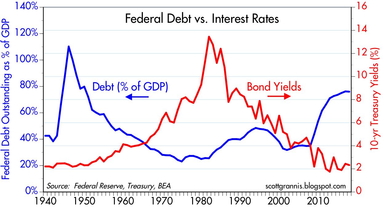

There is not a shred of evidence to suggest that rising federal budget deficits have any impact significant impact on interest rates. In the chart above we see that huge increases in the budget deficit have occurred alongside very low interest rates. Predicting higher interest rates as a result of rising deficits is not supported by the experience of the past.


As the chart above shows, recessions almost always result in very weak tax collections. No surprise: recessions cause incomes and employment to fall; the tax base shrinks and revenues decline. Periods of economic growth almost always cause revenues to rise.


Federal spending almost always rises as a result of recessions. Politicians can't resist spending extra money to "stimulate" the economy, and automatic stabilizers like food stamps and unemployment insurance kick in. The most important influence on revenues and spending is the health of the economy.


The Reagan tax cuts did little if anything to worsen the deficit, which began rising in the wake of the recessions of '81 and '82. The current deficit, relative to GDP, is well within the range of post-war experience.


The chart above makes it clear that people respond to incentives, especially when it comes to taxes. Prior to the increase in capital gains taxes in late 1986, capital gains realizations surged. They then fell dramatically, coming in at about half what the CBO had projected prior to the hike in the capital gains tax rate. Note also that declining capital gains tax rates in the late 90s saw a big increase in capgain revenues—exactly the opposite of what an accountant would have projected. The capital gains tax is the only tax you can legally avoid, by the way. All it takes is not selling something you hold at a gain. If we reduced capital gains taxes tomorrow I would bet a lot of money that federal revenues would rise. I for one would sell a lot of things that I have avoided selling. I would also diversify my portfolio in the process, and I would be much more willing (and able) to invest in new things. As it is, a lot of my money is tied up in gains that pain me to realize. It's the same story for corporations who refuse to repatriate their profits. It's therefore hard to overestimate the potential impact of true tax reform.


The chart above shows that federal spending and revenues today are very much in line with historical experience. The weakness in revenues of late could very well be driven by the anticipation of lower tax rates. Taxpayers have lots of ways to postpone or defer income, just as they can postpone or defer capital gains—if they think there is a chance that tax rates will fall in the future. Corporations can postpone or defer new investment as well. Thus, it's not wise to promise tax cuts in the future and then delay their implementation. That was the mistake that Reagan made with his first round of tax cuts; revenues promptly declined because people were waiting for the second round of cuts.

Meanwhile, there is still little if any evidence to suggest that the market has priced in any meaningful increase in the economy's health. People may be postponing income in anticipation of lower tax rates, but nobody's betting that the economy is going to pull out of its 2% annual GDP growth rut anytime soon.


The chart above compares the real yield on 5-yr TIPS to the real Fed funds rate. It's best to think of the red line as being the market's forecast for the average level of the blue line over the next 5 years. Right now the market is not expecting the Fed to do much more in terms of raising the real rate of short-term interest rates in coming years. That expectation, in turn, is very likely driven by the belief that the economy is going to be stuck in its 2% growth rut for as far as the eye can see.


The chart above confirms that from another angle. Here we see that real yields tend to match the economy's growth rate trend. The current level of real yields is consistent with economic growth of about 2%. If the market were more enthusiastic about the economy, TIP yields would be much higher.


The gold market agrees. The prices of gold and TIPS have been strongly correlated over the years. My interpretation of this is that people are more inclined to buy gold when the economy is weak, and less inclined when it is strong. If the market really believed the economy were about to break out of its 2% growth rut, real yields would be a lot higher and gold prices a lot lower. Why hold gold if the economy is improving? Better opportunities can be found when the economy is healthy and chugging along. Gold and TIPS have been meandering around the same levels of several years, all the while the economy has been stuck in a 2% growth rut.

Thursday, September 21, 2017

FOMC's cautious and correct plan to unwind QE

The bond market was little rattled yesterday after the FOMC announced that, despite the trauma of two major hurricanes, despite the absence of news suggesting the economy has strengthened, and despite the fact that inflation remains somewhat below their 2% target, they would proceed, starting next month, with the long-awaited unwinding of their Quantitative Easing efforts. This moderate surprise was somewhat offset by the FOMC's decision to hold off on hiking short-term interest rates, presumably until December. Now that the dust has settled, short-term interest rates are a handful of basis points higher, gold is down a bit, and the dollar is up a bit—all of which suggest a slight improvement in the market's outlook for the economy. People feel better knowing the Fed is finally on track to "normalize" its balance sheet, even though it will likely take several years to accomplish. (Their plan to start selling $6 billion per month of Treasuries and $4 billion per month of MBS, to be ramped up slowly, is very cautious and conservative and will take a long time.)

A review of some key market-based indicators shows that the market's outlook for economic growth is has only improved marginally from sub-par levels. More importantly, however, there are few if any signs in the market that the Fed's plans to raise short-term rates modestly, while slowly paring down the size of its monster bond portfolio, pose any threat to growth. This tells me that the Fed is moving in the right direction, and its caution is warranted. The Fed is proposing to move slowly and cautiously to take steps to bolster the demand for money (by raising the interest rate it pays on excess reserves), now that there are increasing signs that money demand is beginning to ebb. I reviewed this in detail in a post last month, "Something to worry about." As long as the Fed keeps the supply of money in line with the demand for money, we won't have to worry about inflation. So far, it looks like they have been doing their job, since inflation has been relatively low and stable for quite a few years, and forward-looking inflation expectations have not increased.


This first chart is one of the most important. Although neither the press nor the Fed normally talk about the inflation-adjusted Fed funds rate, that is the monetary variable which is the most important for the economy, since it sets the floor for the true cost of borrowing and the true benefit to saving. Today, the real rate of interest on overnight money is slightly negative (the funds rate is 1.25% and the inflation rate is about 1.5%). It's a lot less negative now than it has been for most of the current recovery, but it's still the case that although real borrowing costs are negative and real savings rates are very low or negative. This has been the case for years, and we have yet to see any unpleasant consequences. It can't go on forever, however. If the Fed holds the real funds rate to an unreasonably low level, that would inevitably result in an imbalance between the supply and demand for money, and that in turn would result in rising inflation, a weaker dollar, and rising gold and commodity prices.

The real yield on 5-yr TIPS is best thought of as the market's expectation for what the real Fed funds rate will average over the next 5 years. 5-yr TIPS today carry a real yield of only 0.1%, while the current real yield on the Fed funds rate is about -0.15% to -0.25%. That means the market expects only very modest "tightening" from the Fed over the next 5 years. This squares with implied forward rates which show the Fed raising rates only 2 or maybe 3 times over the next several years. Both the market and the Fed believe that interest rates need rise only modestly, and that in turn implies a belief that the economy will not pick up significantly from its 2% trend rate of growth that has prevailed since 2009.

As I've said many times before, one thing to watch for and worry about would be the nominal funds rate exceeding the 5-yr real TIPS yield. That would be the market's way of saying that the Fed is entering "tight" territory and thus threatening real economic growth.


The chart above is also very important. It shows that every recession in the past 60 years has been preceded by a substantial tightening of monetary policy. Monetary policy is tight when the real Fed funds rate (blue line) is at least 3-4%, and when the Treasury yield curve (red line) is flat or inverted. We are likely years away from seeing those conditions. 


As the chart above suggests, today's very low level of real interest rates is consistent with real GDP growth of about 2%. If the market today were convinced that major tax reform is going to happen in the foreseeable future, I have to believe that real interest rates would be significantly higher, because true tax reform could unleash a lot of the economy's untapped potential. So despite rumblings of progress on tax reform, the market has not priced it in yet. The market remains cautious, just as the Fed remains cautious.


The chart above shows how the bond market reveals its inflation expectations. The difference between the nominal yield on 5-yr Treasuries and the real yield on 5-yr TIPS gives us the market's expectations for what the CPI is going to average over the next 5 years. That's currently about 1.75%, which is very much in line with the current level of inflation (the CPI is up 1.9% in the past 12 months, and the Core CPI is up 1.7%). That tells me the market is reasonably confident that the Fed is going to be doing a good job for the foreseeable future. If the market were worried that the Fed was being too aggressive, inflation expectations would be declining.


The two charts above compare the price of gold to the price of 5-yr TIPS over different time frames. I find it fascinating that these two completely different assets should behave so similarly. If anything, it means that strong economic growth (which typically coincides with high real yields such as we had in the late 1990s) depresses demand for gold, and weak growth increases the demand for gold. That in turn suggests that buying gold today is a hedge against a weaker economy.


The two charts above show that credit spreads in the US are at relatively low levels ("normal" swap spreads are 15-30 bps or so). That implies that systemic risk is low, liquidity is plentiful, and the economy is unlikely to throw a wrench into the sales and profits of the US economy's businesses. Conditions are expected to be good, and profits are expected to rise. The Fed is years away from creating a liquidity squeeze, which could only be precipitated at this point by a massive reduction in bank reserves.


In the absence of obvious or budding threats to the economy, investors find it difficult to resist the stock market, which continues to drift higher. At the current PE ratio of the S&P 500 (21.5), stocks have an earnings yield of almost 4.7% (i.e., if companies paid out all their after tax profits in the form of dividends, the market's average dividend yield would be almost 4.7%). That yield beats the 4.3% yield on the average BAA corporate bond, and it towers over the 1 - 2.8% yields to be found in savings deposits and the Treasury market. Since stocks uniquely can be expected over time to produce capital gains in addition to their yield, the only reason the market would price stocks to yield more than bonds is that the market does not expect earnings to rise, and to more likely fall. Again, this is a sign of market caution.

But what is slowly happening is that the yield on stocks is declining as their prices rise, and the yield on cash is slowly rising as the price of money declines. This process could continue for some time to come, as the Fed sets the pace for the yield on cash and the market balances the expected risk-adjusted yield on equities with the risk-free returns on cash. It's a big balancing act that could be disrupted by unforeseen events, but for the time being it looks like everything is working out OK.

If something about this picture changes, I'd bet that it's the outlook for growth, which could improve if and when Congress manages to pass meaningful tax reform and privatize—at least to some extent—the healthcare industry. That would trigger reduced demand for money (since it would boost confidence and make risky investments more attractive), and that in turn would compel the Fed to accelerate rate hikes and the unwinding of QE. But even if all those good things came to pass, I would not expect to see the future returns on equities exceeding the returns we have seen in recent years. Stocks are no longer cheap and are instead arguably overvalued; dramatic grains from these levels are thus unlikely.

Monday, September 18, 2017

Big Picture charts

UPDATED: The last two charts now reflect recently-released data as of Q2/17, which showed continued strong gains in every measure of households' balance sheets. Net worth rose by $8.2 trillion (a gain of 9.3%) over the most recent 12-month period, driven by a $6.6 trillion gain in financial assets and a $1.9 trillion rise in the value of real estate holdings, which are now worth $2 trillion more than at the peak of the housing bubble in 2006. Total household debt rose by less than $500 billion in the past year, and now stands only $600 billion higher than the prior peak in 2008; household leverage (total debt as a percent of total assets) has thus fallen by fully one-third since the all-time high in 2009.

The global economy and global financial markets are huge, but just how huge? Answer: a lot bigger than most people realize. Here are some charts which help put things in perspective. They also show that what's going on today is not unprecedented nor extraordinary. As always, all the charts contain the most recent data available at the time of this post.


Global GDP is roughly $80 trillion, about four times the size of the US economy. As the chart above shows, the global economy supports actively traded bonds and stocks worth $132 trillion, of which about 40% are US-based. There's nothing unusual about any of this, considering that a typical US household has a net worth (stocks, bonds, savings accounts and real estate) equal to about three times its annual income. 


As the charts above show, the market cap of Non-US equities has grown at a much faster rate than US equities since 2004 (US equities have grown at a 5.4% annualized rate, non-US equities at a 8.9% annualized rate). US equities are now worth about 50% of the value of non-US equities, down from more than 80%. Non-US equities have suffered somewhat, however, due to the dollar's 5% rise (on a trade-weighted basis) over the period of these charts, but that's relatively insignificant in the great scheme of things.


The defining characteristic of the current US economic expansion is its meager 2.1% annualized rate of growth, which stands in sharp contrast, as the chart above shows, to its 3.1% annualized rate of growth trend from 1965 through 2007. If this shortfall in growth is due, as I've argued over the years, to misguided fiscal and monetary policies, then the US economy has significant untapped growth potential and could possibly be $3 trillion larger today if policies were to become more growth-friendly.


As the chart above shows, the value of US equities relative to GDP tends to fluctuate inversely to the level of interest rates. This is not surprising, since the market cap of a stock is theoretically equal to the discounted present value of its future earnings. Thus, higher interest rates should normally result in a reduced market cap relative to GDP, and vice versa. Since 10-yr Treasury yields—a widely respected benchmark for discounting future earnings streams—are currently at near-record lows, it is not surprising that stocks are near record highs relative to GDP. If the economy were $3 trillion larger, however, stocks at today's prices would be in the same range, relative to GDP, as they were in the late 50s and 60s. Valuations are relatively high, to be sure, but not off the charts nor wildly unrealistic.


As the chart above suggest, over long periods the value of US stocks tends to rise by about 6.5% per year (the long-term total return on stocks is a bit more due to annual dividends of 1-2%). The chart also suggests that the current level of stock prices is generally in line with historical trends. 


Adjusting for inflation, we see that stock prices tend to rise about 3% a year, and the current level is not unreasonably high, as it was in the late 1990s.


US equities have significantly outpaced Eurozone equities over the past nine years. That has a lot to do with the fact that the US economy has grown faster as well.


US households (i.e., the private sector) have a net worth that is approaching $100 trillion. That figure has been growing at about a 3.5% annualized rate for a very long time. The current level of wealth is very much in line with historical experience.


Adjusting for inflation and population growth, the average person in the US is worth almost $300,000. That is, there are assets in the US economy which support our jobs and living standards (e.g., real estate, equipment, savings accounts, equities, bonds) worth about $300,000 per person. We are richer than ever before, but the gains are very much in line with historical experience.