Wednesday, August 30, 2023

2% growth and 2% inflation: the Fed's done


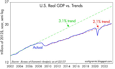
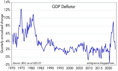
This brief post highlights some under-appreciated news contained in today's revised estimate of Q2/23 GDP. Real growth in the quarter (annualized) was revised down from 2.4% to 2.1%, and inflation (according to the all-encompassing GDP deflator, also annualized) was revised down from 2.2% to 2.0%. We're very much in a 2% growth world, as I noted last May. Inflation, meanwhile, has plunged from a high of 9.1% a year ago to a mere 2.0%.

These facts lay bare the false belief that inflation is the by-product of an economy that is "running hot," and that in order to bring inflation down the economy must suffer a period of "below-trend" growth. It just doesn't work that way. The economy has been growing at a sub-par rate since 2009, while inflation has been all over the map. Inflation is the result of too much money relative to the demand for money. 

These facts also highlight just how wrong the market is to worry that the economy is "too strong" and therefore the Fed must keep short-term rates at a high level for an extended period. I see the 3.4% rally in the S&P 500 over the past 12 days as evidence that the market is just beginning to appreciate these facts. 

Chart #1

Chart #1 shows the path of real GDP compared to two different trend lines. (Note: the y-axis uses a semi-log scale which shows constant rates of growth as straight lines.) The 3.2% trend was in effect from 1955 through 2007, while the 2.1% trend has been in effect since mid-2009. This highlights the grim reality that the U.S. economy has been suffering from a prolonged period of sub-par growth, thanks mainly to unusually high regulatory and tax burdens, coupled with excessive government spending, which in turn has been driven primarily by transfer payments (i.e., sending out checks to people without demanding any work in return).

Chart #2

Chart #2 shows the quarterly annualized rate of growth of the GDP deflator—the broadest, most inclusive, and most timely measure of inflation that we have. (Most folks seem to prefer a narrow, year over year measure of inflation, which is guaranteed to obscure important changes on the margin.) Why don't you see this 2% number in the press? Why is the Fed bemoaning the fact that inflation is still "too high?" Go figure.

One thing for sure: it's only a matter of time before the Fed realizes that instead of keeping rates high for longer, it's time to bring them back down.

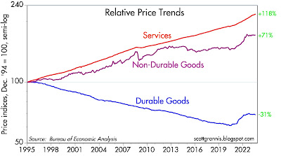
P.S. (8/31): Don't forget that as of July, the CPI ex-shelter index was up only 0.85% year over year. See Chart #2 at this post. Shelter costs are almost certain to decline in coming months since they lag the housing market by about one year. And as Chart #3 shows (below), durable and nondurable goods prices have been flat to down over the 12 months ending in July, leaving services (which includes shelter costs) as the only source of inflation.

Chart #3


Wednesday, August 23, 2023

The most important variable that won't be discussed at Jackson Hole


Today's Bloomberg headline: "Powell to map final steps in inflation fight at Jackson Hole." Memo to Fed: the fight is over. You won. 

Central bankers meeting this week in Jackson Hole likely will be talking about everything BUT what matters the most: the balance between the supply and the demand for money. Incredibly, our central bankers have failed to notice the monetary elephant in their living room for the past 3+ years. 

I've been writing extensively about money in the Covid era since October 2020. As I noted back then, strong growth in M2 in 2020 was driven by a huge increase in money demand. That's why rapid M2 growth wasn't inflationary in the beginning. 

Inflation didn't start showing up until 2021, when Covid fears began to ease and the economy began to get back on its feet. Rising confidence meant that people no longer needed to hold tons of money in their bank accounts. Declining money demand at a time of abundant M2 unleashed a wave of inflation. It wasn't until a year later—March '22—that the Fed (very belatedly) took steps to bolster the demand for money by raising short-term interest rates. Sharply higher interest rates over the past 16 months have had their intended effect: the public has become much more willing to hold on to the huge excess of M2, even as excess M2 has been declining. Falling inflation is the result. Money supply and money demand have moved back into rough balance.

Contrary to all the hand-wringing in the press (e.g., will the Fed need to crush the economy in order to bring inflation down?), and as I've been arguing for months, inflation has all but disappeared, even as the economy has remained healthy throughout the tightening process. 

There is still plenty of money in the economy. This tightening cycle has been very different from past episodes, because this time the Fed has not had to shrink the supply of bank reserves. As a result, there is still plenty of liquidity in the market. Swap and credit spreads are correspondingly low, and that implies little or no risk of a recession for the foreseeable future.

Markets are on edge, worrying that the Fed will need to keep rates very high for a long time to come. Those fears are misplaced. It won't be long until both the market and the Fed realize that lower interest rates have become the big story.

Some updated charts that incorporate yesterday's M2 release for July:

Chart #1

As Chart #1 shows, the M2 money supply continues to follow a path back to its long-term trend (6% per year since 1995). The "gap" between M2 today and where it would have been in a more normal world has fallen by half since its peak in late 2021. Excess M2 supply is declining at the same time as M2 demand has increased thanks to aggressive Fed rate hikes. This implies reduced inflation pressures—which is exactly what we have been seeing. 

Chart #2

Chart #2 shows the amount of US currency in circulation (this includes all the $100 dollar bills circulating in Argentina as well as in other countries with unstable currencies). Currency in circulation is an excellent measure of money demand, since unwanted currency is easily converted into interest-bearing deposits at any bank. People hold currency only if they want to hold it. Slow growth in currency is telling us that the demand for money is easing—but not collapsing. According to this chart, currency in circulation is only about $70 billion higher than it might have been had the Covid shutdowns and massive government spending not occurred (the 6% trend line has been in place since 1995). 

Chart #3

Chart #3 compares the growth rate of M2 to the level of the federal budget deficit. It's quite clear from this chart that $6 trillion of government "stimulus" spending was monetized. It's also clear that even as the deficit has again been rising, M2 continues to shrink. Rising deficits do not pose a risk of rising inflation this time around—at least so far. Rising deficits are being caused almost exclusively by excessive government spending, and that is the problem going forward. Government spending squanders the economy's scarce resources and saps the economy of energy by weakening productivity growth. 

Chart #4

Chart #4 compares the growth of M2 to the rate of inflation according to the CPI. Note that CPI has been shifted to the left ("lagged") by one year. Thus, changes in M2 growth are reflected in changes in inflation about one year later. Slowing growth in M2 is beating a path to lower inflation. 

Friday, August 18, 2023

TIPS vs Gold: which is the better inflation hedge?


TIPS and gold are widely considered to be classic inflation hedges, but they couldn't be more different. TIPS (Treasury Inflation Protected Securities) look far more attractive than gold these days, since they are not only an inflation hedge but also a deflation hedge and a hedge against an economic slowdown or recession.

Here's how they stack up against each other on key attributes:

Guarantees: Gold promises to keep up with inflation over long periods, but there is no guarantee this will happen, especially over shorter periods. TIPS, on the other hand, are guaranteed by the US government to keep up with inflation—and then some, due to the 2% real yield they currently pay on top of whatever inflation is registered by the CPI. Arguably, TIPS have an additional benefit since they are tied to changes in the CPI, which tends to overstate inflation over time (by about 0.5% per year according to most estimates).

Holding costs: Gold pays no interest and costs money to store. TIPS pay a guaranteed real rate of interest and their principal is adjusted for inflation continuously—and since TIPS are Treasuries, they are default free. Owning TIPS at a typical brokerage firm costs virtually nothing (there several ETFs which invest exclusively in TIPS as well).

Recent price action: The recent bout of high inflation has fueled demand for gold, which has risen about 25% in the past three years. In response to rising inflation, the Fed has tightened monetary policy significantly, boosting 5-yr real yields (the benchmark for most TIPS investments) from a low of -2% to +2.2% in the past two years, thus reducing the price of 5-yr TIPS by about 20%.

Background: The level of real yields is the best measure of how "tight" or "loose" monetary policy is: the higher the tighter, the lower the looser. Tight money is always associated with high real rates, and thus low TIPS prices. You can read detailed explanation of the mechanics of TIPS here

And now for some charts:

Chart #1

Gold is expensive. Chart #1 shows the inflation-adjusted price of gold from 1913 through today. Gold was worth about $19/oz back in 1913; in today's dollars that would be about $600/oz as shown in the chart. From an historical perspective, gold is pretty expensive. Today it is only about 20% below its all-time high in today's dollar terms (~$2400/oz in 1980), and it's up some 580% from its all-time low (~$280/oz in 1970). Over the past 110 years, gold in today's dollars has averaged about $780/oz. It'w worth 140% more than that today. 

Chart #2

Chart #3

Real yields tend to track gold prices. As Charts #2 and #3 show, TIPS and gold prices tend to move together—but not all of the time. Chart #2 compares the prices of 5-yr TIPS (using the inverse of their real yield as a proxy for their price) to the prices of gold in today's dollars. Chart #3 uses a shorter time frame and nominal gold prices instead of real gold prices. Chart #2 starts in 1997 because that's when TIPS were first introduced.

The first anomalous period was in the 2000s, when TIPS prices soared and gold lagged but finally caught up. We might say that in this period, real yields were leading indicators of gold prices. The second anomalous period began early last year, as TIPS prices fell (driven down by tighter Fed policy) and gold prices held relatively steady. The question today is: will gold prices eventually fall given the high level of real yields? I think there's a good chance of this happening, especially if the Fed stays too tight for too long. But if not, then we're likely to see real yields fall as the Fed eases, thus driving the two prices closer together.

TIPS are cheap, given the high level of real yields which in turn are driven by tight Fed policy. The Fed is tight because they want inflation to fall. But as I've been pointing out for the past several months, inflation is falling and is very likely to continue to fall; by some measures it's fallen well into the range that should make the Fed happy. The Fed and the market seem to be overlooking this key fact, but sooner or later it will become blindingly obvious that inflation has been tamed. That should prompt the Fed to ease, and real yields to fall, thus boosting TIPS prices.

In summary: Recent high inflation has driven demand for gold to historically high levels. Meanwhile, Fed tightening has pushed real yields sharply higher (and TIPS prices lower). Gold is vulnerable to lots of downside risk in a low and stable inflation environment (such as we're likely entering) and is far more volatile in price than TIPS. TIPS have upside price potential if the Fed eases, and their downside risk is limited by how much the Fed can tighten. If real yields were to rise to 3-4% on top of inflation, TIPS become compelling and relatively safe alternatives to equities. Every time real yields have risen to 3-4% or more, the economy has suffered a recession and the Fed has eventually eased.

Conclusion: Gold is exposed to the threat of high real rates and the likelihood that inflation will soon fall to the Fed's target, if not lower. TIPS are a deflation and recession hedge because either event will force the Fed to ease, thus lowering real rates and boosting TIPS prices. TIPS are an attractive and guaranteed inflation hedge since they offer a government-guaranteed real yield in addition to having their principal continuously adjusted for inflation. 

Sunday, August 13, 2023

A look inside the inflation numbers says the Fed is done


I've long believed that the Fed and most media observers are confused about how inflation works. That's because most people are still captive to the traditional Phillips Curve model of inflation, which says that in order to tame inflation, the economy needs to suffer a significant slowdown in growth. In turn, that means that the Fed needs to be very tight for a significant period; no easing until early next year. 

So the market is convinced the Fed will be on hold through at least the end of the year. But a look inside the inflation statistics suggests that is likely to be unnecessary; inflation is very likely to continue to decline in the months to come. At some point, likely well before year end, the Fed is going to have to concede that inflation has been licked—and lower rates accordingly. 

And now for some charts:

Chart #1

Chart #1 shows the quarterly annualized rate of inflation according to the GDP deflator. This is the broadest and most inclusive measure of inflation that we have. In the second quarter prices throughout the economy rose at a mere 2.2% annualized rate—exactly in line with the Fed's target. Why is no one else talking about this? To me, it's abundantly clear that inflation is yesterday's news. Inflation is more likely to decline further than it is to rise. 

Chart #2

Chart #2 looks at the 6-mo. annualized growth of the Consumer Price Index with and without shelter costs, the latter of which comprise over one-third of the total. I've been highlighting this for a long time: shelter costs are notorious for measuring housing prices and rents with a lag of one year or more. Absent shelter costs, the CPI over the past six months is up at a teeny-tiny annualized rate of only 0.6%! Including shelter costs, the CPI over the past six months is up at a 2.6% annualized rate, which is only slightly above the Fed's 2% target. (Actually, the Fed is targeting 2% for the PCE deflator, which is equivalent to about a 2.5% CPI.) Why all the anguish about inflation "still running hot?" 

Chart #3

Chart #4

It's well-known that housing prices and rents stopped rising about a year ago, but owner's equivalent rent, the largest single component of the CPI (red line) is still rising, albeit at a somewhat slower rate in recent months. As Chart #3 shows, OER lags changes in housing prices by about 12-18 months. As Chart #4 shows, OER inflation has been falling—and it will very likely continue to fall for the next 6-9 months. Before the year is out, OER disinflation might well be enough to cause the overall CPI to turn negative.

Chart #5

Chart #5 shows the three major components of the Personal Consumption Deflator, which increased by 3.0% in the year ending June. Note how both the non-durable goods and durable goods indices have been unchanged since June of last year. This means that the only source of inflation in the economy since June of 2022 has been in the service sector. Shelter costs figure prominently in this sector, just as they figure prominently in the CPI. Shelter costs are badly measured; correcting for that we find that inflation is no longer a problem.

Chart #6

Chart #6 shows the percentage of businesses who report paying higher prices, according to the ISM survey. Only 57% reported paying higher prices in July, and that is about the same number that reported paying higher prices in the year prior to Covid. In short, we're back to where we started on inflation.

Chart #7

Chart #7 shows the nominal and real yields on 5-yr Treasuries and TIPS, and the difference between them (green line), which is the market's expectation for what CPI inflation will average over the next 5 years. By this measure, the bond market fully expects the Fed will deliver on its inflation promise: 5-yr inflation expectations are about 2.2%. 

Chart #8

Now let's turn to the economy. Contrary to the hand-wringers who lament that the economy is "running hot" and thus we're unlikely to see further declines in inflation, Chart #8 (monthly changes in private sector jobs) makes it clear that the growth of private sector jobs has been declining since early 2022. The private sector is the one that counts, and jobs there have grown by only 2.2% in the past year. That's down sharply from the 5.0% year over year growth rate through July '22. Over the past six months, private sector jobs have increased at only a 1.6% annualized rate. Judging by the jobs market, the economy is unlikely to do much better than 2% going forward. That's not even close to "running hot" in my book.

Chart #9

Chart #9 compares the level of inflation-adjusted GDP (blue line) with two trend lines (green and red dashed lines). It's plotted on a log scale axis, which means constant rates of growth show up as straight lines. Here we seen that since the summer of 2009, the US economy has grown on average by about 2.1% per year. That's way less than the 3.1% growth trend that prevailed from 1965 through 2007—21% less, in fact. If the economy had followed a 3.1% trend growth path, it would be 26% larger today. We live in a slow-growth world, thanks to massive (and terribly wasteful) government spending on transfer payments and inefficient "green" energy.

Economic growth has been sluggish for the past 14 years, yet that didn't stop inflation from rising to double-digit levels. That's because growth has nothing to do with inflation; inflation is all about money. By sharply boosting short-term interest rates since early last year, the Fed has managed to bring money supply and money demand back into line, and that is why inflation has fallen. 

M2 growth has slowed dramatically and inflation has fallen because interest rates have soared. Higher interest rates make holding money more attractive, AND they make borrowing money less attractive. The public today is more willing to hold onto M2 and less willing to spend it. The public is less willing to borrow money since interest rates are so high and more willing to pay back existing loans. (Banks create M2 money when they make net new loans.) The result is a balancing of the supply of money and the demand for money, and the gradual disappearance of inflation.

Currently, the market expects the Fed to hold rates steady through the early part of next year, and then to begin easing. If my reading of the monetary and inflation tea leaves is correct, the Fed should begin cutting rates now, not next year. If they wait too long, we will see the CPI entering negative territory (i.e., deflation). 

Would deflation be a huge problem? Many seem to think so, but I'm not so sure. The argument against deflation is that consumers would pull back on their spending—and weaken the economy—because cash would become an earning asset. Why buy something now if you can buy it later with fewer dollars? The problem with this line of thinking is that economic growth does not depend on consumers spending money. We don't spend our way to prosperity, we work hard and invest in order to prosper.

Growth is the by-product of savings and investments that boost the productivity of the average worker, in addition to the organic growth of the workforce. For example, and roughly speaking, a 1% increase in productivity plus a 1% increase in jobs results in real economic growth of 2%.

Be patient. Sooner or later the numbers will convince the Fed that lower rates are called for. In the meantime, enjoy an economy that continues to grow, albeit relatively slowly, and inflation that continues to decline.

P.S. Two days ago we returned from a two-week family vacation in West Maui (Napili Bay, to be precise). If you've been following the news, you know that last week an unimaginably disastrous tragedy befell Lahaina, which is about 8 miles south of Napili. Although we suffered no harm, we were without electricity and communications with the rest of the world for 3+ days. Our hearts and prayers go out to those (several of which worked at our hotel) who lost their homes, friends, and family members.