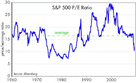

Equity valuation can be dressed up with lots of math, but in the end it is probably more art than science. Nobody has come up with a definitive method, and there are lots of variations on the theme. The first two charts are my contribution to the debate.
The first chart is simply the result of dividing the price of the S&P 500 index by per-share earnings, using data from Bloomberg. You might think this is fairly straightforward, but its not. A lively debate on the subject has been kicked off by a February 25 article by Jeremy Siegel in the WSJ, in which he argued that the S&P folks have been making a huge mistake with the methodology they use to calculate earnings on the S&P 500 index. He explains it all in greater and better detail in this article which came out yesterday. (HT: Greg Mankiw) The issue boils down to whether the earnings of all companies in the index should be added together to come up with a total, or whether they should be weighted by the weight of each stock in the index. Doing it the first way gives you a very high PE ratio, suggesting that stocks are not cheap at all. Doing it Siegel's way, which is what I show in the first chart, suggests that stocks are in fact quite cheap. Like Mankiw, I think Siegel is right. When you see reports that S&P earnings are extremely depressed, and PE ratios are extremely high, it's because huge losses being reported by a handful of companies whose market value is now extremely small are distorting the overall picture.
The second chart uses the price of the S&P 500 index, but instead of S&P earnings, it uses earnings as calculated in National Income and Products Accounts. NIPA earnings are adjusted for a variety of things, in an attempt to come up with "economic" profits that are not subject to the vagaries of things like goodwill writedowns. As a result, NIPA profits tend to be more stable over time, as seen in the following chart (and NIPA profits represent the profits of all companies, not just the top 500). Interestingly, both charts tell roughly the same story: stocks are cheap.
 To put profits in a different light, the next chart compares NIPA profits to nominal GDP, with the most recent data (only recently released) being for the fourth quarter of 2008. At the end of last year, corporate profits after tax were a little over 7% of GDP, above the 6% average of the past 50 years. If all you had to go by was this chart, you would be hard-pressed to explain why equity prices have dropped by almost 50% in the past 18 months, and why PE ratios are at the low end of their long-term range.

Whenever 2008 factors from home builders show up, they should have negative pressure all valuation ways.
ReplyDeleteScott-
ReplyDeleteAgain, thanks for all the great stuff. Don't guys like Ed Yardeni get paid a nice living doing pretty much the same thing? And yet you do it for free!
Anyway, I recommend you read Jamie Dimon's annual letter to JPM shareholders. It recounts the events of 2008 in a very clear way and lays bear some numbers on the amount of capital that was pulled from the banking system and the "shadow banking system". We all generally knew this, but to see it summed up is bracing. My takeaways: it is a wonder we made it through at all, and 2) for those focused on 'velocity' and analyzing the crisis through the lens of monetary flows, rather than traditional business cycle analysis, there is a great chance of ultimate vindication. You and the Brian Wesburys of the world may wind up having made one of the all-time great calls.
Scott,
ReplyDeleteAwesome. This helps explain why individual PE ratios tend to be so low and the broad S&P 500 PE ratio seems high. How were you able to determine the historical market weighted EPS for the S&P 500 using the Bloomberg?
Thanks,
In Bloomberg, SPX INDEX (go)
ReplyDeleteThen select option 3 (index overview)
Then select option 7 (P/E table)