Thursday, September 28, 2023

M2, GDP, and interest rate update


A quick update on M2, GDP, and interest rates: 

There is still a "surplus" of M2 money, but it is shrinking every month. Higher interest rates have boosted the demand for money, in effect neutralizing the declining M2 surplus. We know this because all indicators point to a significant decline in inflation, especially when measured at the margin (year over year growth rates can be very misleading when important changes in trends are occurring). High interest rates discourage borrowing (banks expand the money supply by lending), encourage saving and discourage spending (holding onto all that M2 keeps it from getting spent).

Inflation is not driving interest rates higher—the Fed is. Real interest rates on TIPS have surged to levels not seen since before the Great Recession. This is a sign of monetary tightness, as is the recent weakness in gold prices, the strength of the dollar, and well-grounded inflation expectations. It may also be a sign that the market has become more confident about the outlook for the economy. There's one thing that has the market worried, however, and that's the risk that the Fed will keep on pushing rates higher than they need to be. 

The BEA today released revised GDP statistics going back many years. Real (inflation-adjusted) GDP is now measured in 2017 dollars (before it was 2012 dollars), and the revisions show it has been growing a bit faster since 2009 than we thought (before it was 2.1% per year, now it's 2.2% per year). The much-feared recession (I've lost track of the many recession forecasts that have fallen by the wayside over the course of this year) has yet to appear, and I still see no signs that it is imminent or likely in the near future.

Chart #1

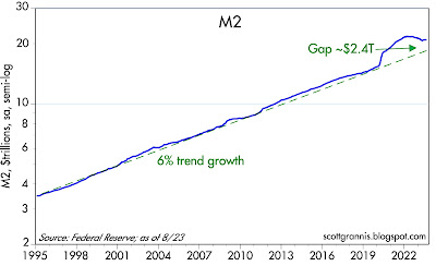
As Chart #1 shows, M2 has fallen by almost 4% since its peak in the summer of last year. The "gap" between M2 and its long-term trend growth of 6% per year since 1995 has now shrunk by half and looks set to continue shrinking. When M2 first surged there was no increase in inflation because the demand for money in the first phase of the Covid lockdowns was intense—fear was rampant, and it was difficult to spend all the money that was being showered on the public in the hopes it would forestall a depression. But as the economy began to open in early 2021, the demand for money began to fall and that fueled a surge in inflation—demand for goods and services outstripped the supply. The Fed failed to react to this dynamic at first, (saying inflation was just "transitory") but then began tightening in earnest in early 2022. 

Chart #2

Chart #2 is evidence that the surge in M2 was caused by excessive, debt-fueled government spending. M2 surged just as the federal deficit surged. Declining deficits removed the source of M2 growth beginning in early 2021. We are fortunate that the second surge in deficit spending, which began about a year ago, has not resulted in any increase in M2. Deficits are no longer being monetized. Thank goodness. And so far, there has been no return of Covid panic.

Chart #3

Currency in circulation comprises about 10% of M2. As Chart #3 shows, currency growth also surged in the wake of Covid, only to retreat. The excesses of the Covid era are fading.

Chart #4

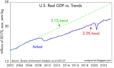
Chart #4 shows the growth of real GDP (blue line) as it compares to two different trend rates of growth (green and red). From the 1960s until 2007, real GDP grew on average by about 3.1% per year. Following the Great Recession, it has only grown by about 2.2% per year. What caused such a huge change? I think it is the result of 1) excessive government regulation and spending, 2) higher tax burdens, and 3) increased social welfare spending (transfer payments). Whatever the cause, the economy has experienced sub-par growth for over two decades. Things are unlikely to improve unless we reverse the causes of sub-par growth, and that's not about to happen anytime soon.

Chart #5

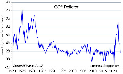
Chart #5 shows the quarterly annualized rate of growth of the GDP deflator, which is the broadest and most timely indicator of inflation available. During the second quarter of this year, prices throughout the economy rose at a mere 1.7% rate, well below the Fed's professed target. Memo to Fed: pass this chart around the office!

Chart #6

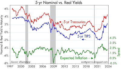
Chart #6 looks at the level of 5-yr real and nominal yields, and the difference between them (green line), which is the rate of inflation the market expects to prevail over the next 5 years. Inflation expectations are well grounded, and have fallen in the past year or so—thanks to the Fed's decision to jack interest rates up. One important conclusion thus appears: interest rates are higher not because of inflation fears, but because of the Fed's actions. And the Fed's actions appear to be driven meaningfully by mistaken worries that the economy might prove to be too strong and thus inflation might remain too high. Balderdash: the economy is still experiencing sub-par growth even as inflation has plunged. Growth didn't cause inflation, deficit spending that was monetized did, and it's not happening anymore.

UPDATE (Sept. 29):

Chart #7

Chart #7 shows the 6-mo. annualized change in the Personal Consumption Deflator and its Core (ex-food and energy) version, both of which were released this morning. The former is a broader measure of inflation than the CPI, and its weightings change dynamically as the economy changes (not so with the CPI, which is why it is a flawed measure). It is up at a 2.6% annualized rate. The latter is the Fed's favorite measure of inflation, and it is up at a 3.0% rate; but on a 3-mo. annualized basis, it is up only 2.2%. Inflation is rapidly approaching the Fed's target—why can't they acknowledge this? Why is the market so nervous? 

Chart #8

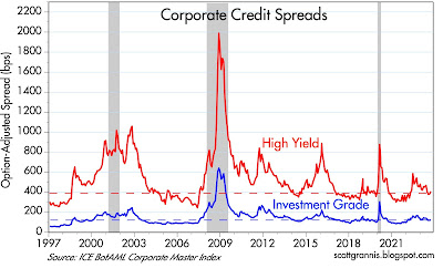
Chart #8 shows credit spreads for investment grade and high-yield corporate debt, as of yesterday. By any measure, credit spreads are relatively low, and that implies a healthy economic outlook. There is no sign whatsoever here of an impending recession. This chart also directly refutes the idea—apparently embraced by our addled Fed—that economic weakness is necessary to bring inflation down. Since inflation peaked in mid-2022, investment grade spreads have fallen from 171 bps to 123 bps, and high yield spreads have fallen from 600 bps to 409 bps. Both of those declines imply a much-improved economic outlook at the same time as inflation was falling from 8-9% to less than 3%.

Thursday, September 21, 2023

What the Fed is overlooking


Yesterday the FOMC decided to keep its target Fed funds rate unchanged at 5.5%. That was no surprise to the market, but the tone of Powell's press conference and meeting minutes convinced the market that rates are likely to be "higher for longer" than previously expected. Market expectations are now geared to expect one more hike before year end, and only a few cuts by the end of next year. To judge by the market's reaction, there's a bit of panic in the air—maybe this time the much-feared recession that was just around the corner most of the year will finally arrive?

It's a shame that economic growth has come to be feared rather than welcomed. We've had 2% growth for over a year now, and inflation has plunged. Growth doesn't cause inflation; too much money relative to the demand for it is what does. The Fed was late to the tightening party, but they have delivered in spades. Today's high interest rates have boosted the demand for money by enough to result in a significant decline in inflation. 

It's terribly unfortunate, but the Fed worries that they haven't done enough, and that they may have underestimated the economy's strength. This tells me that the Fed is overlooking some very important developments: 1) the fact that inflation by current measures has already fallen within range of its long-term target (see Chart #7 in this post), 2) the ongoing slowdown in the growth of private sector jobs, and 3) the emerging weakness in the housing market. 

This post focuses on the housing market, which has suffered a triple whammy of soaring home prices, soaring mortgage rates, and soaring spreads over Treasuries that has combined to crush new mortgage applications, weaken housing starts and cool builder sentiment. 

Chart #1
Chart #1 shows the nominal and real (inflation-adjusted) index of national home prices according to Case-Shiller. (Note: the June figure is actually an average of April, May, and June prices). Home prices are within inches of their all-time highs, and 15% higher, in inflation-adjusted terms, than they were at the peak of the housing market boom in 2006. 

Chart #2
revise?????

Chart #2 shows the level of 30-yr fixed rate mortgages (blue), the level of 10-yr Treasury yields (red), plus the spread between the two (green). As is widely known, 10-yr Treasuries set the bar for fixed rate mortgages. In normal times, mortgage rates tend to be about 150-175 basis points higher than Treasury yields. Today, however, they are about twice as high as that (320 bps). Treasury yields have surged from 1.5% in early 2022 to now 4.4%, and mortgage rates have exploded from 3% to now 7.25%. Since the effective rate today on all outstanding mortgages is about 3.7%, anyone refinancing or taking out a new mortgage faces the prospect of a huge increase in mortgage payments on top of housing prices that have climbed to record levels. It's enough to make nearly everyone think twice. And what they're thinking is that borrowing money today is not a pleasant experience. That is how higher interest rates increase the demand for money: it's better these days to be long money than short money—in the sense that being "long" means you own it, while being "short" means you owe it. What a change from a few years ago, when I noted repeatedly that the Fed was encouraging people to "borrow and buy."

Chart #3

Chart #3 shows an index of new mortgage applications, which are down 70% from the highs of the mid-2000s, and down over 50% from the highs of late 2020. Housing market activity has been severely impacted by higher rates, and the Fed's stance today promises no relief for the foreseeable future. This is powerful evidence of an increase in money demand.

Chart #4

Chart #4 shows a measure of housing affordability, which today is as low as it has ever been, thanks to the combination of soaring home prices and soaring mortgage rates. (I would guess that the affordability of homes in the Los Angeles area would register about 60 on this chart.) 

Chart #5

As Chart #5 shows, since early last year existing home sales activity has dropped by 36%, to levels not seen since the depths of the housing market slump in 2010. Very few want to sell, and very few are able to buy. This is evidence that the housing market is unstable. Very low turnover means that prices are not a reliable indicator of value.

Chart #6

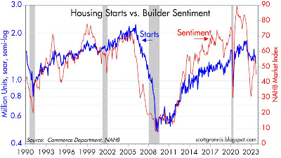
Chart #6 compares housing starts to an index of homebuilder sentiment. Both have dropped sharply from the highs of the past few years. Since early last year, housing starts have fallen almost 30%, and homebuilder sentiment has dropped by almost 50%. Over the same period residential construction spending has dropped about 10%—with further drops very likely to come in the months ahead (residential construction spending is highly correlated to housing starts, but with a lag). 

All of this is reason enough to question the overall strength of the economy. Lurking in the background are $2 trillion annual deficits fueled by excessive and wasteful government spending, the Biden administration's recent throttling of oil exploration and drilling activity, and soaring energy prices. Very expensive energy, just like high taxes, are sure-fire ways of throttling economic growth. Too much government spending is almost guaranteed to sap the economy's strength.

Conclusion: The Fed is highly unlikely to deliver on its "higher for longer" interest rate target for much longer. In coming months events are likely to transpire which will convince both the Fed and the market that inflation is lower and the economy is weaker than commonly thought. And that interest rates need to come down.

Friday, September 15, 2023

Still no boom, no bust


Back in July I ran a post titled "No boom, no bust." Things haven't changed much since then: inflation has come back down to earth, and the economy continues to grow, albeit slowly. Stocks are up a bit, the Fed tightened once, credit spreads have tightened a bit, and the market continues to worry that another Fed tightening might be the kiss of death for the economy. 

Chart #1

Chart #1 compares the level of the S&P 500 to the level of the Vix "fear" index. The two tend to move in opposite directions: rising fear levels result in lower stock prices, and vice versa. The Vix index is back down to pre-Covid levels, and stocks have been rising—though not yet to new highs. 

Chart #2

Chart #2 shows Bloomberg's Financial Conditions Index, a reliable measure of the underlying health of the financial markets and thus a forward-looking indicator of the health of the economy. Conditions are about average these days, so it's reasonable to expect the economy will continue to grow, albeit slowly (~2%). 

Chart #3

Chart #3 compares industrial production levels in the U.S. and the Eurozone. There has been very little progress in the level of industrial production since 2007, although the U.S. economy has been somewhat more dynamic than the Eurozone economy by this measure. Still, nobody's posting gangbuster numbers.

Chart #4

Chart #4 shows U.S. manufacturing production, a subset of overall industrial production. Here again we see very little improvement in recent decades. Ho-hum. But neither do we see any deterioration.

Chart #5

Chart #5 shows two measures of producer price inflation at the final demand level. This captures inflation at an earlier stage of inflation pipeline than the CPI. By either measure, inflation has fallen to less than 2%. The Fed's done. The CPI won't be far behind, except for the fact that energy prices have spiked of late—through no fault of the Fed's. Biden's Green agenda is at work here, as well as fallout from the Ukraine-Russia war.

Chart #6

Chart #6 shows two broader measures of inflation at the wholesale level (as of August). Here again we see inflation back down to where it should be: 2% or less. 

Chart #7

Chart #7 shows the 6-month annualized rate of change of the CPI compared to the CPI less shelter costs. As I and many others have been pointing out for the past several months, shelter costs have been artificially inflated as a result of the BLS using backward-looking statistics related to housing prices. 

Chart #8

Chart #9

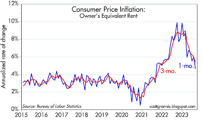
The major component of shelter costs used in the CPI comes from what is called Owner's Equivalent Rent. As Chart #9 shows, OER is driven primarily by housing prices 18 months in the past. The chart shifts OER to the left by 18 months to correct for this. Here we see the peak in housing price inflation corresponding to the peak in OER. Since housing prices peaked over a year ago, OER is now beginning to decelerate. That deceleration is showing up very clearly in Chart #8, which looks at changes in the level of OER over 1- and 3-month annualized rates. What this means is the OER is going be contributing meaningfully to lower rates of CPI inflation in coming months. 

The FOMC meets next week, and I see no reason for them to raise rates yet again. The big question is when they will begin to lower rates. Today the market is betting on a 30% chance of another rate hike at the November meeting, with rate cuts not likely until mid-2024.

It's important to note (again) that Fed tightening this time around is fundamentally different from tightening cycles in the past. The main difference this time is that the Fed is not draining reserves from the banking system. Reserves are still plentiful at over $3 trillion. That's a huge deal. Chart #2 makes the point another way: there is no shortage of liquidity in the financial markets, unlike during periods leading up to recessions in the past. The only thing that is "disturbing" the economy this time around is that short-term interest rates are relatively high. That doesn't necessarily pose a threat to the economy. It simply makes it more attractive for people to hold money—that is, higher rates increase the public's demand for money, and that in turn neutralizes the amount of "excess" M2 that is still circulating. See this post from late August for a more detailed explanation.

Friday, September 8, 2023

Is this a great country or what?


The list of things that could be better in this country is long and distressing. But the good news is that economic conditions in the U.S. continue to improve, despite all the bad news.

Here are some charts that make the point:

Chart #1

Chart #1 shows the condition of U.S. households' balance sheet. Private sector net worth now stands at a record $154.3 trillion, almost double what it was just 10 years ago. 

Chart #2

Chart #2 shows the inflation-adjusted net worth of U.S. households. It's been increasing on average about 3.6% per year since 1952. That works out to a 12-fold increase in just 70 years. 

Chart #3

But, you say, the population has also increased a lot over that same period. So Chart #3 adjusts the data for Chart #2 by population, which has roughly doubled since 1950. Here also we see steady and impressive growth in inflation- and population-adjusted private sector wealth. By that measure, and as a rough approximation, the living standards of the average American have increased by a factor of almost 6 in the past 73 years. 

Chart #4

It's outrageous that our federal debt as a percentage of GDP is almost 100%. It was about 60% in the early 1950s, then it fell to a low of about 25% in the mid-1970s, and since 2007 it has increased from just over 30% in 2001 to 95% now. Fortunately, the private sector has de-leveraged significantly—by about 40%—since 2007, as Chart #4 shows. It's now back down to where it was in the early 1970s. 

Wednesday, September 6, 2023

The economy is NOT "running hot"


Today bond yields rose and the stock market swooned, as the market was apparently spooked by some stronger-than-expected statistics coupled with the Atlanta Fed's GDP Now forecast of 5% growth in the current quarter. The fear is that the economy is "running hot" and that will prod the Fed to keep rates high (or higher) for longer, in order to lower the economy's temperature—possibly triggering a recession at some point. My read of the data and other key indicators suggests nothing of the sort.

Chart #1

Chart #1 shows the ISM Service Sector Index. While it has ticked higher in recent months, it is still below the levels leading up to the Covid shutdowns, during which time the economy was experiencing relatively modest growth on the order of 2% per year. No boom here and no bust either.

Chart #2

Chart #2 shows the Business Activity component of the overall index. Here too we see an uptick in recent months, but activity is still somewhat less strong than we saw in the latter half of the 2010s. If anything, I'd say this looks like "steady as she goes."

Chart #3

Chart #3 shows the employment component of the Services index. Same story as the others. A modest increase in the number of firms reporting increased hiring activity, but nothing to suggest a boom that needs to be snuffed out.

Chart #4

Chart #4 shows a modest increase in the number of firms reporting paying higher prices. This comes after a gigantic decline over the previous year which corresponded closely with a similar decline in overall inflation. Does the recent uptick foreshadow a return of higher inflation, or is it just a wiggle such as we have seen on and off over the years? I'd have to see rising prices showing in other areas to believe this is of concern. Instead I see most commodity prices flat to down, and housing prices sharply lower than a year ago.  (And of course it bears repeating that the ex-shelter version of the CPI has increased only 0.8% in the past year.) The major exception is rising oil prices which are likely being driven by ongoing problems with Russia's Ukraine-related sanctions. I also see a stronger dollar which is the very antithesis of inflation. 

Chart #5

Chart #5 compares the U.S. service sector index (same one as shown in Chart #1 above) with a similar index measuring the health of the service sector in the Eurozone. The Eurozone is hurting, that's for sure, and so is China. It's tough to see how widespread weakness overseas is going to foster inflationary growth conditions in the U.S. In addition, a strong dollar—driven by rising rates— actually reinforces disinflationary pressures here, since it makes imports cheaper and keeps downward pressure on export prices. If the Fed raises rates yet again, that would likely drive the dollar still higher and that in turn would begin to create destabilizing forces overseas. 
 
Chart #6

Chart #6 shows the spread between the yield on investment grade corporate bonds and their "junk" rated counterparts. This spread is saying the prospects for the U.S. economy are quite favorable (since the spread is unusually low), because investors demand only a relatively small premium to take on the additional credit risk of junk bonds. This is notable especially now, coming on the heels of an impressive increase in corporate debt issuance. Despite increased debt supply, corporate bond yields have not increased in any meaningful fashion. That further suggests that there is no shortage of liquidity in the bond market, and that all but rules out a near-term recession.

I'll repeat once more that the unique characteristic of the Fed's current tightening episode is the continued abundance of bank reserves, which currently total over $3 trillion. All other tightening episodes saw a deliberate contraction in bank reserves (banks actually had to borrow reserves to meet their collateral requirements), and that in turn led to a scarcity of liquidity in the banking system. With lots of liquidity the market is capable of adjusting to almost any kind of disruption. That wasn't the case in prior tightening episodes. Interest rates may be high but there is no shortage of money.

Chart #7

Chart #8

Chart #7 shows an index of new mortgage applications, which are down over 50% since early 2021, and down about 70% from the days of the housing market boom in the mid-2000s. Chart #8 shows an index of housing affordability, which has reached a 33 year low. Higher interest rates have had a huge impact on the housing market, driving resale and refi activity sharply lower, all while making housing unaffordable to legions of households. If any sector of the economy is at risk of a bust, it's housing. 

Housing is also suffering from an effective liquidity shortage. Homes for sale are at very low levels because 1) sellers don't want to give up their 3% mortgages and 2) buyers don't want to take on a 7% mortgage. With very low turnover no one can be sure that current home prices are indicative of underlying value. Moreover, desperate buyers are likely to pay more than they can afford and are thus vulnerable to a recession or any downturn in prices. This is probably the worst time in many decades to buy a house.

Friday, September 1, 2023

Of concern: jobs growth is slowing


I spend a good part of most days following the news and key economic and financial market indicators. When I see Fed governors quoted as saying things like "the labor market is still strong," or "inflation is still too high," I begin to wonder if they even bother to look at the numbers themselves. I suspect they don't devote nearly as much time and effort as I do. Which is disconcerting, to say the least. 

In the same vein, how can the editors of the WSJ allow a front-page article in today's edition to assert that "Household spending [is] the primary driver of economic growth"? You mean that if we all just spent more we could all get richer? That's ancient and totally debunked Keynesian thinking—it's impossible to spend our way to prosperity. Growth comes from producing more with the same amount of inputs, and to do that you need to work harder, invest, and take risk. Or you need to find more people and put them to work. On a global basis, we can never spend more than we produce—unless, of course, central banks hand out monopoly money to create the illusion that our purchasing power has increased. 

Chart #1

Chart #1 shows the level of private sector non-farm employment, plotted on a log scale to highlight growth rates. I focus on private sector jobs because those are the ones that deliver improvements in our standard of living. As a side note, the number of public sector jobs today is about the same as it was in 2008, 15 years ago. Thank goodness for small favors.

As you can see on the chart, the rate of growth of jobs has been decelerating over the past few years (i.e., the slope of the line is getting flatter). On a year over year basis, private sector jobs were growing at a 4.8% rate a year ago (August 2022), whereas they have grown only 2.0% in the year ending August 2023. On a 6-mo. annualized basis, jobs growth was 3.4% a year ago, and now it is only 1.5%. Based on these numbers, it would be fair to say that in the past year the economy has lost over half of its vitality.

Jobs today are growing at about the same rate as they did in the years just prior to Covid, and they show every sign of continuing to decelerate. This is by no standard "too strong." It's more like average-getting-worse. Today's jobs growth is sufficient to deliver real GDP growth of 3% at best, but more likely something equal to or less than the 2.1% rate we have seen since mid-2009—years that featured decidedly sub-par growth from an historical perspective. 

How can a Fed governor look at these numbers and think that the economy is too strong? If anything, these growth numbers should prompt concerns that the Fed has already tightened too much. Especially when you consider, as I did in my previous post, that inflation has already fallen to 2% by some measures.