Friday, October 30, 2020

Timely indicators still quite positive

While we wait for the results of next week's election, here are just a few charts of timely economic indicators (all based on very recent daily and weekly data) that show continuing improvement in the economy:

Chart #1

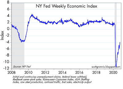
Chart #1 is a very timely compilation of high-frequency weekly economic indicators designed by the NY Fed. It shows continued and rather dramatic improvement (aka a V-shaped recovery).

Chart #2

Chart #2 shows the amount of gasoline supplied, which as of last week was only 7.7% below the level of last year. 

Chart #3
Charer #4
Passenger air traffic (Chart #3) is up only modestly over the past month, but as Chart #4 shows, it continues to improve relative to the levels of last year at this time. This would probably be best described as a U-shaped or gradual recovery. It's going to have to improve significantly before we can conclude that economic activity is getting back to normal.

Chart #5

Chart #5 shows continuing claims for unemployment, which continue to decline rather dramatically. Lots of people are going back to work. My son, who has been furloughed since April, was recently notified that he is being called back to work starting November 9th.

Tuesday, October 27, 2020

Entering the home stretch with hugely mixed signals

As we enter the home stretch in what could prove to be a monumentally important election, I doubt that any honest observer has strong convictions regarding the election's outcome. The implications for the economy are potentially huge: a second term for Trump arguably could put the economy back on a stronger growth track, while a Biden presidency coupled with a Democratic Senate majority would likely give rise to significant obstacles to growth such as much higher tax rates, more regulatory burdens (e.g., an end to fracking and eventually the entire petroleum industry), enormous compliance costs for green energy initiatives, expanded income redistribution efforts, and a more activist industrial policy. If the market expected a Biden/Democrat sweep, I have to believe that stock prices would have been trending lower in recent months, instead of higher. Yet the polls appear to overwhelmingly support a Biden win, as do the betting markets. In any event, never in my lifetime have we had so personally polarizing a president as Trump, and never before have we seen the mainstream media so vociferously, overwhelmingly, and blatantly in support of the challenger—and so antagonistic to the incumbent. 

The personalities of Trump and Biden could not be more opposite. Trump is a hardscrabble billionaire businessman devoid of social graces, while Biden is the epitome of a career politician, albeit one with a checkered past and few if any significant accomplishments. It's not surprising that both have skeletons in their closets, but the Democrats and the press spent most of the last 4 years trying in vain to dig up evidence of Trump's malfeasances while ignoring Biden's. The Democrats went on to impeach Trump over a supposed quid pro quo phone call, but now evidence is surfacing of the Biden family's ties to Chinese business interests and apparent influence peddling. Trump is bursting with energy, while Biden is suffering from old age and the beginnings of dementia. Trump has shaken off the Covid virus while maintaining an active schedule, while Biden has been hunkered down in his basement for months in fear of that same virus. Trump's rallies are many and massive, while Biden's are few and subdued. The "enthusiasm gap" hugely favors Trump, while the polls and the pundits hugely favor Biden. Trump chose a competent and successful person to be his Vice President, while Biden gave the nod to an unliked and unimpressive woman because she ticked the politically correct race and gender boxes. In the end, Biden's strongest selling point is that he is not Trump.

To make matters worse, it's possible that we won't know the results of the election for an unbearably long time. Potential risks cloud the horizon in almost every direction, but the market is not ignoring this. Risk aversion is still abundant and visible, especially in the levels of the Vix index and Treasury yields. And yet the economic statistics of late paint a very promising picture of a V-shaped recovery. I'm cautiously optimistic, as I explain below.

Chart #1

Chart #1 shows how rising fears have accompanied market declines. The Vix index, currently just over 33, is significantly higher than what we have observed during times of relatively tranquility (i.e., 10-15), but substantially less than the panic levels we saw at the outset of the Covid crisis. The market is worried, but not in a panicked sense. 10-yr Treasury yields, however, are very near their lowest level in all of history, as are real yields on TIPS. Inflation expectations, in the meantime, are "normal," averaging about 1.7% for the foreseeable future. Low nominal and real yields are therefore not indicative of deflation fears—they are rather clear signs of a lack of confidence in future growth. I hasten to add that yields are low not because the Fed has made them so; they are low because the demand for Treasuries and safe cash equivalents is intense, and that demand, in turn, can only be driven by the market's strong preference for risk aversion. 

Chart #2

Chart #2 shows that new orders for capital goods—the seed corn of future productivity gains and a good barometer of business' confidence in the future—have rebounded strongly in recent months. This proxy for business investment is still relatively weak when viewed from an historical perspective (capex was much strong in previous economic expansions), but on the margin it has increased at an impressive pace of late. 

Chart #3

Chart #3 highlights the very strong increases in existing home sales in recent months. The housing market is on fire!

Chart #4

Chart #4 shows impressive strength as well in new home construction. Moreover, home builders have never been so optimistic about the future of residential construction. This foreshadows further impressive gains in housing starts and home sales in the months to come.

Chart #5

I don't normally pay much attention to the regional Fed manufacturing surveys, but as Chart #5 shows, conditions in the Richmond area are rather spectacular. Surely a V-shaped recovery of sorts.

Chart #6

Chart #6 shows a similar pattern—though not quite as strong—in the Dallas Fed manufacturing survey. Both Charts #5 and #6 contain data released yesterday and today. 

Chart #7

Chart #7 shows an index of non-energy industrial commodity prices. This also reflects a V-shaped recovery of impressive proportions, and it is driven not just by improving conditions in the U.S., but also in global economic activity. If nothing else, this is a good sign that there is no shortage of money in the world these days.

Chart #8

Third quarter GDP numbers will be released on Thursday, and the market is currently expecting a 32% annualized increase in real GDP. I've plotted that result in Chart #8. Even an impressive gain such as this is not enough, however, to erase the losses of the first half of the year. And compared to the long-term trend growth of real GDP (blue line), today's economy is about $4.5 trillion smaller than it otherwise might have been had we not had the slow-growth Obama recovery and the devastating Covid crisis. That translates into a "shortfall" of about 20%. Given our recent history of over a dozen years of sub-par growth mixed with two recessions, it's no wonder the market is having trouble getting optimistic about the future. 

I have not yet succumbed to pessimism, however. My hopes for the future are sustained by 1) the numerous and growing signs of a V-shaped recovery, 2) impressive progress in developing therapeutics and vaccines for Covid, 3) infection and case fatality rates for Covid that are coming in much lower than feared, 3) my enduring belief that the American public will invariably choose growth over redistributionist policies, and 4) the obvious signs of enthusiasm among Trump voters. 

Wednesday, October 14, 2020

The economic tea leaves look favorable

Here's my current reading of the economic tea leaves: 1) the September CPI inflation release confirms that ex-energy inflation continues on the 2% per year trend which has prevailed for almost two decades; 2) Small Business Optimism has rebounded strongly and confirms the presence of a V-shaped recovery; 3) very low real interest rates on Treasuries confirm that safety is extremely expensive, Treasuries are a bad deal for investors and a great deal for the federal government; 4) stock prices continue to drift higher, confirming an improving economic and favorable political environment; 5) commodity prices have staged a strong V-shaped recovery, which suggests the global economic outlook has improved dramatically; and 6) TSA throughput says air travel is recovering at only a modest pace (not everything is coming up roses).

Near and dear to my heart, meanwhile, was Apple's unveiling yesterday of its iPhone 12 models. I've been an investor in and a fan of AAPL for a very long time and have had optimistic posts on the company over the years. To my mind, the technological advances and capabilities of Apple's new models are breath-taking, not to mention beautiful to look at. This is one more of many examples of how advanced technology has enriched our lives by orders of magnitude while at the same time becoming accessible to just about anyone. Apple continues to impress, and I'll be ordering a new iPhone 12 Pro Friday morning.

Now for the charts:

Chart #1

Chart #1 plots the ex-energy version of the CPI on a log scale, superimposed on a line that increases at a 2% pace each year. I use ex-energy inflation because energy prices are by far the most volatile component of any inflation index—something the Fed cannot possibly offset or attempt to control. That inflation by this measure has averaged 2% per year for over 17 years is remarkable, although I would prefer to see inflation averaging closer to 1% or less.

Chart #2


Charts #2 and #3 show the impressive results of the September survey of small businesses. Overall optimism has surged in the past few months, as have hiring plans. Despite the still-existing legions of the unemployed, the majority of small businesses report having difficulty filling job vacancies with qualified people. Experience and education are still in demand.

Chart #4

Chart #4 shows the inflation-adjusted yield on 10-yr Treasuries. Nominal yields are a mere 0.7%, and the core rate of CPI inflation (CPI ex food and energy) is currently 1.7%. That leaves an investor with a loss of purchasing power of 1% every year for the next 10 years! (That means a real return of -1%.) This loss of purchasing power obviously hurts the investor, but it's a boon to the US Treasury, which gets to repay its obligations with cheaper dollars. Treasury has issued about $3.5 trillion of new debt since last March, so thanks to very low real interest rates (which are a function of very strong demand for the safety of Treasury notes and bonds) and ongoing inflation, the real burden of that debt will decline by about $35 billion every year for the foreseeable future. Those buying these bonds, of course, will suffer a $35 billion loss. 

Chart #5

Chart #5 shows the real and nominal yield on 10-yr Treasuries (blue and red lines) and the difference between the two (green), which is the market's expectation for what CPI inflation will average over the next 10 years: 1.75%. The bond market fully expects nominal yields to remain firmly below the rate of inflation for a very long time. That adds up to either a) tremendous respect for the prowess and power of the Fed, b) a huge amount of risk aversion on the part of the investing public, and/or c) a very negative view of the economy's ability to thrive for the foreseeable future. I'd say the latter two are the obvious choices: risk aversion is very strong and economic optimism is in short supply.  

Chart #6

Chart #7

Charts #6 and #7 show that air travel has picked up modestly in the past month to its highest pre-pandemic level. Yet it is still 65% below the levels which prevailed at this time last year. It's a slow takeoff for this industry.

Chart #8

Chart #8 shows the CRB Raw Industrials commodity index, which has staged a complete and V-shaped recovery over the past 5 months. This is a good indication that the global economic outlook has improved rather dramatically in the wake of the Covid shutdown fever which swept almost very country in the world (with a few notable exceptions like Sweden and Switzerland).

Chart #9

We finish with Chart #9, which by now is quite familiar to readers. On balance, stock prices have been edging higher over the past several years, but the Vix "fear index" is still elevated. The market is cautious, as it should be, because there still are plenty of unknowns in our future, the most obvious of which is next month's election, and the potentially huge changes in fiscal policy (most disturbing being higher taxes) that could be set in motion as a result. Bloomberg (alert: strong liberal bias) tells me the market is cheering Biden's lead in the polls, but I worry that his pledge to raise taxes and re-regulate the economy (e.g., Green New Deal) would deal a significant blow to our still-struggling economy and the present discounted value of future corporate profits (i.e., stock prices) if he wins.

If I were to guess the election result that is priced in to the market, I would say the market is discounting the polls—which show Biden with a strong lead—and betting that Trump's odds of winning are favorable: a replay of sorts of what happened 4 years ago. My confidence in this assessment is not high, but in my defense I note that 56% of Americans say they are better off today than they were 4 years ago. I also note that the NY Times' science reporter recently noted that "Experts are saying, with genuine confidence, that the pandemic in the United States will be over far sooner than they expected, possibly by the middle of next year." Moreover, the Trump administration's "Operation Warp Speed — the government’s agreement to subsidize vaccine companies’ clinical trials and manufacturing costs — appears to have been working with remarkable efficiency."

UPDATE (10/15/20): Just discovered this series produced by the NY Federal Reserve, which is a compilation of 10 indicators that are released on a weekly basis, so it's a pretty good coincident indictor of the economy's health. As you can see in Chart #10, things are improving in V-shaped fashion:

Chart #10

Thursday, October 8, 2020

On the demand for money and other considerations


This blog has consistently employed a supply-side approach to fiscal policy (e.g., improving the incentives to work and take risk tends to lead to a stronger and more prosperous economy, as does reducing regulatory burdens) and a classic approach to monetary policy (e.g., inflation occurs when the supply of money exceeds the demand for it). In this post I focus on monetary policy, reiterating and amplifying observations that I have made over the past decade or so.

It's easy to measure the supply of money, and the Fed provides those statistics weekly. The M2 measure of money is broadly favored, and it is the one I have consistently used. More recently I have emphasized two components of M2—savings deposits and demand deposits—which together comprise about 75% of the $18.4 trillion M2. I have argued that these two measures are a good proxy for the demand for money, even as they are also measures of the supply of money. Both components represent money that has been set aside my consumers and businesses as a form of saving, security and/or comfort—essentially a hedge against risk. They are distinct from checking accounts and currency in circulation, since those are held primarily for convenience (e.g., to make monthly payments and to make miscellaneous purchases) rather as a risk-free store of money.

With the interest paid on savings deposits and demand deposits now hovering just above zero, it's easy to see why these deposits are a good proxy for money demand. Since they yield practically nothing, people hold them simply because they want a store of value that is easily accessible and relatively risk-free. For most of our history, these deposits paid an attractive rate of interest that was greater than the prevailing rate of inflation (i.e., real interest rates were positive). Those conditions (high interest rates) served to muddy the monetary waters, since it's tough to know whether people held these deposits as investments or merely as a store of value. Now, with interest rates at or near zero it's easy: they respond directly to people's demand for money and safety.

As I predicted back in 2009 and 2010, when the M2 measure of money was growing faster than ever before, the then-rapid growth of money would not be inflationary, because rapid M2 growth was being driven by strong growth of savings and demand deposits. The Fed was accommodating a huge increase in the demand for money; the Fed was NOT "printing money" with abandon as so many thought. (That includes yours truly, since I worried about rising inflation in late 2008 and early 2009. I later realized I was wrong.) The proof of the monetary pudding, as it were, was to be found in the fact that inflation has been low and relatively stable for a long time. Indeed, the world has worried more about deflation in the past decade than it has about rising inflation, despite rapid growth in the money supply.

How do you get low and even falling inflation when the supply of money is expanding rapidly, as it did in late 2008 and early 2009? It can only happen if the demand for money is growing as fast or faster than the supply of money. If a farmer is selling more apples every day it's because the demand for apples is also increasing every day; otherwise he would find himself with a glut of apples and would soon have to cut the price of his apples. A lower price would be required to bring demand back into line with supply.

What follows are some charts which focus on money supply and money demand. The story they are telling is similar to what it was a decade ago: incredibly rapid money growth is occurring because the demand for money is incredibly strong. The Fed is not printing money and so, for the time being at least, there is little risk of inflation.

Chart #1

Chart #1 shows the composition of the M2 measure of the money supply. Bank savings deposits make up by far the biggest portion, and they currently total almost $11.6 trillion. Currency is the next largest portion, currently totaling $1.9 trillion. One could argue that currency in circulation in a good measure of money demand, because nobody holds onto currency unless it serves them a purpose. It's complicated, however, because foreigners hold the vast majority of US currency. Do some math, and you will see that if $1.9 trillion of currency (mostly $100 bills) were held by only US residents, then each of us would be holding almost $6,000 in cash on average. Don't know about you, but my family rarely has more than $1000 in cash lying around or stashed under the mattress. Currency tells us a lot more about foreigners' demand for money than it does about the demand for money of US residents. Interestingly, currency has surged at a 23% annual rate since last February, which suggests the whole world is scared of Covid—which is not surprising since Covid is a problem everywhere. In any event, the Fed supplies currency only on demand, and in exchange for bank reserves, so the supply of currency and the demand for it are always in balance.

Chart #2

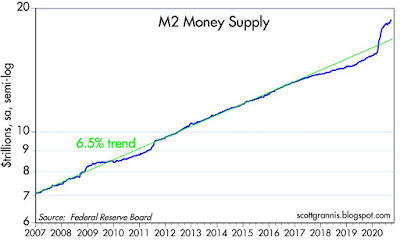
Chart #2 shows the level of the M2 money supply compared to the long-term trend rate of M2 growth (green), which has averaged about 6.5% per year for the past 20 years. M2 exploded starting last March, as the Fed pulled out all the stops and the federal government began mailing big checks to tens of millions of displaced workers and struggling businesses. M2 has now increased by about $3.2 trillion over the past seven months. Growth in savings and demand deposits account for about 80% of the increase in M2.

Here's the underlying and underreported story: federal debt has increased by almost the same amount ($3.4 trillion) as M2 has since last March. The Fed bought substantially all of the Covid-era federal debt (notes and bonds) issued by the federal government and paid for them with bank reserves. The banking system experienced an equivalent surge in deposits, which they used to buy the treasuries the Fed then bought from them. The banking system effectively "invested" their deposit surge in bank reserves. By buying over $3 trillion of treasuries, the Fed effectively converted (transmogrified, as I like to say) notes and bonds into short-term, risk free assets, since bank reserves are essentially T-bill substitutes which the banks find to be an attractive way to invest their deposit inflows. Bottom line, the increase in the money supply was driven by an equivalent increase in the demand for money and money equivalents. That's not inflationary. 

Chart #3

Chart #3 shows the 3-mo. annualized growth rate of savings and demand deposits, which was truly explosive from early March until just a few months ago. Note how this component of M2 also experienced rapid growth around the time of the Eurozone crisis in 2011, when money fled to the security offered by US banks. Note also how the growth of savings and demand deposits slowed in the wake of the Nov. '16 elections: money held in safe form flowed back into the economy as confidence increased and the economy prospered. If we're fortunate, the economy will sooner or later lose its fear of Covid and money will once again leave deposit accounts and go back into the economy, there to fuel rising consumption and an expanding economy.

It's important to note here that the growth rate of M2 has almost completely returned to what it was prior to the Covid crisis: in the past three months M2 has increased at about a 10% annualized rate, and in the three months prior to last March, M2 increased at about a 6% annualized rate. What that means is that demand for money is no longer rising by much. Thus the Fed has little reason and little need to continue to convert notes and bonds into T-bill equivalents. Simply put, there doesn't seem to be a need for much more "monetary stimulus" as it is incorrectly referred to (actually, it's just an accommodation of increased money demand).

Chart #4

Chart #4 compares the level of nominal GDP to the level of M2. Both have increased by about the same order of magnitude over the past 60 years. Until this year, that is. What's happening is that the economy has effectively and suddenly increased its desire to hold money rather than to spend it. This is a natural reaction to the great uncertainty and fear that the Covid crisis has caused. But as that tendency reverses—as the demand for money declines—there is plenty enough money out there to fuel a big increase in real and nominal GDP.

Chart #5

Chart #5 divides the level of M2 by the level of nominal GDP. I've labeled the result "money demand." I like to think of this as being a proxy for the amount of cash and cash equivalents the public wants to hold, expressed as a percentage of average annual income. Prior to the Covid crisis, as a country we were comfortable holding a cash and cash-equivalent reserve equal to about 70% of our annual income; now it's almost 90%. Money demand was relative stable for many decades, but it has increased dramatically in the wake of the Great Recession and now during the Covid panic. However, money demand is already beginning to decline. I've estimated the value of the ratio for the third quarter, assuming 10% annualized growth in M2 and a 30% annualized growth of nominal GDP. It will probably decline a lot more in the months and the years to come as confidence returns and the economy grows.

What happens when the demand for bank deposits declines? Let's say the public decides over the next year to withdraw $1 trillion of the $3 trillion they added to bank deposits this year. As the money is withdrawn, banks will no longer need $1 trillion of the bank reserves they "bought" this year. Banks can simply sell their reserves back to the Fed in exchange for notes and bonds. They can then sell the notes and bonds in exchange for cash which they can then distribute to those who are withdrawing their money. In the process, the demand for notes and bonds will decline, and that would likely translate into higher interest rates. Which is exactly what we would expect to happen as the economy recovers and returns to more normal conditions. If the Fed is on top of this development, they will happily sell notes and bonds and retire bank reserves, and the money supply will shrink in line with a reduction in money demand. But if the Fed insists on keeping plenty of reserves in the banking system, they would risk creating a surplus of money and that would be inflationary.

One soon reaches the conclusion that the Fed has been reacting to changes in the demand for money rather than stimulating anything. I and others have said this many times in the past. The Fed would have us believe they re setting the tone and the level of interest, when in reality they are simply accommodating the mood of the market. Whatever the case, it is clear that interest rates are extremely low not because the Fed has said so, but because the market's demand for short-term, cash-equivalent assets (e.g., T-bills and bank reserves) is enormous. The market is willing to pay such a high price for them that their yield has been pushed down to near zero. Thus, the prevalence of near-zero or even negative interest rates can mean only one thing: risk aversion remains very strong these days. The market is not exuberant or irrational. The Fed has not stimulated anything.
Chart #6

Chart #6 is my favorite way of seeing whether the Fed is behaving correctly. The blue line is the inflation-adjusted Fed funds rate (i.e., the Fed's target rate minus the year over year change in the Core Personal Consumption Deflator), and the red line is the real yield on 5-yr TIPS, which in turn is essentially the market's expectation of what the real funds rate will average over the next 5 years. When the blue line is below the red line, the Fed is behaving well and the economy is healthy, because the market is expecting the real funds rate to rise in the future. But when the blue line is above the red line this means the Fed is so "tight" that the economy is likely to weaken and the Fed will eventually need to lower the real funds rate in response. Today it looks like the Fed is just about right. 

The charts that follow are interesting in their own right, and help me to understand what's going on in the economy:

Chart #7

Chart #7 compares the price of gold to the price of 5-yr TIPS (using the inverse of their real yield as a proxy for their price). It's remarkable that the prices of these two completely different assets should be so closely correlated over so many years. I can only conclude that the market views both assets as "safe havens." Both provide insurance against nasty events: gold protects you from disasters of all sorts, and TIPS are guaranteed to protect you against a rise in inflation. Both prices appear to have peaked, which suggests that the demand for money and safety has peaked. That confirms the message of M2.

Chart #8

Initial claims for unemployment were disappointingly unchanged last week, but continuing claims continued their strong downtrend, as seen in Chart #8. From a peak of 25 million in early May, they are now down to 11 million. That means that at least 14 million people who lost their jobs have now gone back to work. In other words, 60% of the jobs lost have been recovered, which further suggests an ongoing decline in the rate of unemployment. That counts as a V-shaped recovery in may book. It's tragic, however, that there are still so many unemployed, and that their ranks are filled with the most vulnerable. The only solution for so much misery is to OPEN THE ECONOMY ASAP. Failing that, the government should somehow compensate the workers who have fallen on hard times directly as a result of terribly misguided public policy choices. 

Chart #9

Car sales, shown in Chart #9, have almost completely reversed their Covid plunge. Another V-shaped recovery.

Chart #10

CDS spreads, shown in Chart #10, are the most liquid measure of generic corporate credit risk. Happily, they are very low, as are swap spreads. This strongly suggests that liquidity conditions in the financial market are very healthy and the outlook for the economy is also very healthy. 

Chart #11

Chart #12

Charts #11 and #12 show that air travel is decidedly NOT enjoying a V-shaped recovery. For the past three months, gains in passenger traffic have been very small. Overall traffic today is still down some 66% versus year-ago levels. A sobering statistic. Fear of flying will be with us for a long time, it would appear.

Covid comments

Catching Covid is not a death sentence, as Trump has showed us: "Don't be afraid of Covid. Don't let it dominate your life." Very wise words from our Commander in Chief, who is unafraid to bow to the prevailing orthodoxy of fear. In that regard, Heather Mac Donald has a very good quote (HT Mark Perry):

"Reopening is still the right policy. Mandatory outdoor mask-wearing is merely a way for government to turn citizens into walking billboards of fear, sending the false message that danger is everywhere. Infection rarely leads to death. Most of the infected recover. Given his governmental duties, the surprise is that Trump—as president, another kind of front-line worker—has not gotten sick before now."

Don't miss the Great Barrington Declaration, an open letter signed by more than 7,000 mental & public health scientists and medical practitioners. In it they argue strongly for opening the economy, especially schools, while protecting the vulnerable (i.e., mostly the elderly and infirm). Here is a functioning link for the Great Barrington Declaration.

UPDATE: A MUST WATCH VIDEO by Dr Reiner Fullmich. An intelligent, well-argued brief for why there was never a Covid “pandemic.” It’s always been just a bad flu, as I and many others have been arguing since last April. Lockdowns have had no impact. Tests, as even the NY Times has admitted, cannot reliably detect Covid infections, and the vast majority of positive results are false positives. It’s a “case-demic” not a pandemic. Governments everywhere have systematically trampled the constitutional rights and liberties of their people without any justification. Watch it and weep for the miseries unnecessarily inflicted upon millions of innocent people and businesses.

Friday, October 2, 2020

Top charts

Here's a quick review of important charts recently updated:

Chart #1

Today's September jobs report was viewed by some as evidence that the recovery was slowing. I've always argued that private sector jobs are much more important than public sector jobs, and they increased by an impressive 887,000 in September (vs +661,000 total jobs). Chart #1 focuses on these two sources of jobs, and both use a y-axis with the same ratio. What stands out immediately is that private sector jobs have grown much more than public sector jobs in the past 12 years, and in recent months. Private sector jobs have now recovered about 54% of the losses that occurred due to the Covid shutdown, whereas public sector jobs—despite Census hiring—have rebounded by much less, and are actually lower today than they were prior to the Great Recession. I'd say the private sector recovery looks pretty much like a V-shaped recovery. More than half the jobs lost have been recovered in just 5 months! And meanwhile the public sector has been slow to recover, one more sign that the private sector is inherently more dynamic than the public sector.

Chart #2

Chart #2 makes the same point: the unemployment rate has reversed much more than half its rise in just 5 months. 

Chart #3

Yesterday's ISM report provided further evidence of rapid recovery. Both the US and Eurozone manufacturing indices have rebounded very strongly from their Covid lows, and both are now consistent with relative healthy economic growth conditions. Note that the Eurozone suffered much more than the US as a result of their early and drastic lockdowns, which in the end did little or nothing to eradicate the virus. 

Chart #4

As Chart #4 shows, Sweden continues to shine. Its refusal to order drastic lockdowns not only allowed its economy to flourish relative to its locked-down neighbors, it allowed the virus to run its course in a relatively short period of time.  Daily covid-related deaths have been extremely low for the past two months or so, even as Swedes have enjoyed the freedom to travel, work, and socialize, all while eschewing those dreadful masks that do nothing to filter out viral particles. It all adds up to pretty good evidence that Sweden has achieved herd immunity. I hasten to add that deaths per million in Sweden (583 per Worldometer.com) put it lower than Belgium, Spain, USA, UK and Italy, and only somewhat higher than other Eurozone economies. BUT, with a much lower overall cost in terms of reduced economic output, lost jobs, unemployment, stress, suicides, etc. And Sweden currently looks like one of the few countries in the world that has "beat" Covid.

Chart #5

Chart #5 shows that swap spreads continue to signal very healthy liquidity conditions and very low systemic risk in both the US and the Eurozone. By this important—and often leading—indicator, the fundamentals look great.

Chart #6

Chart #6 shows two all-important measures of the Fed's monetary policy stance. The real Fed funds rate (blue) is decidedly negative (which implies very easy monetary conditions), while the slope of the Treasury yield is positive. Low real rates and a positively-sloped yield curve strongly suggest we are in the early stages of what could prove to be an extended recovery. At the very least it's safe to say that the Fed poses no risk to the economy for the foreseeable future. Note that all previous recessions were preceded by high real rates and a flat or inverted yield curve slope.

Chart #7

As Chart #7 suggests, the equity market is still somewhat cautious, with the Vix fear index still trading at elevated levels, and prices today about the same as they were prior to the Covid crisis. The Treasury market is even more cautious, given that 10-yr Treasury yields (currently less than 0.7%) are extremely low. The demand for security is still very strong.