I got my new iPhone X a few days ago, and it is by far the most beautiful and exciting of all the iPhones I've ever had (and I've owned every model they've made). Face ID is surprisingly fast and seamless (and accurate!), the display is much larger and a pleasure to look at, the build quality is superb, the battery life is much longer, the camera is much better, and the gestures that replace the home button are powerful and easy to use, not to mention it's wicked fast. It costs more than its predecessor (iPhone 8), but it delivers much more at the same time. Since my digital life revolves around this little jewel, I'm happy to pay extra, and I'm sure tens of millions of others will feel the same way. Apple can no longer be accused of not innovating. Its flagship product has leapfrogged the competition, and it's become the "apple" of everyone's eye.
The iPhone X is going to set sales records. Face ID is almost surely coming to Apple's entire product line over the next year, and that will very likely trigger a wave of upgrades. But the market, believe it or not, is still not convinced that Apple's best days lie ahead. Apple's cash-adjusted PE ratio today is less than 17, giving it an earnings yield of 6%. That implies, in my judgment, that the market still suspects Apple will have a hard time increasing earnings. If expectations were solidly behind continued earnings gains, Apple's PE ratio would be a lot higher. Following are some nifty charts which tell the story.
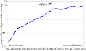
Chart #1
Wow. One of the Great American Success Stories, told in one chart. (Note the y-axis is done with a semi-log scale.)
Chart #2
If the market were wildly optimistic about Apple, it would be tough to recommend the stock. But as the chart above shows, Apple's PE ratio has been below 20 for the past seven years, even as its stock price as more than quadrupled. As I've suggested in my prior posts, the market has consistently under-appreciated Apple's ability to grow. And that still looks to be the case, with the S&P 500 trading at a PE of just under 22 (using earnings from continuing operations), and Apple's PE trading at more than a 10% discount to that. If you adjust for the mountain of cash that Apple has sitting offshore, Apple's PE ratio is trading at almost a 25% discount to the broad market.
Chart #3
As the chart above shows, Apple's earnings haven't grown nearly as fast in recent years as its stock price. In the past 5 years, earnings per share have grown over 45%, while the stock price has more than doubled. The way I see it, the market has become a lot less pessimistic about Apple's prospects in the past 5 years, which is why Apple's PE ratio has increased from a meager 10 in early 2013. But the market is still cautious.
Chart #4
Is a $1 trillion capitalization reasonable? Apple is not outrageously priced compared to other companies, as Chart #4 shows. Microsoft today is only $250 billion behind Apple's current market cap, and most of what MSFT sells is software and services. This chart is a great David vs. Goliath story, with once-tiny Apple leapfrogging its gigantic former rival. 20 years ago the market thought MSFT would control the entire PC market within a few years. Today Apple has made tremendous gains, but they still don't have a majority of smartphone sales, nor a majority of PC sales. There's plenty of room for Apple to grow.
Chart #5
One final note: I could be wrong, but it strikes me that Apple has set an important precedent with the pricing of iPhone X. Prior to this, Apple (and most of its competitors) routinely brought out better, faster, and more capable products for the same price as what was being replaced; customers were thus getting more and more power and features for the same price. Now, for the first time, a hi-tech computer product has come out that is not only better but more expensive. Apple has demonstrated pricing power in an industry that has suffered from 20 years of deflation. You can see that in Chart #5 above.
The BLS uses what is called "hedonic pricing" to calculate that personal computer and peripherals have effectively fallen continuously over the past 20 years—if you get more of something for the same price as before, its price has effectively fallen. The index in the chart has fallen by more than 96% over the past 20 years. But it should also be apparent that the rate of decline has been slowing ever since the early 00s. In the initial heydays of PCs, prices fell 35% a year; then 20% per year; then 10% per year. In the past 12 months, prices have fallen by a mere 3.3%. The pricing and the success of the iPhone X may be among the first signs that in coming years you can expect to pay more in order to get more when it comes to computers.
Full disclosure: I am long AAPL at the time of this writing, and have no plans to sell in the near future.


