Monday, September 28, 2015

Walls of worry update


The inverse correlation between the market's level of fear, doubt and uncertainty as proxied by the ratio of the Vix index to the 10-yr Treasury yield) remains strong, as the chart above shows.

The list of worries is long: China, commodities, oil prices, energy sector debt, emerging markets (especially Brazil), regulatory burdens, high marginal tax rates, and more recently, healthcare stocks that face the threat of politicians who want to control the prices of certain drugs.


And it is still the case that, despite all these concerns and the rising level of corporate credit spreads, 2-yr swap spreads are unusually low. Swap spreads stand out in a field of nerves, because at current level they signal that systemic risk is virtually nonexistent, financial market liquidity conditions are very healthy, and the banking sector is strong (as well it should be, with trillions of dollars of excess reserves).

It's worth repeating that every recession in the past 60 years has been preceded by a severe tightening of monetary policy, which can be seen in a strong and rising dollar, high real yields, a flat to inverted yield curve, and rising credit spreads. Moreover, the past three recessions have been preceded by high and rising swap spreads (the swap market wasn't very active prior to that). Of all those preconditions, only  rising credit spreads can be found today, but as the chart above shows, they are not critically high. Without the confirmation of rising swap spreads, it looks like the problems of the HY debt sector—although serious, especially for the energy and commodity sectors—are not highly contagious.

Inflation is not too low

There's a meme running around that says that deflationary pressures are so acute (think falling oil and commodity prices, coupled with cheap Chinese imports) that the Fed is almost powerless to get inflation up to its 2% target and therefore they would be crazy to start raising short-term interest rates.

I think the current level of inflation (approximately 1.5% if you look at a variety of indicators) is just fine, and I wouldn't mind at all if it were a bit lower. In fact, zero sounds right to me, because I have never understood why 2% is ideal and zero is not. Inflation—no matter how low or high—is insidious; it robs the poor and ignorant, while benefiting governments and the financially astute. It transfers wealth from the private sector to the public sector, with the bulk of the wealth confiscation coming from savers and the uninformed. Governments (and their complicit partners, central banks) create inflation, and—surprise, surprise—governments are the major beneficiaries of inflation.

Regardless of what you think the ideal rate of inflation is, the real problem is figuring out how to measure it.


The mathematicians at the BLS face the daunting task of figuring out just how much prices for personal computers have declined over the years, given that their speed, memory, and capabilities have multiplied by orders of magnitude. How am I to compare what I spent in today's dollars on my first Mac SE in 1987? I paid about $2700 for it, but it had a small black & white screen, 1 MB of RAM, and a 20 MB hard drive. It talked to the internet at snail speed, and it took hours to back up the hard drive to floppy disks. For $2500 today, I can buy a MacBook Pro that is so much more powerful you'd think it came from a parallel universe: 16 GB of RAM, 512 GB SSD, 9 hour battery, and a 15" screen that rivals a National Geographic photo. It can download terabytes of data in the time it took my Mac SE to back up a few floppy disks. To make matters worse, today's laptop can perform functions (like editing full-length HD movies) that weren't even possible in 1987.

How can hedonic pricing figure this out?

As the chart above shows, the BLS has made a good faith effort to resolve this seemingly impossible task. They figure that a dollar spent on personal computers in 1998 is equivalent to about 4 cents today. In other words, they figure that the prices of personal computers and peripherals (which comprise only a few percentage points of the overall CPI index) have dropped by almost 96% since 1998 (nominal prices haven't dropped all that much, but the bang for the buck has been gigantic). The BLS is telling us that personal computers are almost 24 times more powerful today per dollar than they were just 17 years ago. I'm not sure that's correct, but then I don't think anyone knows the right answer. How important a role should the massive deflation of personal computers alongside their huge technological advances play in the overall CPI index? It's transformed society and the way we work and communicate with each other. What we take for granted today was not even possible at any price in 1998. Maybe computers have effectively fallen even more in price, and/or they should have a larger weight in the CPI.


But it's not just personal computers that have fallen in price. As the chart above shows, the BEA calculates that the costs of durable goods in general (e.g., TVs, cars, computers, appliances) have fallen by 32% on average since 1995. Meanwhile, the costs of just above everything else have been rising. (I chose 1995 as the start date for this chart since that is the first year in history that the prices of durable goods fell even as other prices rose. It's also not a coincidence that 1995 was the first year that China started exporting cheap goods to the U.S. in a serious fashion.)

Consider that the "Services" index in the above chart is a good proxy for personal incomes (both have risen by approximately the same amount since 1995). What this means is that durable goods have become very cheap relative to incomes in the past 20 years. One hour's worth of income today now buys almost two and a half times more in the way of durable goods than it did 20 years ago. Wow.

Is it a bad thing when our wages allow us to buy more of the things that enrich our life? If durable goods deflation is good, why should falling prices of other things be bad?

In any event, the falling prices of durable goods have to some palpable degree contributed to lowering the rate of inflation that we all have experienced. China gets the bulk of the credit, since China figured out how to transfer hundreds of millions of workers from the countryside to modern factories. A substantial portion of the world's workforce became dramatically more productive in a relatively short timeframe, and this resulted in a huge increase in the productivity of the average human being on this planet. More productivity in China has resulted in higher living standards for everyone. Progress of this sort is most definitely NOT a zero-sum game. (Donald Trump, call your office!)


When sharply lower oil prices (down by more than 50% since the summer of 2014) are factored in to the inflation indices, the result is lower headline inflation. But there's nothing wrong or sinister about that, is there? Cheaper computers, cheaper gasoline, it's all the same: our dollars go farther and our living standards rise. It's times like this when we have to look at "core" inflation, which factors out food and energy prices. As the chart above shows, the core rate of inflation according to the PCE deflator is 1.3% in the 12 months ended August, while the headline rate is a mere 0.3%.


But if we look at the annualized rate of change in both the indices over the past six months, the picture changes significantly. As the chart above shows, headline inflation by this measure is 1.8% and the core rate is 1.6%—pretty close to high end of the Fed's target. Oil prices are no longer falling, and the dollar has been relatively stable for the past six months. Maybe the CPI over the past six months is giving us a better reading of underlying inflation than most people realize.


As the chart above shows, the headline CPI is running at a 2.3% annualized rate over the past six months, and the core rate is running just over 2.0%. The ex-energy version of the CPI is up at a 1.9% annualized pace over the same period. Put all these together and I think it's safe to say that inflation today is at least 1.5%. How this presents a problem to anyone outside of the energy and computer industries (Apple's profit margins are still huge, by the way) I just don't know. Why it should keep the Fed from raising interest rates by a puny 0.25% I fail to comprehend. Shouldn't the Fed be forward looking? 

Friday, September 25, 2015

Chart du jour

The news at times seems overwhelmingly bearish. To paraphrase the consensus: China's economy is slowing down; China's currency has been devalued; commodity prices are falling, devastating the commodity producers; the Brazilian stock market is melting down; low oil prices are killing the oil producers; the Fed is gearing up for liftoff, which will boost the dollar and further crush commodities and emerging market economies; the Middle East is in shambles, with millions of immigrants flooding into Europe; Iran is going to get the bomb; US stocks are down almost 10% from their May highs; nerves everywhere are frazzled.

Amidst all this depressing news are two gems: U.S. GDP growth has been picking up and real yields on TIPS have been rising. Is the U.S. actually swimming against the tide and making progress? Seems incredible, but it might be true. This chart says it all:


Over the past two years, US GDP growth has accelerated to a 2.65% annualized pace, up from a 1.7% annualized pace two years ago. At the same time, real yields on TIPS have also increased. Real growth is up, and the bond market's confidence in future real growth (as embodied in TIPS yields) is up. Sometimes the news can color our perception of reality; this might be one of those times.

Wednesday, September 23, 2015

Why a recession is very unlikely

Here are four charts that suggest that a recession is quite unlikely, at least for the foreseeable future.


As the chart above shows, the past three recessions have been preceded by a significant rise in 2-yr swap spreads. Swap spreads, as I explain here, are essentially barometers of systemic risk. When they are as low as they are today—which is quite low, in fact—they tell us that financial markets are extremely liquid and it is very easy for those who are nervous to lay off risk on others. It's almost the opposite of the "don't shout fire in a crowded theater" phenomenon, because those who these days are worried and want to get out have almost no problem doing so. The problems happen when everyone wants to get out at once, which is what leads to high swap spreads. If everyone is feeling scared, if everyone is worried about the ability of others to survive, if money is scarce, then the underlying fundamentals have deteriorated significantly and there is something very wrong out there. Today, swap spreads are telling us that the economic and financial fundamentals are very sound; thus there is a very low probability of a recession.


As the chart above shows, the past 8 recessions have been preceded by two very important developments in the bond market: high and rising real short-term interest rates (red line) and flat to negatively-sloped yield curves (blue line). High real short-term interest rates are the Fed's main tool for slowing down an "overheated" economy and reducing inflation. High real rates make borrowing expensive and increase the demand for money (remember: inflation happens when the supply of money exceeds the demand for money—taking steps to increase the demand for money thus reduces inflation pressures). When the Treasury yield curve becomes flat or inverted (i.e., when short-term interest rates approach and/or exceed long-term interest rates) this is the bond market's way of saying that monetary policy is so tight that it is unlikely to remain so for much longer. When long-term interest rates are higher than short-term rates, the bond market is effectively forecasting that short-term rates will be declining in the future because the Fed will sooner or later need to "help" the economy by reducing rates. A positively-sloped yield curve, on the other hand, is the bond market's way of saying that short-term interest rates are unlikely to remain low and are very likely to rise in the future because the Fed will at some point need to "withdraw the punch bowl."

In short, high real interest rates and a flat or inverted yield curve are very reliable indicators that monetary policy is so tight that it is threatening the health of the economy. That is manifestly NOT the case today. It would likely take years for these two indicators to move into the red zone.


It's common knowledge—or at least it should be—that the Fed manages monetary policy by targeting the overnight Fed funds rate. Actually, that's not exactly the case these days, because the most important tool the Fed now has is the interest rate it pays on excess reserves (IOER). But in practice they both mean the same thing: the Fed can cause short-term rates to rise or fall at will. However—and this is not so common knowledge—what the Fed is really trying to do by raising or lowering short-term interest rates is to change the level of inflation-adjusted short-term rates. If inflation is 10% and short-term rates are 5%, the monetary policy is extremely loose; but if inflation is 2% and short-term rates are 6%, then policy is extremely tight.

While the Fed can influence short-term rates directly, it has much less control over longer-term interest rates, which are set by the bond market depending on the market's expectations for inflation and real economic growth.

So the best way to understand Fed policy is to realize that the Fed controls the front end of the real yield curve, but not the back end. When the real yield curve is positively-sloped, the Fed is easy because the market figures that they will almost certainly have to raise real rates in the future. When it is flat or negatively-sloped the Fed is tight, because the market senses that the Fed will almost certainly have to lower rates in the future.

The chart above shows us two points on the real yield curve: the real Fed funds (overnight) rate and the real rate on 5-yr TIPS. Note that the red line exceeded the blue line before each of the past two recessions—which means that the real yield curve was negatively sloped prior to each recession. This chart thus reinforces the message of the preceding chart, since both the real and nominal yield curves prior to the past two recessions were negatively sloped. Today that is manifestly not the case. Real short-term rates are lower than real intermediate-term rates. The market, in other words, fully expects the Fed to increase rates going forward. Higher interest rates are a given, not something to worry about.


The chart above shows the level of real GDP on a semi-log scale, so that a constant slope is equal to a constant rate of growth (in this case 3.1% per year). The current recovery is unique in modern history, because the economy has for six years failed to recover to its prior trend growth rate. There is, in other words, a huge "output gap" which I estimate to be about 15%, or roughly $2.8 trillion per year in income that has gone missing. It's the weakest recovery ever.

What this means is that there is an enormous supply of unused capacity in the economy today. Maybe 5 or possibly as much as 10 million people who could be working but for whatever reason are not. Factories that have lots of idle capacity. Stores and shopping centers that have unused space. It's easier for the economy to slow down when there are lots of capacity constraints, than when—as is the case today—there is plenty of capacity. Capacity constraints tend to be associated with expensive prices for capacity, and when the Fed makes money scarce then it becomes harder for businesses to pay for labor, materials, and infrastructure. Capacity constraints plus tight money equal recession risk.

Today, money is abundant and resources are abundant. Even energy is abundant, because its price has fallen by over 50% in the past year or so. Corporate profits are near record highs, the supply of labor is virtually unconstrained, energy is suddenly cheap, and productive capacity is relatively abundant. This adds up to a lot of room for maneuver and very little reason for the economic engine of growth to shut down.

Tuesday, September 22, 2015

Chart updates

Markets continue to be nervous, but not nearly as much as they were a month ago. Oil prices are very low, commodity prices are still drifting lower, and the Brazilian stock market is imploding. But there are signs of stability: the dollar has been flat for the past six months. and swap spreads here and in the Eurozone remain quite low. 


Fears are still dominating the market, but they have receded substantially, lifting equity prices from their panic lows of a month ago.


Inflation expectations have fallen, but they are being driven almost exclusively by falling oil prices, as the chart above shows. Longer-term inflation expectations (e.g., the Fed's favorite—the 5-yr, 5-yr forward breakeven rate on TIPS) are still close to historical norms: just shy of 2%, whereas the CPI has risen an annualized 2% over the past 10 years. This tells us that the current fears are not related to deflation, since there is no sign here that the Fed is being too tight.


Commodity prices tend to move inversely to the value of the dollar, as the chart above shows. But the recent relative stability of the dollar (flat for the past six months) suggests that commodity prices are not being pressured by overly-tight monetary policy. More likely, commodities are being driven by weak demand from China, while supplies of commodities are up in a delayed response to their very high prices of just a few years ago. In contrast, the big increase in the dollar in the early 2000s was a sign of very tight money, and commodity prices were much lower then than they are now.


Credit spreads are elevated, but not by enough to signal widespread distress. Most of the damage is confined to the HY energy sector, where spreads today reached 1011 bps—still shy of their August 24th high of 1054. We continue to see the notable disconnect between credit and swap spreads (top chart). This suggests that the underlying fundamentals of the economy and the financial markets are still quite healthy, and that the distress in the energy sector is not spreading to other sectors.


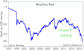
Brazil, however, is in deep trouble. In dollar terms, the Brazilian stock market is down an astonishing 75% over the past five years. About half of this decline is due to the plunging real, which is now at a new all-time low of 4.05 to the dollar. Either way you measure it, this is a world-class, super-ugly bear market. From a contrarian perspective, however, the recent decline is beginning to look like the kind of panic selling that marks major market bottoms.

Friday, September 18, 2015

Good news trumps bad news

Bad news seems more prone to get the headlines, whereas there's lots of good news that goes largely unnoticed. Some examples:

The bad news: this is the weakest recovery ever; the labor force participation rate has been falling for 15 years; productivity growth is dismally low; our national debt is at a post-war high of 72% of GDP; race relations have deteriorated; tax and regulatory burdens are suffocating the private sector; savers and retirees have been severely penalized by seven years of near-zero interest rates; the rule of law has been weakened by the emergence of the Imperial Presidency; crony capitalism (a euphemism for corruption in government) is rampant; the tax code is a nightmare; and transfer payments are at record-high levels that correspond to 20% of personal income and over 70% of federal spending.

The good news: despite all the bad news, household net worth is at an all-time high ($85.7 trillion), whether measured in nominal, real or per capita terms; households' leverage has fallen by more than 30% since the 2009 peak; the economy has been growing and jobs have been expanding for more than six years; 30-yr fixed mortgage rates are 3.84%, only 40 bps higher than their all-time lows of 2012; housing starts have increased by an annualized 15% rate for the past six years; the private sector has created over 4 million net new jobs since 2007; inflation has averaged only 2% for the past 10 years; and the dollar is still one of the world's strongest currencies.

Here are some charts which incorporate the data on Q2/15 household net worth released today:


Household net worth has reached an astounding $85.7 trillion. That represents an increase of almost 30% ($18.9 trillion) from the pre-recession levels of 2007. The increase was driven by a $16.7 trillion increase in financial assets, and it occurred—in very healthy fashion—alongside a modest reduction in liabilities.


After adjusting for inflation, household net worth now stands at a new, all-time high. That continues the long-term trend of annualized increases of almost 2.5% in real household net worth.


After adjusting for inflation and population growth, real per capita net worth is also at a new, all-time high of about $268K. 

Even if all this staggering amount of wealth were held by just a handful of people, it would still be the case that we all benefit from it. This wealth is the ultimate source of all jobs and our living standards. Because our economy can produce so much, so efficiently, the fruits of modern life (e.g., iPhones, air travel, clean water, abundant food) are available to virtually everyone. This is unequivocally good news.


As the chart above shows, all of the wealth gains have occurred against a backdrop of pronounced deleveraging on the part of the household sector. Leverage has been rolled back to the levels of the mid-1980s. Who says that deleveraging is bad for growth and prosperity?


The chart above shows the Fed's calculation of the average homeowner's percentage equity ownership in his or her home. Although still relatively low from a long-term historical perspective (it was over 80% in the early 1950s), it has rebounded significantly in the past six years. Households' real estate holdings today have just about regained their prior peak levels of 2006. You can almost hear the sighs of relief all across the country.

Thursday, September 17, 2015

Post FOMC charts and comments

Going into the FOMC meeting, the market was priced to a 30% chance that the Fed would begin "liftoff." In the aftermath of the Fed's announcement that it would postpone liftoff, short-term interest rates adjusted downwards by about 7-8 bps, which is roughly one-third of a 25 bps "tightening." Translation: the market moved rationally, pricing out what had previously been priced in. Implied volatility and the equity markets jerked around, however, but ended relatively unchanged. So on balance the FOMC announcement was a non-event. It resulted in a very modest reduction in interest rates, but did not increase or decrease uncertainty, leaving the fundamentals reasonably healthy: 2-year swap spreads inched higher to 12.7 bps, but remain very low; gold inched higher but remains in a multi-year downtrend; the dollar inched lower but remains relatively flat year-to-date, and close to its long-term average valuation relative to other currencies; and credit spreads were relatively unchanged while remaining somewhat elevated.


With implied equity volatility relatively unchanged but yields lower, the Vix/10-yr ratio inched higher, but remains significantly below its peak of a few weeks ago. The market is still nervous and still concerned that the U.S. economy is going to prove sluggish, but the outlook is no longer as dire as everyone thought. Equity prices have predictably responded to a reduction in fear and uncertainty by increasing.


Recent changes to gold and 5-yr TIPS prices have been minor, when seen from an historical perspective such as the chart above affords. Both remain in a downtrend, a sign that the demand fro safe assets is declining and that therefore the market is becoming less concerned about drastic outcomes. Fear and uncertainty are gradually being displaced by a slow return of confidence.


The first of the charts above compares the nominal yield on 5-yr Treasuries to the real yield on 5-yr TIPS, and the difference between the two which is the market's expectation for inflation over the next 5 years (1.3%). Not surprisingly, near-term inflation expectations have declined over the past year. As the second chart shows, lower inflation expectations are almost entirely the result of lower energy prices. This also is rational, and does not reflect negatively or positively on the Fed's policy stance.


 The chart above shows inflation expectations for years 5 through 10—currently about 1.9%.


The chart above shows inflation expectations for the entirety of the next 10 years—currently about 1.6%. In other words, the market sees inflation being relatively low for years 1-5 (1.3%), but then picking up to 1.9% for years 5-10, and averaging 1.6% for years 1-10. That's not significantly less than the annualized increase in the CPI over the previous 10 years of 1.95%. As John Cochrane notes,

The outcomes we desire from monetary policy are about as good as one could hope. Inflation is low and steady. Interest rates are lower than Americans have seen in generations. Unemployment, at 5.1%, has recovered to near normal. And banks and businesses sitting on huge piles of cash don’t go bust, a boon to financial stability.

Although far from ideal, things could be a lot worse. There is no evidence to date that the Fed has made any serious mistakes. For newer readers, I note once again that—contrary to popular belief—the Fed has not been printing money, and instead has been merely accommodating a very strong demand for money by swapping bank reserves for notes and bonds.

I continue to worry that when the time comes to raise rates, the Fed will move too slowly, and this will result in an unpleasant increase in inflation and eventually much higher interest rates. But for now this is only something to keep a sharp eye out for. I don't yet see hard evidence of a decline in the demand for money which would precipitate a meaningful rise in inflation, but I have not let down my guard on this. That's the important point: it's all about the demand for money. If the demand for money falls and the Fed fails to counteract that by reducing bank reserves and raising the rate it pays on excess reserves, then inflation and inflation expectations should rise.

Wednesday, September 16, 2015

More good housing news

Given the abundance of bad news these days (Fed "tightening," Chinese slowdown, global growth slowdown, xenophobia, Iran going nuclear, Brazil meltdown, sluggish US growth, stock market corrections, etc.) good news doesn't get the press it deserves. So here's a modest contribution:


Housing starts are up 25% in the past year and 120% in the past four years, and look to have plenty of upside potential given household formation growth and scrappage. Builders' sentiment hasn't been this strong in almost 10 years. Together, the two strongly suggest further improvement in residential construction for the next year or so, and they further suggest that households are regaining confidence in the future of homeownership. Confidence, as I've argued for years, has been the thing most lacking in the current business cycle recovery, so this is good news.


As a corollary, an index of the stocks of 18 leading home builders has more than tripled since early 2009, and is very close to an 8-year high. Yet prices are still 40% below their "bubble" high of 10 years ago: lots of improvement, but still lots of room for future growth.

UPDATE (Sep 17): August housing starts fell, coming in a bit lower than expectations (1126K vs. 1160K), and prior months were revised downwards a bit. This runs counter to the gist of this post, but does it change the big picture? Hardly. This series is notoriously volatile on a month-to-month basis. Starts likely remain in an uptrend, and the rise in builders' sentiment supports the outlook for continued gains in the months to come. Here's the updated chart, which you can compare with yesterday's version above:


There's no inflation excuse for postponing a rate hike

If the FOMC tomorrow decides to postpone raising short-term interest rates, it won't be because inflation is "too low."

The chart above shows the year over year change in the total Consumer Price Index and in the Core version of same (i.e., ex-food & energy). The total is up only 0.2% in the 12 months ended August, and that indeed is a pretty low number. But the reason it's low is almost entirely due to the big collapse in oil prices over the past year: crude oil is down by more than 50%. If we exclude food and energy, the Core CPI is up 1.83% in the past year. When there are big swings in energy prices, the Fed shouldn't be concerned, since controlling oil prices is not part of its mandate. These days, the Fed should be focusing almost exclusively on ex-energy measures of inflation.


So here it is. The chart above shows the level of the CPI ex-energy on a semi-log scale. From this perspective, inflation today is only a hair below the 2% per year it's averaged over the past 12-13 years. If anything in this chart stands out, it is the quickening of inflation in the 2006-2008 period.


And if we look at annualized changes in the total and core versions of the CPI over rolling six-month periods, as the chart above does, then we see that inflation is actually more than 2%: the CPI is up 2.35%, while the Core is up 2.05%. I haven't shown it on this chart, but the 6-mo. annualized rate of the CPI ex-energy is 1.88%. By these measures, the Fed should already be raising rates.

Tuesday, September 15, 2015

It's Not Easy

That's the title of Howard Marks' latest memo to clients, and one I highly recommend—especially given all the things that people worry about these days. One of the most important things that successful investors have to do is to 1) have a sense for what the market is assuming, and 2) decide whether the market is right or wrong in its assumptions. For most of the past seven years I've argued that the market was overly pessimistic about the future, and therefore it made sense to be long equities. As it turned out, the future didn't turn out to be as bad as the market thought, and prices rose impressively, despite some setbacks along the way. Here's just one of my posts that pointed out how pessimistic the market was, and how that presented an opportunity for investors whose own view of the future was not so pessimistic. When the world is worried about all the things that could go wrong (e.g., China, oil, the Middle East), then it makes sense to worry about what might go right. 

Some excerpts from Howard's memo:

[Investing is] not supposed to be easy. Anyone who finds it easy is stupid.
First-level thinking says, “It’s a good company; let’s buy the stock.” Second-level thinking says, “It’s a good company, but everyone thinks it’s a great company, and it’s not. So the stock’s overrated and overpriced; let’s sell.”
First-level thinking says, “The outlook calls for low growth and rising inflation. Let’s dump our stocks.” Second-level thinking says, “The outlook stinks, but everyone else is selling in panic. Buy!”

First-level thinking says, “I think the company’s earnings will fall; sell.” Second- level thinking says, “I think the company’s earnings will fall far less than people expect, and the pleasant surprise will lift the stock; buy.”

First-level thinking is simplistic and superficial, and just about everyone can do it (a bad sign for anything involving an attempt at superiority). All the first-level thinker needs is an opinion about the future, as in, “The outlook for the company is favorable, meaning the stock will go up.”

Second-level thinking is deep, complex and convoluted. The second-level thinker takes many things into account:
–What is the range of likely future outcomes? Which outcome do I think will occur? What’s the probability I’m right?
–What does the consensus think?

–How does my expectation differ from the consensus?

Fears are fading

Here's a quick update of some key charts I've been highlighting for the past three weeks or so. It's all about how terrified the market has been of slowing Chinese growth, a devalued yuan, and collapsing oil prices. Lots of fear, uncertainty and doubt out there, but so far nothing in the way of confirmation that the economic and financial fundamentals are deteriorating. It's hard for markets to stay extremely worried when nothing bad happens. What's changing on the margin is that fears appear to be slowly fading.


The Vix/10-yr ratio has plunged, but remains pretty high. Stocks are struggling to regain their former ground. We're not out of the woods yet, but we've made progress.


5-yr TIPS real yields continue to edge higher, suggesting that investors are regaining some confidence in the economy's ability to grow. Gold prices continue to drift lower, suggesting that investors are realizing that the fundamentals are not deteriorating. If the world were really unravelling, prices of TIPS and gold would be a lot higher.


2-year swap spreads both here and in the Eurozone continue to be relatively low, suggesting that the economic and financial market fundamentals are healthy. Healthy and liquid financial markets are an essential precondition if we are to weather the current storm of fears and doubts.


If swap spreads continue to be leading indicators of the direction of the economy, then spreads on high-yield debt are likely to tighten going forward. This is a very hopeful indicator suggesting we will survive the current bout of nerves.

In the absence of any outright unraveling of the economic and financial fundamentals, whether the FOMC raises rates or not at its meeting this week is almost irrelevant.

Friday, September 11, 2015

Budget deficit on track for 2% of GDP


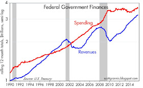
Six years ago the world was shocked by federal budget deficits that were forecast to be over $1 trillion per year for as far as the eye could see. Well, we've come a long way since then. By the end of next month, the federal budget deficit for the current fiscal year is likely to be about $420 billion, a mere 2% of GDP. If present trends continue (spending growth of 5% per year and revenue growth of 8%), next year's budget deficit could be as little as $380 billion, or just 1.7% of GDP. The secret to this remarkable change of fiscal fortunes? Spending restraint, coupled with booming individual and corporate income tax receipts. In short, a relative shrinkage of the public sector and a healthy expansion of the private sector.

These are impressive fundamentals which support the near-term outlook for the economy. They also offer the promise of even better things to come, since the government can easily "afford" to experiment with lower marginal tax rates on individuals and corporations. 


Over the past six years, federal government spending has increased at a mere 1% annualized rate. Relative to GDP, spending has declined from 23.6% of GDP to 20.6%, which is right in line with its post-war average. Leviathan has been tamed, at least for now. Meanwhile, federal government revenues have increased at a 7% annualized rate. Relative to GDP, revenues have increased from 15% of GDP to 18.2% of GDP, which is also in line with its post-war average.


Individual income taxes (including capital gains taxes) and corporate income taxes have been the major drivers of revenue growth. Payroll taxes have been growing by a modest 4-5% per year, in line with the increase in jobs and personal incomes. Estate and gift taxes, in contrast, have declined by one-third over the past seven years, and in the past year they have totaled less than $20 billion, a puny 0.11% of GDP. (This is so small it would hardly register on the chart.) If we abolished the death tax, the impact on the deficit would be trivial—equivalent to a rounding error. Why can't we get rid of this tax? Our economy surely spends more trying to minimize this tax than the government receives from the tax—making it an absurd endeavor and a deadweight loss which hurts us all.

Wednesday, September 9, 2015

Job openings surge

Newsflash: U.S. businesses have openings for over 5.7 million jobs!


This is the most promising chart that I have seen in a long time. It's put together by the Bureau of Labor Statistics, and it shows the total number of job openings in the economy (in thousands). Job openings as of July 31st were up an eye-popping 47% since the end of 2013. That works out to a 26% annualized rate of growth, which is simply astounding. We haven't seen anything like this since the stats were first collected in late 2000. It suggests businesses are much more confident about the future. Of course, we have yet to see this increased confidence translate into a meaningful increase in hirings, but it is nevertheless a very encouraging development.

Calculated Risk has more on the subject here.

UPDATE: The very strong JOLTS report is rumored to be the cause of today's stock slump. (i.e., "good news is bad news," because good news makes it easier for the Fed to raise rates). If that's true then I think it's a buying opportunity because a rate hike is very unlikely to hurt the economy's prospects. Higher rates typically occur against a backdrop of a stronger economy. They don't weaken a stronger economy until real short term rates exceed 3-4%, and we are years away from that.

Tuesday, September 8, 2015

Equity valuation update

Here's a quick look at equity valuations using some traditional and non-traditional methods. Data as of August 31, 2015. Worst case, stocks look a bit overvalued. Best case, stocks still look attractive.


According to Bloomberg's calculations, the trailing 12-month PE ratio of the S&P 500 (17.4) is only slightly above its long-term average (16), and far lower than its 2000 peak of 30. My read of this is that equity valuations are about average—neither over- nor under-valued.


The chart above compares the earnings yield on the S&P 500 (the inverse of the PE ratio) to the yield on BAA corporate bonds. On this basis, holding stocks gives you a slightly better yield than holding the typical corporate bond. From an historical perspective, what this means is that stocks are unusually attractive relative to corporate bonds. Why? Because equity ownership gives you unlimited, long-term upside potential, whereas the best you can get from holding corporate bonds is their yield to maturity. It also implies that the equity market is still possessed of a healthy degree of pessimism. Why? Because if investors were optimistic about the prospects for corporate earnings they would much prefer to own equities than corporate bonds, since equities promise not only yields but capital gains.


The chart above compares the earnings yield on stocks to the inverse of the real yield on 5-yr TIPS. These two series tend to move together, and they are good proxies for the degree of pessimism/optimism in equity prices. For example: when optimism was high in 2000, real yields were very high (meaning TIPS prices were very low) and earnings yields were very low (meaning equity prices were very high). The world was so enthusiastic about the prospect for corporate earnings and economic growth that investors were willing to all but ignore the historically attractive and government-guaranteed 4% real yields on TIPS, in favor of the non-guaranteed 3.5% earnings yield on stocks. Today, investors seem indifferent to the almost 6% yield on stocks, versus the meager 0.3% real yield on 5-yr TIPS. Pessimism is not hard to find these days.


Investors always have a choice between owning risky stocks or risk-free 10-yr Treasuries. Currently, the earnings yield on stocks is about 350 bps higher than the yield on 10-yr Treasuries. From an historical perspective, this is a relatively rare occurence. My read on this is that investors today are not very confident that corporate profits can hold at current levels. They fear that earnings are going to decline, and so they demand an unusually high premium for holding stocks instead of Treasuries. By this measure, stocks offer attractive valuations for those who believe that earnings are unlikely to fall. 


Corporate profits tend to track the growth of nominal GDP over time. Stock prices are theoretically driven by the discounted present value of future after-tax earnings. The market cap of equities (using the S&P 500 as a proxy) should therefore tend to track the inverse of risk-free Treasury yields (because they are the appropriate discount rate). And as the chart above shows, they do. Treasury yields are very low from an historical perspective, but the market cap of equities is not out of line with historical trends, being roughly the same today as in the early 1960s.

Chart updates V

High volatility remains just about the only thing unusual in the key financial indicators these days.


The Vix/10-yr ratio has dropped significantly since its August 24th peak, but remains quite high from an historical perspective. However, a reduced level of fear and pessimism (for which this ratio is a proxy) has corresponded to a welcome bounce in equity prices.


2-yr swap spreads remain quite low, suggesting that the moderate rise in high-yield credit spreads is likely to fade. In any event, the rise in HY spreads is mainly attributable to the energy sector, where a significant decline in oil prices has increased default risk.


Eurozone swap spreads remain relatively low as well. The chart above suggests that systemic risk in the U.S. and the Eurozone is low—so far there has been no contagion from the energy sector to the broader economy.


The prices of gold and 5-yr TIPS (using the inverse of their real yield as a proxy) continue to trend lower. This suggests that the world is gradually recovering some of the confidence it lost in the runup to the PIIGS crisis in late 2011. It also suggests that the fears surrounding the possible ramifications of a slowdown in the Chinese economy are relatively groundless. If the global economy were unraveling, prices of gold and TIPS would be moving higher, not lower.