Thursday, January 30, 2014

The good news behind modest GDP growth

Fourth quarter GDP growth came in as expected (+3.2% on an annualized basis). It's not much to cheer about, since it leaves the economy with a huge and unprecedented output gap, but it is a whole lot better than anyone was expecting a year or so ago. The big news is that things are picking up and slowly improving, in spite of some formidable headwinds: a two percentage point decline in federal spending relative to GDP; a three percentage point decline in the federal deficit; the lowest labor force participation rate since 1978; a meager 1.6% increase in employment; sluggish business investment; higher marginal tax rates on middle- and upper-class taxpayers; and a significant increase in regulatory burdens. If you could go back in time to December 2012 and show any economist just these facts, the majority would have predicted GDP would be miserably slow in 2013. Instead, real GDP increased 2.7%, and growth accelerated in the second half of the year.

The force that moves markets is the unexpected. The economy has performed much better than expected, and that's why the stock market returned over 32.4% last year and 10-year Treasury yields rose 100 bps.

Although it's unlikely that things will improve so dramatically in the coming year, I remain optimistic. Despite the headwinds, there are some impressive positive forces at work: the inherent dynamism of the U.S. economy, the reduction in the size of government, the decline of risk aversion, and the significant increase in U.S. petroleum production. Many will likely disagree with me, but I see the ongoing failure of Obamacare as a big positive, since I think it ushers in a new era of thinking in which we become skeptical of attempts by the government to manage more of the economy, and more open to allowing free market forces to resolve problems.

Here are some charts which make interesting points that you might not see elsewhere:


This continues to be the weakest recovery ever. The "gap" between where the economy is today and where it could be if it had returned to its long-term growth trend (which is roughly 3% per year) is about 10% (see chart above). If this had been a typical recovery, national income would have been about $1.6 trillion higher than it is today. That's a lot of money—about $11,700 per working person—that's been left on the table, and that goes a long way to explaining why there is still a dearth of confidence and optimism.


As the first of the above two charts shows, quarterly growth rates in real and nominal GDP have been rather erratic in recent years, but there is a strengthening trend that is evident over the course of the past year. The second chart smooths things out by showing the 2-year annualized growth of real GDP. The economy has been growing at about a 2.5% annualized pace, on average, for the past four and a half years. Not very impressive, but somewhat better than the "new normal" economy which many expected to be 2% annual growth for as far as the eye could see.


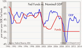
As the above chart shows, nominal GDP has been growing at about a 4% annualized pace since mid-2009. Ordinarily, the Fed would have kept short-term interest rates in a 2-3% range given this pace of  growth. Instead, they have kept short-term rates near zero for over five years. That translates into an unprecedented degree of monetary policy accommodation. But as I've argued before, the Fed hasn't been "stimulative." It's more appropriate to view the Fed's policy actions as "accommodative." By buying trillions of notes and bonds and paying for them with bank reserves, the Fed has been accommodating the world's seemingly insatiable demand for "safe" assets. This is unlikely to continue much longer, because risk aversion is declining and the demand for money is no longer surging. Interest rates will move higher in coming years, and it's only a question of when and how fast.


The chart above shows one measure of money demand: the ratio of M2 to nominal GDP. Think of that as the portion of the average person's annual income that he or she wishes to hold in the form of readily spendable cash. The ratio (the demand for money) increased rapidly in the wake of the 2008 financial crisis, as almost everyone struggled to deleverage and/or boost savings. Over the past year, however, money demand by this measure has only increased by 1% or so. Most of the increase in M2 relative to nominal GDP since 2008 can be accounted for by a $3 trillion increase in bank savings deposits, and most of those savings deposits are now backed up by bank reserves. Banks effectively took in $3 trillion of new deposits and handed the money over to the Fed in exchange for bank reserves. People were willing to accept almost nothing in the way of interest on their deposits, and banks were unwilling to lend to anyone but the U.S. government, even though it left them with a negligible spread.


One of the most extraordinary developments in the current recovery has been the dramatic closing of the fiscal gap. Government spending relative to GDP has collapsed, mainly because nominal spending has not increased at all since mid-2009. Meanwhile, revenues have increased at a faster rate than nominal GDP, thanks mainly to an expanding tax base (i.e., more people working, rising incomes, more corporate profits, more capital gains realizations).


As a result, in the space of just four and a half years, the federal deficit has fallen by almost two-thirds in dollar terms. Not one single person in the world thought that anything like this would or could happen. Four years ago the federal deficit was projected to be measured in trillions of dollars per year for as far as the eye could see. Now it's back down to levels that are easily manageable. There remains the concern, of course, that entitlement spending is likely to soar in coming years, so we are not out of the woods yet. But this is still incredibly welcome news.

What we have learned over the past 4-5 years is very important. Government "stimulus" spending doesn't work. Transfer payments don't boost economic growth. The government spending multiplier is almost certainly less than one (i.e., one extra dollar of government spending is likely to add less than one dollar to GDP, and in all likelihood, could actually subtract from GDP). Fiscal "contraction" (i.e., a decline in government spending) doesn't necessarily hurt the economy and can even help, by giving the private sector more breathing room. And most importantly, government cannot possibly manage entire industries (e.g., healthcare) better than the private sector can. All of this knowledge and evidence will add up in coming years to a positive end: less government interference in the economy. And that, in turn, will be the best kind of stimulus for the economy.

The present is still disappointing, but the future is looking much brighter.

Wednesday, January 29, 2014

Minimum wage factoids

For years I've had fun at cocktail parties by asking people what percent of all the people who work in the U.S. were paid minimum wage or less. Of all the people I've asked, only one has come even close to the right answer. The vast majority of the answers I've received (try it yourself!) range from 10% to as much as 50%. Clearly, the public doesn't have a clue, and that's why politicians are able to exploit the minimum wage issue for political gain.

But don't take my word for it, just look at the facts as calculated by the BLS, in their Characteristics of Minimum Wage Workers 2012:

In 2012, 75.3 million workers in the United States age 16 and over were paid at hourly rates, representing 59.0 percent of all wage and salary workers. 1 Among those paid by the hour, 1.6 million earned exactly the prevailing federal minimum wage of $7.25 per hour. About 2.0 million had wages below the federal minimum.2 Together, these 3.6 million workers with wages at or below the federal minimum made up 4.7 percent of all hourly paid workers.

The BLS also tells us that, as of the end of 2012, there were roughly 140 million non-farm employees in the U.S. So the percentage of all the people working who were making minimum wage or less is (1.6 + 2.0)/140 = 2.6%. Less than 3% of all those who work in the U.S. make minimum wage or less, and over half of those earn less than the minimum wage. By the same logic, over 97% of those who work already make more than the minimum wage without any help from government fiats.

But there's more, and its impressive: "About three-fifths of workers earning the minimum wage or less in 2012 were employed in service occupations, mostly in food preparation and serving related jobs." In other words, 60% of those making minimum wage or less work in restaurants, where they undoubtedly make more than minimum wage if you count their tip income. That means that approximately 1% of those who work (40% of 2.6%) in the U.S. actually make minimum wage or less for their hourly efforts. Fully 99% of those who work effectively earn more than the minimum wage.

Raising the minimum wage would therefore benefit only 1-2% of the working population, but it would probably make life miserable for young and inexperienced workers, who could find that the jobs available to them have vanished because the minimum wage has been set at a level that exceeds their productivity. The unemployment rate for those aged 16-19 is already sky-high, at almost 24%.

Let's not make things worse for those who need a low minimum wage in order to get their first job.


The taper is here to stay

Good news today from the FOMC: they will continue to taper their purchases of bonds by $10 billion per month. At this pace the Fed would stop buying bonds by October, although they might continue to reinvest coupons and maturing principal for awhile longer. It's nice that the Fed was undeterred by the recent flareup in emerging markets or by the unexpected weakness in December job gains. It's also nice that markets have not displayed any unusual amount of anxiety over what is now an important and durable course correction in U.S. monetary policy. Over time, this should contribute to a further, gradual increase in confidence and a further, gradual decline in money demand, and as such should give a modest upward boost to nominal GDP.


2-yr swap spreads, shown in the chart above, are excellent and forward-looking indicators of systemic risk. Currently they are about as low as they have ever been, which suggests that markets are highly liquid, confident that the future holds no big surprises, and expecting economic and financial conditions to improve. Swap spreads were unchanged on the FOMC news today.


The Vix index is a good proxy for the market's level of fear, anxiety, and general uncertainty. The index rose modestly (shown in the chart above as a decline in the red line) a few days ago as the emerging market turmoil left global markets disconcerted, but this sort of increase in the Vix is relatively minor in the great scheme of things. Indeed, the flareups of unease and fear that we have seen in the past two years have all been relatively minor, compared to the huge bouts of panic that accompanied the financial disasters of late 2008 and the emergence of the Eurozone sovereign debt crisis in 2010 and 2011. Equities typically decline as fear rises, and rise as fears decline. It's likely we'll see a repeat of this sooner or later.


Gold and short-maturity TIPS are classic refuges in times of great uncertainty, and the prices of both have been trading fairly steadily at lower levels over the past six months. (The chart above shows the inverse of TIPS real yields, which is a good proxy for their price.) I take that to mean that the market's demand for safe assets has been relatively unchanged of late, despite the announcement of tapering, and despite the problems in the emerging market space.

Truck tonnage rose 8% last year


According to the American Trucking Association, U.S. trucks carried 8.2% more freight tonnage last December than they did a year ago. That's pretty impressive, since we haven't seen strong gains like that on a sustained basis since 1997-98.

As the chart above suggests, this expansion of the physical side of the economy tracks well with the gains in inflation-adjusted equity prices. Nothing out of line these days, as compared to the excessive enthusiasm of the equity market in the late 1990s and the extreme pessimism towards the end of the last recession.

The Tea Party is alive and well

Mike Lee last night gave the Tea Party response to Obama's State of the Union, and it was quite refreshing. Democrats and Republicans are to blame for most of the ills that burden our country these days, not the rich, the big corporations, or the big banks. Some excerpts:

On inequality: Immobility among the poor, who are being trapped in poverty by big-government programs; insecurity in the middle class, where families are struggling just to get by and can’t seem to get ahead; and cronyist privilege at the top, where political and economic insiders twist the immense power of the federal government to profit at the expense of everyone else.

... six of the ten wealthiest counties in America are now suburbs of Washington, D.C.
... where does this new inequality come from? From government—every time it takes rights and opportunities away from the American people and gives them instead to politicians, bureaucrats, and special interests.
... trapping poor children in failing schools to benefit bureaucrats and union bosses ... penalizing low-income parents for getting married, or getting better jobs, ... guaranteeing insurance companies taxpayer bailouts if Obamacare cuts into their profits.
On principles: The founders made a point at Boston Harbor, but they made history in Philadelphia’s Independence Hall. As Americans we must always be willing to fight the Boston-type battles—boldly calling out bad policy whenever we see it—but we must do so with an eye toward Philadelphia, maintaining a positive focus on the kind of nation we want to be and become.

I could be wrong, but this hardly sounds like a radical agenda.

UPDATE: Jennifer Rubin has a nice and objective review of the speech here.

Tuesday, January 28, 2014

Housing prices continue to recover, but business investment is still sluggish


The Case-Shiller housing price index, shown in the chart above, may not be a perfect measure of housing prices, but it's probably the best one we have. The data for November, released today, is several months old, but it shows an ongoing recovery that is fairly impressive. From their peak in April, 2006, housing prices on average fell by 34%. Since hitting bottom in early 2012, prices have risen by almost 21%. Put another way, in the past two years prices have recovered about 40% of what they lost as a result of the Great Housing Market Collapse. It's likely that the housing recovery is now  taking a breather, with prices rising at a much slower rate—thanks to higher mortgage rates and fears of tapering—but there is no reason to think that the recovery has been or will be aborted.


December capital goods orders, on the other hand, were somewhat disappointing. As the chart above shows, they have been relatively flat for the past year, and have yet to reach convincing new highs. This, in spite of the fact that corporate profits have more than tripled since 2000, and are up fully 70% from their pre-recession level. Without more aggressive investment on the part of business, the U.S. economy is unlikely to meaningfully narrow the roughly 10% "gap" between its current size and its long-term trend potential (see chart below). 


Business investment is unlikely to improve significantly unless and until policies become more investment- and growth-friendly. Personal and corporate income tax rates are very high, regulatory burdens are very high (e.g., Obamacare and Dodd-Frank), and monetary policy uncertainty is unprecedented (e.g., will tapering continue, and if so, does it pose a risk to the recovery? or will tapering be delayed, thus posing other potential risks down the line?). 

Argentina's problem is not Fed tapering

The media meme which posits that Fed tapering has caused big problems in the emerging market world ignores lots of facts to the contrary, especially in Argentina.

Argentina experienced a significant devaluation of its peso last week, but the bigger picture is that the peso has been falling for years. The peso has been falling because of the misguided and inflationary policies of the Argentine government and its central bank.


The decline of the Argentine peso began three years ago. The magnitude of the recent decline was fully anticipated by the black market exchange rate (the so-called "blue" rate) one year ago. 


The underlying symptoms of the peso's weakness have been evident since 2011, when Argentina's foreign reserves began to decline. Reserves are now down 45% from their 2011 high. This was a direct result of efforts by the central bank to support its currency peg at an unrealistically high level: with capital fleeing the country, the central bank was forced to sell dollars almost continuously in order to avoid a faster depreciation of the currency. What happened last week was inevitable.


With a pegged exchange rate such as Argentina's, a decline in foreign reserves would ordinarily result in a decline in the domestic money supply, because declining reserves are the result of capital flight. If the central bank were following the "rules" of a pegged exchange rate policy, declining reserves would be matched by a decline in the money supply, which in turn would put downward pressure on prices. This would continue until the peso's effective exchange rate repriced to a level consistent with stable capital flows. 

Yet Argentina's currency in circulation has been expanding by over 30% a year despite a 45% drop in its international reserves. This can only mean one thing: the Argentine central bank is literally "printing money" that has no backing. This is the proximate cause of Argentina's inflation, which appears to be in the range of 25-30% a year. The peso is down because its value has been undermined by years of reckless monetary expansion and inflation. Unable to borrow money from the capital markets to finance its ongoing fiscal deficit, the Argentine government has been resorting to the printing press to pay its bills. This is the problem in a nutshell, and it has almost nothing to do with the Fed's QE policy or the tapering of QE. 

An emerging meme posits that the recent weakness in quite a few emerging market currencies (e.g., Argentina, Venezuela, Brazil, Chile, Turkey) is a replay of the S.E. Asian currency crisis of 1997-98, and as such this may persuade the Fed to back off on its intention to continue its QE taper. I disagree, because there are some very important differences between now and then. 


In 1997, the Fed was in full-bore tightening mode, having raised the real Federal funds rate by over 300 bps in the prior two years. Today, the Fed is still extraordinarily accommodative, since the banking system is flush with excess reserves and the real Federal funds rate is decidedly negative. The tapering of QE has begun, but only in very modest fashion. The Fed is still supplying the world with oodles of bank reserves every month, and is many months away from even modest hikes in the real Fed funds rate. 


In mid-1997, just prior to the big collapse of S.E. Asian currencies, the dollar was over 10% stronger in real terms, against a broad basket of currencies, than it is today. 


Today, industrial commodity prices are almost 60% higher than they were in mid-1997. In 1997, the S.E. Asian currencies were under tremendous outside pressures, in the form of a) very tight monetary policy, b) a strengthening dollar, and c) relatively weak commodity prices. Today, those pressures are far less: U.S. monetary policy is still very accommodative, the dollar is weak, and commodity prices are much stronger. 

Arguably, the problems in emerging market countries that have surfaced recently have been brewing for quite some time and are only tangentially related to the Fed's decision to taper. For example, the Turkish lira has been in decline for over 3 years, and the Brazilian real and the Chilean peso for two and a half years. Thus there is little reason to think that the Fed needs to back away from a decision to continue tapering its QE bond purchases.

Monday, January 27, 2014

World trade and industrial production look good

What's good for the world is good for everyone. The more overseas economies produce, the more money they have to purchase goods and services from us. It's a win-win situation. Although the data in these charts is only through last November, it shows that world trade and industrial production is at the very least stable and in some areas gradually picking up, with most of the recent improvements concentrated in the advanced economies.


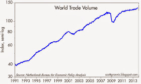
The volume of world trade grew 2.5% in 2011 and only 2% or so in 2012, but in the six months ended November 2013, world trade surged at a 6.7% annualized pace. 


As the first two of the three charts above show, world industrial production has been picking up over the past year. In the six months ended November 2013, world industrial production rose at a 4.9% annualized pace. That's reminiscent of the growth rates that prevailed in the generally healthy mid-2000s. As the third chart shows, a good deal of this improvement is coming from a decent recovery in manufacturing activity in the U.S. and Eurozone economies


Industrial production in advanced economies was stagnant in 2011 and 2012 (think Eurozone debt default problems), but things have improved this past year. Industrial production in advanced economies rose at a 4.2% annualized pace in the six months ended November 2013. Manufacturing activity in the U.S. rose at a 6.8% pace in the fourth quarter of last year.


Markets recently have been skittish over fears that Fed tapering is going to be very bad for emerging market economies. In my view, those fears are misplaced. As I noted last week, the problems in Argentina are almost entirely homegrown, and the same can be said in spades for Venezuela. In any event, as the chart above suggests, it's hard to find evidence that the QE era has led to a "bubble" in emerging market economies that threatens to burst. Industrial production in emerging economies has been growing at a relatively constant and unremarkable 4-5% pace for the past several years. They were doing much better in the mid-2000s, when industrial production was rising at 7-10% rates.

As the second of the above charts shows, the Brazilian stock market has been struggling ever since early 2011. If there was an emerging market bubble, it has been deflating for the past 2-3 years.


Markets have also been obsessed with worries of an impending slowdown in China. But as the chart above shows, industrial production in the Asian economies has been growing at a relatively steady 6-7% pace for the past several years. Talk of a China "slowdown" is very relative, since it refers to real GDP growth being "only" 7% instead of 9 or 10%. That kind of "slowdown" was inevitable—China can't grow by 10% a year forever.

See Mark Perry's blog for more charts and commentary on this subject.

Thursday, January 23, 2014

Good news on Food Stamps

The good news on Food Stamps? The number of people receiving food stamps hasn't increased at all over the past year. The bad news? There are still almost 50 million people in the U.S. who receive foods stamps, and the government is spending almost $80 billion per year on this program. 


The top chart shows annual data for the food stamp program, while the bottom chart shows monthly data which go back only to late 2008, with the latest datapoint being October of last year. This really puts the good and bad in perspective. This program started out with humble origins, but has now morphed—as do almost all government entitlement programs—to something that touches the lives of 1 out of every 7 Americans.

Fortunately, and despite the government's best efforts to continue expanding the rolls of food stamp recipients, it looks like things are no longer getting worse. Although it's a national tragedy that this program has spun so far out of control (consider the likelihood of massive fraud, not to mention the perverse incentives created), it is nevertheless a relief to see that it appears to have reached its limits for the time being. That's small comfort, but a positive sign on the margin.

See more details on the history of the program in my post, over a year ago, here.

Big change on the unemployment front

First-time claims for unemployment insurance continue to be relatively low, which suggests that the labor market remains reasonably healthy. However, this month marks a big change on the claims front: the expiration of the unprecedented emergency unemployment claims program that began about four years ago. As a result, today about 1.3 million fewer people are receiving unemployment checks than just a few weeks ago. While this is undoubtedly painful for many, it should help strengthen the economy in the long run, provided Congress resists the temptation to reinstate the program.


On a seasonally-adjusted basis, first-time claims for unemployment are running about 325K per week and trending slowly down. It doesn't get a whole lot better than this, to judge from prior economic cycles.


The chart above documents the expiration of the emergency claims program, and puts it into the context of non-seasonally adjusted continuing claims.


On a non-seasonally adjusted basis, 3.56 million people are currently receiving unemployment insurance checks every week. On a seasonally adjusted basis, that is about 2% of the workforce, as shown in the chart above. Government support for the unemployed has finally returned to levels that in the past were considered "normal" at this point in the business cycle. It is arguably not a coincidence that the unprecedented level of government assistance for the unemployed in recent years has coincided with the current recovery being the weakest ever. The existence of the emergency claims program likely retarded the labor market's ability to adjust to the new post-recession realities. 


Also released today were the leading indicators (although "coincident" would probably be a better adjective) for December. As the chart above shows, the fundamentals of the economy are relatively healthy, to judge by the increase in the leading indicators index over the past year.

Congress should consider the wisdom of John Cowperthwaite before deciding to reinstate the emergency claims program. When it comes to government assistance, doing nothing is usually better than doing something.

Economic wisdom from a non-economist

Today's WSJ highlights a passage from Andrew Ferguson's superb essay in The Weekly Standard regarding the unimpeachable wisdom of John Cowperthwaite, Hong Kong's financial secretary from 1961 to 1971, who generated an economic boom by doing as little as possible. Here's a choice excerpt, but be sure to read the whole thing—and don't miss the part about how we would all be better off with fewer government-collected economic statistics.

... how the world works: If you tax something you get less of it; as a general rule an individual manages his own affairs better than his neighbor can; it’s rude to be bossy; the number of problems that resolve themselves if only you wait long enough is far larger than the number of problems solved by mucking around in them. And the cure is often worse than the disease: In the long run, the aggregate of the decisions of individual businessmen, exercising individual judgment in a free economy, even if often mistaken, is likely to do less harm than the centralized decisions of a Government; and certainly the harm is likely to be counteracted faster.

Wednesday, January 22, 2014

Another Argentine meltdown

As the U.S. stock market gradually "melts up," the Argentine peso is rapidly "melting down," as the below two charts illustrate.


The last time Argentina suffered a currency collapse was in early 2002, when the peso plunged almost overnight from 1 to 1 to the dollar to almost 4 to 1. Not content with 12 years of relative prosperity since then, the Argentine government seems dead set on creating another.

The problems began to get serious in 2011, when it first became apparent that the government was pegging the peso at a level that was too strong. The evidence for that can be found in the first chart, with the appearance of a black market (now the so-called "blue rate") peso that was weaker than the official rate. It can also be found in the second chart, with the decline in Argentina's international reserves that began in 2011. When Argentines perceive that the official rate is "too strong," they want to convert their cash holdings into dollars, which are more likely to hold their value than is the peso over time.

Argentines began to realize in 2011 that the official exchange rate was artificially high, and thus began the capital flight that has drained the government's international reserves by almost 50% in the past three years. (The artificially strong peso peg forces the government to sell dollars in the face of an overwhelming demand on the part of the public to buy dollars.) The government has of course tried to stem the capital flight by imposing exchange controls and import controls, but that has only exacerbated the problem. When it comes to confidence, the owners of capital want to know that they are free to leave if problems develop. If they begin to perceive that investing in a country is like a "roach motel" (i.e., you can put your money in, but you can't get it out), then capital will find no end of ways to circumvent a government's attempt to keep capital within its borders.

For the past few years, Argentines have been flocking to the U.S. to spend as much as possible with their credit cards, because in this manner they can effectively buy dollars at the official rate plus a 20% "surcharge" imposed by the government to discourage this practice. But that's better than buying dollars on the black market, where they would have to pay 50-70% more. We had some Argentine friends with us several months ago, and they wanted to stop at every ATM they saw, where they would then withdraw as many dollars as the machine would let them. After buying copious amounts of clothes and electronic goodies, they then sold the dollars they took back with them to Argentina on the black market, and easily paid for the cost of their trip. This is how dollars are fleeing Argentina these days.

With international reserves in virtual free-fall, the black market peso rate plunging, and no sign for months that President Kirchner has any appreciation at all of the gravity of the situation, the country is in the advanced stages of another financial panic/meltdown. This will end badly, another chapter in the long history of Argentine financial crises extending back almost 100 years.

In 1916, one U.S. dollar was worth two Argentine pesos. Since then, there have been a four major redenominations of the peso (in which multiple zeros were erased from its value). If the original peso were still in circulation, one U.S. dollar would be worth about 70 trillion pesos at the current official rate, and 120 trillion at the current black market rate.

Interestingly, the Argentine stock market (in peso terms) has almost tripled in the past two years, even as economic growth has slowed dramatically and inflation has risen to 30-35% per year. But in dollar terms, Argentine stocks have registered virtually no gain at all since 1992, when the peso was pegged at 1 to 1 to the dollar and stayed that way for a decade. I take this to be evidence that stocks can be a decent hedge against inflation over time, but not much more.

It's time to cry once more for Argentina.

UPDATE (Jan. 23): The decline of the peso accelerated today as the central bank apparently made no effort to prop up the peso with dollar sales. The dollar briefly hit 8.2 pesos, and is now trading just under 8. This marks a surge in the dollar's value against the peso of almost 60% since the beginning of last year, and that in turn points to a 60% rise in Argentina's general price level over the next year or so. That further implies a doubling of Argentina's inflation rate. At this point the central bank has little choice but to announce either a significant devaluation of the official rate or a float of the currency. But the underlying problem—too much government spending financed by printing money—will remain. Only a radical change in government policies can restore order to the Argentine economy, and that is unlikely as long as President Kirchner remains in control. It's time for the grownups to take charge.


UPDATE 2: The government-imposed "surcharge" on credit card purchases outside the country is now 35%. Band-aid solutions such as this only make things worse, as they effectively move the country closer and closer to a mega-devaluation, which in turn brings higher inflation and more money-printing, in what ends up being a vicious cycle that ends only when the government abandons all attempts to impose "order" on the economy and allows the free market to work its magic. We're not there yet.

Friday, January 17, 2014

New banner photo

My wife snapped this photo at sunset with her iPhone 5s. The special orange glow comes from the smoke that was created by the "Colby Fire" in Glendale that billowed out over Catalina Island yesterday. We've been experiencing a real Indian Summer this Winter, with temperatures in the mid-80s, very low humidity and clear blue skies almost every day for the past several weeks. The Midwest and East Coast appear to have stolen all of our rain and cold weather this season, and California now faces a severe drought.

Housing starts and industrial production look good

Today's release of December housing starts and industrial production add support to the view that the economy continues to grow at a moderate pace with a tendency to strengthen on the margin. Importantly, there is no sign of the economy slipping into a recession.


Housing starts were slightly above expectations (999K vs. 989K), and as the chart above suggests, they are likely to continue to rise in coming months based on the strength of the builders' sentiment index.


December industrial production and its subset, manufacturing production (see charts above), matched expectations (+0.3%), but both have accelerated meaningfully in the past six months. Industrial production rose at a modest 2.1% pace in the first half of last year, while expanding at a much more respectable 5.3% pace in the second half. Similarly, manufacturing production rose at a 1.1% pace in the first half of 2013, and accelerated to a 4.2% pace in the second half. This is very encouraging.

As the first of the above two charts shows, U.S. industrial production has now pulled way ahead of Eurozone industrial production. Nevertheless, it is comforting to see that the latter has also picked up of late. Europe is regaining some of the strength it lost in recent years, and that translates into reduced headwinds to U.S. growth going forward.

Higher Treasury yields reflect less pessimism

In a post back in October 2012, I noted "The unattractiveness of Treasuries," citing the fact that Treasury yields were very low relative to core inflation. I rejected the hypothesis—which was then quite common—that the depressed level of Treasury yields was due to the Fed's QE purchases, noting that the Fed's purchases were only a small fraction of the outstanding value of Treasuries, and arguing instead that Treasury yields are set by the market's demand to hold the entire outstanding stock of Treasuries, which in turn is a function of the market's expectations for future growth and inflation. The very low level of Treasury yields back then was, I thought, primarily due to the market's pessimistic outlook for U.S. growth. In hindsight, with Treasury yields up substantially since then, even though the Fed has purchased tons of Treasuries in the interim, I think the facts have born out my hypothesis. 


As the chart above shows, the huge gap between 30-yr Treasury yields and core inflation which opened up in the 2011-2012 period has now almost completely closed, with rising yields doing the lion's share of the closing. If yields were low back then because the market was very worried about the prospects for U.S. growth, it is certainly less worried today.


The above chart looks at the same relationship from a slightly different perspective, using 10-yr yields instead of 30-yr yields, shortening the time frame to only four years instead of several decades, and using forward-looking inflation expectations instead of actual inflation. However, the story is the same. Yields today are much better aligned with inflation fundamentals than they were in late 2012.

So what has caused Treasury yields to move sharply higher? Many would undoubtedly argue that the bond market is reacting to the prospect of 1) the tapering of QE and 2) the eventual reversal of QE. That would be hard to refute, since yields jumped last Spring when the notion of "tapering" was first floated. But as I argued last May:

... the Fed can only influence yields to the extent that the market's view of the economy is similar to the Fed's. If both expect the economy to be very weak, yields will be low, and prices will behave as if Fed purchases of bonds to stimulate the economy are in fact achieving their stated objective (i.e., QE purchases depress yields). But if the market thinks the economy is improving and/or inflation is rising, then no amount of Fed purchases will be able to keep yields from rising.
Even though the Fed continued to buy boatloads of bonds throughout last year, and even though the Fed didn't begin to taper its purchases until very recently, yields rose sharply and continue to be significantly higher than they were when QE3 began in late 2012. I believe that is because both the bond market and the Fed have revised upwards their assessment of the health of the U.S. economy, and with an improving growth outlook. Better growth expectations can be seen in the chart below, which compares the real yield on 5-yr TIPS to the prevailing rate of growth of the economy.


Whether expectations for growth are now optimistic or merely moderate is the key question. I believe that the above chart tells the story: the market is still priced to expectations of weak growth. Yields would likely move up another 100-200 basis points if the market (and the Fed) became convinced that economic growth would be at least 3% going forward. In short, the bond market is not yet optimistic about growth, but it is definitely less pessimistic than it was last Spring.

From this it follows that equities today are more reasonably priced, but with less upside potential than before—but still attractive.

Thursday, January 16, 2014

Financial conditions are excellent: avoid cash


The Bloomberg index of financial conditions is at an all-time high, which suggests that financial markets haven't been this healthy for the past two decades. This index is composed entirely of real-time measures of market sentiment, risk aversion, liquidity, credit risk, and profit expectations. No seasonal adjustment factors were used in the manufacture of this index, and no revisions will ever be made to the data. This index has a good record of leading economic conditions in general, and currently it is saying that there is virtually no risk of any significant economic disruption on the horizon.


Very healthy financial conditions are like a big green light for investors, especially these days, since the yield on cash and cash equivalents is almost zero. Holding zero-yielding cash when the economy is very likely to continue growing is a very expensive undertaking, since it means foregoing the much higher yields available on risky assets, as shown in the chart above. Holding cash only makes sense if you are very worried about the economy stumbling, but financial indicators say that the risk of that happening is extremely low.

By setting the yield on cash at an extremely low level, the Fed is essentially urging investors to take on more risk. It's ironic that the Fed's extraordinarily accommodative policy stance is still interpreted by most observers to be reflective of a deep and abiding concern over the recovery's fragility. Instead, as I've argued repeatedly, the Fed has in effect been forced to adopt an extraordinarily accommodative policy stance because the world has been so very risk averse.


Swap spreads, shown above, are one of the components of Bloomberg's index. They are indeed very low, which is very good. This is a direct reading of the market's liquidity and the systemic risk currently to be found in the markets and the economy. Things just don't get much better. Eurozone conditions aren't quite as attractive or healthy, but they have improved significantly in the past two years.


As the above chart shows, swap spreads have been excellent leading indicators of the economic health of the economy, rising meaningfully in advance of recessions, and falling meaningfully in advance of recoveries. (A short primer on swap spreads can be found here.)

Wednesday, January 15, 2014

It's time to downsize government

Cato, my favorite think tank, recently created five excellent, 3-minute videos which make it very clear why and how we need to downsize the Departments of Agriculture, Education, Energy, Health and Human Services, and Labor. We could be saving hundreds of billions of dollars a year while making the economy more efficient and increasing everyone's living standards in the process. This is not about eliminating government, it's about scaling back a government that has grown like Topsy for way too long.

We've already made good progress in reducing the size of government over the past four years by freezing spending; what needs to happen next is outright cuts to wasteful and unnecessary programs.

I'm optimistic about the future because, as these videos demonstrate, there are so many things wrong with our government that could be easily fixed.

Check out the videos here.

Tuesday, January 14, 2014

Retail sales beat expectations

Auto sales have been unusually volatile in the past several months, and they dropped 7% in December. If we exclude them from today's December retail sales release, sales were much stronger than expected (+0.7% vs. +0.4%). If we exclude the other volatile components (building materials and gas stations), sales also beat expectations (+0.7% vs. +0.3%). If, as Brian Wesbury notes, we consider the headwinds that buffeted the economy last year (e.g., the budget sequester, debt limit debate, partial federal shutdown, tapering, and higher long-term interest rates) retail sales by any measure were fairly impressive, increasing about 4% for the year.


On an inflation adjusted basis, retail sales ex-autos rose about 2.5% last year, with no sign of any emerging weakness or slowdown. (see chart above) Sales are comfortably above their pre-recession highs.


The non-volatile components of retail sales are increasing at almost the same pace that has prevailed for decades. As the chart above shows, the retail sales "control group" increased 4.3% last year, and rose at an annualized pace of 5.5% in the second half of last year.

Despite the huge decline in the labor force participation rate, which has effectively removed some 10 million from the workforce, the economy continues to expand. It could be doing a lot better (e.g., the blue line in the above chart could be tracking the green trend line) if all those people could be enticed back into the labor force and were able to find jobs, but nevertheless the economy continues to expand at a fairly normal pace, which I would argue is somewhat better than the market has been expecting.