Thursday, May 31, 2012

Eurozone default losses are water under the bridge

Forget all the talk about PIIGS defaults and a possible Eurozone banking and/or currency crisis. The losses from lending to Greece, Portugal, Spain, etc., are water under the bridge. The real issue is that Eurozone economies have been doing poorly for many years, thanks to excessive and unproductive spending and bloated governments.


As the chart above shows, the U.S. equity market has been outperforming its Eurozone counterpart ever since 2001. 


This chart quantifies the outperformance, by showing the ratio of the S&P 500 to the Euro Stoxx index since 2001. U.S. equities have outperformed by an astounding 125% since the Eurozone glory days of early 2001. (Correcting for the fact that the Euro has appreciate vis a vis the dollar by some 37% since then, U.S. equities have still outperformed by an impressive 63%.) Europe's underperformance relative to the U.S. would be the equivalent of many trillions of dollars of foregone income. 


It's only been in the last year or two that this outperformance has really gathered speed. The chart above shows the ratio of the two equity indices from the beginning of last year. Here we see that U.S. equities have outperformed by over 40%. (And correcting for the Euro's depreciation against the dollar over this period, US equities have outperformed by over 50%.)

My point here is that the concerns over the eventual size and impact of Eurozone defaults is misplaced. The losses resulting from the profligate borrow-and-spend policies of Greece, Spain, Italy, Portugal, etc., have already occurred in an economic sense. The losses began to accrue from the moment these countries took advantage of the strong euro to borrow money that was used to support lavish lifestyles for public sector employees, corporate cronies, and other beneficiaries of income redistribution. Very little of the money went to productive purposes, so there is nothing to show for it.

It's wise to remember that debt is a zero-sum game in an accounting sense. When Greece declares default, its creditors must take the hit to their bottom line, but the Greek government wins because it has relieved itself of the need to make interest and debt repayments. In the real world, Greece's creditors began losing money many years ago as Greece squandered the money it borrowed. For many years, Europe collectively diverted massive amounts of scare resources to the Southern Eurozone countries, and the money and the resources were consumed rather than invested, so there is nothing to recover.

The real losses are shown in the charts above, and they have manifested themselves in more than a decade of serious economic underperformance. This is the elephant in the room, not the potential impact of PIIGS' defaults on the Eurozone banking system.

Given the degree of Eurozone underperformance, I would be tempted to buy Eurozone equities, but only if and when the PIIGS governments decide to address their true underlying problem. They need to radically cut back the size and scope of their governments, and at the same time eschew any effort to raise taxes to close their funding gaps. Raising taxes only serves to validate the size of government; instead, government must be shrunk to fit the ability of the private sector to afford. This will of course be difficult, since Europe has long been addicted to Big Government, and Big Government will not consent to go into rehab until it has exhausted all other efforts at reform. So I don't see it happening soon, but I'll be watching closely, as will all other serious investors.

And of course, all of this is a timely lesson for the U.S. Our problem is not a shortfall of revenues, it's an excess of unproductive spending.

Corporate profits continue to impress

With today's release of revised first quarter GDP statistics comes the first estimate of corporate profits for the first quarter. I've been highlighting this measure of corporate profits, which comes from the National Income and Product Accounts (NIPA), and adjusts for inventory valuation and capital consumption allowances, for quite some time, since it is 1) based on corporate profits as reported to the IRS, not on profits as reported according GAAP rules (and thus provides what might be termed "true economic profits"), 2) it uses a consistent methodology for measuring corporate profits going back to 1958, and 3) it is an annualized and seasonally adjusted number that arguably provides a more current estimate of profits than the traditional one-year trailing measure of profits that is used to calculate PE ratios. (HT to Art Laffer, who has been making these arguments for as long as I can remember.) 


As the first two charts show, total after-tax, adjusted corporate profits in the first quarter fell 4% from the previous quarter, from $1.576 trillion to $1.511 trillion, but they remain extraordinarily strong relative to nominal GDP. First quarter profits were up 4% from a year ago.


Using the NIPA measure of corporate profits as the "E" in P/E ratios, and using a normalized S&P 500 index as a proxy for the "P" of all corporate equities, I derive an alternative measure of the P/E ratio for the entire corporate sector of the U.S. economy. According to this measure of equity valuation, equities are almost as cheap as they have ever been. Another way to appreciate how cheap equities are is to consider that over the past 20 years, corporate profits have increased 340%, while the S&P 500 index has increased only 250%. Since the end of 2008, by which time corporate profits had collapsed, through the end of this year's first quarter, corporate profits doubled, but the S&P 500 only rose 60%. Clearly, prices have not kept up with the growth of profits.


Even using the standard methodology (dividing the S&P 500 index by one-year trailing earnings), equities look to be relatively cheap: today's PE ratio is 13.2, which is 15% less than they average of the past 50 years.


Although total corporate profits fell 4% in the first quarter, the profits of nonfinancial domestic corporations surged to a new high; thus, the weakness in total profits came mainly from the financial and international sectors, and the strength came from the domestic operations of non financial corporations.


Once again I feature this chart, which I think is very important to bear in mind. Many will argue that since corporate profits are at extremely high levels relative to GDP, they are very likely to mean-revert to their long-term average at some point. That would involve an extended period of very weak or negative growth in profits, and that is enough to given any equity bull nightmares. But in a sense a big drop in profits has already been priced in, because current PE ratios today are substantially below average; it's as if the market already expects to see a mean reversion in profits.

As the above chart suggests, corporate profits relative to world GDP are not unusually high at all, and any mean reversion here would be relatively minor. I think there is a strong case to be made that it no longer makes sense to compare corporate profits to U.S. GDP, since the U.S. economy is much more integrated into global commerce than ever before. One proof of that is in the chart below; in the past 30 years, U.S. exports of goods and services have grown 2 and a half times faster than GDP. More and more companies are able to market their products all over the globe, and the global market (e.g., India, China) has grown by leaps and bounds in the past decade. More and more companies are finding that the market for their products and services has grown by much more than the U.S. market, so it is not surprising that profits have grown far more than nominal GDP. Going forward, corporate profits are likely to average much more than 6% of GDP.

Labor market news is mixed


Weekly unemployment claims last week were slightly higher than expected (383K vs. 370K), but that is well within the normal level of "noise" for this series. At worst, this could be a sign that the downtrend in claims is slowing; still, the unadjusted claims number was down 10.6% from a year ago, and that is a good thing.


This chart highlights what is arguably the most important (and positive) change on the margin in the labor market: the ongoing and significant decline in the total number of people receiving unemployment insurance. Over the past year, that number has declined by 17.6%; 1.22 million fewer people are receiving unemployment compensation checks today than were a year ago. This is significant because it creates meaningful changes in the incentives of workers looking for jobs—when you are no longer paid to be out of work, you are more likely to be searching harder and more likely to accept an offer that you might otherwise have turned down. Tracking changes in incentives is key to understanding the important changes on the margin in the economy. Moreover, we are likely to see more of this in the weeks and months to come, since a growing number of people will be exhausting their eligibility for emergency claims.


The May ADP estimate for private sector jobs growth was a little disappointing (133K vs. 150K), but it suggests that the BLS estimate of payroll changes in May will be up from April's level. Expectations call for the BLS to announce an increase of 160K for May, which is indeed better than April's 130K, but that would still reflect rather tepid jobs growth.

On balance, nothing to get really excited about, but then again there is nothing in these numbers to suggest that the economy is getting worse.

Wednesday, May 30, 2012

What record-low Treasury yields tell us


As shown in the top chart, 10-yr Treasury yields have never been lower than they are today (1.62% as I write this). Ordinarily, you would expect low Treasury yields to be a sign of low inflation and/or low inflation expectations, but this time around, that's not the case. As the second chart shows, forward-looking inflation expectations, as derived from the pricing of TIPS and Treasuries, are near the upper end of their 15-year historical range and have been rising of late. Forward inflation expectations are slightly higher than the increase in the CPI over the past year (2.3%), and about equal to the average annual increase in the CPI for the past 20 years. In other words, inflation and inflation expectations are alive and well, so the decline in nominal Treasury yields must be symptomatic of something other than inflation. It's also worth noting that real yields on 5-yr TIPS are -1%, and this means that investors are happy to lose 1% of their annual purchasing power in exchange for the privilege of avoiding what they fear will be even bigger losses on just about everything else over the next 5 years. 

The only explanation that fits these facts is that the market is behaving as if economic growth is going to be severely depressed, but without having any negative impact on inflation. That alone is very unusual, since the biggest hit to growth in recent memory (the 2008-9 recession) also produced the lowest inflation expectations ever: 5-yr, 5-yr forward inflation expectations plunged to almost zero in late 2008. This makes sense, however, since the biggest thing happening on the margin is the sovereign debt crisis that is roiling the Eurozone. Europeans are extremely worried about a collapse of the Euro and a return to individual currencies (particularly the Drachma). The collapse of the Euro could bring with it a financial crisis like we saw in the wake of the collapse of Lehman Bros. in 2008, which in turn resulted in a sudden and deep global recession. Plus, it goes without saying that any spin-offs from the Euro are almost certain to result in substantial devaluations, and big devaluations invariably bring with them big increases in inflation.

So the threat of a euro breakup has raised fears of a deep recession accompanied by rising inflation, and with those fears in mind, 10-yr Treasuries yielding less than 2% look like a fabulous safe haven. Europeans are piling into Treasuries since they look like the only lifeboat that's likely to survive. Investors should understand that when the price of safety is extremely high, as it is today, then buying Treasuries in the expectation of making a profit will only work if the future ends up being even more catastrophic than what the market currently expects. By the same logic, buying anything risky in the expectation of making a profit will work as long as the future is less catastrophically bad than is currently expected. In other words, you don't need a robust economy to make money taking risk these days, you just need an economy that avoids disaster. Even a measly 2% real rate of growth in the U.S. economy would be like manna from heaven for investors in risky assets.


So how to explain the fact that, in the face of tremendous uncertainty and expectations of continued inflation, the price of gold (see above chart) has declined by 18% in dollar terms since last September? 

My answer to that rather difficult question is that the market is beginning to realize that the massive central bank easings that we have seen over the past 5 years have not been nearly as inflationary and destructive as the market had feared. At $1900/oz., gold prices had incorporated enormous quantities of fear that have not yet been justified by reality. The future, in other words, has turned out to be much less dire than expected. 


Even after its sharp decline since September, gold has risen by an annualized 14.6% since its low 13 years ago. That's a far cry from Apple's 45% annualized return over the same period, but it beats just about anything else you could hope to have owned. Gold has been priced to very traumatic conditions for quite some time. In real terms, gold today is worth about one-third less that it was at its very brief peak in mid-January 1980, which marked the worst of double-digit inflation fears and a collapsing dollar. But compared to its value at the end of January 1980, gold today is only down 19% in inflation-adjusted terms. In short, gold today is priced at levels that are roughly equivalent to the conditions that prevailed in early 1980, when the world feared recession, a collapsing dollar, and a continuation of double-digit inflation. Conditions might not be all that much better today, but they are almost surely no worse. 


In inflation-adjusted terms and against a broad basket of trade-weighted currencies, the dollar is actually a bit weaker today than it was in early 1980, but inflation and inflation expectations are significantly lower. 

If I had to sum up what all this means, I would say that the evidence of market prices points to a very high level of fear, uncertainty and doubt among global investors. Today's record-low 10-yr Treasury yield is just the latest sign that investors are consumed by fears. When emotions reach such heights, as they did in the early 1980s and in late 2008/early 2009, investors willing to bear risk stand a good chance of being rewarded, provided the future turns out to be less awful than the market expects. 

Tuesday, May 29, 2012

Housing price update


According to the seasonally adjusted Case Shiller index, housing prices actually rose a bit (about 0.2%) in the first quarter of this year. According to the non-seasonally adjusted Radar Logic data, prices rose about 3%.


As the chart above suggests, the rate of decline in housing prices has moderated quite a bit in recent years.


Adjusted for inflation, the Case Shiller data for 10 large metropolitan areas shows that prices declined about 3% in the first quarter. Real home prices by this measure are still about 10% higher today than they were in 1990. But since the cost of a mortgage in 1990 was about two and a half times higher than it is today, and real disposable incomes have increased over 70% since 1990, housing prices are best thought of as being incredibly cheap.


This chart compares the rise in home prices as measured by Case Shiller, and the BLS' estimate of the rental equivalent of home prices has been. Housing prices and rents have come back into line.

All the evidence to date suggests that there has been a major pricing adjustment in the U.S. housing market, and that this has been sufficient to clear the market. Anecdotal reports from a number of areas in the country now suggest that activity and prices are beginning to pick up. While we may see a bit more softness in these indices before they turn up (bear in mind that they are produced with a lag of at least three months), prospective homebuyers would be wise to view the glass as half full rather than half empty (i.e., prices are more likely to be higher a few years hence than lower).

Good advice from "Spengler"

David Goldman, a long-time supply-side friend, seems to have found his stride channeling Spengler. His most recent article, Lessons from Europe's Winners and Losers, is a fresh look at the problems of the Eurozone. Germany is doing things right, and the Southern Europeans are doing things wrong. There will be large bankruptcies, but the world is not going to end:

Don’t believe the reports that a new Lehman-style financial crash is in the offing. What’s going to happen is much less dramatic. In 2008 no-one knew how to value Wall Street’s liabilities (for example, AIG’s famous guarantees on subprime securities). Now the full extent of the problem is known to everyone. It’s just a negotiation now over who gets knackered. And the answer, by one means or another, is the southern Europeans.
Spain probably has to spend the equivalent of 20% of GDP bailing out its bankrupt banks. It won’t quite bail them out: the $85 billion of subordinated debt of the banks — two-thirds of which is owned by individuals — will be vaporized, so Spaniards will lose a good deal of their savings. If Spain has to reduce debt payments to creditors like Greece, other European banks (mainly French) will get hung out to dry just like the Spanish banks. Their subordinated debt will vaporize, and the French will lose a large part of their savings. It’s easy to fix a financial crisis when you can put the damage back to individuals, insurance companies and pension funds. A lot of Europeans will get poor, fast. And the Chinese, or the Germans, or the Canadians, or someone with ready cash will come in and recapitalize the bankrupt banks. The Germans will be left with a lot of loans to the European Central Bank. They’ll live with it.

This reminds me of my Carmaggedon analogy, in which I argued that the PIIGS debt crisis was fundamentally different from the financial crisis of 2008, mainly because it's so much easier to understand what's at stake:

... back then the market found it almost impossible to value the thousands of often obscure and arcane mortgage-backed securities that were tied to many millions of homes whose prices were tumbling at different rates all over the country. With the PIIGS crisis, we are dealing with only a handful of borrowers who have issued fairly straightforward debt securities. 

I also argued that this time around the markets have had plenty of time—years—to get adjusted to the idea that there will be large debt write-downs in Europe. With so much advance warning, and with relatively transparent facts and securities to deal with, it is very unlikely that we will see a collapse of the Eurozone or the global banking system; lots of pain and anguish, to be sure, but not a collapse. 


That's why Eurozone swap spreads are not soaring, and are well below last year's highs. There are still problems in Europe, but they don't spell the end of the world as we know it.

The clamor in Europe these days is all about who is going to get stuck ("knackered," as David so crudely puts it) with the losses. As I pointed out last July, from an economic point of view the losses happened long ago. The losses happened when "the feckless Greeks, Spaniards, and Italians used the euro system to borrow money to pay themselves more than they are worth," as David notes. The money was borrowed and wasted. This is a true economic loss: scarce resources were used for no productive end. This loss cannot be erased, and it has already been reflected in several years of lost Eurozone output, declining living standards, and high unemployment. The only thing we don't know yet is who will be left without a chair when the Eurozone music stops. 

If Greece follows the leave-the-euro-and-return-to-a-devalued-Drachma route, then the losses will be shared by the entire Greek private sector, and the government will be the sole winner (devaluations are essentially a quick and dirty way for the government to collect taxes from the private sector). If Greece stays in the Euro, then sooner or later the government will have to shrink and the salaries and benefits of lots of Greeks will need to be cut. Either way, it's all about who will have to bear the loss, not whether there will be a loss.

The sooner the Europeans realize that they can't make the losses go away, the sooner their economy can get back on its feet.  

Friday, May 25, 2012

More optimism, or less pessimism?


The University of Michigan's May Index of Consumer Confidence turned out to be much higher than expected (79.3 vs. 77.8), and the headline sounded breathless: "Consumer confidence rose in May to the highest level since October 2007 as Americans became more upbeat about the prospects for employment."

I think there is another way to interpret this. Rather than seeing the rise in confidence as a sign of growing confidence in the future, I see it as a sign that Americans are become somewhat less concerned about the future. After all, the May reading was similar to or even lower than what we have seen during several past recessions. In other words, for most of the period from 1983 through 2006, a reading of 79.3 would have been considered shockingly low. Optimism is still in very short supply these days.

Thursday, May 24, 2012

Slow progress, but not a recession, and that's bullish

When analyzing incoming economic data, it is important to view it from the perspective of the market's expectations. In my view, the extremely low level of Treasury yields (and the same goes for sovereign yields in most developed countries) is a strong sign that the market's growth expectations are dismal at best, and downright dreadful at worst. Similarly, price/earnings multiples on the S&P 500 of 13.4 and forward multiples of 12.2, at a time when corporate profits are at all-time highs, both in nominal terms and relative to GDP, can only mean that the market is expecting a significant decline in future earnings, which in turn is likely only if the economy is on the verge of another recession. Moreover, when there are $6.3 trillion of retail savings deposits earning almost zero at a time when earnings yields on equities are 7.5%, one is forced to conclude that a significant portion of the population is still in the grips of fear. In short, both the bond and stock markets are priced to the expectation of an imminent recession that could prove substantial.

With that said, today's economic releases reflect an economy that is improving, but only slowly. Is that something to worry about? No, because even a slow-growing economy is much better than what the market is expecting. In that light, today's news is a reason to be bullish.


The level of weekly unemployment claims has been choppy of late, but shows no sign of any deterioration in the economy. As the above chart suggests, the recent correction in equity prices is just that, a correction; the market was worried that the rise in claims in early April was a harbinger of another recession, but as it turns out it was most likely just an artifact of seasonal adjustment problems. Non-adjusted claims have been low and flat for the past several months, and last week's number was down 13% from a year ago, so on balance claims are still pointing to a slowly improving labor market. In the absence of any actual deterioration, stocks are likely to turn back up.


The number of people receiving unemployment insurance continues to decline, and is down 17% from a year ago. This is a positive indicator, since it means that those who are still looking for jobs have a greater incentive to find and accept job offers. And of course, it also reflects the fact that the ranks of the employed continue to expand, albeit relatively slowly.


New orders for capital goods, a proxy for business investment, have shown almost no growth since last summer. This is disappointing, since it would be much better to see continued increases. But it is not a sign of recession, and at worst it simply reflects what might be termed a economic "soft patch."


Swap spreads are good indicators of systemic risk, and they can also be good leading indicators of overall economic conditions. In the chart above we see that spreads in the Eurozone are quite elevated, and that makes sense given the ongoing difficulties with sovereign default risk. U.S. spreads have inched higher, but are still well within the range of "normal." Europe is having problems, but the U.S. has so far been unaffected, even though the market continues to worry about contagion risk.


As this chart of credit default swap spreads shows, the market is still quite worried about the risk of corporate default risk. Spreads today are at levels that we saw at the beginning of the last recession, and this is a clear sign that the market is priced to a recession, even though we have yet to see any signs of a downturn.


As a reminder, the chart above shows the trailing PE ratio of the S&P 500. At 13.4 today, it is approximately equal to what it was at the end of 2008, when the market fully expected a multi-year global recession/depression and years of deflation.


And as another reminder, this chart shows after-tax corporate profits as a % of GDP. We've never seen anything close to this good. The market's current PE ratio can only imply the expectation that profits are going to collapse, and that would only occur if the economy lurches into another recession.


Skeptics will be quick to point out that corporate profits are likely to exhibit mean-reverting behavior relative to GDP, and so today's very high level almost guarantees that profits are going to significantly underperform in the years to come—and thus the market is correct in assigning a very low multiple to current earnings. My rebuttal comes in the chart above, which shows that as a % of world GDP, corporate profits today are not unusually high at all. The globalization of most large corporations has brought significant advantages to U.S. business. Firms that can address a significantly larger global market can expect to earn profits that far exceed what was possible when U.S. firms were limited to just the U.S. market. Think Apple, which appears to have doubled its share of the booming Chinese smartphone market in just the past quarter.

The U.S. news may not be very exciting these days, but it is far better than the market's expectations. Thus I think it pays to remain bullish, even in the face of the "fiscal cliff" that is approaching at year end. The world is rapidly learning that lots of government spending does little or nothing to boost an economy, and that less government intrusion in the economy is much better for growth than boosting taxes. (See my previous post for more on this.) I think it will be very difficult for anyone in Congress to argue convincingly for allowing a big increase in tax burdens to occur starting January 1st. And I don't see a constituency in favor of ramping up government spending either. I note that Congressional gridlock has already resulted in a significant decline in the federal budget deficit as a % of GDP in recent years (from 10.4% to 7.4%), and a welcome decline in federal spending as a % of GDP (from 25.3% to 22.7%).

Good and bad austerity

I've been a friend and admirer of David Malpass for a long time, even though we have not always agreed on the outlook for the economy. Today, David has a very nice op-ed in the WSJ, "Greece's False Austerity," that makes a critical distinction: austerity that shrinks the public sector is good, while austerity that imposes increased burdens on the private sector is bad. This is excellent advice for Greece, just as it is for the U.S. Some excerpts:

The conflict between growth and austerity is artificial and framed to favor bigger government. Growth comes from economic freedom within a framework of sound money, property rights, and a rule of law that restrains government overreach. Businesses won't invest or hire as much in an environment where governments dominate the economy. Thus, government austerity is absolutely necessary for economic growth in both the short and long run. 
Economics has often ignored the critical distinction between austerity for the government and government-imposed austerity on the private sector. In the former, governments which are over-budget sell assets, restrain their hiring, and limit their mission to essentials. That's growth-oriented austerity. 
In the private-sector version of austerity, governments impose new taxes and mandates on the private sector while maintaining their own personnel, salaries and pensions. That's the antigrowth version of austerity prevalent in Europe's austerity programs.Many economic models, including the U.S. Congress's budget scoring system and Keynesian stimulus, ignore national debt levels and disregard whether spending decisions are made by the private sector or the government. This creates the absurd result that an economy in which the government spends and invests increasing amounts—even 100% of GDP—has the same projected growth rate as an economy where the government spends and taxes less. 
As the U.S. struggles with tax reform, deficit reduction and the year-end fiscal cliff, it will be critical to distinguish between reforms that downsize the government and reforms that downsize the private sector and put the dollar at risk. One approach points to growth, the other to Greece.

UPDATE: The Centre for Policy Studies yesterday published a study of 28 OECD countries that finds "that the size of government as a proportion of GDP is a major influence, controlling for other factors, on a country's rate of economic growth. If you want growth, scaling back the state should be an aim whether you have a deficit or not." Furthermore, the study finds that "other things equal, countries with small governments and with small tax burdens grow faster," and "pupils in small-government countries achieve significantly better results in reading, math and science than those in big-government countries."

The good news is spreading: cutting back on bloated government spending is not austerity, it is one of the best ways to stimulate an economy.

Wednesday, May 23, 2012

How natural gas stimulates the economy

Mark Perry has a post today which makes a very important point: thanks to new fracking technology, natural gas has become abundant and very cheap; this in turn has created savings of $350 billion for end-use customers over the past three years, many thousands of new jobs, and it promises to revolutionize manufacturing in this country in coming years. In short, one new idea (how to get natural gas out of shale) has allowed the U.S. economy to produce much more energy with a given amount of resources, and abundant and cheap energy has allowed consumers and companies all over the country to devote more of their scarce resources to other purposes. This is how jobs are created, not by increased government spending or artificially stimulating demand, but by producing more with less effort. Growth comes from increased production, increased productivity, and increased investment. As F. Say famously said, supply creates its own demand. I can think of no better way to illustrate why the supply-side view of how the economy works is better than the Keynesian demand-side view.


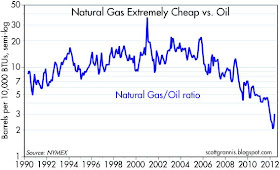
Here's an updated chart of natural gas prices. Prices are up this month, but are no higher than they were 15 years ago, and only slightly higher than they were 20 years ago. Oil prices, of course, are 4.5 times higher today than they were 20 years ago.


Relative to oil, natural gas prices have literally collapsed. Relative to oil, natural gas prices have fallen by roughly 80% compared to the late 1990s. We have only just begun to see the impact of this incredible development on the U.S. economy's ability to grow.

Tuesday, May 22, 2012

Obama's tipping point

I think we have seen the tipping point at which Obama's reelection prospects begin what could be a relentless decline. His policies were arguably the main reason the economy has done so poorly in recent years, and now we begin to see that the real problem is his total lack of understanding about how economies and markets work, compounded by an amazingly inept campaign. Romney should have no trouble convincing a majority of voters that he will be a better steward of the economy. Jennifer Rubin, an outstanding political observer writing for the Washington Post, makes this chilling point in her blog post today:

I confess that not in my wildest dreams did I imagine President Obama’s campaign would be so awful. Oh sure, I knew it would be “awful” in the sense of going negative, being disingenuous and blaming everyone for his failings. But I was taken by surprise by how “awful,” in the sense of incompetent and ham-handed, it has been. 
Virtually every gambit and issue (“war on women,” gay marriage, and now Bain) has gone haywire, arguably inflicting more damage to Obama than to Mitt Romney. 
Either Obama is preying on the public’s ignorance in a transparent effort to distract them from his rotten record, or he’s economically illiterate, soaked in the rhetoric of the left with no real feel for the American economy. (These are not mutually-exclusive explanations.)

Obama is at best an empty suit and ignoramus when it comes to our economy.

This chart of Obama's chances of winning reelection needs no further explanation:


UPDATE: As of June 4th, this prediction seems to be on track:


More signs of a housing upturn


Existing home sales in April were close to expectations, but as this chart shows, the pace of sales has been improving: sales are up 14% since last July.


It's also nice to see that prices are bottoming/improving as well; this chart shows the median price of existing single family homes, adjusted for inflation. Over the past year, real prices have jumped about 8%. The chart also suggests that real home prices have found support at levels that have prevailed over long periods. In short, the housing bubble has burst and prices have finally returned to sensible levels. The repricing of the U.S. housing stock has allowed the market to clear; we've seen the worst, and now things are beginning to improve on the margin.


But not only have prices become reasonable from an historical perspective, the cost of purchasing a home relative to median family incomes has now fallen to record-low levels, as shown in the chart above of housing affordability.

The evidence is becoming very strong that at the very least we have seen a bottom in the residential housing market.

Monday, May 21, 2012

Euro update

With the world's worst fears dominated by events unfolding in the Eurozone, and with the euro's continued existence a key question, I offer some charts which perhaps provide some useful perspective. Despite all the fears of cataclysmic outcomes, the euro has actually strengthened vis a vis the dollar since its 1999 inception, and the euro today is trading about 10% above its purchasing power parity relative to the dollar by my calculations. This suggests that the ECB has been doing a pretty good job of defending the euro—better even than the Fed.


The euro today is slightly higher against the dollar than it was at its inception. It's been a long roller-coaster ride, but I see nothing here that would point to an imminent collapse. What seems more likely is a further gradual decline of the euro vs. the dollar.


The euro (using the DM as a proxy going back prior to the inception of the euro) has been trending higher against the dollar for the past 40 years, primarily because inflation in Europe has been lower than in the U.S. Purchasing power parity theory conforms with this experience; the currency with lower inflation should outperform, over time, the currency with higher inflation (the inflation differential between the U.S. and the Eurozone is reflected in the green line on the chart). The inflation differential that has favored the euro is ultimately the result of tighter monetary policy in Europe. The gap between the blue and green line suggests that the euro is about 10% "overvalued" against the dollar, which means that an American tourist in Europe is likely to find that most goods and services cost about 10% more in Europe than they do in the U.S. By the same logic, European tourists to the U.S. are likely to find that things are about 10% cheaper here.

The ECB can take credit for maintaining the purchasing power of the euro even as the world's demand for euros has weakened as a result of the Eurozone crisis, even as the world's demand for safe-haven currencies has been intense, and even as the Eurozone financial crisis has required the ECB to inject massive amounts of liquidity to shore up its banking system. But the strains are showing, and I think the euro is likely to weaken some more.


This chart shows the price of gold in the world's three major currencies. Here again we see that the dollar has lost purchasing power against the euro (because the price of gold has risen more in dollar terms than it has in euro terms). The yen has been the strongest currency of all for the past several decades; the price of gold in yen today is still less than it was at the gold's peak in the early 1980s.

The dollar is weak against the great majority of the world's currencies, and the Fed's Real Broad Dollar Index shows indeed that the dollar is very near its all time lows. But the euro's resilience in the face of great adversity, and the dollar's rather extreme weakness in general, don't mean the dollar is doomed. I've been arguing for awhile that the dollar was likely to rise this year against other developed currencies, because I think the economy is going to end up doing better than expected, and I continue to believe a stronger dollar is likely. The ECB is going to have a tough time maintaining its tight-fisted stance (relative to the dollar, that is), since the Eurozone financial system is still far from being out of the woods, and the Bank of Japan already is making a real effort to keep the yen from appreciating further. If the ECB and the BoJ have to further expand their balance sheets to achieve their goals, this could result in additional supplies of euros and yen relative to the dollar, thus supporting the dollar's value in a relative sense. And if the U.S. economy continues to beat expectations, then demand for the dollar could strengthen, and that in turn could provide a tailwind for the Fed's efforts to drain liquidity as the economy improves.

Friday, May 18, 2012

Eurozone update

It's time to look once again at the key indicators of risk in the Eurozone, especially since Eurozone fears are at the epicenter of the fears roiling world markets these days.


First, however, let's check in on the status of fears in the U.S. As the above chart shows, bond yields have fallen back to the levels they hit in late September, when the Eurozone crisis was heating up and there was lots of talk about an imminent U.S. recession. (10-yr Treasury yields hit a new all-time low of 1.7% yesterday.) I interpret this to be the result of a scramble by investors around the world to get into the safest asset that still has a measurable yield, and that sort of demand can only be driven by deep-seated fears of an extended global recession likely triggered by a Eurozone financial implosion. But: although the S&P 500 has taken a hit, it is still almost 20% above its Oct. 3rd low. Why haven't stocks tracked bonds? That's easy: earnings have continued to surprise on the upside, and the U.S. economy has shown no sign of the expected double-dip recession. Equity investors here are rattled, but they aren't nearly as fearful as global bond investors; equities have gotten a lot cheaper relative to Treasuries. Treasuries have never been more expensive. Never. I should also note that the Euro Stoxx index is now very close to its recession-era lows. Add this all up and it says that the biggest economic risks are still relatively isolated, and they can be found mainly in the Eurozone.


According to swap spreads, systemic risk in the U.S. is up a bit, but not nearly as much as in the Eurozone. There is fear of Eurozone contagion, but it's not intense by any means. Interestingly, Eurozone swap spreads are lower today than they were at the peak of the last Eurozone crisis late last year. So swap spreads are saying things are not critical at all in the U.S., and not yet catastrophic in the Eurozone. Yet 10-yr bond yields reflect an extreme degree of concern. The world's demand for Treasuries is exceptionally strong, and seems out of line with other indicators of risk.


The charts above compare 2-yr yields in various Eurozone countries. Both charts make it clear that near-term default risk in the Eurozone has declined dramatically from what it was at the end of last year. Note how the outlook for France has barely budged; the recent elections were not a surprise and the market feels moderately comfortable with near-term prospects there.


On a longer-term horizon, this chart of 5-yr CDS spreads shows that default risk in most Eurozone countries is elevated, but nevertheless equal to or lower than the default risk of the average high-yield corporate bond issuer in the U.S. (high-yield CDS spreads currently average about 700 bps). That's bad considering we're talking about the sovereign debt of developed countries, but from a global perspective it's not exactly the end of the world. Markets can live very comfortably with high-yield debt risk.


This chart helps sum things up. Europe is really struggling, but the U.S. equity market has suffered what appears to be just a correction. So far there are no signs that the U.S. economy has been dealt anything more than a glancing blow by all the turmoil in Europe. And despite all the hand-wringing and the flight to Treasuries and the Eurozone bank runs, key indicators of risk are saying that the fundamentals are not catastrophically bad by any means. I think there's a good chance the world will survive the Eurozone crisis.

Thursday, May 17, 2012

What TIPS say about the future


As the world agonizes over a Greek default/banking implosion spreading to the rest of the Eurozone, I thought it would be good to revisit what is going on in the TIPS market. The first chart above compares 10-yr TIPS to 10-yr Treasuries, while the second looks at the 5-yr version of each. Nominal and real yields are on the top of each chart, and the bottom line is the difference between the two, which is the market's expectation for annual inflation over the life of the bonds.

Not surprisingly, both charts show the same patterns. The dominant pattern is that real and nominal yields are moving down at pretty much the same pace, with the result that inflation expectations are not much different today than they have been on average over the past 15 years. The important trend here, then, is the decline in real yields, which is being tracked by the decline in nominal yields; since inflation expectations haven't changed, nominal yields must follow the decline in real yields. Real yields are falling because the market's implicit expectation for real growth is falling. Back in the year 2000 you could buy 10-yr TIPS with a 4% real yield because the market thought the economy was going to be going gangbusters forever; real yields on TIPS had to compete with the market's very bullish expectations for real economic growth.

Today, of course, things are just the opposite. Real yields are now negative, and that means the market has almost no hope for any meaningful economic growth for as far as the eye can see. Why buy 10-yr TIPS with a negative real yield (thus ensuring you will lose purchasing power with your investment, since the total return on TIPS will be less than the rate of inflation) when you could buy an equity index fund and gain exposure to the rise in corporate profits which should be at least equal to the increase in nominal GDP over time? You would be indifferent to these two choices only if you held out no hope for there being any real growth over the next 10 years. Put another way, it's as if the market is saying that since the risk of big losses on everything is huge (e.g. there may be a global depression around the corner), then risk-free TIPS which will deliver a guaranteed real loss are better than investing in anything else because at least you know that with TIPS your real loss will be limited.

If that's not a pessimistic market, I don't know what is. But maybe it's just the case that Europeans are panicking en masse, and they will pay any price for a security backed by the U.S. government. Even so, TIPS and Treasuries are priced to something like a depression. This is a replay of sorts of what we saw at the end of 2008, only this time the market is not expecting any deflation; worrying about deflation now doesn't make sense when Greece might default and the euro might disappear, and maybe confidence in currencies collapses and that all leads of course to inflation.

So: anyone who buys TIPS and Treasuries today is effectively endorsing the view that a deep recession or depression—with average inflation—is the most likely outcome.

If you think that view is too pessimistic, then that effectively makes you an optimist.