Friday, December 31, 2010

Year-end review of the dollar: very weak

As the year winds down and we survey what's done well and what hasn't, the dollar stands out as not having done much on balance. It's down against the yen, up against the euro, down against the loonie, down against the aussie, and up against the pound. It's about unchanged against a basket of major currencies, weaker against a large basket of currencies, and weaker against the Indian and Chinese currencies. On an inflation-adjusted basis, against a very large basket of trade-weighted currencies, the dollar is weaker on the year. From a long-term perspective, the dollar stands out as very weak, and by one measure (arguably the best) it is now as weak as it's ever been.


This is perhaps the most popular measure of the dollar's value, and it compares the dollar to the Euro, Yen, Pound, Canadian Dollar, Swedish Krona, and Swiss Franc on a trade-weighted basis. The dollar by this measure is up 1.5% for the year, but that is small consolation given how weak it remains.


This second chart compares the dollar to a very large basket of currencies on a trade-weighted basis. Pretty much the same story as the first chart: the dollar is very weak.


The third chart (arguably the best measure of the dollar's overall value against other currencies, and my personal favorite) compares the dollar to a very large basket of trade-weighted currencies, and is adjusted for inflation differentials. This corrects for those situations where high-inflation currencies fall by a lot against the dollar in nominal terms; if not corrected for inflation differentials, the effective decline in those currencies is exaggerated, and thus the dollar comes out looking stronger than it really is. This index shows the dollar has—for the fourth time since 1973—hit an all-time low.


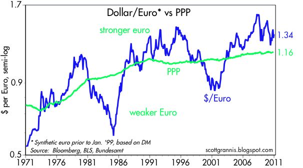
This next chart (above) shows the dollar vs. the euro, using a synthetic value of the euro (based on the DM) for the years prior to 1999. In this and in the charts that follow, the green line is my estimate of the purchasing power parity (PPP) of the dollar—the exchange rate that would equate prices between the two countries. This value changes according to relative inflation differentials. In the case of the euro, the PPP value of the euro has been trending stronger since the 1970s because inflation in Europe has for the most part been lower than inflation in the U.S. According to this chart, at today's value of 1.34 dollars per euro, the euro is about 15% "overvalued" against the dollar. That is a way of saying that a U.S. citizen traveling in Europe is likely to find that, on average, things cost about 15% more in Europe than they do in the U.S. Note that the dollar has been much weaker against the euro than it is today, and the reason for this is that the euro is suffering from fears that sovereign defaults among its member nations (e.g., Ireland, Portugal, Spain, and Italy) could result in a breakup of the euro. Personally, I think that is a very unlikely event, but in the meantime the perceived threat to the euro ends up being to the advantage of the dollar.


This chart (above) shows the dramatic gain in the value of the Canadian dollar vs. the US dollar. Relative to its PPP, the loonie today is almost as strong as it has ever been. US tourists are likely to find that traveling in Canada is quite expensive these days. Strong commodity prices have helped support the loonie, as has its central bank. Monetary policy in Canada has been less volatile than in the U.S., and Canada has apparently avoided a housing and bank bust.


The Australian dollar (above) has also benefited enormously from strong commodity prices, which in turn have boosted its resource-based economy, with the result that it is now about 50% "overvalued" relative to the dollar by my calculations.

The yen today is trading right around its strongest level ever (in nominal terms) against the dollar. But in inflation-adjusted terms, the yen is not as strong today as it was in 1995, when it was briefly "overvalued" against the dollar by almost 100%. By my calculations, today the yen is about 50% "overvalued" against the dollar. The long-term strengthening of the yen against the dollar is explained by the fact that Japan has had much lower inflation than the U.S., and that in turn is the result of Japan's chronically tight—to the point of being somewhat deflationary—monetary policy.


The pound at $1.56 is only about 12% "overvalued" by my calculations, and it has weakened considerably in recent years. (I was unlucky to have my daughter studying in London during the years when the pound was the strongest.) The long-term trend of the pound against the dollar has been down, and that is explained by the fact that inflation in the U.K. has been consistently higher than in the U.S.

I note that all of these major currencies are "overvalued" relative to the U.S. to some degree. That's the flip side of saying that the dollar is "undervalued" against all these currencies, and that confirms the message in the first set of charts above, which is that the dollar is generally very weak.


This last chart compares the dollar (blue line, inverted) against one measure of commodity prices. Note how the correlation between the two has been fairly strong in the past decade—dollar weakness corresponds to commodity strength, and vice versa. This is one way of showing that there is a monetary explanation for rising commodity prices: a weaker dollar buys less of other currencies and fewer commodities. Dollar weakness, in turn, is ultimately the responsibility of the Fed: keeping interest rates too low results in an effective over-supply of dollars, and a loss of the dollar's purchasing power.

Bottom line: the dollar is unequivocally weak against many objective standards (e.g., gold, commodities, and other currencies). It's about as weak, in fact, as it has ever been, and its prospects are grim, since the Fed has vowed to remain ultra-accommodative for a long time to come. If there is a silver lining to this dark dollar cloud, it is that with the dollar at extremely weak levels, perhaps all the bad news is priced in. If so, then the dollar becomes quite "vulnerable" to any good news, or simply to a failure of the expected bad news to show up. I'm on record as predicting the dollar will strengthen against most major currencies this coming year, and I sure hope I'm right, since further dollar weakness from this point would be very unpleasant, if not inflationary.

Thursday, December 30, 2010

Impressive signs of economic strength


It's said that "Dr. Copper" is the commodity that is best at diagnosing the health of the economy. If that's true, then the global economy is really humming along, since copper prices are now hitting new, all-time highs.

The CRB spot index measures the price of a collection of very basic, non-energy industrial commodities. It too is at a new all-time high, suggesting that global manufacturing activity is moving forward in robust fashion. Most of the commodities in this index do not have associated futures contracts, so speculative hoarding is not liable to be a distorting factor.


The chart above is the Chicago Purchasing Manager's Index, and it has reached a 22-year high; the employment component of the same index has reached a new post-recession high. Moreover, the December Milwaukee PMI released today rose much more than expected.


The chart above shows the average price of regular gasoline according to the AAA survey, and it has reached a new, post-recession high.


The Korean stock market (KOSPI) is within inches of a new all-time high (the all-time intra-day high was 2085 in Nov. '07).


The chart above shows Commercial & Industrial Loans, a good measure of bank lending to small and medium-sized businesses. Loans have stopped declining and are now rising, a sign that banks have eased their lending standards and/or businesses are once again seeking to borrow more. In either case, that bodes well for future economic growth.

Some of the action in the above charts may be due to accommodative monetary policy and rising inflation pressures, but it's equally likely that they reflect improving economic activity. There are certainly pockets of weakness left, particularly in the housing market, but it's hard to ignore the growing list of signs of strength.

Unemployment claims fall dramatically


If people filing for unemployment claims is bad news, then the news from the labor market is certainly a whole lot less bad. Seasonally-adjusted claims have fallen dramatically in the past month or so (top chart) because not as many people are being laid off as would normally be the case around the end of the year (second chart, showing actual, non-adjusted claims—note the huge spikes that occur around year-end, and how small the spike has been this year). This recovery has been sluggish compared to others, but the decline in claims is now more impressive than it was 18 months into the recoveries that started after the 1990 and 2001 recessions.

One way to interpret this is that companies are laying off fewer people because they were already running a tight ship, having laid off tons of workers over the previous year in order to cope with uncertainty and a weaker economy. The economy was braced for the worst, in other words. That would imply that any unexpected uptick in the economy's health, now that uncertainty over future tax rates has been mostly resolved, should translate rather quickly into new hiring. That's been the story of this recovery: the reality has almost always proved much better than the fears. The employment situation should be improving in a positive fashion in coming months, with job gains coming in above expectations.

Tuesday, December 28, 2010

No improvement so far in housing prices


The October Case Shiller home price data released today seem to have revived the calls for a housing double-dip. Prices were a bit lower than expected, and according to the broader measure of prices (a composite of 20 large markets), they are now at a new post-recession low in real terms (but only by a hair). But whether the recent modest decline in prices is the beginning of a new major downturn in prices remains to be seen; it could be just temporary, and in any event it represents price action from the third quarter of last year, which was a period we now know was somewhat of an economic soft patch.

The bigger picture is that both indices show housing prices have fallen about 35% from their 2006 highs in major markets, which also happened to be the areas with the most froth at the peak. Coupled with an almost 25% decline in mortgage rates since 2006, the effective cost of buying a house dropped by some 50% in just four years. The real question today is whether that price drop is sufficient to elicit enough buyers to purchase the large (but presumably still shadow) inventory of foreclosed homes that are likely to be hitting the market over the next year. Even as housing prices have declined significantly, new household formations have continued and the population has grown.

Have prices fallen enough to clear this market? I continue to think they have. The economy is clearly on the mend, and incomes and jobs are rising. New home construction has declined to de minimis levels. Perhaps there is some further weakness in store, but surely we have seen the lion's share of the weakness by now. It hasn't happened before, but that is no reason it can't: housing is likely to be supported by an expanding economy this time around, whereas before it was housing that gave an important impetus to the economy. New jobs and economic growth can take care of a lot of excess housing inventory, and easy money, relatively low mortgage rates, and a gradual easing of lending standards can take care of the rest. It's time to put concerns about the housing market on the back burner.

Predictions for 2011

Predicting the future back in late 2008 wasn't too difficult, because the market was priced to Armageddon; I thought we would survive, and I turned out to be right. Last year it was more difficult to predict the future, and while I got most things right I made some critical mistakes, mostly concerning the Fed and inflation. This year is going to be even more difficult, because the difference between what the market expects and what I expect to see isn't nearly as great as it was one or two years ago.

From an investor's perspective, the important thing about forecasts is not whether you get the exact number right (e.g., whether economic growth is going to be 3.5% or 3.8%), it's whether you get the direction right relative to what the market is expecting (e.g., whether growth is going to be stronger or weaker than the market expects). If the market expects 3% growth and you correctly forecast 3% growth, that isn't worth much since you are unlikely to make much money by betting with the market.

With those caveats in mind, my outlook for 2011 is shaped by a belief that the economy will do somewhat better than the market expects, that the Fed will be less easy than the market expects, and that inflation will be somewhat more than the market expects. I held the same general view a year ago and turned out to be wrong on the Fed and inflation, but I don't see any reason to change now. Monetary policy is notorious for acting with long and unpredictable lags, and policy has moved much further in the direction of stimulus in the past year, so at some point we could see the fruits of monetary ease come true with a vengeance. This is no time to get wobbly on the Fed's ability to get what it wants (i.e., higher inflation).

So here we go:

The economy will grow by 4% or more in 2011. I think the market is priced to the expectation that growth will be around 2.5-3%, slightly better than the "new normal" economy scenario that has been all the rage in the past year or so. I'm more optimistic, for a number of reasons. Most important is the 180º shift in the direction of fiscal policy that started with the November '10 elections—that's very good news for the economy. Washington is now much more friendly to capital and to the private sector, and those are the folks who create real jobs and real growth. Going forward, fiscal policy is likely to promote the growth of the private sector at the expense of the public sector. Taxes are not going to rise as so many had feared, and we may even see some cuts along with a simplification of the tax code. Many worry that cutbacks in federal, state and local government spending will prove very painful for the economy as a whole, but I disagree. One reason the economy has experienced a very sluggish recovery is precisely because there has been way too much growth in the public sector in recent years. Feeding resources to the public sector is a recipe for disappointing growth, and the experience of the past two years is proof of that proposition. So it only stands to reason that reversing the tendency to fiscal profligacy should be stimulative: fiscal austerity is bad for the public sector but good for the private sector. Given the improvement in unemployment claims of late, I expect to see an increasing number of new jobs over the course of the year. And the improvements already evident in autos, exports, mining and manufacturing can generate a positive feedback that lifts most other sectors. The forces of recovery are alive and well, and growth can trump a lot of the lingering problems we still have (e.g., underwater mortgages, state and local insolvency, high unemployment).

Inflation will trend slowly higher. Inflation is already a mixed bag, with the CPI and the PCE deflator having trended lower in the past year and the GDP deflator having trended higher. I would expect to see more uniformity this coming year, with all inflation measures showing a rising trend, albeit only a moderate one. Nevertheless, inflation is likely to be more of a problem than the market currently expects. TIPS currently are priced to the expectation that the CPI will be about 1.3% next year, compared to 1.1% over the past year. I see lots of signs that money is in abundant supply, and that is a good indicator that inflation pressures are on the rise: gold and commodity prices are soaring, the dollar is very weak, and inflation in China—a canary in the coal mine since China is tied to the dollar and thus is experiencing the same monetary policy as we have—is on the rise.

The Fed will raise rates sooner than the market expects. Fed funds futures currently are priced to the expectation that the Fed will raise the funds rate to 0.5% next December. I think it will happen sooner. The combination of a stronger-than-expected economy and signs of rising inflation will motivate the Fed to reverse its quantitative easing program sooner than most expect. Ending and/or reversing quantitative easing does not, however, equate to monetary policy that is a threat to growth; it will be a long time before the Fed raises rates enough to choke off growth.

The housing market will be showing signs of life by the end of the year. Housing still looks weak, and the weakness will probably last a bit longer (e.g., a modest further decline in prices, and flat construction activity). But with the economy picking up speed, money in abundant supply, and ongoing growth in the population and household formations, I think the housing market could be on the mend by the end of the year.

Interest rates on Treasury bills, notes and bonds should be higher than they are today, and higher than the market currently expects. Treasury yields out to 10 years are driven by expectations of future Fed policy, so if I'm right about the Fed raising rates sooner than the market currently expects, this should result in higher rates across the yield curve. Currently, according to implied forwards, the market expects to see 3-mo T-bill yields at 0.85% by the end of next year, with 2-yr T-notes at 1.6% and 10-yr T-note yields at 3.9%. Betting that 10-yr yields will rise from their current level of 3.4% is not enough, however; shorting the 10-yr incurs a carry cost that must be made up by falling prices. 10-yr yields need to be at least 3.9% for a short position in the 10-yr to be profitable. Higher yields on risk-free Treasuries will not threaten the economy, since they will be the result of a stronger economy. Higher yields on cash will be a net benefit to the household sector, since it holds more floating rate assets than floating rate liabilities.

MBS spreads are likely to widen over the course of the year. The main impetus for wider MBS spreads next year is likely to come from an across-the-board increase in the extension risk of MBS as Treasury yields rise. Mortgages, which currently behave like intermediate-maturity bonds, are at risk of becoming long-term bonds as interest rates rise and refinancing dries up.  It's possible, however, that MBS could still provide a reasonable rate of return, and/or beat the returns on comparable Treasuries if spreads fail to widen significantly.

Credit spreads are likely to decline gradually over the course of the year. Easy money and a strengthening economy add up to a perfect environment for borrowers. Easy money adds fuel to corporate pricing power, and improved cash flows are a boon to borrowers, especially the most indebted ones, and that in turn means lenders will be rewarded by today's still-relatively-high yields and lower-than-expected default rates. High-yield bonds should be the biggest beneficiaries of tighter spreads. If Treasury yields rise enough, however, spreads on higher quality bonds are not likely to be able to absorb the full brunt of rising market rates, meaning there is the risk of mark-to-market losses on corporate bond prices. 

Equity prices are likely to register gains of 10-15% next year. I see no signs that the equity market currently is overvalued. Corporate profits have been very strong, and PE ratios remain relatively subdued. A stronger economy should continue to boost profits, and enhance investors' confidence in the outlook for future earnings, resulting in at least a moderate rise in equity prices.

Commodity prices will continue to work their way higher over the course of the year, buoyed by ongoing improvement in global economic growth and accommodative monetary policy. In real terms, commodity prices are still far below the highs they reached in the inflationary 1970s. Oil prices are likely to drift higher as well, and at these levels still do not present a serious threat to economic recovery. Commodity investing, however, is fraught with perils, particularly the fact that commodity speculation can result in backwardated futures prices, and those act to limit the speculative returns to commodity investing.

Emerging market economies are likely to do somewhat better than industrialized economies. These economies tend to thrive in an environment of easy money, rising commodity prices, fiscal policy reform, and ongoing globalization.

Gold will probably move higher, mainly since monetary policy is very likely to remain accommodative. But the potential for a significant decline—should, for example, the Fed surprise everyone and tighten early—is enough to keep me out of the gold market. Gold is a highly speculative investment at this point and should be approached with extreme caution.

The dollar is likely to move higher against most major currencies, and hold relatively steady against emerging market and commodity currencies. Currently, the dollar is so weak against most major currencies, both nominally and in inflation-adjusted terms, that even modest upside surprises such as higher-than-expected U.S. growth and/or an earlier-than-expected reversal of quantitative could prove very bullish for the dollar. Put another way, so much bad news is already priced into the dollar that I think its downside potential is limited.

Full disclosure: I am long equities, short Treasury bonds, and long high-yield debt at the time of this writing.

Why a lack of confidence is good


The December reading of the Conference Board's measure of consumer confidence was weaker than expected (52.5 vs. 56.3). Is that cause for concern? Hardly. As this long-term chart of the series shows, monthly volatility in the index is the norm, and the latest wiggle can hardly be seen. The only message to be found in this series is that consumers are still very un-confident. This is hardly surprising, since confidence almost always lags what is going on in the real economy. For example, it took about 3 years for consumers to begin feeling better about the economy following the recession of 1990-91. Plus, consumers don't usually get depressed until recessions are well underway.

The fact that consumer confidence remains low is a good reason for investors to be optimistic, because it means there is a lot of room for improvement. The rally in equity and corporate bond prices that began almost two years ago has been driven fundamentally by the discovery that the future was not turning out as bad as everyone had thought. In early 2009, markets were priced to the expectation of a very deep depression and years of deflation. Instead, we find the economy recovering and inflation low but not negative. Positive shocks such as this (the reality turns out better than the expectation) are what drive risky asset prices higher.

By the time everyone recovers their confidence in the future, prices will be a lot higher than they are today. You can't wait for the news to turn good before betting on higher prices. The current low level of consumer confidence is also a reason to doubt the warnings being issued by a number of pundits that the stock market is over-bought and frothy.


Investors—those with real skin in the game—are usually better at discerning the state of things. This chart of option-adjusted spreads on corporate debt is a good measure of how confident investors are about the credit-worthiness of corporate borrowers, and about the future of the economy. Spreads have come way down from their highs, as investors have realized that the world was not coming to an end, but spreads are still quite a bit above where they would be if the world were back to "normal" and confidence in the future were high. I think this jibes well with the consumer confidence numbers, with both confirming that there is still a good deal of caution and fear out there. We're a long ways from seeing speculative froth or another asset price bubble.

Sunday, December 26, 2010

Federal revenue growth is impressive, believe it or not


It strikes me that the recent growth in federal tax revenue is not widely nor sufficiently appreciated, probably due to the pessimism that pervades just about every long-term outlook these days. The chart above, which plots the 6-mo. annualized growth in rolling 12-mo. federal revenues, shows that tax receipts are now rising at double-digit rates. Total federal receipts over the 12 months ended November '10 are more than 10% above (annualized) total receipts over the 12 months ending May '10. This is shown in the chart below: monthly revenues this past year have been consistently higher than they were a year ago. All that progress, without raising a single tax rate! In fact, as the charts above and the second one below document, the major determinant of federal revenues is the business cycle, not tax rates. During recessions, revenues collapse, and during recoveries revenues rise, usually faster than the growth in nominal GDP. Now that we are 18 months into a recovery, it is not surprising at all that tax revenues should be rising at a much faster rate than GDP.


The chart below helps put this into perspective. For 50 years, from 1955 through 2005, revenues on average rose at the same rate as nominal GDP (i.e., revenues as a % of GDP were relatively unchanged), even though tax rates changed dramatically. Revenues are still at a post-war low relative to GDP, of course, but that is mainly because this recession has been deeper than most others.


As the economy picks up, tax receipts accelerate because more people work and pay taxes, corporate profits rise, and incomes rise in our highly progressive tax system—the most progressive of any advanced economy. Recoveries always result in a huge increase in tax revenues. Unfortunately, when revenue growth is at its strongest, politicians inevitably figure out how to spend money even faster.

There is every reason to think that federal (and state and local) revenues will continue to grow at a relatively high rate as long as the economy continues to recover. Balancing the budget doesn't require higher tax rates, it just requires spending restraint and pro-growth policies. Holding spending constant, and assuming revenues grow at their current rate, the federal budget would be balanced in 5-6 years. If the new Congress can't make a significant move in this direction (i.e., holding the line on spending and keeping tax rates as low as possible), they deserve to be trounced in the next election.

Thursday, December 23, 2010

The recovery in consumer spending


The top chart shows the level of real personal consumption expenditures over the past 40 years, while the bottom chart shows the year-over-year change in real spending. In inflation-adjusted terms, spending has increased about 150% since 1970, with the apparent trend (green line) being about 3.3% per year annualized. Real spending over the 12 months ended November '10 rose 2.8%, half a percentage point below its long-term average growth rate.

The level of real spending now exceeds the peak of late 2007, so we've already had what might be called a "recovery" of sorts. But to get back to our 3.3% long-term growth path (we're about 8% below that path currently), real spending would need to increase by more than 3.3% per year. A 5% annual increase in real spending would get us there in just over 5 years. That sounds almost impossible in today's climate, but it would be consistent with the economy's demonstrated ability to bounce back from adversity over and over again, and it would give us growth approaching that of the heydays of the Reagan boom in the 1980s. And although nobody seems to be giving the consumer much credit these days, real consumer spending is already up at 4.3% annualized rate over the past three months.

What would a full recovery to trend growth look like? Well, if Congress can slow the growth of federal spending, broaden the tax base by eliminating deductions, and reduce and flatten tax rates, I'd be willing to bet we would enjoy a handsome recovery in the years to come, and it's not impossible at all.

Business investment remains strong


The 3-mo. moving average of capital goods orders (my preferred measure, since it removes some obvious seasonal distortions in the reported data) moved higher in November, the 18th consecutive month of gains that add up to a 17% annualized rate of growth—very impressive indeed. To be sure, growth has slowed of late (about 11% annualized over the past six months), but it still remains above average. It remains the case that these numbers reflect growing confidence on the part of businesses, and portend stronger economic growth in the months and years to come. Business investment is still less than it was a few years ago, but accumulated profits keep piling up, and that could drive many years of stronger capital spending.

Unemployment claims continue to improve


Both of these charts show seasonally adjusted first time claims for unemployment. The top chart takes the long view using a 4-week moving average, while the bottom chart zooms in on the weekly numbers for the last 5 years. Claims are now down 37% from their early 2009 high, and it would only take a 20% decline from here to get claims down to the levels that prevailed in 2006-2007. Dare it be said that we are beginning to see signs of actual strength in these numbers? Perhaps, but for now the main thing driving adjusted claims lower is that actual claims are not declining as they usually do at this time of the year. But no matter how you spin the numbers, I think it's safe to say there has been some genuine improvement in the economy in recent months, and that is one more reason to think that Q4 GDP growth could come in much stronger than Q3.

Wednesday, December 22, 2010

Further reflections on QE2


As the chart above shows, 30-yr Treasury yields and equity prices have been moving higher ever since the end of August, which happens to be when the Fed first began to float the idea of QE2. Proponents of QE2 say this proves their case—that QE2 was needed and has been effective. Opponents of QE2 say just the opposite, that this proves QE2 was unnecessary and has been ineffective. The truth probably lies somewhere between.

Supporters of QE2 argue that QE2 has given the economy a boost (witness the 20% rise in equity prices since QE2 was first floated) and it has vanquished deflation fears (as reflected in the almost 100 bps rise in long bond yields, plus the rise in 5-yr, 5-yr forward breakeven inflation expectations from 2% to almost 3%—see chart below). Boosting the economy and raising inflation expectations was exactly what QE2 was meant to do, so it has worked.

So far this makes sense, but it doesn't jibe with the Fed's claim that QE2 would boost the economy by depressing bond yields and keeping borrowing costs low. Since QE2 actually go underway in early November, Treasury yields haven't fallen at all—they've actually risen a lot—and corporate borrowing costs have also risen. According to Merrill Lynch, yields on investment grade bonds have risen about 60 bps since the Fed began its QE2 purchases of Treasuries, while yields on high-yield bonds have risen about 30 bps. That's not a lot, in the great scheme of things, but it's hard to see from these facts how QE2 has stimulated the economy. For more detail on how Quantitative Easing has worked so far, please see this post.

But it does make sense that if a government program were successful in stimulating the economy, then we would expect to see higher bond yields, since a stronger economy almost always goes hand in hand with higher bond yields—especially since bond yields were extraordinarily depressed last summer because of concerns that the economy was slipping into a double-dip recession. But are higher bond yields proof that Fed purchases of Treasuries are stimulating the economy? Not necessarily.

An alternative explanation—one that I and others have been advancing—is that QE2 was never necessary, and has been counterproductive, since all it has done is to push inflation expectations up, weaken the dollar, and boost commodity prices. What was really necessary back in August was for the Fed to convince the world that deflation was no longer a risk. The fear of deflation had been a drag on confidence and animal spirits ever since late 2008, when deflation expectations first became firmly embedded in TIPS prices. As I mentioned quite a few times, fear and uncertainty have played a major role in the recent recession and recovery, so anything which reduced investor fears would likely improve the economy's prospects. Deflation fears have surely worried many of the FOMC governors, especially Bernanke, and those fears have generated some contagion among the wider public. If QE2 has been successful, it is because it has raised inflation expectations and thus all but vanquished the fear of deflation, not because it has stimulated the economy.

Deflation was always more of a theoretical rather than a real risk, since while some measures of inflation were sliding perilously close to zero in recent months, others were rising (e.g., the GDP deflator was -0.3% in Q4/09 but rose to 2.0% in Q3/10). Similarly, although housing prices have been plunging, commodity prices have been soaring; we are nowhere near a deflationary situation, which is defined as a general decline in the overall price level. Plus, key indicators of liquidity conditions last summer were suggesting an abundant supply of dollars: the dollar was demonstrably weak, while gold and energy prices were rising, and swap spreads were very low.  What was needed was some positive shock to investors' confidence about in the future, not more dollars in circulation.


Another reason to think that QE2 wasn't necessary is that it didn't actually get approved until October and wasn't implemented until the first part of November, yet equity prices started rising the day after the idea of QE2 was first floated, and commodity prices were rising strongly by late July. We've only just begun to see a meaningful amount of Treasury purchases, and little if any evidence of unusual expansion in any measures of the money supply. In short, the evidence supports the notion that the economy was doing fine before QE2 started, and QE2 has not had any demonstrable impact on the economy beyond raising inflation expectations and eliminating deflation fears. As the charts below show, M2 growth has only been 4.5% annualized over the past six months, and 3.6% annualized over the past two years.


What this all means is that while QE2 may well have made a positive contribution to the economy to date, there is a risk that it could create a good deal of fear and uncertainty in the future. The Fed is creating hundreds of billions of new bank reserves that are sitting idle. Should banks decide to put them to work, no one knows whether the Fed can reverse course fast enough to prevent a true eruption of inflation.

Tuesday, December 21, 2010

Fear subsides, prices rise


I must have shown this chart at least a dozen times since late 2008, but it is so important that repetition is justified. (Here is a post from May '09 as an example) The main message here is that fear was the key driver of the 2008-2009 recession: fear of a global depression, fear of a global banking collapse, fear of deflation, and fear of a huge increase in future tax burdens thanks to an equally huge increase in the size of government. Fear drove us to the brink of what was expected to be an awful depression, and the reduction of fear is putting us back on a growth track.

The correlation between fear (represented by the red line, the Vix index inverted) and equity prices that is evident in this chart speaks for itself. The Vix has now returned to its pre-recession levels, and equity prices are on track to do the same, though the S&P 500 will need to rise another 25% to recover its previous highs.

Fears have been assuaged relentlessly since March '09. Swap spreads narrowed sharply. Credit spreads narrowed sharply. Signs of a recovery displaced expectations of a depression. Public reaction to the stimulus plan was mixed. Obama's popularity began declining, and the implementation of his agenda started facing headwinds. The Fed took strong action to expand the money supply. Financial markets began healing instead of collapsing. Commodity prices and gold prices started rising. Global trade got back in gear. Since the recession ended 18 months ago, the economy has proven the skeptics wrong more than once, and the forces of recovery have been working steadily behind the scenes, albeit slowly. Housing stopped collapsing and started stabilizing. A sea-change in the mood of the electorate resulted in a huge change in the congressional balance of power; the private sector now has a friend in Congress, and capital once again is held in high regard. More recently, a major increase in tax burdens was avoided, and a gargantuan omnibus spending bill went down in flames.

Short-term interest rates have been essentially zero for two years now. Investors, faced with the steep cost of safety (i.e., accepting a zero return for the safety of cash) have been realizing that the risks were not as great as they once feared, and they have been slowly deploying their cash hoards. Fearful investors have climbed countless walls of worry along the way, only to see the prices of risk assets moving higher. Consumers have been slowly drawing down their cash hoards, with the result that retail sales have now made a complete recovery. The next shoe to drop will be when corporations begin deploying their immense cash hoards to fund expansion plans and new hiring.

 It's hard to see how this self-reinforcing process of recovery can be derailed.

Monday, December 20, 2010

Amazing factoid

According to The Economist, "sometime in the next few months, the number of mobile phones in use will exceed 3.3 billion, or half the world's population. No technology has ever spread faster around the globe: the mobile phone took less than two decades to reach this degree of penetration."

HT: Glenn Reynolds

Taking the pulse of uncertainty


As I gear up for making another round of fearless forecasts (due out next week), it's important to first take the market's pulse. In this post, I consider how uncertain the market is concerning the outlook for the future. This chart compares the implied volatility of equity options and bond options. Implied volatility is a good measure of now much uncertainty the market perceives in the future, since it is a measure of how expensive options are (buying options is a way to reduce your risk exposure when you are unsure about the future). I also note that when uncertainty is highest, this tends to correspond to or signal market extremes. For example, the peak in the MOVE occurred in early Oct. '08, about three months before 10-yr Treasury yields hit their post-Depression low of 2.06%. The peak in the Vix occurred a few weeks later, preceding the equity market's ultimate bottom in early March by just over four months. The Vix was trading over 20 for about a year prior to the market's 2000 peak, meaning that a lot of people were nervous that prices were moving too high, and that turned out to be the case.

The Vix index is now trading at just about the lowest level we have seen since before the great crash of 2008. It's still higher than what we would expect to see in relatively calm conditions (e.g., 10-14), but not by much. Thus it would seem that the market is not greatly concerned about the outlook for the market or the economy. To be sure, optimism is in short supply these days, but when you combine today's skeptical market with implied volatility that is only moderately elevated, the result is like a sort of "consensus" that things aren't going to be greatly different in the future than they have been in the immediate past, namely: economic growth that is plodding, unspectacular, and insufficient to make much of a dent in the unemployment rate. The outlook for tax rates has been resolved, and that certainly helps reduce uncertainty, but there are still large uncertainties surrounding fiscal policy at the federal, state and local levels, and the still-unresolved debt crisis in the eurozone.

The MOVE index (the implied volatility of Treasury debt options) has risen in recent months, but it is still substantially lower than it has been for most of the past three years. This is to be expected, given the recent surge in yields on Treasury debt (10-yr yields are up almost 100 bps since October), and it is proportional in magnitude to what we saw when 10-yr yields surged 160 bps in the first few months of 2009. The most uncertain thing in the financial markets at this point would thus appear to be the future level of Treasury yields. I would note here that despite their recent rise, Treasury yields in general are still very low from an historical perspective. The only time in modern history that they have been lower, in fact, is during the Depression and deflation of the 30s and 40s. In my view, the rise in implied Treasury volatility is not sufficient to signal a market that has gone to an extreme (i.e., it does not suggest that yields are vulnerable to a reversal). I think the rise in yields reflects a market that has shifted its focus from one of expecting a double-dip recession to one that is trying to judge how strong or weak the expansion is likely to be.


A return to something characterized as more "normal" can be seen in the Bloomberg Financial Conditions index (below), which is "the number of standard deviations that current financial conditions lie above or below the average of the 1994-June 2008 period." Reduced uncertainty and volatility are generally supportive of economic growth, since at the very least they remove artificial barriers to growth. The return of "normal" conditions to the financial markets is a reflection of the return of both liquidity and confidence, and that is supportive of growth going forward, but not a guarantee.


I think this all paints a picture of a market that has ruled out a double-dip recession and an economic boom, but a market that assumes that a continuation of relatively slow growth (given the stage of the business cycle) is likely. This same outlook can also be found in the Fed funds futures market, where prices imply that the Fed is quite unlikely to raise the Fed funds rate before December of next year—thus ruling out a boom and assuming the continuation of slow growth that requires lots of help from monetary policy.

Reviewing my 2010 forecast

The first prediction I made a year ago was a no-brainer and absolutely right: I would never again get everything right. Of 11 other predictions I made a year ago, 6 were correct, 3 were wrong or mixed, and 2 were dead wrong. My biggest mistake was in thinking that the Fed would would begin raising rates this year in response to an improving outlook for growth.

Inflation will continue to trend slowly higher. Wrong/mixed. Inflation as measured by the CPI in fact trended lower over the course of last year, falling from 1.8% (year over year) from November '09 to 1.1% in November '10. But inflation as measured by the broadest possible measure—the GDP deflator—trended higher, from 0.2% year over year in Q3/09 to 1.2% in Q3/10.

The economy will grow 3-4% over the course of the year. Probably correct. Real GDP in the four quarters ending Sep. '10 was up 3.24%, and growth for 2010 will be 3% or better if Q4/10 annualized growth comes in above 4%. Most forecasts are calling for an upward revision to Q3 growth, and a relatively strong print for Q4 growth, so I think my lower bound growth forecast will hold.

The Fed will end up raising rates sooner and/or somewhat more aggressively than the market currently expects. Dead wrong. The Fed kept short-term rates close to zero for the entire year, and has given no sign at all that it intends to raise rates in the near future.

Residential construction activity is likely to slowly but gradually improve over the course of the year. Housing prices on average are likely to post modest gains as well. Wrong/mixed. Housing starts fell modestly over the course of last year, but have been relatively flat since early 2009. Prices, according to the Case Shiller data, were roughly unchanged. Compared to the consensus a year ago—which I think called for more bad news from the housing market—my optimism was not egregiously misplaced.

Interest rates on Treasury bills, notes and bonds should rise significantly over the course of the year, with 10-yr T-bond yields exceeding 4.5%. Dead wrong. T-bill rates rose, but only by a few bps over the course  of the year, 2-yr Treasury Note yields fell 40 bps, 10-yr yields fell about 50 bps, and 30-yr yields fell about 20 bps.

MBS spreads are likely to widen over the course of the year. Correct. MBS spreads rose from 70 bps a year ago to about 85 bps today. However, the rise in spreads was not enough to significantly detract from the generous total returns that MBS investors enjoyed for the year.

Credit spreads are likely to decline gradually over the course of the year. Correct. Spreads rose in the first half of the year, but ended the year with a net decline. Both investment grade and high-yield bonds enjoyed very strong performance as spreads declined and default rates plunged. 

Equity prices should be at least 10-20% higher by the end of the year. Correct. As of this writing, the S&P 500 is up about 12% year to date (with a total return of almost 15%), and the NASDAQ is up 17%. The going wasn't easy, however, with equities suffering a major setback in the second quarter after a strong first quarter.

Commodity prices will continue to work their way higher over the course of the year. Correct. The great majority of commodity prices registered strong gains for the year. 

Gold prices are likely to spike one more time to a new high this coming year. Correct. Gold rose from $1100 to $1400/oz., setting a new record high.

The dollar is likely to rise at least modestly against most major currencies, and it should be able to hold near its current levels against most emerging market and commodity currencies. Mixed. The dollar eked out a 3% gain against major currencies, but fell moderately against most emerging market and commodity currencies.

Friday, December 17, 2010

Oil prices reach a post-recession high


This chart shows the spot price of Arab Light Crude, and I feature it because oil prices have moved to new post-recession high ground in the past few weeks, after having been range-bound for most of the recovery. As with the story behind commodity prices, I think there are two things driving higher oil prices: 1) accommodative monetary policy from almost every central bank in the world that is weakening the purchasing power of currencies, and 2) an ongoing and probably-strengthening global economic recovery that is causing the demand for commodities and energy to exceed the expectations of commodity producers.


This chart shows the price of Arab Light Crude in constant dollars (using the PCE deflator). In real terms, oil today is not only at a post-recession high, but also higher than it was in the early 1980s. I've argued before that this is not necessarily an ominous development, since U.S. consumption of oil per unit of output has fallen by more than half since the early 1980s. In other words, we are much less reliant on oil to run the economy, so higher prices are less harmful than they were before.


The chart below compares the real price of crude (using the CPI) to the worldwide drilling rig count. Not surprisingly, higher prices are providing an extra incentive to producers to increase drilling and exploration activity, and that should eventually bring more supply to the market, thus capping the rise in prices.


The last chart compares the price of crude to the price of gold, and it shows that crude prices are roughly in line with the gold prices from an historical perspective. The ramifications of this are many, however, and I'll have to leave that for later.

Green lights for a stronger recovery


The first chart shows the level of the Index of Leading Indicators, while the bottom chart shows the year-over-year change in the index. Two things stand out: One, the index is moving higher and showing absolutely no sign of any economic slowdown. Two, as the top chart suggests, the growth in the index over the past several decades has been impressive, and not at all like the stagnant conditions which prevailed during the great equity bear market of 1965-82. In other words, the index is a big green light for continued expansion and prosperity.

With the sea change in the direction of fiscal policy that began with the November elections and which has been confirmed now with the extension of the Bush tax cuts for everyone and for capital, plus the defeat of the last-gasp-of-the-big-spenders Omnibus spending bill yesterday, the private sector has a very good chance of generating a stronger recovery in the years to come. The private sector has been oppressed for years by increased regulatory burdens; investors and businesses have been reluctant to invest given the threat of a massive increase in tax burdens; and the huge increase in inefficient government spending and transfer payments has been a drag on overall productivity. Looking ahead, all of these headwinds should be reversing, or at least slowing down dramatically.

This amounts to a giant Christmas present for investors in equities and corporate debt. At the same time, it is a death knell for investors in Treasury notes and bonds, since they have been priced to a very gloomy economic growth outlook.

Thursday, December 16, 2010

Exports continue to grow


October exports were quite strong, as I noted in a recent post, and now comes news from the ports of Los Angeles and Long Beach that November loaded outbound container shipments were strong as well. This suggests that November trade statistics will be strong as well. With strength evident in exports, retail sales, and manufacturing, fourth quarter GDP could come in as strong as 4-5%. Mark Perry has some more color on the activity at the Port of Los Angeles here.

Housing has become almost irrelevant


Housing starts have been essentially flat for about two years, and have plumbed the lowest level of residential construction activity relative to GDP (slightly over 2%) ever recorded. If construction activity were to decline further, it most likely would have happened by now—no construction company CEO by now could possibly have ignored all the signs of distress and overbuilding and excess housing inventories. Even if activity were to decline further, it would have a de minimis impact on the overall economy. Conclusion: for all practical purposes, housing can only get better, since it can't get much worse. When will the improvement come? It doesn't really matter, since even a 10 or 20% jump in housing starts would have a minimal impact on the economy. Housing will likely turn up well after everything else has turned up, and most things have been turning up for almost a year and a half. Housing is going to be bringing up the rear this time around, for the first time ever. This is a very different business cycle, because it was the only one that was precipitated by a housing crash following a housing boom of epic proportions.

Labor market conditions continue to improve


The labor market is showing enduring signs of improvement. It's not that lots of people are getting hired, however. It's that not many are being fired given the time of year. The top chart shows new, seasonally adjusted claims for unemployment, while the bottom chart shows the raw, nonseasonally adjusted numbers. From the latter, the degree of improvement is noticeable. Currently, layoffs are running only slightly higher than they were at the same time of the year in the growth years of 2004-2007. That suggests that businesses are running a very tight ship, so that any improvement in underlying conditions, coupled with improved confidence in the future, could quickly translate into significant new hiring activity next year. And of course there is that mountain of cash that has accumulated on corporate balance sheets that is just waiting for something to do.

Wednesday, December 15, 2010

How the bond market vigilantes work


The controversy over QE2 continues, but the real action is in the bond market, where bond yields and inflation expectations are moving up daily, if not hourly.

Before QE2 was even a possibility, yields and inflation expectations were declining from May through August. The fuel for this move was the belief that sovereign defaults in Europe would spread contagion through the global economy that could result in a double-dip recession in the U.S. Weaker growth, in turn, would intensify deflation pressures, thus making 10-yr Treasuries an attractive hedge. So everyone piled into 10-yr Treasury bonds, driving their yield down from 4.0% to 2.5%.

Then the Fed floated the idea of QE2 at the end of August, and everything started changing. Traders began speculating that Fed purchases would create downward pressure on the Treasury yield curve out to 10 years. The market began to front-run the Fed, by buying bonds that the Fed was expected to purchase. By October, the market had driven 10-yr yields down to an extremely low 2.4%.

Meanwhile, speculators were also figuring that QE2 could have inflationary consequences. Normally this would have pushed up yields all across the curve, but savvy traders focused their efforts on the long end, because they knew they would be fighting the Fed if they bought the intermediate part of the curve. So the 30-yr bond came under intense selling pressure, and 30-yr yields soared relative to 10-yr yields, taking the 10-30 spread to by far its steepest level ever: 160 bps. For investors making a yield curve play, a popular strategy was to buy 10-yr Treasuries and sell 30-yr Treasuries in a duration-neutral fashion.

The latest twist in this tale began in November, when the FOMC executed the first of its planned $600 billion in purchases of intermediate Treasuries. Two forces were at work: On the one hand, you had a trader's natural impulse to "buy the rumor, sell the fact." The market had been buying 10-yr Treasuries in advance of QE2, and that had been profitable, so now was the time to start unwinding the trade. On the other hand, you had a tremendous hue and cry coming out against QE2. Criticism of the Fed, and dissension with the ranks of the FOMC hadn't been so intense for as long as I can remember. Maybe QE2 would be shut down or cut short? All the more reason to start reversing the trades that had been put into place leading up to November. So the 10-30 part of the curve flattened with a vengeance, and the 2-10 part of the curve steepened dramatically.

Today the steepness of the various segments of the yield curve has returned to the levels that prevailed earlier this year, before sovereign defaults, double-dip recessions, and QE2 arrived on the scene.

What are we likely to see going forward? Two factors are going to figure large in coming months: QE2 and the strength of the recovery. QE2 is likely to continue to fuel inflation concerns, driving inflation expectations higher. Meanwhile, the economy is likely to strengthen at least moderately, with the extension of the Bush tax cuts adding to the forward momentum that has been building for the past several months. The combination of those two forces will very likely result in higher 10-yr yields, and a steeper 2-10 curve, because rising inflation expectations and a stronger economy not only increase the likelihood that QE2 will be curtailed or aborted, but more importantly, they demand a higher level of Treasury yields.


If the market comes to believe that the economy will grow at a more normal rate next year, then by my estimation (laid out in the above chart) 10-yr yields need to be at least 4%. If in addition to that, inflation expectations continue to rise, then we're talking yields of 5% or so.

I think many observers are misinterpreting the rise in yields, thinking that the market is reacting in horror to the prospect that extending the Bush tax cuts will mean an even-bigger federal deficit. They fail to appreciate that federal revenues are already rising at 10% annual pace, and that this is sufficient, if combined with some spending restraint on the part of the new Congress, to reduce the deficit substantially in coming years. Extending the tax cuts won't affect this picture at all; it will most likely increase the economy's ability to generate jobs, expand the tax base, and lift tax revenues.

The stock market appears to be getting a little spooked by the rise in yields as well, thinking that higher yields will shut down the forces of growth. But that's not how things work. Treasury yields are rising because the economy's prospects are improving, and yields are still quite low from an historical perspective. We've seen very strong growth coexist just fine with much higher yields than we have today. It's also the case that while rising Treasury yields make it more expensive for the government to borrow money, they don't necessarily cause corporate borrowing costs to increase. Credit spreads are still quite generous and they can compress further.

There is nothing here that would derail the forces of growth. The only thing of real concern is that Fed policy may eventually unleash the inflation genie that to date has been quite restrained. That could trigger a new round of Fed tightening that would eventually be bad for the economy, but those are concerns we're unlikely to have to worry about for at least the next year or two.