Tuesday, August 31, 2010

Gold leads commodity prices, and both respond to monetary policy


This chart covers almost 30 years of gold and commodity prices, and I think it shows an impressive correlation between the two. Moreover, it shows that gold prices tend to lead commodity prices—by as much as a year—at important turning points, which further suggests that commodities likely still have some impressive upside potential.

I think it's also important to note the strong correlation between gold and commodity prices, which speaks volumes about how important monetary policy is to both commodities. It's no coincidence that both gold and commodities trended lower throughout the 1981-2001 period, during which time the Federal Reserve was generally pursuing a policy that brought inflation down and kept it relatively low. Recall also that just the opposite happened in the 1970s, when the Fed was generally easy and inflation, gold, and commodity prices rose.

And it's no coincidence that gold turned up in early 2001, followed by commodities by the end of the year, as the Fed embarked on what would eventually prove to be the most dramatic reduction in short-term interest rates in modern times: lowering the Fed funds target rate from 6.5% to 1% over a 3 1/2 year period.

So, gold and commodity prices can be strongly influenced by monetary policy. Of course, commodity prices can also be influenced by the imbalances that arise between the growth-driven demand for commodities and their supply. But from the looks of this chart—gold and commodities were weakest in the late 1990s when the economy was so strong that the Fed worried about "overheating"—monetary policy is the more important influence.

And so the ongoing rise in gold and commodity prices is an important sign that monetary policy is easy, and thus likely to result in rising inflation.

Harpex update


After a six-week pause, the Harpex index of container shipping costs in the Atlantic is once again on the rise. As an alert reader pointed out last week, the strongest component of the index is for the Class 8 type of ship—the very largest of the containerships. That sub-index has now returned to its early 2007 levels, having risen a spectacular 300% from its low 8 months ago. That likely counts as the most impressive V-shaped recovery I've seen so far.

Gold as an investment


With gold only few dollars shy of marking another all-time high, it's appropriate to review the investment and central banking ramifications of gold at $1250/oz.

When approaching gold from the point of view of an investor, the first thing you should ask yourself is whether you think gold prices can rise by enough in the future to at least equal the returns you can lock in on risk-free investments. (I'll ignore transactions and storage costs for the sake of simplicity.) To be attractive, any risky investment needs to at least promise to do better than the risk-free alternative, and Treasuries are effectively the "gold standard" of risk-free investments, the benchmark against which all risky investments need to be evaluated. (Those who think the U.S. will default on its Treasury obligations may be excused from this class.)

A central bank pursuing a gold standard might ask itself a similar question, but from a different perspective: is today's interest rate environment sufficient to leave investors indifferent between owning Treasuries or gold?

Investors who buy gold need future gold prices to exceed the hurdle represented by, say, 10-yr Treasury yields. With 10-yr Treasuries trading today at 2.5%, an investment in gold makes sense only if gold prices rise by at least 2.5% per year over the next 10 years. Central bankers following a gold standard are content as long as investors in aggregate can't decide whether gold will outperform Treasuries, a condition which if met results in relatively stable gold prices, but interest rates that change to offset investors' changing perceptions of gold's potential price performance.

This chart shows the historical price of gold in blue, and is plotted with a semi-log scale for the y-axis to facilitate the comparison of annual returns. The slope of the colored lines represents the hurdle price of gold that an investor at different points of time must expect gold to exceed. Gold is good investment when future prices exceed today's hurdle rate, and a bad investment if future prices fall below today's hurdle rate.

From 1970 through 1980, gold beat its hurdle rate almost every year, except for 1975-78. By 1979, investors were so anxious to buy gold, figuring it would have another winning year, that gold prices briefly soared to $850/oz. in early 1980. By this time, however, the Fed had taken a hugely restrictive policy stance, with the result that 10-yr Treasury yields had reached double-digit levels.

With the huge hurdle rates that resulted from tight money, gold investors were by and large extremely disappointed from 1980 through 2001, as gold consistently underperformed Treasuries. Not coincidentally, inflation fell from 14.8% in early 1980 to a mere 1.1% in early 2002.

Since 2002, gold has consistently exceeded its Treasury hurdles, leaving investors emboldened and anxious for more. Unlike the situation in 1980, however, the Fed has done the opposite of tightening, pledging instead to keep interest rates very low for an extended period. That means that the future hurdle rate for gold is so low that it shouldn't be too hard to beat. Thus, gold prices are still rising, and will probably continue to rise until such time as the Fed decides to change course. I should note here that in real terms, gold is still significantly below its peak price in January '80 (which I calculate would have been $2370 in today's dollars), so it's not unreasonable at all to think that gold could reach $1500 or even $2000.

I have said as much in the past (e.g. that gold is likely to rise further), but have also cautioned that with gold at these levels, it is a very risky investment and not for the faint of heart. As a retired person and a long-term investor, I have decided to eschew any exposure to gold, but a more adventurous speculator would likely find gold attractive. For my part, I think equities hold out the better promise of long-term expected returns.

More evidence that housing has stabilized


The Case Shiller home price data for June (which reflects a moving average of prices several months before) ticked up, and now show that housing prices, in real terms, have been essentially flat to slightly higher for the past 16 months. The top chart shows an index of 20 housing markets, whereas the bottom chart shows an index of only 10 markets but over a longer time frame. Both tell the same story: increasingly, it looks like the housing market has found a new equilibrium clearing price level.

Housing skeptics are anticipating (as they have been for most of the past year) that this run of relatively good news will soon end, however, thanks to the recent expiration of the government's subsidy for new homebuyers. Those concerns may prove well-founded, but then again they may not. We do know that sales activity dropped significantly in the months following the data included in the Case Shiller release, but we don't know much about how prices behaved in the past few months.

I continue to think that prices have fallen enough to at least hold steady at current levels for the foreseeable future. As the top chart shows, there has been a 33% decline in inflation-adjusted housing prices from their 2006 peak, and that is by far the biggest downward price adjustment in nationwide housing prices in my lifetime. In addition to a one-third decline in home prices, the cost of borrowing money to buy a house today has dropped by 30% over the same period, since 30-yr conforming mortgage rates have fallen from 6.7% in 2006 to 4.7% today. Combine those two price declines and you get an effective decline of 54% in the monthly cost of buying the typical house. 

Monday, August 30, 2010

If you subsidize unemployment, don't be surprised if you get more of it


Robert Barro has a good article in today's WSJ, titled "The Folly of Subsidizing Unemployment."  In it he argues reasonably that "the expansion of unemployment-insurance eligibility to as much as 99 weeks from the standard 26 weeks" has made the economy less efficient "because the program subsidizes unemployment, causing insufficient job-search, job-acceptance and levels of employment." My chart above helps illustrate the numbers he uses in his article, making it clear that we have never before seen such a large number of people receiving unemployment compensation. The 1981-82 recession saw a higher unemployment rate than we have seen in the recent recession, but one-third fewer people were subsidized for not working. This undoubtedly helps explain why this recovery has proceeded at a very disappointing pace.

... it is reasonable during a recession to adopt a more generous unemployment-insurance program. In the past, this change entailed extensions to perhaps 39 weeks of eligibility from 26 weeks, though sometimes a bit more and typically conditioned on the employment situation in a person's state of residence. However, we have never experienced anything close to the blanket extension of eligibility to nearly two years. We have shifted toward a welfare program that resembles those in many Western European countries.
The administration has argued that the more generous unemployment-insurance program could not have had much impact on the unemployment rate because the recession is so severe that jobs are unavailable for many people. This perspective is odd on its face because, even at the worst of the downturn, the U.S. labor market featured a tremendous amount of turnover in the form of large numbers of persons hired and separated every month.
For example, the Bureau of Labor Statistics reports that, near the worst of the recession in March 2009, 3.9 million people were hired and 4.7 million were separated from jobs. This net loss of 800,000 jobs in one month indicates a very weak economy—but nevertheless one in which 3.9 million people were hired. A program that reduced incentives for people to search for and accept jobs could surely matter a lot here.

Inflation update—still tame, but still a concern


If you don't believe that the Bureau of Economic Analysis is staffed by professionals that do their best to measure inflation accurately, then this post is not for you. I've been working with the BEA's numbers since 1980, and I have never managed to turn up evidence of gross or chronic error in their numbers. It's fashionable to say that the government is systematically understating inflation, but as the Boskin Commission found, the CPI, for example, may actually be overstating inflation (the CPI is calculated by the Bureau of Labor Statistics). I've compared the CPI to the broader and better-calculated personal consumption deflator (shown above), and to me it looks like there is indeed a case to be made that the CPI overstates inflation as measured by the PCE deflator by maybe as much as 0.5% per year over time. But that's relatively small potatoes. The PCE deflator is arguably the best measure of inflation at the consumer level that we have, and that's why the Fed has adopted it as their preferred measure of inflation.

I've been worried for almost two years that the Fed's late-2008 quantitative easing would eventually translate into higher inflation, and so far I've been dead wrong. As the chart above demonstrates, inflation—whether you exclude food & energy or not—has been close to or within the Fed's 1-2% target range since early last year. On balance, and since the mid-1990s, the Fed has come pretty close to keeping inflation within target. That's pretty impressive, and that's coming from someone who has severely criticized the Fed in the past.

It's also impressive that core inflation has been relatively subdued and stable for the past two years, because relative price stability is only apparent on an aggregate basis. Some prices have gone down by a lot (e.g., anything associated with housing, plus a lot of durable goods prices), while other prices have gone up by a lot (e.g., most industrial commodity prices). And of course energy prices have gone up and down by an extreme amount in recent years, but oil prices today are just about equal to their average of the past four years.

I hesitate to speak for other economists, but I would have bet money that, prior to the Fed's quantitative easing program which started in the fourth quarter of 2008, virtually all economists would have predicted a significant rise in inflation in a scenario in which—as actually happened—the Fed expanded its balance sheet and the monetary base by well over $1 trillion in a matter of months. I don't have a good explanation for why inflation has not gone up, but on the surface, it would appear that the Fed's massive injection of reserves was just the right amount: enough to keep us from experiencing deflation, but not enough to push inflation higher. From a monetarist point of view, in late 2008 the world suddenly developed a massive demand for dollar liquidity, and the Fed managed to satisfy that demand just about perfectly.

This is not to say that inflation is going to remain well-behaved, however. As Milton Friedman always said, the lags between monetary policy and inflation can be long and variable. It may take years before the Fed's over-supply of bank reserves results in a significant rise in inflation. The U.S. economy is huge and most prices and wages are sticky—there's considerable pricing inertia that must be overcome before prices can rise at a faster clip. But most importantly, the Fed's quantitative easing program has not finished yet; we won't know for some time whether the Fed is able to withdraw its excess supply of bank reserves in time to keep a flood of excess money from washing through the system.

I remain concerned that the risk of a significant rise in inflation is much greater than the risk of deflation. The evidence of an effective oversupply of dollars is already out there: the dollar is very weak, gold prices have soared, and most commodity prices have risen substantially. Plus, there is growing evidence that the demand for dollars is weakening on the margin, as this chart of M2 demand (the inverse of M2 velocity) shows:


One of the unique characteristics of the 2008 recession was the huge and rapid increase in money demand that occurred in the wake of the global financial panic. People the world over suddenly wanted to hold more dollars, and in doing so they sharply cut back on their spending. The dollars that were accumulated in bank accounts (and beneath some mattresses, no doubt) are now slowly being returned to normal circulation. This has the effect of increasing the amount of money available to the economy, which in turn can fuel growth as well as higher inflation.

Putting the yen into perspective


"Japan Battles Soaring Yen," is the title of the front-page feature article in today's WSJ. The yen recently strengthened to 84 versus the dollar, the strongest level seen since the yen briefly flirted with 80 back in April '95. The yen has been the strongest currency in the world over the past 40 years, rising from just under 400 yen to the dollar in the early 1970s, to 85 today.


The inherent strength of the yen is also seen in this second chart, which shows the value of gold in dollars, euros, and yen. Since 1977, gold has risen about seven-fold in dollar terms, about five-fold in euro terms (linking the euro to the DM), and only two and a half-fold in yen terms. The yen's long-term strength is not so much due to some mysterious force, as it is due to Japan's central bank. Japan's currency is strongest relative to gold and other currencies because the Bank of Japan has done a much better job of keeping inflation low than any other central bank.

But currency strength is best measured in inflation-adjusted terms, not in nominal terms, and that's the point of the first and third charts. The blue line in the first chart is the nominal value of the yen/dollar exchange rate, while the green line is my calculation of the purchasing power parity (PPP) value of the exchange rate. The PPP value is the level of the exchange rate over time that would make prices in Japan roughly similar to corresponding prices in the U.S. This line is driven by changes in the relative inflation rate between the two currencies. Japan's PPP has been rising relative to the U.S. dollar ever since the late 1970s because Japan's inflation rate has been much lower than ours. In fact, Japan's CPI has risen only half as much as our CPI since early 1977. This inflation differential would dictate that the dollar should have lost about half its value against the yen, and that is reflected in the appreciation of the dollar/yen PPP exchange rate from 240 to 120.

The degree of a currency's strength can be measured by comparing its current value to its PPP value. On that basis, in the mid 1990s the yen was far stronger relative to the dollar than it is today, as seen in this last chart. By my calculations, the yen today is only about 40% "overvalued" vis a vis the dollar, which means that a U.S. tourist today should expect to find that things in Japan cost on average about 40% more than they do in the U.S.


According to the headlines, the yen is incredibly strong relative to the dollar. But when you look at relative inflation differentials, the yen today is not much stronger, on average, than it has been since the mid-1980s.

Incomes and spending are improving


The government's ability to measure income and spending is subject to lags, revisions, and estimates—so I don't tend to pay too much attention to data on personal income and spending. It's better to use real-time pricing data—such as commodity prices—to see what is going on with supply and demand on the margin. Nevertheless, I post these charts of growth in real personal income and spending because they show that the economy has clearly been in recovery mode for the past year, and there is no sign in these numbers of a double-dip recession.

Skeptics will point out that both consumption spending and incomes have been bolstered by hundreds of billions in transfer payments, so they overstate the true strength of the economy. I would counter by noting that transfer payments by definition involve taking money from one person's pocket and putting it into another's. One person can spend more, but the other has to spend less. From a macro point of view, this is a wash, so these numbers are, I think, a legitimate approximation of what is really going on in the economy: a modest recovery from a fairly deep recession.

Skeptics will also point out that the savings rate has increased significantly—from 2% of disposable income to 6%—over the past three years and that is sapping some of the economy's strength. I would counter by noting that whatever one person saves, another person must perforce spend; people no longer save by stuffing money under their mattress, they put the money into a bank, for example, and the bank then lends that money to someone else who then spends it. An increased savings rate doesn't mean less spending overall, it means that spending is being redirected, away from typical consumption items to, presumably, things which are likely to boost the economy's productivity.

Friday, August 27, 2010

Corporate profits are very strong


Along with today's revision to second quarter GDP, we received the first estimate of corporate profits for the quarter. Profits rose 3% from the first quarter, and are up 25% in the past year. Plus, they continue to look very strong relative to GDP.

The worst thing you could say about corporate profits, as Art Laffer argues, is that corporations may be doing their best to accelerate profits—to book profits now before taxes go up next year. So profits might be overstated to some extent. But I see profits growing consistently for several quarters, so I'm not sure how significant the overstatement is. Regardless, it remains the case that profits have more than doubled since 1998, while the S&P 500 has not budged, on balance, over the past 12 years. As I've been arguing for a long time, the equity market looks very undervalued to me. Perhaps that's because, like the bond market (see my post from yesterday), the equity market believes the future will be very grim.


Note in this last chart how the NIPA measure of profits continues to be a leading indicator of accounting profits (which are used to calculate standard PE ratios). With strong profits growth likely to continue, it's hard to believe the equity market is going to remain at depressed levels for much longer.

Quick thoughts on Bernanke's speech

First, I like the way the market is reacting: higher bond yields, stronger equities, and a slight rise in inflation expectations. That's good, because higher bond yields and a stronger economy go hand in hand. If the economy grows by some reasonable amount, then we should expect to see lots more of this—much higher bond yields and a much stronger equity market.

Second, it's a shame that Bernanke could not muster the courage to blame profligate fiscal policy for the sluggish economy. At least he refrained from suggesting we need more spending.

Third, it's good that he is drawing a line in the sand on inflation. He will do anything to avoid deflation, but he won't even entertain the notion of trying actively (by raising the Fed's inflation target) to get inflation to rise. He wants strongly to maintain some semblance of price stability. That is reassuring to the markets. Building confidence in relative price stability is essential to help the economy recover. The market needs to know that Bernanke won't squander what the Fed has worked so hard to achieve since the inflationary 1970s.

Thursday, August 26, 2010

A bond bubble?


Like many others, I remain fascinated by the rally in bonds that has taken the 10-yr yield to 2.5%, only 50 bps above its all-time lows which first occurred when the economy was mired in a decade-long depression and deflation. Is that the fate—depression and deflation—that awaits us today? How can we have ultra-low yields at a time when the federal deficit is gigantic and federal debt/GDP ratios are soaring? I have some thoughts and speculations.

One explanation would be that the market is simply priced to the expectation of deflation. But that hypothesis is not validated by TIPS spreads, because inflation expectations are still reasonably positive: a 1.4% CPI on average over the next 5 years, and 1.6% over the next 10 years (see next chart). Deflation was our expected destination at the end of 2008—TIPS spreads were flat to negative, and TIPS yields soared because deflation fears were so strong that nobody had any interest in the securities. But things are very different today, with 10-yr TIPS real yields of 1% reflecting very strong demand for TIPS.


So perhaps the explanation behind ultra low yields is simply that growth expectations are extremely low; after all, we know that the market has been obsessed with a double-dip recession for awhile, so perhaps a real doozy of a recession is being priced into 10-yr Treasuries—something like a depression but without the attendant deflation that we saw in the 1930s.

But that hypothesis is not convincingly validated by the corporate bond market, where spreads are trading at levels that are similar to or less than what we saw in advance of the (very mild) 2001 recession, and at levels that are an order of magnitude less than what we saw at the end of 2008, when a depression was indeed priced in.


So perhaps there is, in addition to weak growth expectations, an inordinate fear of the future: a fear of big tax hikes, and of a prolonged economic malaise caused by an overbearing state that absorbs the fruits of and smothers the private sector. Japan comes to mind, with its massive deficits, a debt/GDP ratio that has been well into triple digits for years, and sluggish growth. Perhaps it's the case that as debt approaches and exceeds 90% of GDP the economy simply loses much of its forward momentum, a thesis supported by the findings of a recent research paper by Rogoff and Reinhart. There's even some support for this thesis in our own history—muddled of course, by WWII—when federal debt surged to 120% of GDP in the early 1940s, even as 10-yr yields traded at 2% or so.


This last explanation appears to be the most satisfying, given the various signals available in our capital markets. Animal spirits are seriously lacking, thanks to a massive expansion in the size and role of the government, coupled with the host of uncertainties which surround the future course of monetary policy—for example, many observers argue today that the Fed has run out of ammunition to jolt the economy out of its (supposedly) current funk. If the market is scrambling to buy bonds yielding 2.5% or less, it only makes sense if market participants hold little or no hope for a better alternative in the foreseeable future on a risk-adjusted basis.

It also makes sense that today's almost-zero yields on cash, extremely low yields on risk-free bonds, and massive debt sales become in a sense a self-fulfilling prophecy. Low yields represent very low hopes and aspirations on the part of the private sector, while the bonds being sold and the money absorbed from the private sector by our federal deficit are being used to fund a level of spending and wealth redistribution such as we have never seen before. For those of us who believe the spending multiplier is much less than one, it makes perfect sense that a huge increase in spending can only result in a dismal return on investment—i.e., a moribund economy. Ultra-low yields on Treasuries thus reflect dismal growth expectations while at the same time virtually ensuring that growth will be disappointing.

We're not witnessing a bond bubble in the making, we're living in a statist nightmare. Bonds are not in a bubble, because they are priced rationally if you believe, as the market seems to, that the outlook for the future is grim.

The future, however, is not written in stone, and there is little reason—in my view—to expect that the current state of affairs is going to go on forever. But you have to be an optimist to venture outside the safe haven of ultra-low Treasury yields that only the pessimists are content to receive. Today's bond market will prove to be a bubble if and when the people take back control of government from the statists currently occupying the White House and running Congress. I believe they will, come November. If you don't, then go out and buy some of those Treasury bonds; you'll have plenty of company.

CRE update


I included this chart in yesterday's post (20 bullish charts), only to discover today that I had neglected to update the chart for the June release of the commercial property index, which declined 4%. I don't think that changes the interpretation of the chart however. My eyeball says that commercial and residential property prices have been flat to slightly up for the past year, and that's encouraging. You need stabilization and consolidation, and that's what we are seeing.

This would be a good place to note that the prices of commercial real estate-backed securities (CMBS) have been trending higher for the past several months. This is happening because property prices have stabilized at a time when the market was expecting further declines. In other words, defaults have been lower than expected.

Claims back on track


As I mentioned last week, the unexpected rise in weekly unemployment claims that rattled the market could have been due to the vagaries of seasonal adjustment. This week's unexpected fall in claims suggests that I was correct.

The top chart shows seasonally adjusted claims, while the bottom shows actual claims. Actual claims have fallen the past two weeks, and now the seasonally adjusted claims number is catching up. What happened last week was that actual claims did not fall as much as the seasonals expected, probably because they didn't rise as much as expected in July. Note also that the actual claims number has hit a new low for the year, and the continuing claims number has been trending down since peaking in June of last year.

By next week, we'll probably see the adjusted number fall a bit further, to show that claims are about where they've been on average since January. In short, all the hoopla over claims has been an exercise in futility, because there has been no real change in the underlying fundamentals of the labor market so far this year. The much-anticipated double-dip recession is still a no-show in the data.

Wednesday, August 25, 2010

20 bullish charts

Pessimism is rampant, and most of the articles and commentaries I see have some doom-and-gloom flavor to them; indeed, many pundits are already claiming to see a double-dip recession either in progress or as imminent. I think the "conservative" bull case—that the economy is growing at a sub-par trend rate of 3-4%, which will leave the unemployment rate uncomfortably high for some time to come—is not getting its fair share of the news. So here is my attempt to balance the scales: a collection of charts that to me point to ongoing economic growth, however mild that might be, with not a hint of a double-dip recession. All charts contain the latest data available, and they are shown in no particular order. I've discussed all of these in recent posts, so for long-time readers this just a recap of how I see things today.


Capital spending has grown at an impressive rate since the end of the recession, with no signs yet (assuming the July numbers contained a faulty seasonal adjustment, as I detailed in an earlier post today) of any slowdown. Strong capex reflects at least some positive degree of confidence on the part of businesses, and that is a leading indicator of future growth in the economy.


Industrial production is increasing at a very fast rate, with no signs of any slowdown. Most global economies also are experiencing a rapid recovery in industrial production. This is a good indication that the cutback in production that occurred in the wake of the financial crisis was sufficient to allow a substantial inventory drawdown. Now, with demand and confidence slowly returning, production must ramp up to avoid continued inventory drawdowns. Rising production supports increased confidence, leading to a virtuous cycle that all but guarantees further gains.


Commodity prices are up across the board. This likely reflects strong growth in global demand and/or accommodative monetary policies worldwide. Whatever the case, rising commodity prices all but preclude the deflation that so many are worried about, and rule out the existence of a double-dip recession.


Global trade is rebounding strongly. Rising exports are adding to U.S. GDP growth, while strongly rising imports reflect a healthy rebound in consumer demand, which in turn likely reflects a consumer that is in better shape than most give him/her credit for.


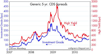
Credit spreads have been reliable leading indicators of recessions in the past. While it's true that spreads haven't tightened on balance over the course of this year, there is no sign of any rise in spreads that might foreshadow a return to recession. In any event, it's not unusual at all for several years to pass, following a recession, before spreads return to more normal levels. The behavior of spreads today—especially swap spreads, which are currently somewhat lower than what we typically see during periods of healthy growth—is fully consistent with an ongoing, albeit relatively sub-par, recovery.


The slope of the yield curve has been an excellent leading indicator of recessions and recoveries for many decades. The curve typically flattens or inverts in advance of recessions, but today it is still very far from being flat or inverted. The curve is strongly upward-sloping, which reflects easy money and expectations that monetary policy will eventually need to tighten as the economy improves. We've never seen a recession develop when the curve was this steep and monetary policy was this easy.


The fact that the demand for temporary and part-time workers is steadily increasing may not guarantee a continued recovery, but I think it argues strongly against a double-dip recession being underway.


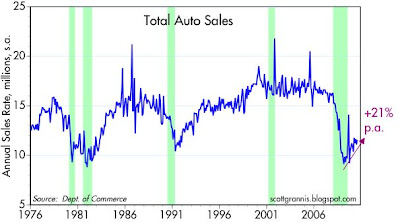
Car sales are up strongly over the past year, reflecting underlying improvement in confidence and in consumers' financial health. Car sales had fallen so much and for so long that this created pent-up demand that has the potential to be self-perpetuating. Bears focus on the fact that sales are still at abysmally low levels, but the correct way to see this is as very positive change on the margin.


Large corporate layoffs are essentially a thing of the past. It's very likely that corporations have done all or almost all of the cost-cutting that they need to do. A big decline in layoffs is almost a necessary precursor to a new wave of hiring, and that's what we're getting set up for.


China and almost all emerging market economies are growing like gangbusters, and global trade is recovering nicely. What's good for emerging market economies is good for everyone, since the more they produce the more they can buy from us.


Corporate profits typically decline in the years leading up to a recession, but for the past 18 months they have been growing strongly—which in turn is typical of the early years of a recovery. Strong profits are the fuel for future investments in new job creating ventures.


Although key indicators of financial health—most notably the Vix index, which at 27 is still significantly above its long-term average—are not in perfect shape, neither have they deteriorated enough to foreshadow any significant deterioration in the health of our financial markets.


Key indicators of shipping activity suggest that at the very least, there is no sign of any slowdown underway in global trade volumes or demand.


The Bloomberg index of the stocks of leading home builders hit a low almost 18 months ago and has more than doubled since. Prices of residential and commercial real estate have been flat to somewhat higher for more than a year. At the very least this tells us that the worst of the bad news from a housing and construction standpoint has passed. Residential construction is at an all-time low of about 2.5% of GDP, so even if things get worse, it would have only a modest impact on the overall economy.


It is arguable whether the Leading Indicators actually lead the economy, or whether they are just good coincident indicators of the economy. But in any case, they aren't even close to a level that would suggest that the economy has deteriorated to any meaningful extent. Indeed, they are at a level which strongly suggests continued growth.


Last but not least, I offer this chart which shows how the ISM manufacturing index has done a pretty good job of reflecting the underlying growth rate of the economy as a whole. Although the index doesn't match up exactly with each quarter's GDP growth rate, the recent level of the index strongly suggests that growth is still in positive territory, and that a 3-4% growth expectation for the current quarter is not unreasonable.

Credit spread update


These charts use data from the Markit indices of credit default swaps, as of yesterday. Spreads have widened a bit over the course of this month, but when you put this in the context of the past few years, the widening is hardly noticeable. Is the recent widening a sign of emerging economic weakness (e.g., the dreaded double-dip)? I don't think so. The magnitude of the widening isn't big enough to signal anything other than random noise or subtle shifts in sentiment—there has been no significant or fundamental deterioration in the economic outlook at all this year, according to these figures. And the outlook remains dramatically better today than it was early last year.

Of course, these charts also show that the fundamentals of the economy are still much worse than what we would expect to see in a normal expansion—spreads are still substantially higher today than they were in early 2007. So the economy is doing much better than the market expected a year ago, but the economy is still far from being termed "healthy." I think the explanation for the relatively poor performance of the economy is not too difficult to pinpoint: it's fiscal policy, stupid—huge increases in government spending and regulatory burdens, coupled with huge uncertainty over the level of future tax burdens. We could argue about monetary policy, since it has created huge uncertainty about future inflation risk, but at this point monetary policy is a minor problem compared to fiscal policy. The Fed can't create growth out of thin air, but intelligent tax and spending policies can, by altering the incentives to working and investing.

The economy has been facing serious fiscal headwinds for the past several years. That's a bummer, to be sure. But if anything, the outlook for fiscal policy today is not as bad as it was a year ago. Cap and trade is dead, and it appears highly likely that the Democrats will lose enough seats in Congress this November to make regulatory gridlock a reality (and one devoutly to be wished). With a little luck, the November elections could result in outright reform of fiscal policy.

My point here is that the problem of bad fiscal policy is nothing new, and sensitive indicators of the economy's health (e.g., swap spreads and credit spreads) do not reflect any meaningful deterioration in recent months. All of the angst and hand-wringing over a double-dip recession might just be the growing realization that we have had a big fiscal problem on our hands for quite some time. If that's the case, then the hue and cry might actually be a good thing, since it could nudge policymakers and the electorate in a direction that might restore some common sense to Washington.

Yes, things are bad, but that's nothing new. What's important on the margin is how things are likely to change in the future, and whether those changes are being factored into today's prices.

July capital goods orders were very weak, but possibly misleading


July new orders for capital goods were down a steep 8%, much weaker than expected. Is this hard evidence of a double-dip recession? While it shakes my confidence, I think there is a good chance that the weakness is an artifact of poor seasonal adjustment. Both Brian Wesbury and our own "brodero" noted today the pronounced tendency of this series to drop on the first month of every quarter: "this is the eighth consecutive first month of the quarter (January/April/July/October) where machinery orders have dropped, with the typical decline being around 9%."

The top chart shows the raw (seasonally adjusted) data. The second chart uses a 3-mo. moving average, and it should be immediately obvious that this removes a lot of the noise in the raw data without changing its character or its signal. The third chart shows the 6-mo. annualized growth in the moving average.

Regardless of how you massage the data, the story remains the same: over the past year, the rebound in capital spending by U.S. corporations has been quite strong and is likely ongoing. This is an important indicator not only of business confidence, but also of the economy's ability to grow in the future, since capital spending is the raw material necessary for future productivity growth.

Tuesday, August 24, 2010

What double-dip?


No sign of a double-dip recession here. For more info, see Mark Perry's comments on this.